Get a skill gap analysis, personalised roadmap, and AI-powered resume optimisation.
Introduction
Microsoft Excel is a prevalent spreadsheet software that provides many valuable tools and allows users to create boring and simple data into engaging graphs and charts. One such tool is the 3D Graph in Excel.
In this blog, we will discuss 3DGraphsinExcel in detail. We will discuss 3D Graphs with the help of a step-by-step explanation of the steps involved in creating graphs from our data with suitable examples. We will also discuss some best practices to remember while using 3Dgraphs in Excel. But let us first learn a bit more about 3D Graphs in the next section.
3D Graphs in Excel
3D graphs in Excel are a very powerful tool to represent data more aesthetically. 3D graphs add depth and perspective to the dataset. These 3D graphs provide a better representation of data by adding depth to our dataset. 3D graphs are mainly useful while dealing with multivariate(with multiple variables) graphs.
3D graphs are a very easy way to represent complex relationships between variables in graphs. 3D graphs sometimes can be more effective in showcasing trends and patterns that can't be shown by 2D Graphs. These are some of the main advantages of using 3D graphs in Excel:
Depth and Perspective
Better Visualization of Data
Better Appearance
Multivariate Analysis
Spatial Data Representation
In the next section, we will see the steps required to plot a 3D graph from our dataset in Excel.
Steps Involved in Preparing a 3D Graph in Excel
In this section, we will see a step-by-step explanation of how to prepare a 3D graph from our Dataset in Excel.
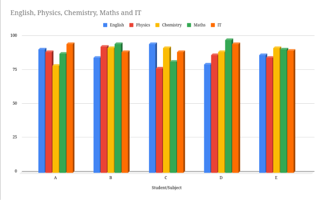
We have sample data of 5 students, A, B, C, D, and E, along with their marks in 5 subjects (English, Physics, Chemistry, Maths, and IT) out of 100. We will use this Dataset to create various 3D graphs.
Student/Subject
English
Physics
Chemistry
Maths
IT
A
91
89
79
88
95
B
85
93
92
95
89
C
95
77
92
82
89
D
80
87
89
98
95
E
87
85
92
91
90
Step1: Select the Dataset and plot a 2D Graph
To create a chart in Excel, select the Dataset, go to the Insert tab, and select the Chart section.
A simple 2D bar chart will appear on the screen.
In the further steps, we will convert this 2D Graph into a 3D graph.
Step2: Convert the 2D graph into 3D
To convert the 2D Graph into a 3D graph, go to the customize section of the Graph, select the chartstyledropdown, and check the 3Dcheckbox. Your Graph will change from 2D to 3D.
Step3: Customizing the graph
Excel provides many options to customize the Graph according to our needs. For example, we can add labels and legends, add titles to the Graph, add stacking, and change between various chart types present in Excel.
We have added a legend at the bottom of the chart, titles on both X and Y axis to make it more apparent to the reader, and a suitable title for the table.
We can also change the type of Graph we are using. Excel provides many graph options like columns, Lines, Bar Charts, etc. We can change the chart type through the Setup section of the chart settings.
Best Practices while using 3D Graphs
Now that we know the steps to use 3D graphs in Excel, we will discuss some tips you should keep in mind while using 3D Graphs in Excel to make your presentation or report look more aesthetic and appealing.
Choosing the correct type of Graph
Excel provides various graphs like lines, bars, and area charts. Thus the user must carefully select the correct kind of Graph that corresponds to their Dataset and best suits their needs to convey the data.
Appropriate Axis Titles
A graph alone can only convey a little information to the readers. Hence the user must provide appropriate titles for all the axes so that the reader can easily understand what the Graph is trying to show.
Legends
Legends are also an essential component of any graph. Legends usually indicate the colors which represent different categories in a graph. It helps the viewers to interpret the Graph by associating each type with its corresponding color.
Avoid Overuse
One of the most important things is that users must refrain from using 3D graphs. 3D graphs make our presentation look more appealing, but using them in unnecessary scenarios makes it clearer.
Axis Scaling
We should also keep our Graph concise and easy to read by providing scaling whenever necessary. If the values on any axis do not fit the Graph properly, we should use a more extensive scale to make the Graph look better.
Frequently Asked Questions
What are the benefits of using 3D graphs for visualizing data in Excel?
3D graphs add an extra dimension to the visualization making it comparatively easy to analyze large quantities. 3D graphs also make the content look more visually appealing and capture attention quickly.
Is it possible to export 3D Graphs from Excel into other formats?
Excel allows us to export 3D graphs in the Excel sheet to other formats. We can export 3D graphs from Excel sheets to other formats like images (JPEG and PNG), PDFs, etc.
Is it possible to animate graphs in Excel?
Although Excel provides many features to customize 3D graphs in Excel, sadly, animation isn't one of them. You can create animations by generating graphs and applying transitions to mimic the animation effect.
Why are 2D graphs better than 3D graphs in depth-perception?
2D graphs present the data in a flat plane, resulting in less clutter than the 3D Graph. Moreover, in 2D graphs, the data is aligned only on a single axis, making comparing values easier than the 3D Graphs.
Conclusion
In this article, we discussed 3D Graphs in Excel. We discussed 3D Graphs in detail. We also discussed the steps involved in creating a 3D graph in Excel with our custom data with the help of an example. In the end, we concluded by discussing some best practices to keep in mind while using 3D Graphs in Excel and some frequently asked questions.
So now that you know about 3D Graphs in Excel, you can refer to similar articles.


 9+ registered

