Types Of Linear Layout Orientation
As the name implies, these two orientations arrange their children in a line, either vertically or horizontally. Let us go over these in greater depth.
Let's discuss both with a single example, we will write the snippet below in our activity_main.xml.
Code:
<?xml version="1.0" encoding="utf-8"?>
<LinearLayout xmlns:android="http://schemas.android.com/apk/res/android"
    xmlns:tools="http://schemas.android.com/tools"
    android:layout_width="match_parent"
    android:layout_height="match_parent"
    tools:context=".MainActivity"
    android:weightSum="2"
    android:baselineAligned="false">

        <LinearLayout
            android:id="@+id/ll_grey"
            android:layout_width="wrap_content"
            android:layout_height="wrap_content"
            android:background="#CEC7D6"
            android:padding="20dp"
            android:orientation="horizontal"
            android:layout_weight="1">

                <androidx.appcompat.widget.AppCompatTextView
                    android:layout_width="wrap_content"
                    android:layout_height="wrap_content"
                    android:text="@string/app_name"/>

                <androidx.appcompat.widget.AppCompatTextView
                    android:layout_width="wrap_content"
                    android:layout_height="wrap_content"
                    android:text="@string/app_name"/>

        </LinearLayout>

        <LinearLayout
            android:id="@+id/ll_green"
            android:layout_width="wrap_content"
            android:layout_height="wrap_content"
            android:background="#6FBA54"
            android:padding="20dp"
            android:orientation="vertical"
            android:layout_weight="1">

                <androidx.appcompat.widget.AppCompatTextView
                    android:layout_width="wrap_content"
                    android:layout_height="wrap_content"
                    android:text="@string/app_name"/>

                <androidx.appcompat.widget.AppCompatTextView
                    android:layout_width="wrap_content"
                    android:layout_height="wrap_content"
                    android:text="@string/app_name"/>

        </LinearLayout>

</LinearLayout>
Output:
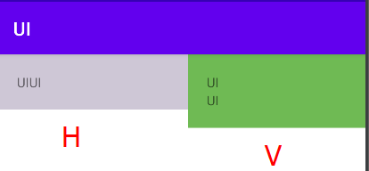
In the above example, we can see that we have created two layouts, one is horizontal, and the other is vertical. We have added AppCompatTextView, which is similar to normal TextView.
The orientation is self-explanatory. The default orientation in the Linear layout is vertical. Let us move into another attribute like weightSum, where we supply a total number of child layouts where we will use layout_weight property defining how to divide the size of the layout within a total number of layout children.
The layout_weight attribute specifies the relative importance of each child control within the parent linear layout. weightSum attribute is necessary if the child's weight property is defined.
The gravity attribute is an optional attribute that is used to regulate the layout's alignment, such as start, end, center, top, bottom, and so on. Let’s make changes in our activity_main.xml.
Code:
<?xml version="1.0" encoding="utf-8"?>
<LinearLayout xmlns:android="http://schemas.android.com/apk/res/android"
    android:layout_width="match_parent"
    android:layout_height="match_parent"
    android:gravity="start"
    android:orientation="horizontal">

    <Button
        android:id="@+id/buttonOne"
        android:layout_width="wrap_content"
        android:layout_height="wrap_content"
        android:backgroundTint="#C36969"
        android:text="Button One" />

    <Button
        android:id="@+id/buttonTwo"
        android:layout_width="wrap_content"
        android:layout_height="wrap_content"
        android:backgroundTint="#5ED15D"
        android:text="Button Two" />

</LinearLayout>
Output:

For linear layout, we have specified gravity start. As a result, the buttons in Horizontal orientation are aligned from the left side.
FAQs
-
What is the difference between padding and margin android layout?
Ans: This is the distinction between android margin and padding. Padding is the gap inside the border between the border and the content of the actual view. The spaces outside, between the border and the other elements adjacent to this perspective, are referred to as margins.
-
What does setOnClickListener do in Android?
Ans: The setOnClickListener function in Android is useful since it allows us to associate a listener with specific attributes. A callback function will be executed when this method is invoked. You can also build a class for more than one listener, leading to code reuse.
-
What is custom Toast in Android?
Ans: Toast is a small popup notification in Android that displays information about the operation we completed in our app. The Toast will display the message for a short time before disappearing automatically after a timeout.
Key Takeaways
In this article, we have extensively discussed various types of linear layouts in Android and their attributes.
You can head over to our Android Development Course on the Coding Ninjas Website to dive deep into Android Development and build future applications.
We hope that this blog has helped you enhance your knowledge regarding linear layout attributes and if you would like to learn more, check out our articles on Relative Layout. Do upvote our blog to help other ninjas grow. Happy Coding!


 9+ registered

