Example
Open Android Studio, start an empty activity, give a name to your app(Kotlin Shimmer layout CN in our case), and let Android do the Gradle syncing.
Now add dependency of Shimmer layout in build.Gradle (:app), this will allow us to use inbuilt Shimmer layout methods and start Shimmer animation.
Code:
dependencies {
implementation 'io.supercharge:shimmerlayout:2.1.0
}
Now make the activity_main.xml file as per the need of your desired layout.
Code:
<androidx.constraintlayout.widget.ConstraintLayout xmlns:android="http://schemas.android.com/apk/res/android"
    xmlns:app="http://schemas.android.com/apk/res-auto"
    xmlns:tools="http://schemas.android.com/tools"
    android:layout_width="match_parent"
    android:layout_height="match_parent"
    tools:context=".MainActivity">

    <io.supercharge.shimmerlayout.ShimmerLayout
        android:id="@+id/shimmer_layout"
        android:layout_width="match_parent"
        android:layout_height="wrap_content"
        app:shimmer_animation_duration="1500">

        <LinearLayout
            android:layout_width="match_parent"
            android:layout_height="match_parent"
            android:orientation="vertical">
        <LinearLayout
            android:layout_marginTop="5dp"
            android:layout_width="match_parent"
            android:layout_height="wrap_content"
            android:orientation="horizontal">
            <ImageView
                android:layout_marginStart="5dp"
                android:src="@drawable/circle"
                android:layout_width="wrap_content"
                android:layout_height="wrap_content"
                android:layout_marginEnd="10dp"
                />
            <TextView
                android:layout_marginEnd="5dp"
                android:layout_width="match_parent"
                android:layout_height="40dp"
                android:gravity="center"
                android:background="#918F8F"
                android:textSize="26sp"/>
        </LinearLayout>

        <LinearLayout
            android:layout_marginTop="5dp"
            android:layout_width="match_parent"
            android:layout_height="wrap_content"
            android:orientation="horizontal">
            <ImageView
                android:layout_marginStart="5dp"
                android:src="@drawable/circle"
                android:layout_width="wrap_content"
                android:layout_height="wrap_content"
                android:layout_marginEnd="5dp"
                />
            <ImageView
                android:src="@drawable/circle"
                android:layout_width="wrap_content"
                android:layout_height="wrap_content"
                android:layout_marginEnd="5dp"/>

            <ImageView
                android:src="@drawable/circle"
                android:layout_width="wrap_content"
                android:layout_height="wrap_content"
                android:layout_marginEnd="5dp"/>

            <ImageView
                android:src="@drawable/circle"
                android:layout_width="wrap_content"
                android:layout_height="wrap_content"
                android:layout_marginEnd="5dp"/>

            <ImageView
                android:src="@drawable/circle"
                android:layout_width="wrap_content"
                android:layout_height="wrap_content"
                android:layout_marginEnd="5dp"/>

            <ImageView
                android:src="@drawable/circle"
                android:layout_width="wrap_content"
                android:layout_height="wrap_content"
                android:layout_marginEnd="5dp"/>

            <ImageView
                android:src="@drawable/circle"
                android:layout_width="wrap_content"
                android:layout_height="wrap_content"
                android:layout_marginEnd="5dp"/>

            <ImageView
                android:src="@drawable/circle"
                android:layout_width="wrap_content"
                android:layout_height="wrap_content"
                android:layout_marginEnd="5dp"/>

        </LinearLayout>

            <LinearLayout
                android:layout_marginTop="5dp"
                android:layout_width="match_parent"
                android:layout_height="wrap_content"
                android:orientation="horizontal">
                <ImageView
                    android:layout_marginStart="5dp"
                    android:src="@drawable/meme"
                    android:layout_width="match_parent"
                    android:layout_height="500dp"
                    android:layout_marginEnd="5dp"
                    />

            </LinearLayout>

            <LinearLayout
                android:layout_marginTop="50dp"
                android:layout_width="match_parent"
                android:layout_height="wrap_content"
                android:orientation="horizontal">
                <ImageView
                    android:layout_marginStart="5dp"
                    android:src="@drawable/meme"
                    android:layout_width="match_parent"
                    android:layout_height="50dp"
                    android:layout_marginEnd="5dp"
                    />


            </LinearLayout>

        </LinearLayout>

    </io.supercharge.shimmerlayout.ShimmerLayout>

</androidx.constraintlayout.widget.ConstraintLayout>
Since we have used circle and meme in our XML file layout, create circle.xml and meme.xml in res -> drawable.
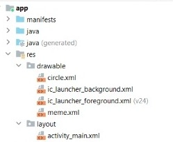
Add this code to your circle and meme XML files.
Code:
circle.xml
<shape xmlns:android="http://schemas.android.com/apk/res/android"
    android:shape="rectangle">
    <size
        android:height="35dp"
        android:width="35dp"/>
    <corners android:radius="25dp"/>
    <solid android:color="#918F8F"/>
</shape>
meme.xml
<shape xmlns:android="http://schemas.android.com/apk/res/android"
    android:shape="rectangle">
    <solid android:color="#918F8F"/>
</shape>
Now in MainActivity.kt call your Shimmer layout from activity_main.xml using.
Code:
import android.os.Bundle
import androidx.appcompat.app.AppCompatActivity
import io.supercharge.shimmerlayout.ShimmerLayout

class MainActivity : AppCompatActivity() {
    override fun onCreate(savedInstanceState: Bundle?) {
        super.onCreate(savedInstanceState)
        setContentView(R.layout.activity_main)

        val my_layout = findViewById<ShimmerLayout>(R.id.shimmer_layout)
        my_layout.startShimmerAnimation()
    }
}
Output:
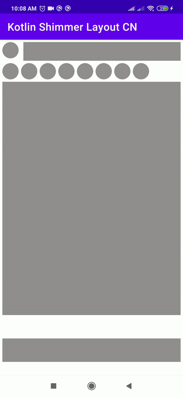
Here, we have added the Shimmer animation effect of the loading process using the layout.startShimmerAnimation() method so that the user will see some loading animation instead of a blank screen till the data fetching completes.
FAQs
1. What exactly is the shimmer effect?
Ans: Facebook invented the Shimmer effect to display a loading state, so instead of utilizing the ProgressBar or a standard loader, we can use Shimmer for a better design and user interface.
2. In Recyclerview, how can we apply Shimmer?
Ans: Starting with creating a placeholder layout for Shimmer, then Gathering information for the recycler view, which is followed by making the shimmer placeholder visible and at last Showcase the original.
3. When Shall we use Progress bars and Spinners?
Ans: For a short loading process that takes less than 4 seconds, we shall use Spinners, but for processes with more than 4 seconds of loading time, we shall use Progress bars.
Key Takeaways
In this article, we learned about the Shimmer layout and its implementation. We also infer from this article how using the Shimmer effect is better than Progress bars and Spinners.
You can head over to our Android Development Course on the Coding Ninjas Website to dive deep into Android Development and build future applications.
We hope this article has helped you enhance your knowledge of the Android UI Shimmer layout. If you want to learn more, check out our Programming Fundamentals and Competitive Programming articles. Do upvote this article to help other ninjas grow.


 8+ registered

