Do you think IIT Guwahati certified course can help you in your career?
Introduction
An essential aspect of developing an android application is creating its user interface through which the user navigates through the application and uses it. On Android, UIs or input controls are interactive or display components used to design the user interface of an application. There are various UIs or input controls available on Android. These are TextView, EditText, Buttons, Checkbox, Progressbar, Spinners and more. We will learn more about these in the upcoming section of our blog.
So let us move ahead and discuss the topic in depth.
What are Android UI controls?
Android UI controls, also known as widgets or views, are the building blocks used to create the user interface (UI) of Android applications. They include various elements such as buttons, text fields, checkboxes, radio buttons, sliders, progress bars, and more. UI controls are responsible for presenting information to users and enabling interaction with the application. They are customizable and can be styled to match the overall look and feel of the application. Android UI controls are typically defined in XML layout files and manipulated programmatically using Java or Kotlin code.
What is UI elements?
UI elements, also referred to as user interface elements, are the components that users interact with when using a software application or system. They include visual elements such as buttons, text fields, menus, icons, and images, as well as interactive elements like checkboxes, radio buttons, sliders, and progress bars. UI elements play a crucial role in providing users with a way to navigate, input data, and interact with the application's features and functionality. Effective UI design considers factors such as usability, accessibility, consistency, and aesthetics to create a positive user experience. UI elements are designed and arranged to convey information clearly and intuitively, guiding users through tasks and workflows within the application.
UI Control creation
Input controls are an interactive component of your app's user interface. Android provides a variety of controls that you can use in the user interface. Android gives us multiple controls that we can use in our UIs. These include:
Buttons
Text fields
Checkboxes
Zoom Buttons
Toggle Buttons
ProgressBar
SeekBar
Switch
RatingBar
AutoCompleteTextView
RadioButton
ImageButton
TimePicker
AlertDialog
TextView
View objects can be assigned a unique ID that uniquely identifies the view in the tree.
The syntax of the ID in the XML tag is:
android:id="@+id/text_id"
Top UI controls
There are several types of UI Controls available on android. As discussed earlier, these UI Controls help us define the application's user interface.
This section shall understand the diffTextView
We use TextView to show textual content to the user. A view is an object that draws something on a screen that you can interact with, and a view group is an object that contains another view (and view group) object for defining user interface layouts. We can create this in two ways:
By using an XML file
Through Activity File
EditText
EditText is a predefined subclass of TextView that consists of multiple enhancing capabilities used to improve the appearance of the textual content. Like TextView, we can create it in two ways: i,e, using the XML file and the activity file.
AutoCompleteTextView
The AutoCompleteTextView is a view that is much like the EditText. The only differentiating factor is that it suggests a routine listing of entire guidelines while the developer is typing. This feature helps the developer to include and consider the suggestions.
Button
A push-button is a button that may be pressed or clicked to do a particular task.
ImageButton
An ImageButton is an AbsoluteLayout that allows you to specify the precise area of its children. It is a button with an image (rather than textual content).
It allows the user to perform a specific action and use the application or its features.
CheckBox
An on/off transfer for any value. We have to take a look at the containers while providing the user with a collection of selectable alternatives that aren't at the same time exclusive. The checkboxes give the user options that they can select.
ToggleButton
A ToggleButton is an on/off button with a mild indicator.
RadioButton
The RadioButton has states: both checked or unchecked.
Spinner
A drop-down listing that lets users pick out one option from a set of given options. Spinners work the same way as a drop-down list. It is efficient and allows the user to select their choice fastly. The first value can be the value selected by default. The value can be selected and changed by the user's preference.
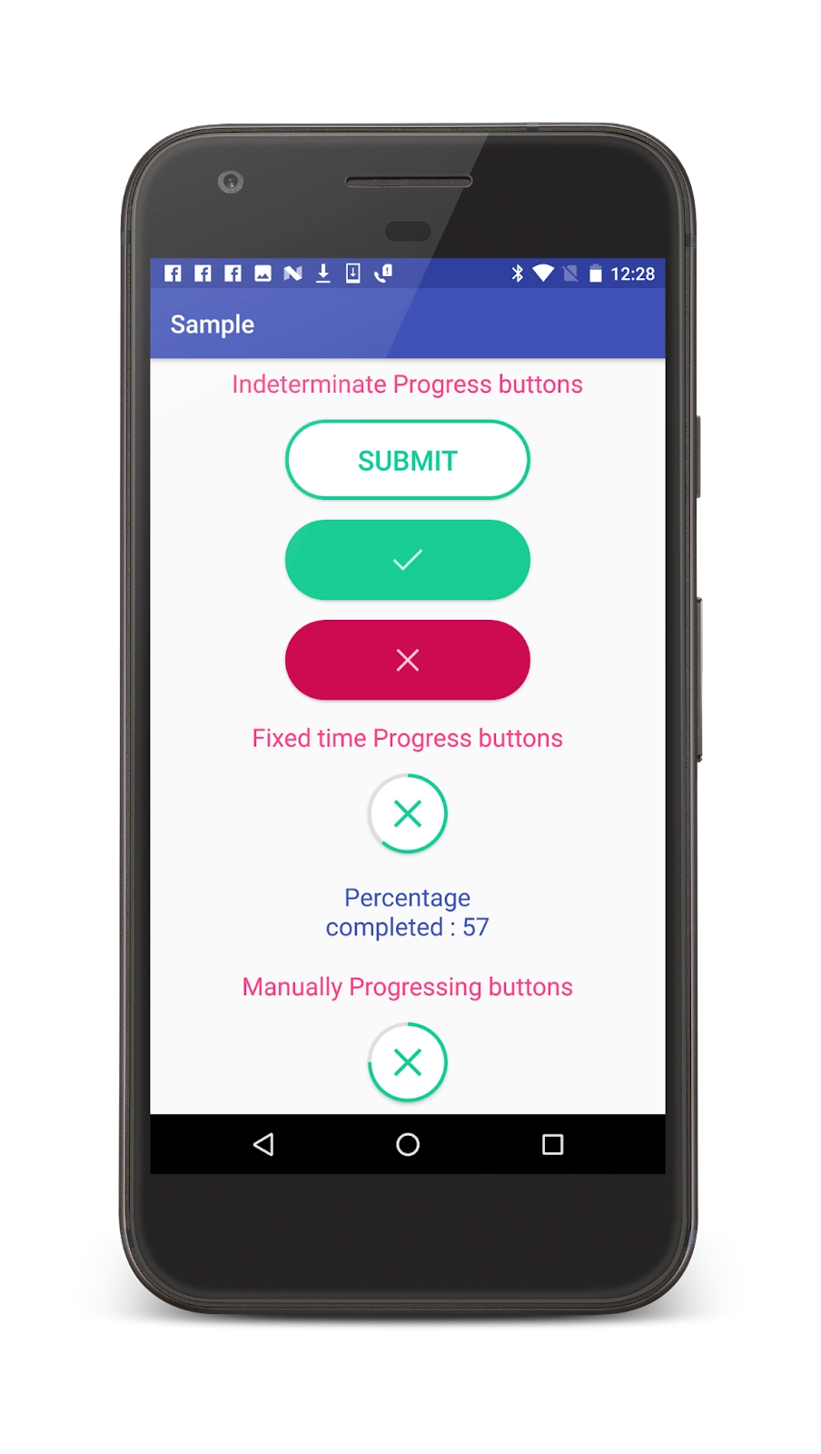
ProgressBar
The ProgressBar view gives visible remarks on completing a few ongoing tasks. It shows the percentage of the work that has been performed.
TimePicker
The TimePicker view allows customers to pick out a time of the day in both 24-hour mode or AM/PM mode. We put up a virtual Clock or a watch for this purpose.
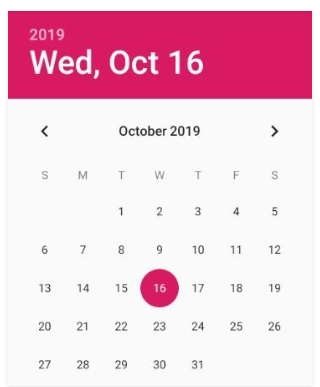
DatePicker
The DatePicker view allows customers to pick out the date of the day.
AlertDailog
We use it to give the user a warning message every time something undesirable happens.
Android Layouts
Android layouts define a user interface that contains UI controls or widgets. These UI controls appear on an Android application or activity screen. In general, each application is a combination of View and ViewGroup. As you know, an Android application contains a lot of activities, and each activity is a page of the application. Therefore, each activity has multiple UI components, which are instances of View and ViewGroup.
The UI in Android enables users to interact with apps, facilitating navigation, data input, and access to features and content.
What are UI design controls?
UI design controls are elements like buttons, text fields, and sliders that users interact with to navigate and input data in software applications.
What are UI components?
UI components are the visual elements, such as buttons, menus, and icons, that enable user interaction and facilitate navigation within software applications.
What are Android Layouts used for?
Android layouts are used to define a user interface that contains UI controls or widgets.
Conclusion
In this article, we have extensively discussed the Android UI Control and Types in Android and their implementation in Android Studio. We discussed the various types of UI Control in detail. The several types were listed and explained. We then also moved on to learning about android layouts. We hope that this blog has helped you enhance your knowledge regarding Android UI Control and Types. All the widgets are enclosed inside a UI layout and if you would like to learn more about layouts, check out our article on Android UI layouts. And to learn in-depth about android development, check out our Android Development course on the Coding Ninjas website. Do upvote our blog to help other ninjas grow. Happy Coding!


 9+ registered

