
Introduction
Charts are used in Microsoft Excel to provide a graphical representation of any data set. A chart represents data that uses symbols such as lines in a line chart or bars in a bar chart to represent the data.
Area charts are very much similar to line charts, except that the area below the lines is filled in, or we can say that the area chart is a line chart with color-filled areas below the lines. To visualize the contribution of each item to total overtime, use stacked area charts in excel.
The area charts in Excel are one of the few charts that can graphically display data. It's usually plotted to highlight the data that shows the Time-series relationship. This blog provides a basic overview of the Area Chart, including its types and examples in Excel. Let's look at the topic now to learn more about it.
Understanding Area Chart
An area chart is a data visualization feature of Microsoft Excel that displays the rate of change of one or more variables over a specified time period. It usually helps measure trends in various data sets over time by utilizing colors to fill in the space between the x-axis and the line segments. In brief, an area chart is a line chart with color-filled areas beneath the lines.
The chart may display a different color in the area between two consecutive line segments when working with several line segments. The area chart, which is a type of line chart, emphasizes the "gaps" between the data and the axis and is typically used to compare data sets.
The area chart can be viewed in two different ways:
- The Data Plots overlapping each other
- The Data Plots stacked on each other
We will take the example of ‘Mark Distribution’’ and will see the data in various formats of charts in Excel.
Data Representation
So, how do we make an area chart from a data set? The steps below will show you how to create an area chart. For this chart, we'll use the data from the sample spreadsheet. You can either copy or create your data in your worksheet.
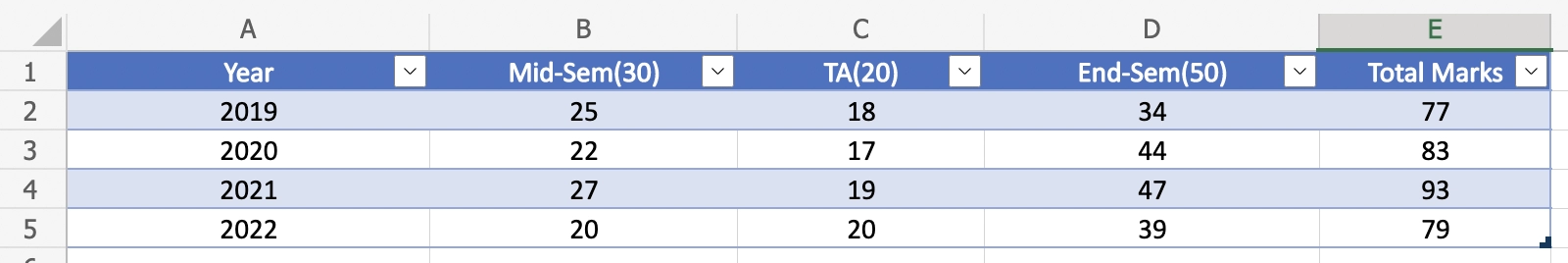
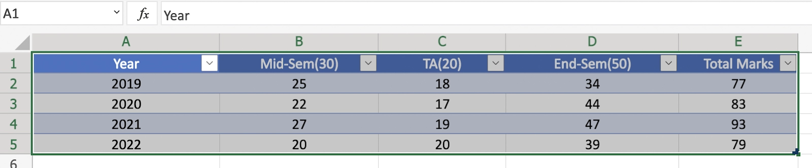
1. Select the range A1:E5.
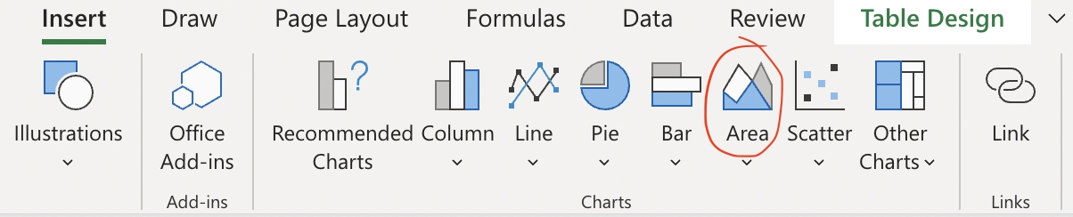
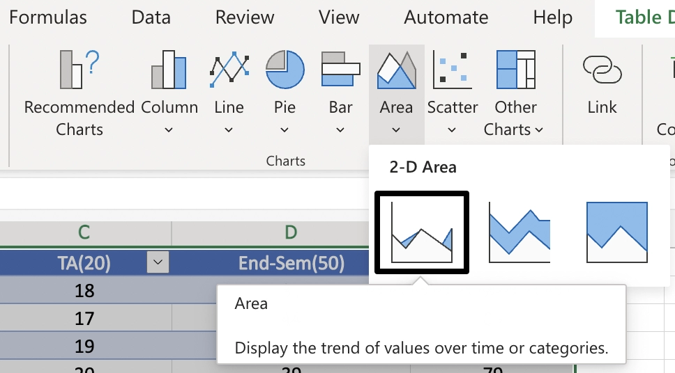
2. On the 'Insert tab', go to the 'Charts group', and then we will click on the Area symbol.
There are three types of in-built charts available(in 2-D Area Chart in Excel):
Representing in Area Chart
Simple Area Chart (2D)
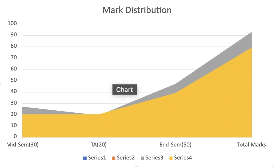
If we use the above data to make an area chart, we might end up with something like this (where we have plotted four types of data: Mid-Sem, TA, End-Sem and Total Marks, but we only see two colors). Here the data overlap each other.
When we have two datasets, this regular 2-D area chart is more suited (an overall data set and a subset).
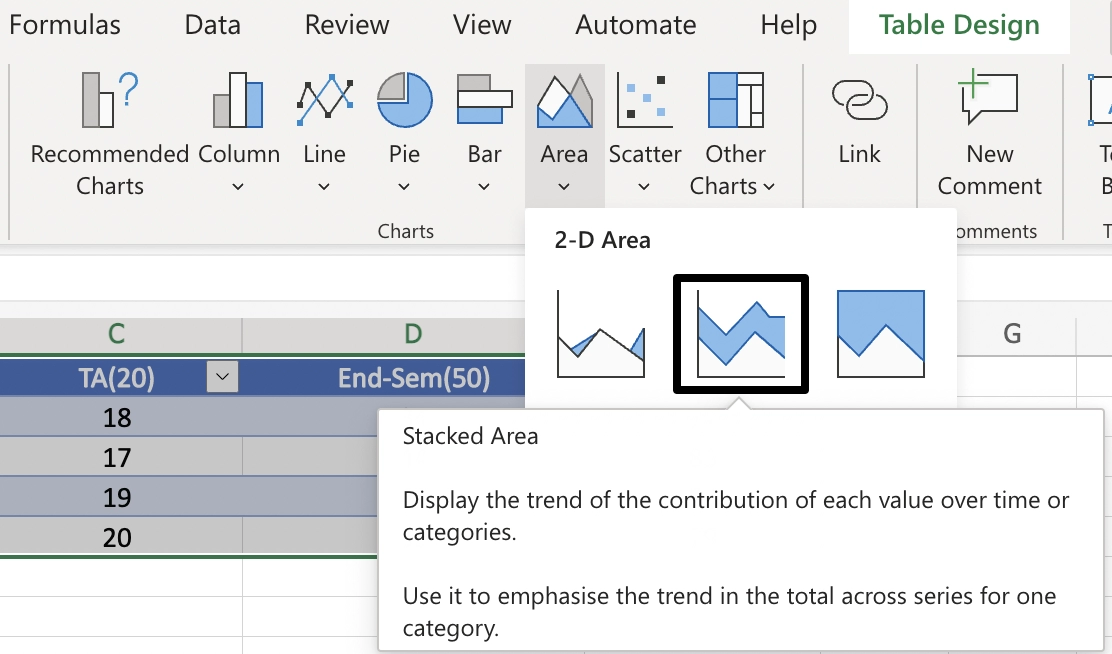
Stacked Area Chart (2D)
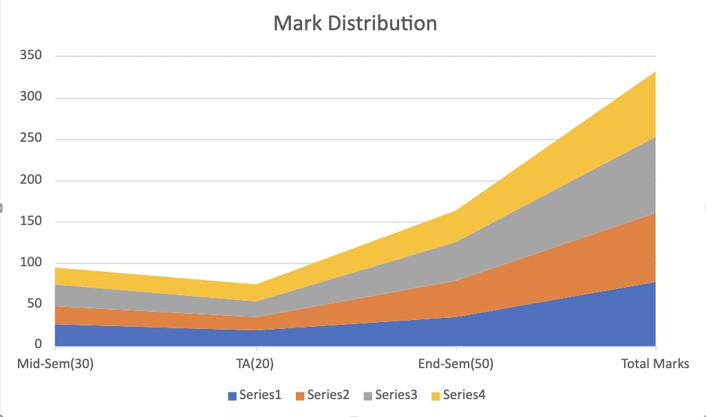
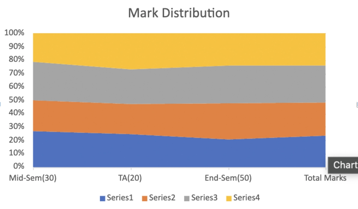
It is the best way possible to represent the above data taken by us.
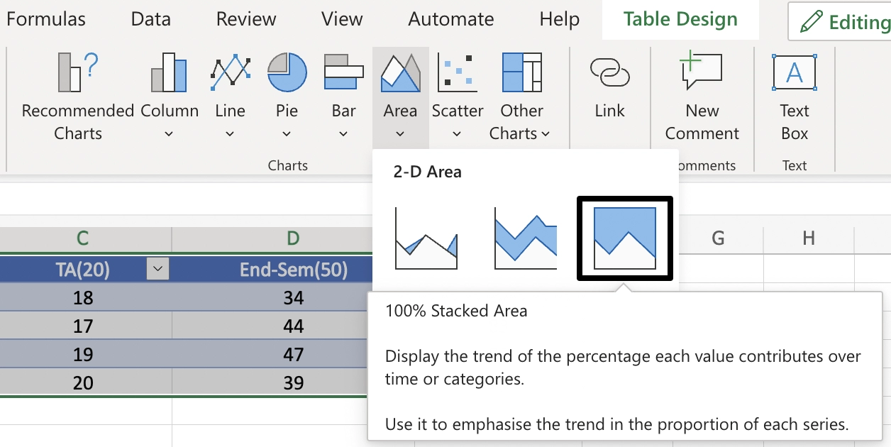
100% Stacked Area Chart (2D)
Representing data in Line Chart
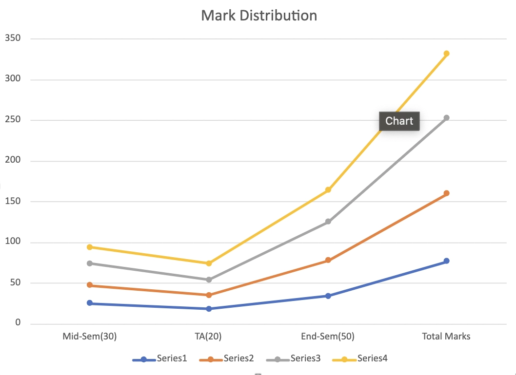
Here, we represented the stacked area chart into the stacked line chart for a clear and distinct view.


 6+ registered