Do you think IIT Guwahati certified course can help you in your career?
Introduction
Hey Ninjas! You must have heard about the Bootstrap framework in your programming career. While styling any web page, we need some alerts to show the critical message to the user. Do you know how to add these alerts? If not, then welcome to the bootstrap alerts blog.
This blog will discuss all types of bootstrap alerts in detail. Let's take a quick look at the definition of bootstrap alerts in the beginning.
Bootstrap Alerts
Bootstrap alerts use several reliable and adaptable alerts to give contextual feedback messages for typical user behaviours. In simpler words, bootstrap alerts tell the users about their actions taken.
For instance, if you click on a submit button, it will show you a success alert message to confirm your action.
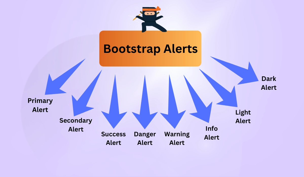
Types of Bootstrap Alerts
There are a total of eight types of bootstrap alerts. Let's check them out using a diagram.
Let's take a look at each of these in brief.
Primary Alert: The primary alert displays any basic notification to the user. The default colour of the primary alert is Blue.
Secondary Alert: The secondary alert displays a sub-alert notification to the user. The default colour of the secondary alert is Grey.
Success Alert: The success alert displays on the screen after completing any process successfully. The default colour of the success alert is Green.
Danger Alert: The danger alert is used to aware the user about the risk. The default colour of the danger alert is Red.
Warning Alert: The warning alert is used to warn the user about the uncertainty. The default colour of the warning alert is Yellow.
Info Alert: The info alert is used to inform the user. The default colour of the info alert is Light Blue.
Light Alert: The light alert is used to highlight information to the user. The default colour of the light alert is White.
Dark Alert: The dark alert is used to inform any predefined message to the user. The default colour of the dark alert is Dark Grey.
Implementation
We will now see the working code example of these alerts. Let's have a look.
<!DOCTYPE html>
<html>
    <head>
        <meta chrset="UTF 8" />
        <title>Bootstrap Alerts</title>
        <meta name="viewport", initial-scale=1">
        <link href="https://cdn.jsdelivr.net/npm/bootstrap@5.2.3/dist/css/bootstrap.min.css" rel="stylesheet">
        <link href="https://getbootstrap.com/docs/5.2/assets/css/docs.css" rel="stylesheet">
        <script src="https://cdn.jsdelivr.net/npm/bootstrap@5.2.3/dist/js/bootstrap.bundle.min.js"></script>
    </head>
    <body>
        </br><h2>My Bootstrap Alerts</h2>
        <div class="alert alert-primary" role="alert">Displaying Primary Alert here. The default colour is Blue.</div>
        <div class="alert alert-secondary" role="alert">Displaying Secondary Alert here. The default colour is Grey.</div>
        <div class="alert alert-success" role="alert">Displaying Success Alert here. The default colour is Green.</div>
        <div class="alert alert-danger" role="alert">Displaying Danger Alert here. The default colour is Red.</div>
        <div class="alert alert-warning" role="alert">Displaying Warning Alert here. The default colour is Yellow.</div>
        <div class="alert alert-info" role="alert">Displaying Info Alert here. The default colour is Sky Blue.</div>
        <div class="alert alert-light" role="alert">Displaying Light Alert here. The default colour is White.</div>
        <div class="alert alert-dark" role="alert">Displaying Dark Alert here. The default colour is Dark Grey.</div>
    </body>
</html>
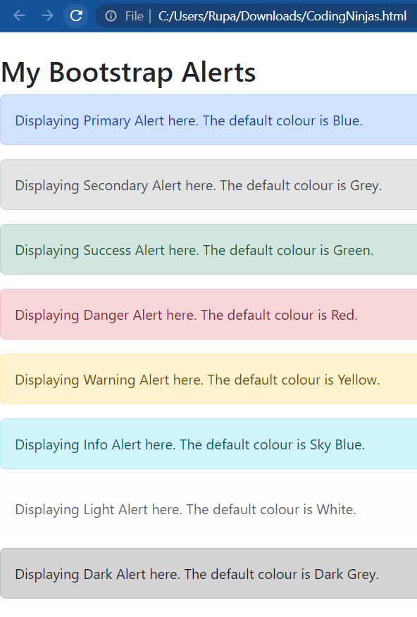
Output:
As you can see in the output shown above, all alerts are in a different colour. And every colour indicates a sign for their alerts. For instance, the red colour indicates the Danger alert.
Links in Bootstrap Alert
While creating an alert in bootstrap, you can add a link also that refers to another page. The syntax for adding a link using bootstrap alerts is as follows:
<a href="#" class="alert-link">Your Text</a>
It's time to check the working code example for a clear vision of what we are trying to say.
<!DOCTYPE html>
<html>
    <head>
        <title>Bootstrap Alerts</title>
        <link href="https://cdn.jsdelivr.net/npm/bootstrap@5.2.3/dist/css/bootstrap.min.css" rel="stylesheet">
    </head>
    <body>
    </br><h2>My Bootstrap Alerts</h2>
        <div class="alert alert-success" role="alert">
            This is <strong>Success Alert!</strong> And <a href="#" class="alert-link">this is the link alert message</a>.
        </div>
        <div class="alert alert-info" role="alert">
            This is <strong>Info Alert!</strong> And <a href="#" class="alert-link">this is the link alert message</a>.
        </div>
        <div class="alert alert-warning" role="alert">
            This is <strong>Warning Alert!</strong> And <a href="#" class="alert-link">this is the link alert message</a>.
        </div>
        <div class="alert alert-danger" role="alert">
            This is <strong>Danger Alert!</strong> And <a href="#" class="alert-link">this is the link alert message</a>.
        </div>
    </body>
</html>
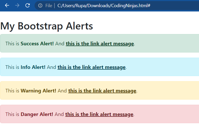
Output:
As you can see in the example, we took four alert messages and inserted the links in every alert. You can also do the same with other alerts by following the same syntax.
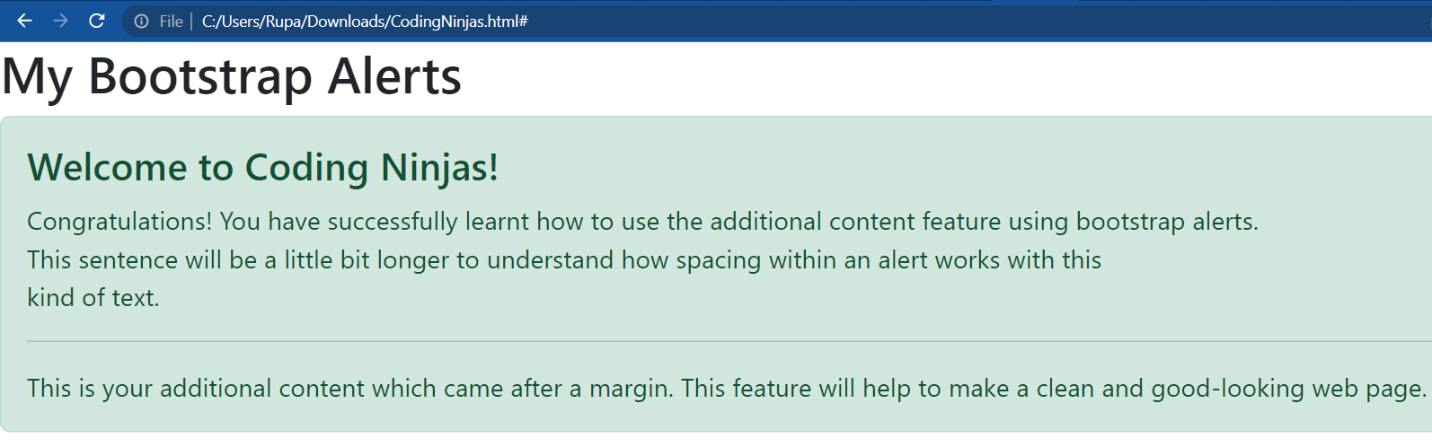
Additional Contents
We can also add additional content to our web pages using bootstrap alerts. This will add a divider between your main content and additional content. Let's see this using a live example.
<!DOCTYPE html>
<html>
    <head>
        <title>Bootstrap Alerts</title>
        <link
            href="https://cdn.jsdelivr.net/npm/bootstrap@5.2.3/dist/css/bootstrap.min.css"
            rel="stylesheet"
        />
    </head>
    <body>
        <h2>My Bootstrap Alerts</h2>
        <div class="alert alert-success" role="alert">
            <h4 class="alert-heading">Welcome to Coding Ninjas!</h4>
            <p>
                Congratulations! You have successfully learnt how to use the additional
                content feature using bootstrap alerts. <br />This sentence will be a
                little bit longer to understand how spacing within an alert works with
                this<br />
                kind of text.
            </p>
            <hr />
            <p class="mb-0">
                This is your additional content which came after a margin. This feature
                will help to make a clean and good-looking web page.
            </p>
        </div>
    </body>
</html>
Output:
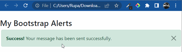
Dismissing Alert
The dismiss alert adds extra padding on the right corner and a ".close” button. The data-dismiss="alert" tag, which activates JavaScript functionality, should be included in the dismiss button.
As you can see in the output, the dismissing alert added a cross (x) on the rightmost corner of the given alert so the user can remove the alert from the screen if they want.
Events
Bootstrap modal events are a collection of Javascript that enable you to start Bootstrap modals in response to a user action.
There are two types of events which are mentioned below.
close.bs.alert: The close.bs.alert event occurs instantly when the close instance method is called.
closed.bs.alert: The close.bs.alert event waits for the CSS to complete the transition, then occurs and closes the alert.
You can refer to our Bootstrap Alert Plugin blog if you want a detailed explanation of events or methods with working examples.
Triggers
Triggers activate when a specific event occurs in the model and view. If you click the close button or alert, it will be removed from the DOM (Document Object Model).
The "Click me" button will trigger a popup message after being clicked.
Frequently Asked Questions
What are alerts in Bootstrap?
Alerts offer contextual feedback messages for typical user actions with a handful of available and flexible alert messages.
What class do we use to implement alerts in Bootstrap?
We use the .alert class in Bootstrap to implement alerts.
What is the alert() method?
The alert() method shows an alert box with an OK button and a message. When you want the user to get information, you use the alert() method.
How can we trigger the dismissing alert?
We can trigger the dismissing alert by using the compiled Bootstrap Javascript.
How can we make bootstrap alerts automatically disappear?
You can dismiss your alert message using the "Closing alert" class.
Conclusion
This article discusses the topic of Bootstrap Alerts. In detail, we have seen the definition of Bootstrap Alerts, types of alerts, their implementation, alert links, additional contents, and dismissing alerts.
We hope this blog has helped you enhance your knowledge of Bootstrap Alerts. If you want to learn more, then check out our articles.
But suppose you have just started your learning process and are looking for questions from tech giants like Amazon, Microsoft, Uber, etc. In that case, you must look at the problems, interview experiences, and interview bundles for placement preparations.
However, you may consider our paid courses to give your career an edge over others!


 9+ registered

