Do you think IIT Guwahati certified course can help you in your career?
Introduction
Bootstrap is a popular front-end framework that makes it easy to create responsive & mobile-friendly websites. One common task in web design is aligning elements to the right side of a container. Bootstrap provides several classes & utilities to achieve this alignment effortlessly.
In this article, we'll learn about different methods to align content to the right using Bootstrap, including the use of float-right class, flexbox utilities, justify-content-between class, align-items-end class, align-self-end class & text-right class.
Prerequisite
Before we start aligning elements to the right in Bootstrap, make sure you have the following prerequisites ready with you:
1. Bootstrap CSS & JavaScript files
Include the Bootstrap CSS & JavaScript files in your project. You can either download them from the official Bootstrap website or use a CDN link. Here's an example of how to include Bootstrap via CDN:
Set up a basic HTML structure for your web page. Make sure to include the `<!DOCTYPE html>` declaration, `<html>`, `<head>`, & `<body>` tags.
<!DOCTYPE html>
<html>
<head>
  <title>Bootstrap Align Right Example</title>
  <!-- Include Bootstrap CSS -->
  <link rel="stylesheet" href="https://cdn.jsdelivr.net/npm/bootstrap@5.0.0/dist/css/bootstrap.min.css">
</head>
<body>
  <!-- Your content goes here -->


  <!-- Include Bootstrap JavaScript -->
  <script src="https://cdn.jsdelivr.net/npm/bootstrap@5.0.0/dist/js/bootstrap.bundle.min.js"></script>
</body>
</html>
With these prerequisites available, you're ready to start aligning elements to the right using Bootstrap.
How to Align-Right in Bootstrap?
Bootstrap provides several ways to align elements to the right within a container. Let's discuss each method in detail:
1. Float-Right Class
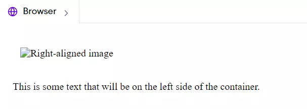
Bootstrap includes a `float-right` class that you can apply to an element to align it to the right side of its container.
For example:
HTML
HTML
<div class="container">

  <div class="float-right">

    <img src="image.jpg" alt="Right-aligned image">

  </div>

  <p>This is some text that will be on the left side of the container.</p>

</div>
Output
In this example, the `<div>` with the class `float-right` will be aligned to the right side of the container, while the `<p>` element will be on the left side.
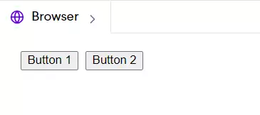
2. Flexbox Alignment Utilities
Bootstrap 4 introduced flexbox utilities that make it easier to align elements within a flex container. To align an element to the right using flexbox, you can use the `justify-content-end` class on the flex container.
In this case, the buttons will be aligned to the right side of the flex container.
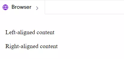
3. Justify-Content-Between Class
If you want to align elements to the right while distributing the remaining space evenly between them, you can use the `justify-content-between` class on the flex container.
The `justify-content-between` class will push the first element to the left & the second element to the right, with equal space between them.
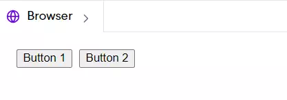
Add a Align-Items-End Class:
In addition to horizontal alignment, Bootstrap also provides classes for vertical alignment within a flex container. To align items to the bottom of a flex container while aligning them to the right, you can use the `align-items-end` class in combination with `justify-content-end`.
In this case, the buttons will be aligned to the bottom-right corner of the flex container. The `align-items-end` class aligns the items vertically to the end (bottom) of the container, while `justify-content-end` aligns them horizontally to the right.
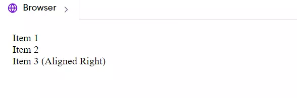
Use .align-self-end Class
If you want to align a single item within a flex container to the right, you can use the `align-self-end` class on that specific item. This class overrides the default alignment set by the `align-items` class on the flex container.
In this example, "Item 3" will be aligned to the bottom-right corner of the flex container, while the other items will follow the default alignment.
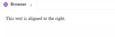
Use Text-Right Class
If you specifically want to align text to the right within an element, Bootstrap provides the `text-right` class. This class can be applied to any inline or block-level element to align its text content to the right. Here's an example:
HTML
HTML
<div class="container">
  <p class="text-right">This text is aligned to the right.</p>
</div>
Output
The `text-right` class will align the text within the `<p>` element to the right side of its container.
Note: It's important to note that the `text-right` class only affects the alignment of the text within an element. It doesn't change the alignment of the element itself within its parent container.
Frequently Asked Questions
Can I align elements to the right in a specific breakpoint using Bootstrap?
A: Yes, Bootstrap provides responsive alignment classes that allow you to align elements to the right at specific breakpoints. For example, you can use classes like float-md-right or justify-content-lg-end to align elements to the right at the medium (md) or large (lg) breakpoints, respectively.
How can I align elements to the right within a grid system in Bootstrap?
When using the Bootstrap grid system, you can align elements to the right within a row by using the justify-content-end class on the row. This will align the columns within the row to the right. Alternatively, you can use the ml-auto class on a column to push it to the right side of the row.
Can I combine multiple alignment classes in Bootstrap?
Yes, you can combine multiple alignment classes in Bootstrap to achieve the desired alignment. For example, you can use float-right in combination with text-right to align an element to the right and its text content to the right as well. Similarly, you can use d-flex, justify-content-end, and align-items-end together to align items to the bottom-right corner of a flex container.
Conclusion
This article taught us various ways to align elements to the right in Bootstrap. We started by exploring the float-right class, which allows you to float an element to the right side of its container. Then, we looked into flexbox alignment utilities, such as justify-content-end and align-items-end, which provide more flexible alignment options. We also discussed the justify-content-between class for distributing space evenly between elements while aligning them to the right. Moreover, we use the align-self-end class to align individual items within a flex container and the text-right class to align text content to the right.
You can also practice coding questions commonly asked in interviews on Coding Ninjas Code360.


 8+ registered

