Table of contents
1.
Introduction
2.
Bootstrap
3.
Badges
3.1.
Implementation
3.2.
Output
4.
Usage of Badge
4.1.
Buttons
4.2.
Position
4.3.
Background Colors
5.
Labels
5.1.
Implementation
5.2.
Output
6.
Usage of Label
6.1.
Program
6.2.
Output
7.
Frequently Asked Questions
7.1.
How can we use the components of Bootstrap?
7.2.
What are Badges in Bootstrap?
7.3.
Which bootstrap class will you use to create a dark badge?
7.4.
How can you add a link to a badge?
7.5.
Does Bootsrap5 support badges?
8.
Conclusion
Last Updated: Mar 27, 2024

Bootstrap - Badges and Labels

Introduction

Isn't Web Development engaging? Building new websites and using amazing animations, different APIsCSSAJAX, and Bootstrap. Don't be scared if you cannot grasp the hold of this vast development.

Bootstrap - Badges and Labels

In this article, we will discuss Bootstrap - Badges and Labels. 

Bootstrap

bootstrap logo

Bootstrap is an open-source CSS framework making it easy to create attractive web pages with responsiveness. These CSS and javascript-based design templates for forms, buttons, and typography are contained in bootstrap.

Badges

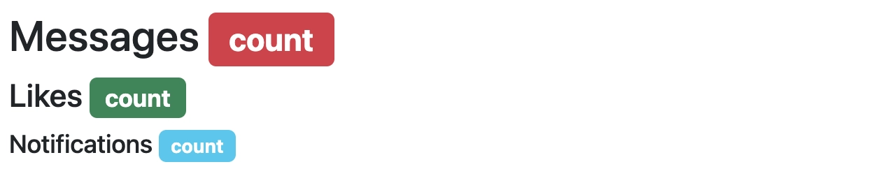
In Bootstrap, badges are components that separate the content in the same wrapper but in a separate pane. We can display only one pane at a time. Badges help add counts, tips, or other markups for pages.

In Bootstrap, the badges scale to match the corresponding parent element size by using relative font sizing and em units. While defining badges, programmers must ensure that the context of using them is clear to the user and that they do not have unnecessary or random additional information.


To generate rectangular badges, use <span> elements with the .badge class and a contextual class (like.badge-secondary). To make badges, use the .badge class in <span> elements because they need to be displayed as inline elements.

Implementation

<html lang="en">
	<head>
		<meta charset="utf-8" />
		<meta name="viewport" content="width=device-width, initial-scale=1" />
		<link
			href="https://cdn.jsdelivr.net/npm/bootstrap@5.3.0-alpha1/dist/css/bootstrap.min.css"
			rel="stylesheet"
		/>
		<link
			href="https://getbootstrap.com/docs/5.3/assets/css/docs.css"
			rel="stylesheet"
		/>
		<title>Bootstrap Example</title>
		<script src="https://cdn.jsdelivr.net/npm/bootstrap@5.3.0-alpha1/dist/js/bootstrap.bundle.min.js"></script>
	</head>
	<body class="p-3 m-0 border-0 bd-example">
		<div class="class1">
			<h1>Messages <span class="badge bg-danger">count</span></h1>
			<h3>Likes <span class="badge bg-success">count</span></h3>
			<h5>Notifications <span class="badge bg-info">count</span></h5>
		</div>
	</body>
</html>

Output

output

Usage of Badge

Several other entities can also be used with badges like

  • Buttons
  • Position
  • Background colors
     

Buttons

We can use badges with buttons as a counter or in similar situations. Let's see an example of the same:

Program

<!doctype html>
<html lang="en">
	<head>
		<meta charset="utf-8">
		<meta name="viewport" content="width=device-width, initial-scale=1">
		<link href="https://cdn.jsdelivr.net/npm/bootstrap@5.3.0-alpha1/dist/css/bootstrap.min.css" rel="stylesheet">
		<link href="https://getbootstrap.com/docs/5.3/assets/css/docs.css/docs.css" rel="stylesheet">
		<title>Bootstrap Example</title>
		<script src="https://cdn.jsdelivr.net/npm/bootstrap@5.3.0-alpha1/dist/jsr/bootstrap.bundle.min.js"></script>
	</head>
	<body class="p-2 m-1 border-0 bd-example">
		<button type="button" class="btn btn-warning">
			Button <span class="badge text-bg-danger">count_number</span>
		</button>
	</body>
</html>


Output

output

Position

We can use utilities to modify the badge's position and place it in any other button location. Let's see an example of the same:

Program

<!doctype html>
<html lang="en">
	<head>
		<meta charset="utf-8">
		<meta name="viewport" content="width=device-width, initial-scale=1">
		<link href="https://cdn.jsdelivr.net/npm/bootstrap@5.3.0-alpha1/dist/css/bootstrap.min.css" rel="stylesheet">
		<link href="https://getbootstrap.com/docs/5.3/assets/css/docs.css/docs.css" rel="stylesheet">
		<title>Bootstrap Example</title>
		<script src="https://cdn.jsdelivr.net/npm/bootstrap@5.3.0-alpha1/dist/jsr/bootstrap.bundle.min.js"></script>
	</head>
	<body class="p-2 m-1 border-0 bd-example">
		<button type="button" class="btn btn-warning position-relative">
			Button
			<span class="position-absolute top-0 start-100 translate-middle badge rounded-pill bg-secondary">
				Count
				<span class="visually-hidden"></span>
			</span>
		</button>
	</body>
</html>


Output

output

Background Colors

We can add color to the background of the text or the content of the badge to modify the appearance. Let's see an example of the same:

Program

<!DOCTYPE html>
<html lang="en">
	<head>
		<meta charset="utf-8" />
		<meta name="viewport" content="width=device-width, initial-scale=1" />
		<link href="https://cdn.jsdelivr.net/npm/bootstrap@5.3.0-alpha1/dist/css/bootstrap.min.css" rel="stylesheet">
		<link href="https://getbootstrap.com/docs/5.3/assets/css/docs.css/docs.css" rel="stylesheet">
		<title>Bootstrap Example</title>
		<script src="https://cdn.jsdelivr.net/npm/bootstrap@5.3.0-alpha1/dist/jsr/bootstrap.bundle.min.js"></script>
	</head>
	<body class="p-2 m-1 border-0 bd-example">
		<span class="badge bg-primary">Content1</span>
		<span class="badge bg-dark"> Content2</span>
		<span class="badge bg-success">Content3</span>
		<span class="badge rounded-pill bg-danger">Content4</span>
		<span class="badge rounded-pill bg-warning">Content5</span>
		<span class="badge rounded-pill bg-info">Content6</span>
	</body>
</html>


Output

output

Here you can see that for the first three content, we haven't done any modifications, but for the following three content, we have made use of badge rounded pill, which has helped modify the shape of the badge.

Labels

We use bootstrap labels to indicate the extra details regarding tip counts, offering counts, or other page compositions.

The labels are shown using the .label class in <span> elements because they need to be displayed as inline elements.

Implementation

<!DOCTYPE html>
<html lang="en">
	<head>
		<meta charset="utf-8" />
		<meta name="viewport" content="width=device-width, initial-scale=1" />
		<link
			href="https://cdn.jsdelivr.net/npm/bootstrap@5.3.0-alpha1/dist/css/bootstrap.min.css"
			rel="stylesheet"
		/>
		<link
			href="https://getbootstrap.com/docs/5.3/assets/css/docs.css"
			rel="stylesheet"
		/>
		<script src="https://cdn.jsdelivr.net/npm/bootstrap@5.3.0-alpha1/dist/js/bootstrap.bundle.min.js"></script>
		<title>Bootstrap Labels</title>
		<link
			rel="stylesheet"
			href="https://maxcdn.bootstrapcdn.com/bootstrap/3.4.1/css/bootstrap.min.css"
		/>
		<script src="https://ajax.googleapis.com/ajax/libs/jquery/3.6.1/jquery.min.js"></script>
		<script src="https://maxcdn.bootstrapcdn.com/bootstrap/3.4.1/js/bootstrap.min.js"></script>
	</head>

	<body class="p-5 m-5 border-1 bd-example">
		<h1><center>Headings</center></h1>
		<div>
			<center>
				<span class="label label-primary">Section 1</span>
				<span class="label label-success">Section 2</span>
				<span class="label label-info">Section 3</span>
				<span class="label label-warning">Section 4</span>
				<span class="label label-danger">Section 5</span>
			</center>
		</div>
	</body>
</html>

Output

output

Usage of Label

Labels can be used in forms. Let's see an example of the same:

Program

<!DOCTYPE html>
<html lang="en">
	<head>
		<meta charset="utf-8" />
		<meta name="viewport" content="width=device-width, initial-scale=1" />
		<link
			href="https://cdn.jsdelivr.net/npm/bootstrap@5.3.0-alpha1/dist/css/bootstrap.min.css"
			rel="stylesheet"
		/>
		<link
			href="https://getbootstrap.com/docs/5.3/assets/css/docs.css"
			rel="stylesheet"
		/>
		<script src="https://cdn.jsdelivr.net/npm/bootstrap@5.3.0-alpha1/dist/js/bootstrap.bundle.min.js"></script>
		<title>Bootstrap Labels</title>
		<link
			rel="stylesheet"
			href="https://maxcdn.bootstrapcdn.com/bootstrap/3.4.1/css/bootstrap.min.css"
		/>
		<script src="https://ajax.googleapis.com/ajax/libs/jquery/3.6.1/jquery.min.js"></script>
		<script src="https://maxcdn.bootstrapcdn.com/bootstrap/3.4.1/js/bootstrap.min.js"></script>
	</head>
	<body class="p-2 m-1 border-0 bd-example">
		<div class="form-floating mb-3">
			<input
				type="name"
				class="form-control"
				id="floatingInput"
				placeholder="name"
			/>
			<label for="floatingInput">Name</label>
		</div>
	</body>
</html>

Output

Before clicking:

output

After clicking:

output


After placing the cursor on the name field, we see that the label "Name" shifts up.

Refer to know about,  javascript replace

Frequently Asked Questions

How can we use the components of Bootstrap?

There are many classes; for example, for dropdowns, we have .drop-down and many more provided by the bootstrap framework, which can be added to the respective elements to get used.

What are Badges in Bootstrap?

In Bootstrap, badges are components that separate the content in the same wrapper but a separate pane. Badges are used to add counts, tips, or other markups for our pages.

Which bootstrap class will you use to create a dark badge?

In Bootstrap 4, we will use the badge-dark class. This class provides a dark background to the badge.

How can you add a link to a badge?

We can add a link to the badge by using the badge class with the anchor tag.

Does Bootsrap5 support badges?

Yes, badges are supported by bootstrap5.

Conclusion

This article covers what badges are and their uses. We have further discussed how easily we can add contextual variations and use pill-shaped badges. To read more about bootstrap, you can read our blogs:


You may refer to our Guided Path on Code Studios for enhancing your skill set on DSACompetitive ProgrammingSystem Design, etc. Check out essential interview questions, practice our available mock tests, look at the interview bundle for interview preparations, and so much more!

Happy Learning, Ninjas!

Live masterclass