Do you think IIT Guwahati certified course can help you in your career?
Introduction
We come across many web pages on the internet with really fascinating UI-UX designs. A lot of creative frameworks are used in creating those web pages. Bootstrap is one of the best frameworks available for it. In this article, we will be discussing the Bootstrap border.
Bootstrap provides many utility classes for borders, colors, orientation, spacing, etc. The Bootstrap border is one of the tools for creating borders around the picture, container, and elements. The border confines the element according to the user's preferences for size, shape, and visibility. Let us now have an in-depth knowledge of the topic: Bootstrap border.
What is Borders in Bootstrap
An HTML element is encased in a box known as a box model. The margin, padding, border, and actual content make up these box models. We are more interested in the box models' borders here.
Several components, including the button, images, link, etc., can have their borders styled and add a border radius using border utilities. Additionally, the border can be customized using various colors. We can add a border using Bootstrap's built-in classes like border, border-top, etc. Borders can be added to an element's start, end, top, or bottom.
The terms "additive classes" and "subtractive classes" refer to the classes that are used to add borders and, respectively, to remove them.
Let us see the various border classes available in Bootstrap.
Bootstrap Border Classes
The following border classes are available in the bootstrap.
Border Class
Description
.border
It gives the element a border on all sides.
.border-top
It is used to give the element's top a border.
.border-bottom
It is applied to give the element's bottom a border.
.border-start
It is utilized to give the start of the element a border.
.border-end
It is utilized to end the element's border.
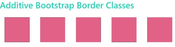
Additive Border Classes
As previously mentioned, additive classes add borders around HTML elements. Nevertheless, these classes can add borders to some or all of the sides of an HTML element.
Let us see the additive Bootstrap border classes below:
Additive Border Class
Description
.border
It gives the element a border on all sides.
.border-top
It is used to give the element's top a border.
.border-bottom
It is applied to give the element's bottom a border.
.border-start
It is utilized to give the left of the element a border.
.border-end
It is utilized to give the right of the element a border.
Let us see an example to understand the additive Bootstrap border classes in a better way.
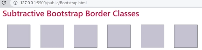
As previously discussed, the sides of an HTML element can have borders removed using subtractive border classes. They can also delete borders from all or some of the sides of the HTML element, similar to additive border classes.
Let us see the additive Bootstrap border classes below:
Subtractive Border Class
Description
.border-0
It removes the border from all sides of the element if it exists.
.border-top-0
It removes the border from the top of the element if it exists.
.border-bottom-0
It removes the border from the bottom of the element if it exists.
.border-left-0
It removes the border from the left of the element if it exists.
.border-right-0
It removes the border from the right of the element if it exists.
Let us see an example to understand the subtractive Bootstrap border classes in a better way.
By utilizing specific bootstrap utilities, you may additionally round or curve the corners of HTML components. The radius of the borders surrounding the HTML element can be changed using these utility classes.
Furthermore, the HTML element's sides can have any number of the bootstrap border-radius utilities applied to them.
All the border-radius utilities are given below in the table
Border Radius
Description
. rounded
It is used to round the corners of an HTML element on all four sides.
.rounded-top
It is used to set the top rounded corners of an HTML element.
.rounded-bottom
It is used to set the bottom rounded corners of an HTML element.
.rounded-left
It is used to set the left-rounded corners of an HTML element.
.rounded-right
It is used to set the right rounded corners of an HTML element.
.rounded-circle
It is used to set the rounded circle.
.rounded-0
It is used to remove all the rounded corners of an HTML element.
Let us see an example to understand the Border Radius class in a better way.
To get rounded borders in Bootstrap, use the class rounded. You can adjust the radius with rounded-sm, rounded-lg, or rounded-circle.
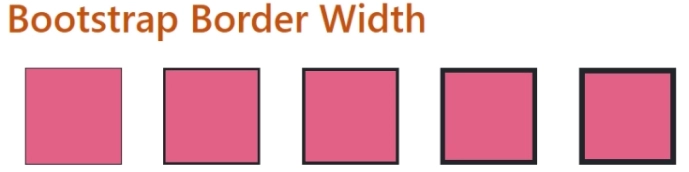
How to reduce the border size in Bootstrap?
To reduce border size in Bootstrap, use border utility classes like border-0 for no border or border-1, border-2, etc., for specific thicknesses.
How to add border to grid in Bootstrap?
To add a border to a grid in Bootstrap, apply border utility classes such as border to the grid container or individual grid items.
Conclusion
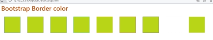
As we have reached the end of this blog, let us see what we have discussed so far. In this blog, we have discussed the Bootstrap border Class. Then we discussed the additive, and subtractive border classes, border color, border radius, and border width.
If you like to learn more, you can check out our articles:


 9+ registered

