Do you think IIT Guwahati certified course can help you in your career?
Introduction
Hey Ninjas! You must have heard about the Bootstrap framework in your programming world. You can create on/off toggle buttons and some interactions on top of bootstrap buttons with Bootstrap Button Plugins.
You can club buttons to make a group and control their active states in Bootstrap Button Plugin. If you want to include some functionality in the individual buttons, you will need additional javascript files. Do you know how to add these button plugins? If not, then welcome to the Bootstrap button plugins blog. We will discuss the Bootstrap Button plugins in detail. Let's start without wasting time.
Bootstrap Button Plugin
Buttons are explained in the blog Bootstrap Buttons. The button is used to define clickable action when constructing button controls. HTML chooses button-type components by using buttons, which are a fundamental component of HTML.
On a web page, the buttons serve a variety of functions, including submit and reset buttons. It can also be used independently control and is frequently used with form elements. Bootstrap enables improving button functionality. For components like toolbars, we can build groups of buttons or different button states. If you want to include this plugin functionality individually, then you will need button.js.
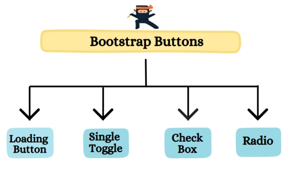
Types of Button Plugins
Loading Button
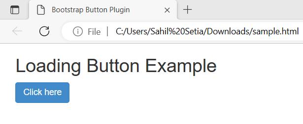
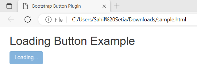
To add the loading style to a button, add thedata-loading-text = "Loading..." attribute to the button element. The loading button is used in almost every web application and web sites. It is used in Login, Signups, Video Players, etc.
Let's take a quick working example for the Loading button and make it Functional.
The above output is an example of a loading state button. The button has a fixed color but we can customize it using CSS.
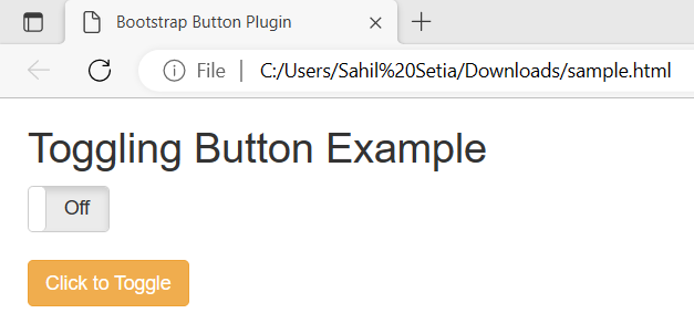
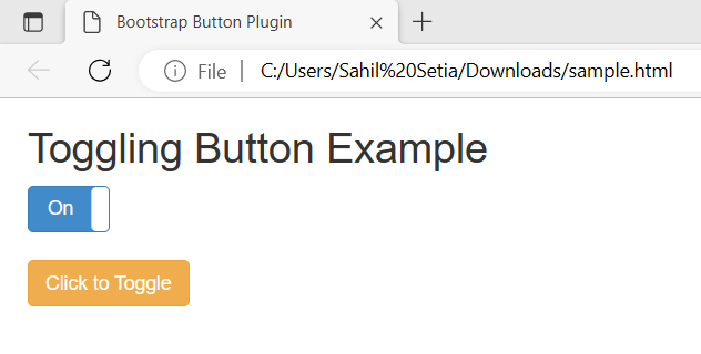
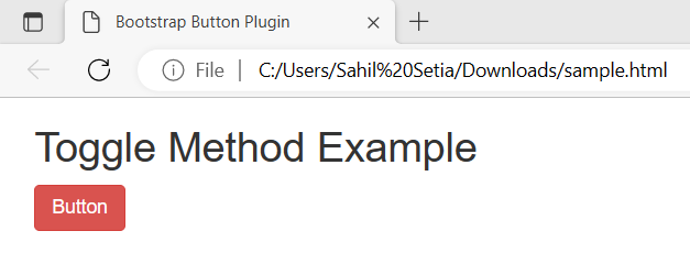
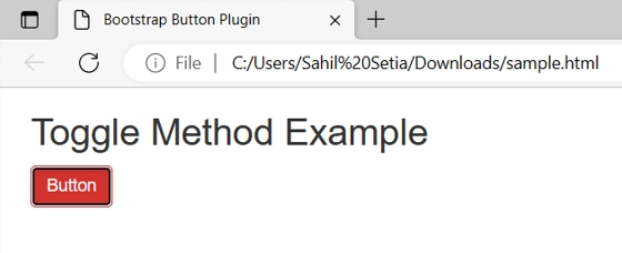
Single Toggle
Add data-toggle = "button" attribute to the button element to activate toggling on a single button. Toggling means switching between two differences by clicking a single button or a short key combination, you can typically access options for (anything, like a computer configuration).
Let's take a quick working example for the Single Toggle button plugin.
Initially, we created an On-Off Button to check the functionality of our Toggle button. We linked out toggle button with the on-off button and upon clicking the Toggle Button the state of the on-off button is changing. Hence, Our Toggle Button is Functionable.
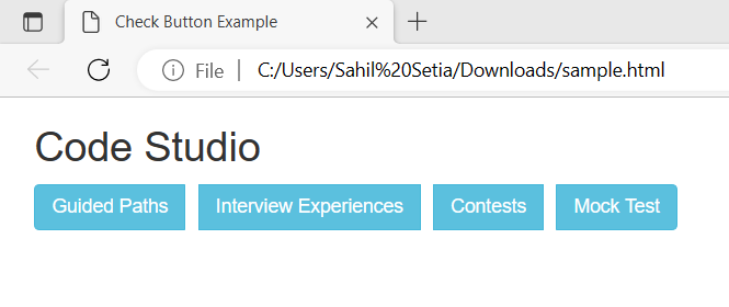
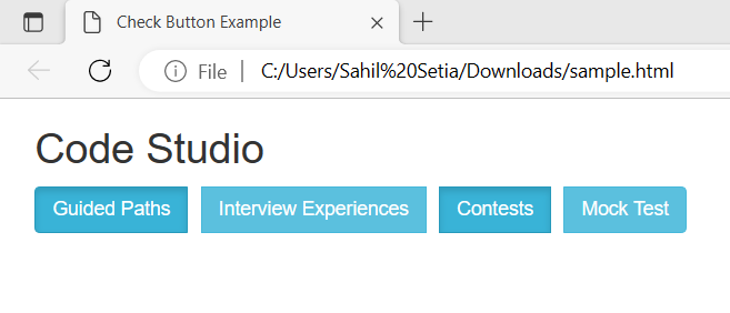
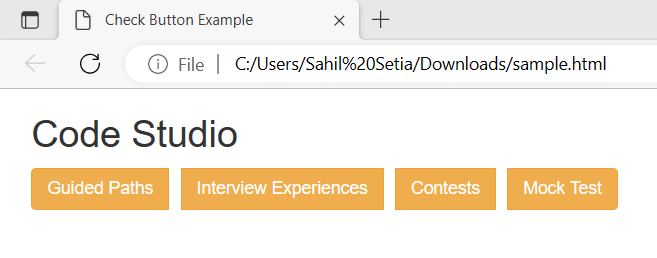
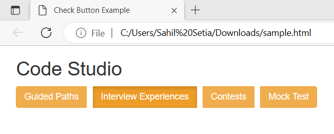
Checkbox
By adding the data-toggle = "button" attribute to the <div> with .btn-group you can create a group of checkboxes and enable toggling.
Let's take a quick working example for the checkbox button plugin.
Upon running the code in our local host we get the ideal image output above. After clicking the ‘Guided Paths’ button and the ‘Contests’ Button we get the output as above. If we want to choose one or more selections from a list of options, we can utilize checkboxes.
Radio
By adding the data-toggle = "button" attribute to the <div> with .btn-group you can create a group of radios and enable toggling.
Let's take a quick working example for the Radio Button Plugin.
Only one of the given options will be selected when we use the radio. So, on clicking a particular button, we will be able to select only that particular button.
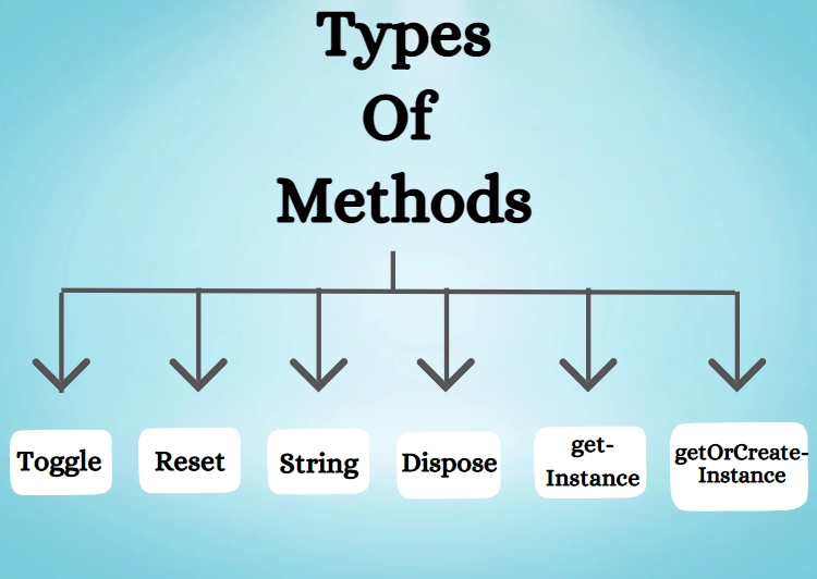
Types of Methods
You can enable the buttons plugin with JavaScript, as shown below.
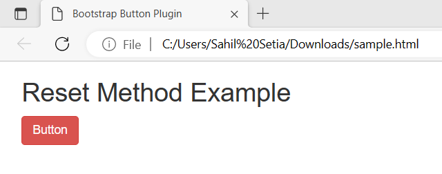
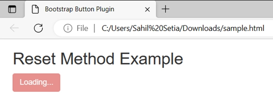
toggle
Use $().button('toggle') to toggle between active and inactive states.
Ideally, we get the normal output as shown above. When we press the button we get the loading state of the button and after a delay of 2-3 seconds, the button is restored to its original state.
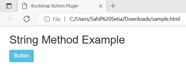
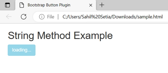
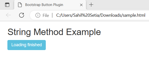
string
Use $().button(string) to display the user-defined string which is passed in this function.
Ideally, we get the normal output as shown above. When we press the button we get the loading state of the button and after the loading is complete the button is taken to a successfully loaded state where the user can pass any message of the successful execution to the user.
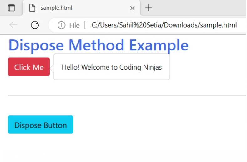
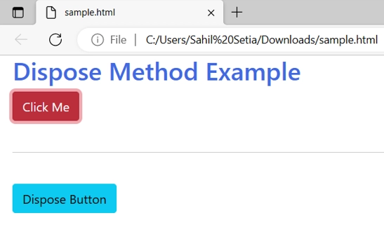
Dispose
Dispose method Destroys an element's button i.e.removes stored data on the DOM(Document Object Model) element.
Let’s take a look at a quick working example of Dispose method
On Clicking(Dispose Button) and clicking the ‘Click Me’ button:
Explanation:
Ideally, we get the normal output as shown above. When we press the ‘Click Me’ button we get a popover message about successful functionality of the button. After clicking on the dispose button and again clicking the ‘Click Me’ button we observe that we don’t get any popover message hence ensuring the functionality of the dispose button.
getInstance
The button instance linked to a DOM(Document Object Model) element can be obtained using the static function getInstance().
Syntax:
bootstrap.Button.getInstance(element)
getOrCreateInstance
The static method getOrCreateInstance retrieves a button instance linked to a DOM element or creates a new one if the existing one wasn't initialised.
Syntax:
bootstrap.Button.getOrCreateInstance(element)
Frequently Asked Questions
What is Bootstrap?
Bootstrap is a vast repository of useful, reusable JavaScript, HTML, and CSS code to quickly build fully responsive websites.
What are the advantages of using Bootstrap?
Bootstrap provides many pre-styled components like buttons, forms, etc. It is used to create responsive designs without any effort. The pages made using bootstrap components are faster and have more functionality.
Why should we use Bootstrap Button Plugin?
With Bootstrap Button Plugin, you can do more with the Bootstrap Button. With its help, you can add interactions such as states or create groups.
What is a Bootstrap Plugin?
Bootstrap comes with 12 jQuery plugins that extend the features and add more interactions to your site. It helps in simplifying the development of informative web pages.
Is Bootstrap a framework or a library?
Bootstrap is a CSS framework for creating responsive and mobile websites.
Conclusion
This article discusses the topic of the Bootstrap button plugin. In detail, we have seen the definition of the Bootstrap button plugin, types of buttons, implementation, methods, events, and types.
We hope this blog has helped you enhance your knowledge of the Bootstrap button plugin. If you want to learn more, then check out our articles.
But suppose you have just started your learning process and are looking for questions from tech giants like Amazon, Microsoft, Uber, etc. In that case, you must look at the problems, interview experiences, and interview bundles for placement preparations.
However, you may consider our paid courses to give your career an edge over others!


 9+ registered

