Do you think IIT Guwahati certified course can help you in your career?
Introduction
Have you ever tried to work with Bootstrap on your web pages? Bootstrap is among the most widely used CSS frameworks for developing responsive websites. This article discusses the different types of buttons available in Bootstrap.
We will also learn about implementing different button styles and sizes.
Bootstrap
Bootstrap is an open-source CSS framework. It is easy to create attractive web pages with responsiveness using Bootstrap.
These CSS and javascript-based design templates for forms, buttons, and typography are contained in Bootstrap. Bootstrap provides easy ways to style websites, and it is less verbose.
Button
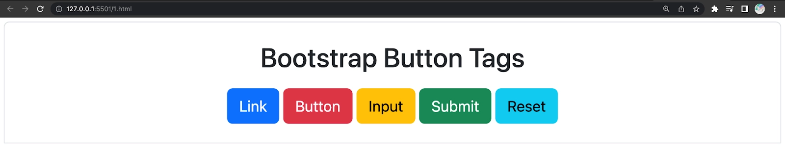
An <button> element in Bootstrap can be implemented using the .btn class. In this class, you can use elements like <a> or <input>.
You can use button classes with <a>, <button>, or <input> elements. Using <button> elements is recommended to avoid cross-browser inconsistency issues(the website must be available for every user).
Here we can see how the Bootstrap button style is implemented by using pre-defined styles. We have also seen variations of button layouts. The first set of eight buttons is regular, and the next set outlines the button with predefined colours.
Along with colour, we can also change the sizes of the buttons. Let's now see more on sizes for Bootstrap buttons.
Button Sizes
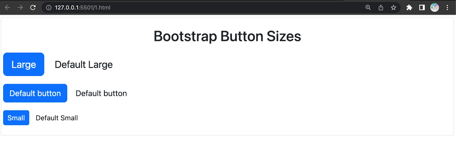
Different sizes are available in Bootstrap buttons. They are
Sizes
Class
Large Button
.btn-lg
Small Button
.btn-sm
Extra Small Button
.btn-xs
Block Level Button
.btn-block
Note: Block-level buttons span the entire width of a parent.
Implementation
This code helps us identify the size of each class of buttons.
Here we can see how the Bootstrap button sizes are implemented using predefined sizes.
Along with colour, we can also change the sizes of the buttons. Let's now see more on sizes for Bootstrap buttons.
Button States
Bootstrap offers many classes that allow us to change the state of buttons.
Active state
Disabled state
Each of these states is discussed in the below sections.
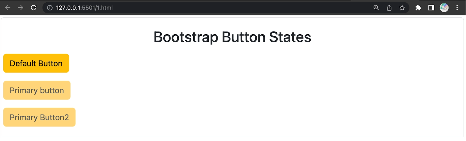
Active State
This is the state of the button that will make a button appear pressed (with a darker border, darker background, and inset shadow) when active. It can be denoted under the .active class. The table below explains the classes that activate the button and anchor elements.
Here we can see how the Bootstrap button states are implemented. The active state buttons have a darker colour when compared to the default Bootstrap button colour.
Disabled State
When a button is disabled, the colour will fade in by 50% and lose the gradient.
The table below explains the classes used to make the button and anchor elements disabled.
Element
Class
Button element
Add the disabled attribute to <button> buttons.
Anchor element
Add the disabled class to <a> buttons.
Note: In the anchor element, this class will only change the appearance, not its functionality. Custom JavaScript needs to be used to disable the links.
Here we can see how the Bootstrap button state is implemented. The disabled state buttons are faded compared to the default Bootstrap button colour.
In this code, we have implemented the Bootstrap button disabled in 2 different ways.
Frequently Asked Questions
How can we start using Bootstrap?
The links provided on Bootstrap's official website can be included in your file in the header, and after that, add classes to respective elements for interacting with the results.
How can we use the components of Bootstrap?
There are many classes; for example, for dropdowns, we have .drop-down and many more provided by the Bootstrap framework, which can be added to the respective elements to get used.
What are the styles in Bootstrap buttons?
The styles available in Bootstrap buttons are Primary, Secondary, Success, Danger, Warning, Info, and Link. These help in adding colours to the button.
What are the different sizes of Bootstrap buttons available?
The different sizes of buttons available in Bootstrap buttons are Large, Small, Extra small, and block-level buttons.
What are the states of Bootstrap buttons?
There are two states in the Bootstrap buttons, namely, Active and Disabled states.
Conclusion
In this article, we have discussed the various types of buttons in Bootstrap. We also learned about the various sizes of buttons in Bootstrap. We also learned about the different states and tags of the buttons in Bootstrap. This article also explained the implementation of all buttons available in Bootstrap. To learn more about Bootstrap, read:


 18+ registered

