Do you think IIT Guwahati certified course can help you in your career?
Introduction
Hello Ninjas! You must be familiar with Bootstrap. Bootstrap makes it easy for us to create the front end of our websites. We have already learnt a few components in Bootstrap. In this article, we will cover the Bootstrap Carousel Plugin with examples.
Let's begin by learning what bootstrap is.
What is Bootstrap?
Bootstrap is a front-end development framework which is used to develop the front-end of the webpage using the pre-styled components. It is used to create attractive web pages with responsiveness. It provides a large number of features to create user-friendly websites.
Bootstrap provides the classes to create and style carousels. Let's discuss it in detail.
Bootstrap Carousel
Bootstrap Carousel is a JavaScript plugin that helps us create a slideshow or carousel of items, such as images or text. We can customize it with the provided styles and options. The carousel can be controlled using navigation buttons and indicators.
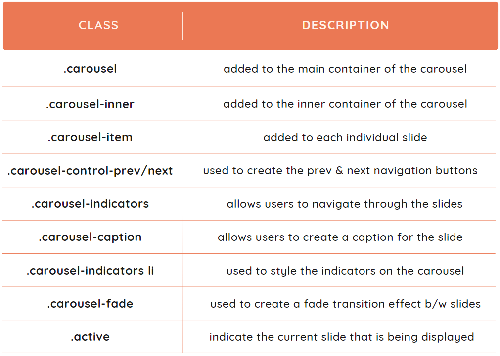
These are some of the main classes provided by bootstrap for carousels:
Let's discuss some of the most used carousels with their example.
Slides Only
This is the most simple carousel without any navigation buttons or indicators. This is how we can create it:
Create an HTML file and include the CSS and JS files provided by Bootstrap. Refer to this.
Create a div with the classes carousel and slide and set its data-ride attribute to the carousel. Set the option data-interval to the time delay according to your choice. This is optional.
Create another div inside it and provide the class carousel-inner, which holds the individual slides.
Create the individual slides with a class of carousel-item and an additional active class to the first slide.
Provide each slide with <img> element that will be displayed in the carousel.
We can add navigation buttons to switch to the previous and next slides. The indicators are used to indicate the number of slides in a carousel and the current slide.
Follow these steps to add controls and indicators in the above example:
Create an unordered list before the inner div and provide the class carousel-indicators to hold the individual indicators.
Create indicators using <li> elements. Provide each item with a data-target attribute, which corresponds to the ID of the carousel, and a data-slide-to attribute, which corresponds to the slide's index.
To create indicators, use two <a> elements with the classes carousel-control-prev and carousel-control-next for the previous and next elements, respectively.
Provide both of them with an href attribute corresponding to the ID, set role attribute to button, and data-slide to prev and next, respectively.
Create a child element <span> with classes of carousel-control-prev-icon and carousel-control-next-icon, respectively, used to create the icons for the navigation buttons.
We can add captions to the individual slides, which are used to describe the image. Let's see the steps you need to follow to add captions in the above example:
Create another div inside each carousel item after the image element. Provide this div with a class carousel-caption.
Simply create headings and paragraphs inside it according to your preference and write captions.
If your text is hard to read, you can change its color or add the class bg-dark to the div and change the opacity of the image element to around 50%.
Bootstrap provides various settings and configuration options that can be used to customize the behaviour and appearance of a carousel. These can be provided by setting the value of attributes on the main carousel container.
Following are some of the available options:
interval: It is used to set the amount of time delay between each transition. Its default value is 5000 milliseconds.
pause: If we enable this option, the carousel will pause when we hover the mouse over it. It is a boolean variable with a default value of true.
keyboard: It controls the carousel's navigation using the left and right arrow keys. The default value is true.
wrap: It justifies if the carousel should have a hard stop at the first and the last slide. It is also a boolean variable with a default value of true.
ride: It autoplay the carousel when the page loads. The data type of ride is a string with a default value of false.
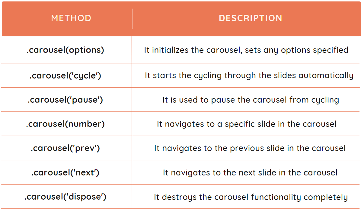
Bootstrap Carousel Methods
We can control the Carousel using several methods provided by Bootstrap. We can use these methods by calling them on the carousel element. Suppose you want to navigate to the second slide; you can use $( '#carousel_ID' ).carousel(1) by providing the ID of your carousel.
These are some of the methods available in Bootstrap to control the carousel.
Example
We have taken a simple example to show the use of the prev, next, and number methods. Let's first see the code, and then we will discuss it.
We have created five separate buttons to show the three methods. Inside the script tag, the button is selected using $('#button_ID') and listened for the click event. Whenever the button is clicked, the corresponding method will be called on the carousel.
Output
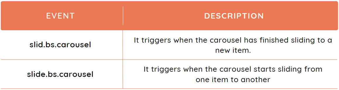
Bootstrap Collapse Events
The events are actions which occur in a browser, like clicking a button. The Bootstrap collapse provides two events that are used to perform the additional actions when the carousel slides. They are listed below:
Example
Let's discuss an example to show the implementation of slid.bs.carousel and slide.bs.carousel events.
We have used the same example to create a simple carousel. The code under the script tag is used to show the implementation of events. The ID of the collapse element is used to bind the event listeners to it. The two event listeners are listening to the separate events and will print the message in the console when the event is triggered. First, the event slide will be triggered when the carousel starts sliding, and then the event slid will be triggered when it stops sliding.
Output
Frequently Asked Questions
What are the advantages of using Bootstrap?
Bootstrap provides many pre-styled components like buttons, forms, etc. It is used to create responsive designs without any effort. The pages made using bootstrap components are faster and have more functionality.
What is the difference between CSS and Bootstrap?
CSS (Cascading Style Sheets) is a styling language that is used to customize the layout and styles of HTML documents. While Bootstrap is a front-end framework built on top of CSS, and it provides pre-designed UI components.
How does a carousel work?
A carousel uses a scripting language, like JavaScript or jQuery, to rotate through the elements in a loop. It provides the elements to enable users to navigate through them.
How can we change the appearance of the Bootstrap carousel?
We can customize the Bootstrap carousel in the way we want by adding the CSS styles to the carousel elements. We can also modify the working of the carousel by using the options available in Bootstrap, like pause, interval, etc.
Which option is used to slide the Bootstrap carousel automatically?
The Bootstrap Carousel can be made slide by itself by setting the time interval between sides using the data-interval attribute. Like, we can change its value to 2 seconds by writing data-interval = ''2000''.
Conclusion
This article was about Bootstrap - Carousel Plugin. We have seen the different types of it with examples. We have also covered different options and methods available in Bootstrap Carousel. You can refer to other articles on Bootstrap:


 9+ registered

