Do you think IIT Guwahati certified course can help you in your career?
Introduction
Hello Ninjas! You must have experienced the collapse component in some websites. It is used for hiding and showing the content on a web page. Have you ever wondered how you can create it using bootstrap? If yes, this article is for you. In this article, we will be looking at the Bootstrap Collapse Plugin.
Bootstrap is a front-end development framework which is used to develop the front-end of the webpage using the pre-styled components. It is used to create attractive web pages with responsiveness. It provides a large number of features to create user-friendly websites.
Bootstrap includes several classes for creating a collapse component. Let's discuss them.
Bootstrap Collapse
The Bootstrap Collapse is used for hiding or showing the contents using a button or a link. It is used to change the visibility of content using a toggleable element. The collapse class can be used to create a design that changes the layout of the content.
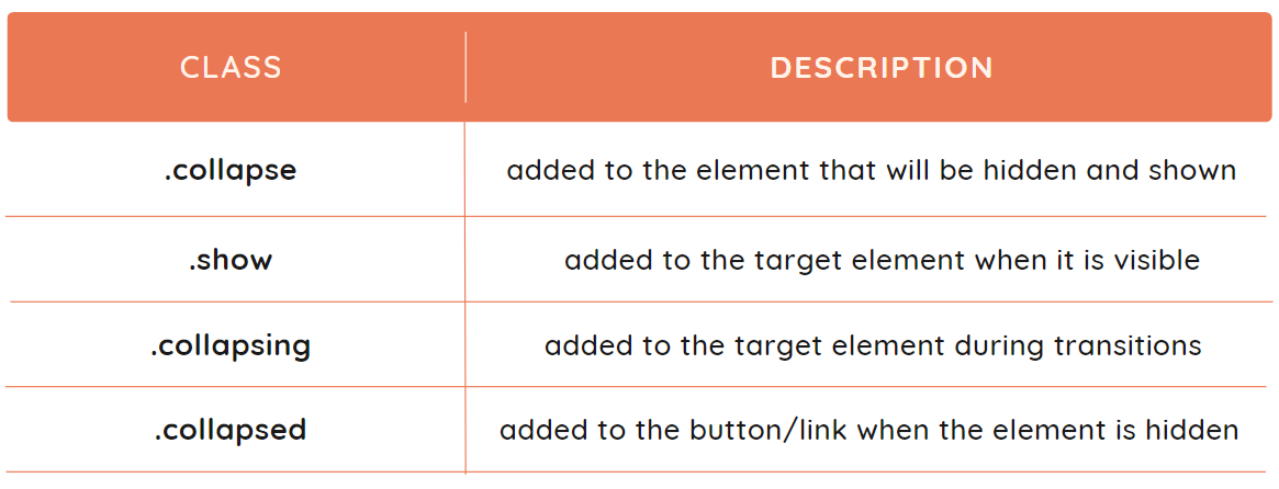
The following are some of the classes provided by bootstrap for creating a collapse component:
Let's discuss a simple collapse and an accordion example.
Simple Collapse Example
We can use both links and buttons to create a collapse. Let's see how we can use them to create a simple example:
Create an HTML document and include the CSS and JS files provided by Bootstrap. Refer to this.
To expand content using links, use <a> tag and set the href attribute as the ID of the div you want to expand. Set data-toggle to the collapse, and specify its role asa button.
To expand content using the button, create a button and set its data-toggle attribute to collapse and data-target to the ID of the div you want to expand.
Create the div with the text that will be hidden, provide the class collapse to it and provide it with some ID that will be used in the href or button.
Style the components according to your choice, and you are done.
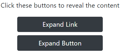
Code
<!DOCTYPE html>
<html>
<head>
<title>Bootstrap Collapse</title>
<link rel="stylesheet" href="pathToYour/bootstrap.min.css">
<script src="pathToYour/bootstrap.bundle.min.js"></script>
<style>
.w-15 {
width: 15%;
}
</style>
</head>
<body>
<center>
<div>
<p>Click these buttons to reveal the content</p>
<a class="btn btn-dark d-block w-15 mb-2" href="#collapse_one"
data-toggle="collapse" role="button">
Expand Link
</a>
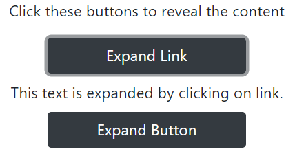
<div class="collapse mb-2" id="collapse_one">
This text is expanded by clicking on link.
</div>
<button class="btn btn-dark d-block w-15 mb-2"
data-toggle="collapse" data-target="#collapse_two">
Expand Button
</button>
<div class="collapse mb-2" id="collapse_two">
This text is expanded by clicking on button.
</div>
</div>
</center>
</body>
</html>
Output
After expanding:
Accordion example
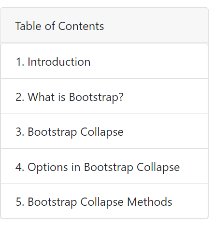
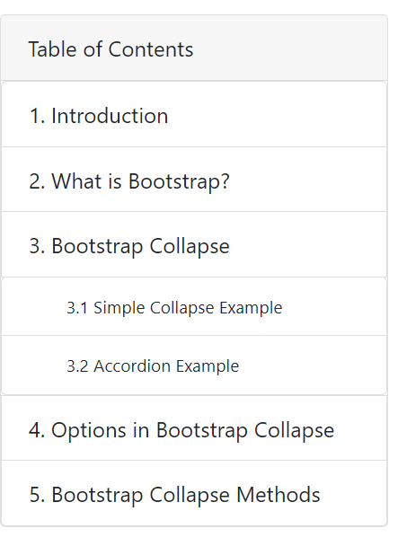
We can create an accordion by applying the collapse classes on the card component. If you are wondering what an accordion is, look to your left, and you will find a table of contents column. Just click on it and notice how it hides the content. This is an example of the accordion.
Let's create the same using Bootstrap Collapse. Follow these steps:
Create an HTML document and include the CSS and JS files provided by Bootstrap. Refer to this.
Create the external div, provide it with a class card, and style it accordingly.
Create an internal div with the class card-header; this will be used to expand the hidden div. Set its data-target attribute to the ID of hidden div and set data-toggle as the collapse and role as the button.
Now, create the div having the list of contents with the class collapse. Make a list inside it according to your choice.
To expand the list items further, you can create one more div with class collapse after that particular list item.
Set the data-target attribute of the list item to the ID of the div you want to expand. Specify data-toggle as collapse and role as the button.
Bootstrap provides some configuration options that can be used to customize the collapse behaviour. They can be passed through data attributes. We have to write data- before the option to use them for data attributes. For example, data-toggle is used for the toggle option.
Let's discuss them:
parent: It is used to specify the parent of the collapse element. It is useful when you have multiple collapse elements that should be grouped together. Its default value is false.
toggle: It is used to toggle the collapse element. It simply specifies that the element will toggle the visibility of the collapse element. Its default value is true.
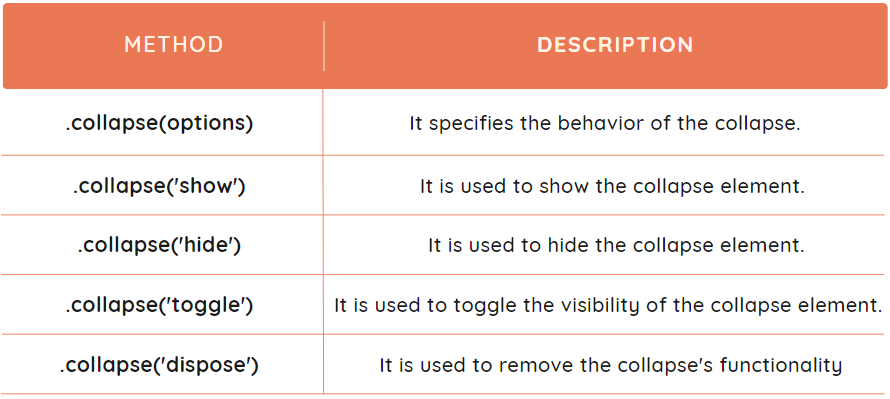
Bootstrap Collapse Methods
We can control the Collapse using several methods provided by Bootstrap. These methods can be used on both the collapse element and the trigger element. They are used to trigger the collapse on the basis of events or user input. For example, the method $('#element_ID').collapse('toggle') is used to toggle the visibility of an element by specifying its ID.
We can use the following methods to control it using JavaScript:
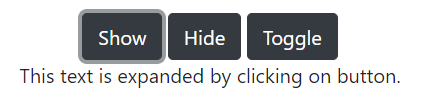
Example
We have taken a simple example to show the use of the show, hide, and toggle. Let's first see the code, and then we will discuss it.
We have created three separate buttons to show the three methods. A div is created with the class collapse that will work as a collapse element. Inside the script tag, the button is selected using $('#button_ID') and listened for the click event. Whenever the button is clicked, the corresponding .collapse('') method will be called on the collapse element.
Output
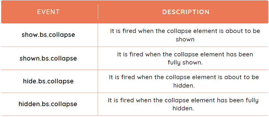
Bootstrap Collapse Events
The events are actions which occur in a browser, like clicking a button. The Bootstrap collapse provides certain events that are used to perform the additional actions when the collapse element is shown or hidden.
The events provided by the Bootstrap collapse component are listed below.
Example
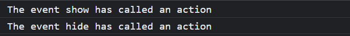
Let's discuss an example to show the implementation of show.bs.collapse and hide.bs.collapse events.
Code
<!DOCTYPE html>
<html>

<head>
	<title>Bootstrap Collapse</title>
	<link rel="stylesheet" href="pathToYour/bootstrap.min.css">
	<script src="pathToYour/bootstrap.bundle.min.js"></script>
</head>

<body>
	<center>
		<div>
			<p>Click the button to reveal the content</p>
			<button class="btn btn-dark" data-toggle="collapse"
			 data-target="#collapse_one">
				Expand Button
			</button>
			<div class="collapse mb-2" id="collapse_one">
				This text is expanded by clicking on button.
			</div>
		</div>
	</center>
	<script>
		$(() => {
			$('#collapse_one').on('show.bs.collapse', () => {
				console.log('The event show has called an action');
			})
		});
		$(() => {
			$('#collapse_one').on('hide.bs.collapse', () => {
				console.log('The event hide has called an action');
			})
		});
	</script>
</body>

</html>
Explanation
We have used the same example to create a collapse component. The code under the script tag is used to show the implementation of events. The ID of the collapse element is used to bind the event listeners to it. The two event listeners are listening to the separate events and will print the message in the console when the event is triggered. Clicking the button twice shows the following output.
Output
Frequently Asked Questions
What are the advantages of using Bootstrap?
Bootstrap provides many pre-styled components like buttons, forms, etc. It is used to create responsive designs without any effort. The pages made using bootstrap components are faster and have more functionality.
What is the difference between CSS and Bootstrap?
CSS (Cascading Style Sheets) is a styling language that is used to customize the layout and styles of HTML documents. While Bootstrap is a front-end framework built on top of CSS, and it provides pre-designed UI components.
How to make Bootstrap Collapse open by default?
The Bootstrap Collapse element can be made open by default by adding the .show class to the target element. This will keep it open on page load.
What is the role of the .collapse( 'dispose' ) method?
The .collapse( 'dispose' ) method removes the behaviour and events associated with a collapse element, or we can simply say it destroys the collapse element permanently.
How can we use show.bs.collapse event?
The show.bs.collapse event is triggered when a collapse element is about to be shown. It performs certain actions before the collapse element is shown, like displaying a message.
Conclusion
This article discussed the Bootstrap Collapse Plugin. We have seen different examples regarding the same. We have also discussed the options, methods and events provided by Bootstrap in the Collapse element.


 9+ registered

