Do you think IIT Guwahati certified course can help you in your career?
Introduction
Bootstrap, a revered front-end framework, is synonymous with responsive and elegant web design. One of its core components, the Bootstrap Container, acts as the bedrock for layout management, setting the stage for a well-structured, responsive design.
In this blog, we will explain about basics concepts of bootstrap, its definition, usage, examples and much more.
What is Bootstrap Container?
The Bootstrap Container is a fundamental building block in Bootstrap, acting as a wrapping element around site contents. The container is crucial as it houses other Bootstrap grid system elements, like rows and columns, which are essential for creating a website’s layout. Here's a basic depiction:
A Bootstrap Container is defined by a simple div element with a class of .container or .container-fluid. The key difference between these two classes is that .container is a fixed-width container, whereas .container-fluid is a full-width container, spanning the entire width of the viewport.
The function of a Bootstrap Container is to contain, pad, and align the content within it, providing a way to ensure content is seamlessly aligned and padded, irrespective of the screen size.
<!-- Fixed-width container -->
<div class="container">
  <p>This is a fixed-width container at the largest breakpoint.</p>
</div>
<!-- Full-width container -->
<div class="container-fluid">
  <p>This container spans the entire width of the viewport.</p>
</div>
Creating Responsive Designs with Bootstrap Container
Bootstrap Container plays a pivotal role in crafting responsive designs. The .container class provides a centered and padded container, while .container-fluid offers a full-width container, which is pivotal for certain design aesthetics.
Here's an example demonstrating a simple layout with a Bootstrap Container, showcasing a responsive design:
<!-- Bootstrap Container with a simple layout -->
<div class="container">
  <div class="row">
    <div class="col-md-6">
      <p>Left Side Content</p>
    </div>
    <div class="col-md-6">
      <p>Right Side Content</p>
    </div>
  </div>
</div>
In this example, the Bootstrap Container encapsulates a row, which in turn houses two columns. The col-md-6 class specifies that each column should take up half the available space on medium and larger screens. This arrangement facilitates a responsive design, ensuring the content adapts to varying screen sizes while maintaining a structured layout.
The Bootstrap Container is the linchpin for managing responsive behaviors in a Bootstrap layout, making it a quintessential component for developers aiming to craft responsive, modern web interfaces.
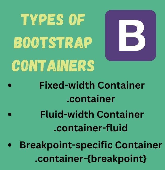
Types of Bootstrap Containers
Bootstrap bestows upon developers three distinct types of containers, each catering to different layout requirements. These are: .container, .container-fluid, and .container-{breakpoint}.
1. Fixed-width Container .container
The fixed-width container, denoted by the class .container, adjusts its width based on the screen size, yet maintains a maximum width. This container type is most suitable when you desire a wrapped, centered layout for your content.
<!-- Fixed-width container -->
<div class="container">
  <p>This container adjusts its width based on the screen size, up to a maximum width.</p>
</div>
2. Fluid-width Container .container-fluid
The fluid-width container, marked by the class .container-fluid, spans the entire width of the viewport, providing a full-width container. This is ideal for designs where a full-width layout is desired.
<!-- Fluid-width container -->
<div class="container-fluid">
  <p>This container spans the entire width of the viewport.</p>
</div>
The breakpoint-specific container allows developers to specify a fixed-width container for different screen sizes using the format .container-{breakpoint}. The {breakpoint} can be sm, md, lg, or xl, representing small, medium, large, and extra large screen sizes, respectively.
<!-- Breakpoint-specific containers -->
<div class="container-sm">
  <p>This container is fixed-width for small screens and above.</p>
</div>

<div class="container-md">
  <p>This container is fixed-width for medium screens and above.</p>
</div>

<div class="container-lg">
  <p>This container is fixed-width for large screens and above.</p>
</div>

<div class="container-xl">
  <p>This container is fixed-width for extra large screens.</p>
</div>
Examples
Let's consider a scenario where you're developing a website and want to ensure that the content remains well-aligned and readable across different device sizes.
For the main content area, you might opt for a fixed-width container .container to keep the content centered and well-padded.
For a full-width header or footer, a fluid-width container .container-fluid could be the choice to ensure they span across the entire width of the screen.
For a section where you desire a specific layout on medium-sized screens and above, a breakpoint-specific container .container-md can be employed.
These container types bestow a granular level of control over the layout, enabling developers to concoct responsive designs that cater to a myriad of screen sizes and devices.
Working with Bootstrap Containers
Working with Bootstrap Containers is a fundamental aspect of managing layouts in Bootstrap. The containers act as a wrapper for other elements, mainly rows and columns, which are the backbone of the Bootstrap grid system.
Understanding Bootstrap Grid System
Bootstrap's grid system is structured into three primary parts: containers, rows, and columns. Here’s a simplified example to illustrate the interplay between these elements:
In this layout, each column occupies a third of the available horizontal space on medium and larger screens.
Comparisons
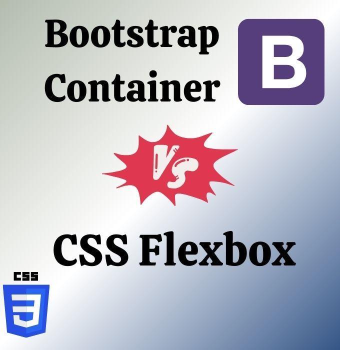
When it comes to layout management, Bootstrap Container, CSS Flexbox, and CSS Grid are prominent players, each with its unique approach.
Bootstrap Container vs CSS Flexbox
Bootstrap Container provides a pre-defined grid system with a set of classes for quick layout design, whereas CSS Flexbox is a lower-level layout model that requires manual setup but offers more flexibility.
Similar to Flexbox, CSS Grid is a lower-level layout model that provides a two-dimensional layout system, allowing for both column and row-based layouts.
Bootstrap Container is great for quick, ready-to-use grid layouts.
CSS Flexbox offers more flexibility in aligning items horizontally or vertically.
CSS Grid provides the most control with a two-dimensional layout system.
Both CSS Flexbox and Grid require a deeper understanding of CSS layout properties, but they offer more granular control over the layout compared to the Bootstrap Container.
Advanced Usage of Bootstrap Containers
Nesting Containers
Bootstrap allows for nesting containers, which means placing a container inside another container. This feature is useful for creating more complex layouts.
Bootstrap Containers play a quintessential role in crafting layouts that are both aesthetically pleasing and functionally robust, making them a go-to choice for developers in various real-world applications.
Bootstrap Container Best Practices
Adherence to certain best practices while working with Bootstrap Containers can significantly enhance the code quality and maintainability.
Correct Nesting
Ensure that containers, rows, and columns are nested correctly to prevent unexpected behaviors.
In the incorrect example above, a column (col) is used directly within a container, bypassing the row. In the correct example, the col is nested within a row, as per Bootstrap’s grid system requirements.
Unexpected Behavior
Unexpected behavior can emerge if Bootstrap classes are used incorrectly or overridden improperly.
/* Avoid overriding Bootstrap styles */
.container {
  /* Avoid adding styles that conflict with Bootstrap's defaults */
}
It's advisable to follow Bootstrap’s documentation to understand the default behavior and styling, which can help prevent unexpected issues.
The Future of Bootstrap Containers
As Bootstrap continues to evolve, its container system is likely to see enhancements that further streamline layout management and introduce new capabilities.
Simplified Layout Management
Future versions of Bootstrap may offer even simpler methods to manage layouts, reducing the need for manual adjustments and custom CSS.
These hypothetical examples depict how Bootstrap Containers could evolve to incorporate modern CSS features and simplify layout management further.
Frequently Asked Questions
How does Bootstrap Container contribute to responsive design?
By providing a flexible container to house other elements, it adapts to different screen sizes ensuring a responsive layout.
Can Bootstrap Container be nested?
Yes, Bootstrap Containers can be nested to create complex layouts.
How does Bootstrap Container compare to CSS Grid?
While Bootstrap Container offers a simplified layout solution, CSS Grid provides granular control over layout design.
What is Bootstrap Container ?
A fundamental layout element in Bootstrap for structuring and organizing webpage content. It creates a fixed-width container, ensuring consistent spacing and content centering.
What is container lg in Bootstrap?
container lg in Bootstrap does have a responsive grid system for large devices. This class define the maximum width of the container for different screen sizes.
The Bootstrap Container is a cornerstone in responsive web design, underpinning the layout structure in Bootstrap-based projects. Its understanding and effective utilization are pivotal for developers looking to create adaptable and visually appealing web interfaces. The myriad of features and the flexibility it offers make the Bootstrap Container a powerful tool in a developer's toolkit.


 9+ registered

