Use of Doctype
DOCTYPE is an abbreviation of Document Type Declaration. The <!DOCTYPE> declaration indicates the document type and assists browsers to display web pages appropriately.
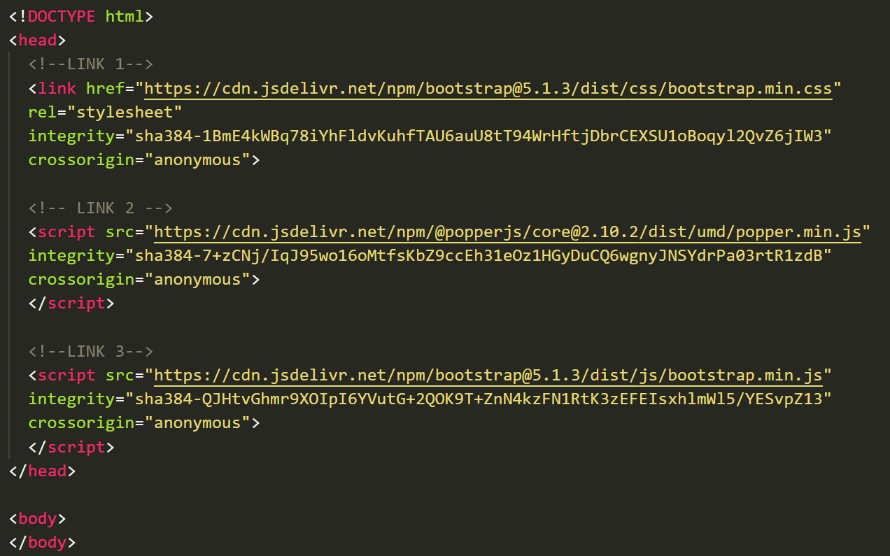
It must appear just once, at the top of the page (before any HTML tags). Every HTML document must begin with a <!DOCTYPE> declaration. Declaration of Doctype in HTML5 is done as follows:
<!DOCTYPE html>
Since the declaration of <!DOCTYPE> tag is NOT case-sensitive; the below declarations are valid:
<!DOCTYPE html>
<!DocType html>
<!Doctype html>
<!doctype html>
Bootstrap makes use of this Doctype tag, hence we must include HTML5 doctype at the beginning of all your Bootstrap projects.
Mobile First Application
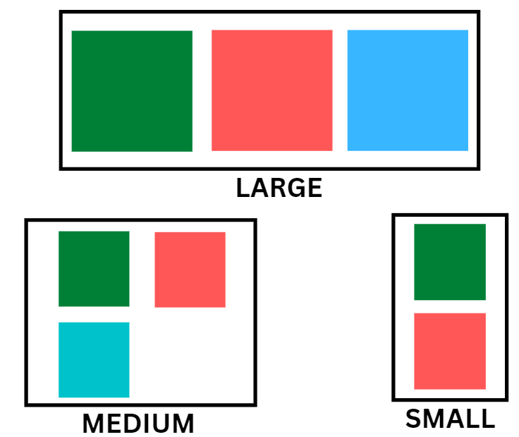
Bootstrap 2 added optional mobile-friendly styles. But Bootstrap 3 rewrite the project to be mobile-friendly throughout. Instead of counting on optional mobile techniques, they're baked right into the core. Bootstrap is now mobile-first, and you can find styles throughout the library instead of in separate files. Bootstrap 4 was released in 2018 and provides more faster stylesheet and responsive design. Along with that bootstrap 5 is the most recent version which is used for mainly mobile first applications.
We need to add a meta tag with a name viewport in the <head> section of your HTML code. It helps in providing touch zooming and easy rendering in mobile devices. The syntax to be included is mentioned below:
<meta name = "viewport" content = "width = device-width, initial-scale = 1.0">
Sometimes we just need to add only scroll capabilities instead of zooming. So, for that you need to assign “NO” value to user-scalable attribute with the above given meta tag syntax as follows:
<meta name = "viewport" content = "width=device-width, initial-scale = 1.0, maximum-scale = 1, user-scalable = no">
Doing this helps us in disabling zooming abilities. But overall, It is not an excellent idea to use it on every site, so use caution!
Typography and Links
Typography is the art & style of arranging letters and characters to form words and sentences which are legible, clear, and visually appealing to the reader. Typography involves font style, appearance, and structure, including typefaces, sizes, line lengths, line-spacing, letter-spacing, and the space between pairs of letters that aim to elicit specific emotions and convey precise messages.
Bootstrap Typography helps you create and style different inline elements like headings, paragraphs, abbreviations, blockquotes, lists, etc. It also helps in setting basic global display by specifying the background color = #fff.
Normalize
To ensure whether the content on your web page is consistent or not across different browsers, we use Normalize in Bootstrap. In other words, Bootstrap uses Normalize for establishing cross-browser consistency. Normalize in bootstrap is a small-sized CSS file. It is a good alternative to the HTML5. Normalize CSS also provide stability for doing default styling using HTML elements.
Containers

To wrap a webpage's content and easily center the content's use class .container as shown below. The .container class in the bootstrap.css file may look like this.
.container {
   padding-right: 20px;
   padding-left: 20px;
   margin-right: auto;
   margin-left: auto;
}

@media (min-width: 525px) {
   .container {
      width: 100%;
   }
}

<div class = "container">
   ...
</div>
Note - Due to padding & fixed widths, containers are not nestable by default.
Here you can see that CSS has media queries for containers with width. This helps apply responsiveness and within those, modify the container class accordingly to render the grid system correctly.
Check this out: Versions of CSS
Frequently Asked Questions
What is Bootstrap?
Bootstrap is a free & open-source CSS framework that aims to be a mobile-first front-end web development framework. It contains CSS & JavaScript-based interface components and design templates like forms, buttons, navbar, and many more.
What is meant by CSS?
Cascading Style Sheets is the language that is used for describing the presentation of Web pages. It includes colors, layout, and fonts, thus making our web pages presentable to the users.
What is the use of CSS?
CSS is used for styling web content. It is time-saving, easily editable, has a wider range of attributes, etc.
What is the difference between Bootstrap and CSS?
CSS is used for styling the webpage while bootstrap is a front-end framework used for creating websites.
What are the disadvantages of using Bootstrap?
Bootstrap is very time consuming as it takes much effort in rewriting a lot of styles while designing the websites. Also, the design deviates from the traditional method used in Bootstrap.
Conclusion
This article teaches us how to use Bootstrap CSS Overview in our projects and make our websites faster by the magic of templating and open source. You can refer to other such articles using the below links:
- Bootstrap Transition Plugin
- Bootstrap- Scrollspy Plugin
- Bootstrap -Tooltip Plugin
-
Bootstrap Accordion
Please refer to our guided paths on Coding Ninjas Studio to learn more about DSA, Competitive Programming, Java Programming, and System Design, etc. Have a look at the interview experiences and interview bundle for placement preparations. And also, enroll in our courses and refer to the mock test and problems available.
All the best for your future endeavors, and Keep Coding!!


