Do you think IIT Guwahati certified course can help you in your career?
Introduction
Bootstrap is the most popular CSS(Cascading Style Sheets) framework. It is used to develop responsive websites. Bootstrap provides us with easy ways to style websites, and it is significantly less verbose.
This article will discuss the dropdown plugin available in Bootstrap's dropdown class. We will also learn about the usage, methods, and events when working with Bootstrap and also see about its implementation.
What is Bootstrap
Bootstrap is a free front-end framework for developing responsive websites and web applications. It contains CSS and JavaScript-based design templates for typography, forms, buttons, navigation, and other interface components, as well as optional JavaScript plugins. Bootstrap is open-source and can be used by developers to build custom websites and applications.
Bootstrap also includes partial Javascript support in plugins which helps in components like user interface. The bootstrap overview also consists of the history of bootstrap, so let's discuss it in the next section.
Bootstrap Dropdown
Dropdowns are toggleable, contextual overlays. These plugins are used for displaying lists of links. We can also make them interactive by including a bootstrap dropdown Javascript plugin. The dropdowns are built on a third-party library named Popper.js. This library provides viewport(User visible area in a webpage) detection and dynamic positioning. So, we must include popper.min.js before using bootstrap.bundle.min.js or bootstrap.bundle.js or Bootstrap's Javascript. The Popper.js library does not position dropdown in navbars, as dynamic positioning isn't required.
If you're building your JavaScript from the source, it requires util.js.
Bootstrap Dropdown Plugin
Using the Dropdown plugin, you can add dropdown menus to any components like navbars, tabs, pills, and buttons.
If you want to include this plugin functionality individually, you will need dropdown.js. As mentioned in the Bootstrap Plugins Overview, you can include bootstrap.js or the minified bootstrap.min.js.
These plugins can be added to our project in two ways:
Individual Files: We can include each plugin individually with *.js files. But one thing we need to take care of while including individual plugin files is that if it is associated with another plugin then we need to add that file as well.
Compiled: We can include all the plugins at once using bootstrap.bundle.js or bootstrap.bundle.min.js.
Include the below <script> tag at the end of your <body> tag right before the closing </body>tag in HTML to include the Compiled version of plugins.
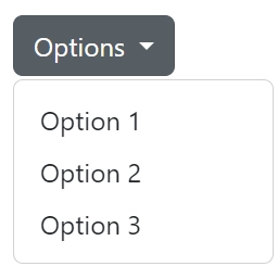
You can toggle the dropdown plugin's hidden content in three ways. These are−
Data Attributes
We need to add data-toggle = "dropdown" to a link or button to toggle a dropdown, as shown below −
<div class = "codingninjas">
    <a data-toggle = "dropdown" href = "#">Dropdown Options</a>
    <ul class = "dropdown-menu" role = "menu" aria-labelledby = "dLabel">
    ...
    </ul>
</div>
Data Target Attributes
If you need to keep links intact (which is useful if the browser is not enabling JavaScript), use the data-target attribute instead of href = "#". It can be done in the following way -
<div class = "codingninjas">
    <a id = "dLabel" role = "button" data-toggle = "dropdown" data-target = "#" href = "/page.html"> Dropdown Options </a>
    <ul class = "dropdown-menu" role = "menu" aria-labelledby = "dLabel">
    ..
    </ul>
</div>
Javascript
To call the dropdown toggle via JavaScript, use the following method
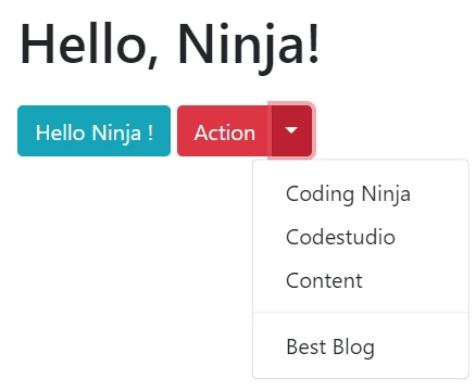
The first line is heading with the text "Hello, Ninja!" wrapped in an H1 tag. The next line has a button element with the text "Hello Ninja!" and a class of "btn btn-info".
The final block of code is a button group using Bootstrap classes. It has two buttons, one with the text "Action" and a class of "btn btn-danger", and another button with a dropdown arrow and the classes "btn btn-danger dropdown-toggle dropdown-toggle-split". Clicking on the dropdown button will reveal a dropdown menu with several links, including "Coding Ninja", "Coding Ninjas Studio", "Content", and "Best Blog". The links are wrapped in anchor tags with a class of "dropdown-item". There is also a divider line within the dropdown menu with a class of "dropdown-divider".
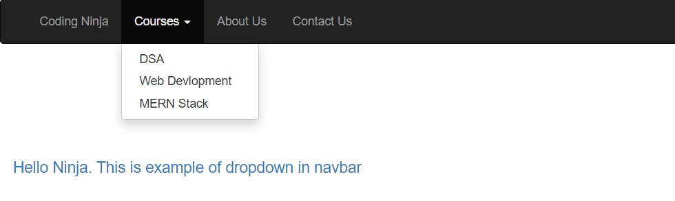
Dropdown in the Navbar
Below is the implementation of for the dropdown in the navbar. It usually implements for the Head Bar.
The nav element with the navbar and navbar-inverse classes creates the basic navbar structure. The navbar-header and navbar-brand classes define the website logo and name. The collapse and navbar-collapse classes create the hamburger menu for smaller screens.
The nav navbar-nav class creates a horizontal list of links. The dropdown class creates a dropdown menu. The dropdown-toggle class creates the button to activate the dropdown menu. The dropdown-menu class creates the menu items. The caret class creates a down arrow next to the dropdown button.
Output
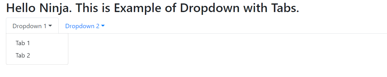
Dropdown with Tabs
Here in this section we will try to make two separate dropdown with tabs. Below is the implementation.
In this example, we are using the "on" method to attach a "show.bs.dropdown" event handler to the dropdown element. When the dropdown is about to be shown, the event handler will log a message to the console.
Output
Method in Bootstrap Dropdown
toggle: This method toggles the visibility of the dropdown menu.
show: This method shows the dropdown menu.
hide: This method hides the dropdown menu.
update: This method updates the position and size of the dropdown menu.
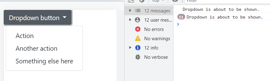
Below is an example of using the "toggle" method in the Bootstrap Dropdown Plugin:
In this example, we are attaching a "click" event handler to the dropdown button. When the button is clicked, the "toggle" method is called on the ".dropdown-menu" element, which toggles its visibility.
Output
Option in Bootstrap Dropdown
offset: This option allows developers to specify the offset of the dropdown menu from the trigger element. It takes an array with two values, representing the horizontal and vertical offset.
flip: This option allows the dropdown menu to flip automatically if it is clipped by an overflow. It can be set to "true" or "false".
boundary: This option allows developers to specify the element that serves as the boundary of the dropdown menu. It takes a selector string or an element.
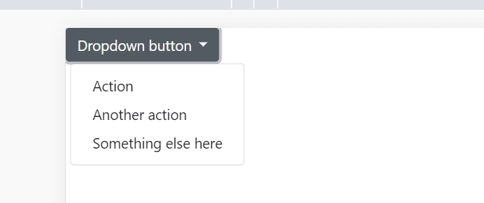
Below is an example of using the offset option in the Bootstrap Dropdown Plugin:
In this example, we are using the data-offset attribute to set the offset for the dropdown menu. The offset is specified as two comma-separated values that represent the horizontal and vertical distance between the dropdown button and the menu.
Output
Now, let’s discuss some Frequently Asked Questions.
Frequently Asked Questions
What is Bootstrap?
Bootstrap is a free & open-source CSS framework that aims to be a mobile-first front-end web development framework. It contains CSS & JavaScript-based interface components and design templates like forms, buttons, navbar, and many more.
How to include plugins?
Plugins can be added to our project in two ways. These are Individual Files and Compiled Files.
Name the different types of plugins in bootstrap?
There are more than ten different plugins. Some of them are - Transition, Modal, Tooltip, Alert, Popover, Affix, etc.
What are bootstrap dropdowns?
Dropdowns are toggleable, contextual overlays. These plugins are used for displaying lists of links. We can also make them interactive by including a bootstrap dropdown Javascript plugin.
What is the use of bootstrap dropdown plugins?
Using the Dropdown plugin you can add dropdown menus to any components like navbars, tabs, pills, and buttons.
Conclusion
We have learned about the dropdown in Bootstrap. We also learned about the dropdown plugins in Bootstrap. We also learned about the different methods and events of the dropdown plugin in Bootstrap. This article also explained the implementation of the usage of the dropdown plugin available in Bootstrap.
You can refer to other such articles using the below links:


 9+ registered

