Do you think IIT Guwahati certified course can help you in your career?
Introduction
Bootstrap is an open-source CSS framework making it easy to create attractive web pages with responsiveness. These CSS and javascript-based design templates for forms, buttons, and typography are contained in bootstrap.
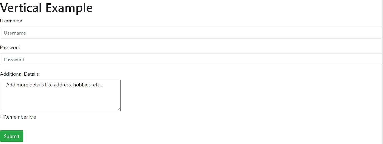
In this blog, let us focus on Bootstrap forms. Bootstrap forms are of three types which are vertical, inline, and horizontal. And have some form controls, for example <input>, <select>, <text-area>, etc., These all are styled with .form-control class with 100% width and display type equals to block. We will discuss them deeply as we go along.
Form Groups
For properly structuring the form, the .form-group class is used and leads to a proper grouping of layouts, labels, form validation messages, etc. It is used with <feildset> or <div> tags and only applies a margin to the bottom.
The <form> tag should contain all groups of form fields. We can also disable form elements by using the disabled attribute within the form tag. The default type of the <button> tag is "submit”, and to change it, we must specify the type we want.
Type of Form Control
The <input>, <select>, <text-area>, and radio tags are textual form controls that can be styled with .form-control class. Moreover, we will go through all of them one by one. Let's start with the following:
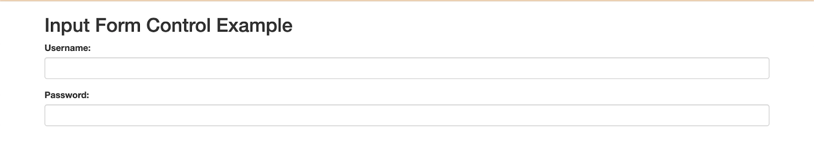
The Input Form Control
It is the most commonly used text field form that stores data that the user enters. Furthermore, all types of input, for example, text, password, DateTime, DateTime-local, date, month, time, week, number, email, URL, search, tel, and color, are supported by bootstrap.
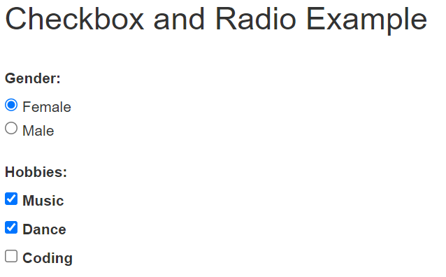
We use checkboxes and radio buttons when we want our users to select input from given choices. For taking multiple inputs, we use the checkbox. For a single input, we need a radio button that limits the user. For placing these controls in the same line, we usethe .checkbox-inlineand.radio-inline or .form-check-inline class. Moreover, we can disable them by using the disabled keyword. They are also used for form validation. For providing appropriate spacing between any number of checkboxes and radio buttons, we use the .form-check class. If there are no labels for the inputs, .position-class is given to input form control.
Example: We can also add gender and hobby selection options in the above form using radio buttons and checkboxes form control type. This can be done as:
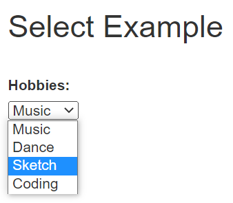
We may select more than one option in this form control, but it permits the user to select one by default. Nevertheless, we can use multiple attributes to select multiple options.
Example: We can also add hobbies using select form control. This can be done as follows:
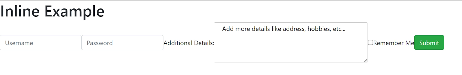
We need to add class .form-inline in <form> tag to display the set of labels, buttons, and form controls. Properties of inline forms-
All the elements are left-aligned, and the labels are also next to them.
We require at least a 576px wide viewport for controls' inline appearance.
Overrides bootstrap width: 100% to width: auto and display:block to display:flex.
Moreover, remember to include <label> tag for every form control; otherwise, the screen reader will have trouble, and you can hide inline form labels from the non-screen reader by using class .sr-only.
Let us now see what form rows are used for more compact and tighter layouts. Furthermore, for that, we add class .row or .form-row in <div> tag.
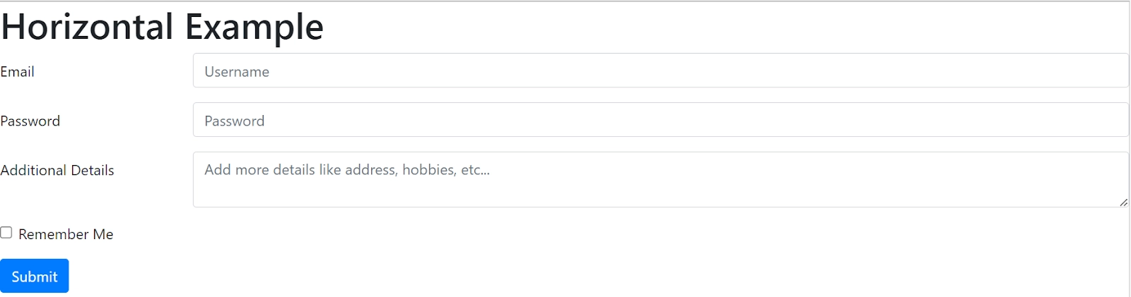
Now let us get back to the horizontal forms. We use the .row class to create horizontal forms with the grid system to form groups. Furthermore, we need the .col-*-* class to specify the width of the layout and controls. Adding .col-form-layout class to labels leads to vertically center alignment with their respective form controls.
Let us now see the steps to form horizontal form with bootstrap -
Parent <form> element should contain class .form-horizontal
<div> tag with .form-group class should wrap all labels and form-control
And labels should have class .control-label
Note- Horizontal forms transform to vertical forms on small screens (767px or below), which means labels are placed above form controls.
Frequently Asked Questions
What is Bootstrap?
Bootstrap is an open-source CSS framework, making it easy to create attractive web pages with responsiveness.
What are forms in HTML?
An HTML Form is a document that uses interactive controls to save a user’s information on a web server. An HTML form holds many types of information such as a username, password, contact number, email address, etc. Checkboxes, input boxes, radio buttons, submit buttons, and other elements are used in HTML forms.
What is a read-only attribute?
Modification of input's value is prevented by readonly boolean attribute. Moreover, to remove default form settings, we use .form-control-plaintext and preserve the correct margin and padding.
What are different types form control states?
Bootstrap forms have form control states like Input focus, disable inputs, disable fieldsets, and validation states. Validation includes class like .has-error, .has-warning and .has-success.
What is control sizing?
Classes like .input-lg and .col-lg-* are used to set the height and width of forms.
Conclusion
In this blog, we enlisted about the bootstrap forms, their different types of layouts, and form controls that are used to make attractive forms on the webpage.
You can refer to other such articles using the below links:


 18+ registered

