Do you think IIT Guwahati certified course can help you in your career?
Introduction
Hey Ninjas, today we will learn a technique that we use to make our website look organized and align the contents of the website. This technique is the use of a bootstrap grid system.
First, let us start with knowing what bootstrap is. Then we will learn about grids in bootstrap.
What is Bootstrap?
Bootstrap is a free front-end framework for developing responsive websites and web applications. It contains CSS and JavaScript-based design templates for typography, forms, buttons, navigation, and other interface components, as well as optional JavaScript plugins. Bootstrap is open-source and can be used by developers to build custom websites and applications.
What is the Grid System in Bootstrap?
The bootstrap grid system is a framework for building responsive web designs using a 12-column grid layout. It provides a set of CSS classes to create and control the layout of web pages, making it easier to create and manage grid-based layouts. The grid system uses a flexible box model, allowing elements to be automatically resized based on the viewport size. It also includes built-in classes for creating common UI elements such as rows, columns, and navigation bars.
Why do we use bootstrap grids?
We use bootstrap grid systems because they provide several benefits:
Responsiveness: The grid system helps to make website designs responsive, ensuring that the site's layout adapts to different screen sizes and devices.
Consistency: Using pre-defined classes helps maintain a consistent design across different pages and elements, making it easier to develop and maintain the site.
Speed: It saves time by reducing the need to write custom CSS code, which can be time-consuming and error-prone.
Easy to Learn: Bootstrap grid system has a simple and intuitive syntax, making it easy to learn and use, even for developers with little or no CSS experience.
Cross-Browser Compatibility: Bootstrap grid system is built with modern web technologies and is compatible with all major browsers, ensuring that the site works consistently across different platforms.
How to use bootstrap grids?
Bootstrap grids are used to create a responsive, flexible, and structured layout for a web page. Here are the steps to use them:
Include the Bootstrap CSS file in the head of your HTML file. We can also use the following CDN to make this process easier.
Within the container, create rows to hold the columns.
<div class="row">
Within the rows, create columns using the "col" class and specify the number of columns for different screen sizes using the col-- classes.
<div class="col">
OR
<div class="col-sm-4">
Add your content within the columns.
Repeat steps 4-5 to create additional rows and columns.
Some basic classes
Before seeing the use of the bootstrap grids, let us understand some basic classes we will use.
Class Name
Reason of use
container
Provides a means to center and horizontally pad your site’s contents
row
Creates horizontal groups of columns
col
Creates a column.
xs
Screensize < 576px wide(extra small devices: phones)
sm
Screensize >= 576px wide(small devices: small tablets)
md
Screensize >= 768px wide(medium devices: tablets)
lg
Screensize >= 992px wide(Large devices: desktops)
xl
Screensize >= 1200px wide(Extra large devices: desktops)
Let us now see some different examples for better understanding.
Some Examples
We will see different types of examples.
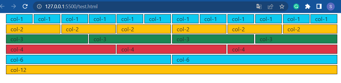
Equal-width columns
For making columns of equal width, there are two ways. One is we can make a row and then make the number of columns we want. All will be equally wide. The other way is we can define the size of each column while we are making them.
<!DOCTYPE html>
<html lang="en">
<head>
<meta charset="UTF-8">
<meta http-equiv="X-UA-Compatible" content="IE=edge">
<meta name="viewport" content="width=device-width, initial-scale=1.0">
<!-- Bootstrap CDN -->
<link href="https://cdn.jsdelivr.net/npm/bootstrap@5.1.3/dist/css/bootstrap.min.css" rel="stylesheet" integrity="sha384-1BmE4kWBq78iYhFldvKuhfTAU6auU8tT94WrHftjDbrCEXSU1oBoqyl2QvZ6jIW3" crossorigin="anonymous">
<title>Document</title>
</head>
<body>
<div class="container">
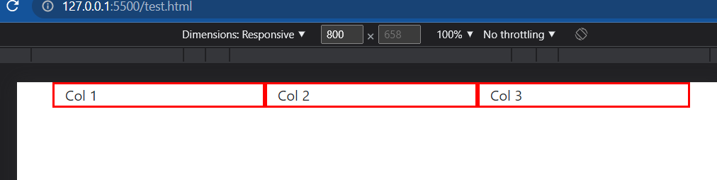
<!-- Using class col to make col and by default they all will be equally wide -->
<div class="row">
<div class="col" style="border: 1px solid red;">
Col 1
</div>
<div class="col" style="border: 1px solid red;">
Col 2
</div>
<div class="col" style="border: 1px solid red;">
Col 3
</div>
<div class="col" style="border: 1px solid red;">
Col 4
</div>
</div>
</div>
</body>
</html>
Output:
Second method:
We can define the size of each column to be 3(since 3*4 = 12). We will get the same output.
<!DOCTYPE html>
<html lang="en">
<head>
    <meta charset="UTF-8">
    <meta http-equiv="X-UA-Compatible" content="IE=edge">
    <meta name="viewport" content="width=device-width, initial-scale=1.0">

    <!-- Bootstrap CDN -->
    <link href="https://cdn.jsdelivr.net/npm/bootstrap@5.1.3/dist/css/bootstrap.min.css" rel="stylesheet" integrity="sha384-1BmE4kWBq78iYhFldvKuhfTAU6auU8tT94WrHftjDbrCEXSU1oBoqyl2QvZ6jIW3" crossorigin="anonymous">

    <title>Document</title>
</head>
<body>
    <div class="container">
        <!-- Giving the size of each col while using class col to make col -->
        <div class="row">
            <div class="col-3" style="border: 1px solid red;">
                Col 1
            </div>
            <div class="col-3" style="border: 1px solid red;">
                Col 2
            </div>
            <div class="col-3" style="border: 1px solid red;">
                Col 3
            </div>
            <div class="col-3" style="border: 1px solid red;">
                Col 4
            </div>
        </div>
    </div>
</body>
</html>
Output:
Unequal width columns
We can give columns different width to get the desired output.
<!DOCTYPE html>
<html lang="en">
<head>
    <meta charset="UTF-8">
    <meta http-equiv="X-UA-Compatible" content="IE=edge">
    <meta name="viewport" content="width=device-width, initial-scale=1.0">

    <!-- Bootstrap CDN -->
    <link href="https://cdn.jsdelivr.net/npm/bootstrap@5.1.3/dist/css/bootstrap.min.css" rel="stylesheet" integrity="sha384-1BmE4kWBq78iYhFldvKuhfTAU6auU8tT94WrHftjDbrCEXSU1oBoqyl2QvZ6jIW3" crossorigin="anonymous">

    <title>Document</title>
</head>
<body>
    <div class="container">
        <!-- Giving the size of each col while using class col to make col -->
        <div class="row">
            <div class="col-3" style="border: 3px solid red;">
                Col 1
            </div>
            <div class="col-6" style="border: 3px solid red;">
                Col 2
            </div>
            <div class="col-3" style="border: 3px solid red;">
                Col 3
            </div>
            <div class="col-4" style="border: 3px solid red;">
                Col 4
            </div>
        </div>
    </div>
</body>
</html>
Output:
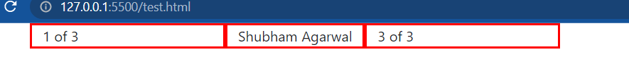
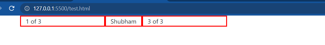
Variable width columns
We can use “col-{breakpoint}-auto” class to set size columns naturally based on the width of their content.
<!DOCTYPE html>
<html lang="en">
<head>
    <meta charset="UTF-8">
    <meta http-equiv="X-UA-Compatible" content="IE=edge">
    <meta name="viewport" content="width=device-width, initial-scale=1.0">

    <!-- Bootstrap CDN -->
    <link href="https://cdn.jsdelivr.net/npm/bootstrap@5.1.3/dist/css/bootstrap.min.css" rel="stylesheet" integrity="sha384-1BmE4kWBq78iYhFldvKuhfTAU6auU8tT94WrHftjDbrCEXSU1oBoqyl2QvZ6jIW3" crossorigin="anonymous">

    <title>Document</title>
</head>
<body>
    <div class="container">
        <!-- When I am changing the content of the second column the size of the column is self adjusting itself. -->
        <div class="row">
            <div class="col col-lg-2" style="border: 3px solid red;">
                1 of 3
            </div>
            <div class="col-md-auto" style="border: 3px solid red;">
                <!-- Shubham Agarwal -->
                Shubham
            </div>
            <div class="col col-lg-2" style="border: 3px solid red;">
                3 of 3
            </div>
        </div>

     </div>
</body>
</html>
Output:
When the content of the second column is “Shubham Agarwal.”
When the content of the second column is “Shubham.”
We can see that the column size is changing by itself as we are changing the size of the content in it.
Special Classes
Responsive Column Resets
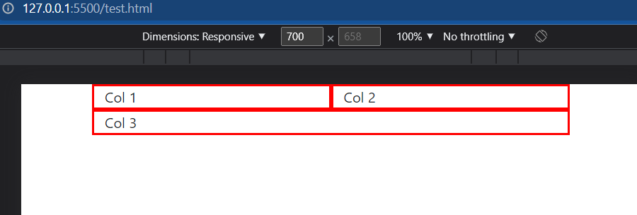
We can reset the number of columns in a row on different screen sizes using the “col-*” classes and the responsive breakpoints.
<!DOCTYPE html>
<html lang="en">
<head>
    <meta charset="UTF-8">
    <meta http-equiv="X-UA-Compatible" content="IE=edge">
    <meta name="viewport" content="width=device-width, initial-scale=1.0">

    <!-- Bootstrap CDN -->
    <link href="https://cdn.jsdelivr.net/npm/bootstrap@5.1.3/dist/css/bootstrap.min.css" rel="stylesheet" integrity="sha384-1BmE4kWBq78iYhFldvKuhfTAU6auU8tT94WrHftjDbrCEXSU1oBoqyl2QvZ6jIW3" crossorigin="anonymous">

    <title>Document</title>
</head>
<body>
    <div class="container">
        <!-- On medium screens, the three columns will have a width of 4 out of 12, but on small screens, the first two columns will have a width of 6 out of 12, and the third column will have a width of 12 out of 12 -->
        <div class="row">
            <div class="col-md-4 col-sm-6" style="border: 3px solid red;">
                Col 1
            </div>
            <div class="col-md-4 col-sm-6" style="border: 3px solid red;">
                Col 2
            </div>
            <div class="col-md-4 col-sm-12" style="border: 3px solid red;">
                Col 3
            </div>
        </div>
     </div>
</body>
</html>
Output (on medium screens):
Output (on small screens):
In the example above, on medium screens, the three columns will have a width of 4 out of 12. But on small screens, the first two columns will have a width of 6 out of 12, and the third column will have a width of 12 out of 12. This is effectively resetting the number of columns in the row.
Offsets Columns
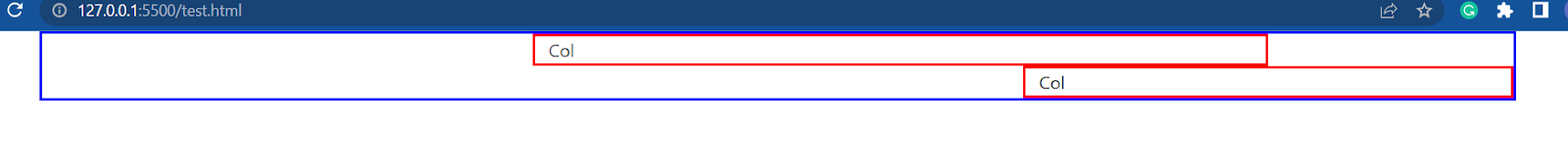
We can offset columns using the “offset-*” classes. These classes push the column to the right by a specified number of columns. The “*” can be replaced by a number from 1 to 11.
<!DOCTYPE html>
<html lang="en">
<head>
    <meta charset="UTF-8">
    <meta http-equiv="X-UA-Compatible" content="IE=edge">
    <meta name="viewport" content="width=device-width, initial-scale=1.0">

    <!-- Bootstrap CDN -->
    <link href="https://cdn.jsdelivr.net/npm/bootstrap@5.1.3/dist/css/bootstrap.min.css" rel="stylesheet" integrity="sha384-1BmE4kWBq78iYhFldvKuhfTAU6auU8tT94WrHftjDbrCEXSU1oBoqyl2QvZ6jIW3" crossorigin="anonymous">

    <title>Document</title>
</head>
<body>
    <div class="container" style="border: 3px solid blue;">
        <!-- the first row has a column that takes up 6 out of 12 columns, but is offset 4 columns to the right, so it starts at the 5th column. The second row has a column that takes up 4 out of 12 columns, but is offset 8 columns to the right, so it starts at the 9th column. -->
        <div class="row">
            <div class="col-md-6 offset-md-4" style="border: 3px solid red;">
                Col
            </div>
        </div>
        <div class="row">
            <div class="col-md-4 offset-md-8" style="border: 3px solid red;">
                Col
            </div>
        </div>
     </div>
</body>
</html>
Output:
In the above example, the first row has a column that takes up 6 out of 12 columns but is offset 4 columns to the right, so it starts at the 5th column. The second row has a column that takes up 4 out of 12 columns but is offset 8 columns to the right, so it starts at the 9th column.
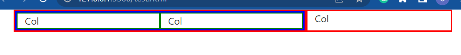
Nesting Columns
We can nest columns inside other columns to create more complex layouts. To nest columns, simply place a row with columns inside another column.
In the example above, the first column takes up 8 out of 12 columns and contains two nested columns, each taking up 6 out of 12 columns. The second column takes up 4 out of 12 columns.
Frequently Asked Questions
What are Bootstrap grids?
Bootstrap grids are a system of columns and rows that are used to create flexible and responsive layouts for websites.
How many columns are in a Bootstrap grid?
A Bootstrap grid has 12 columns.
How do we create rows and columns in Bootstrap?
We create rows in Bootstrap using the .row class, and columns using the .col-* classes, where * is a number from 1 to 12 that represents the fraction of the row that the column should take up.
Is it possible to have more than 12 columns in a Bootstrap grid?
No, it is not possible to have more than 12 columns in a Bootstrap grid. However, you can nest grids to create more complex layouts.
How do we nest columns in Bootstrap?
We can nest columns in Bootstrap by placing a row with columns inside another column.
Conclusion
In this article, we learned about the grids in Bootstrap. We learned the basics of the topic through some simple examples. We also read about some special classes that help in increasing responsiveness. Check out our articles if you think this blog has helped you enhance your knowledge and want to learn more. Visit our website to read more such blogs.


 9+ registered

