Do you think IIT Guwahati certified course can help you in your career?
Introduction
Hey Ninjas, in this article, we will read about bootstrap input groups. The input group is a part of Form Control. Using Input Group, we can add text, icons, buttons, or button groups on either side of the input field.
Input group helps implement default form controls that are used in the input fields on many websites with ease.
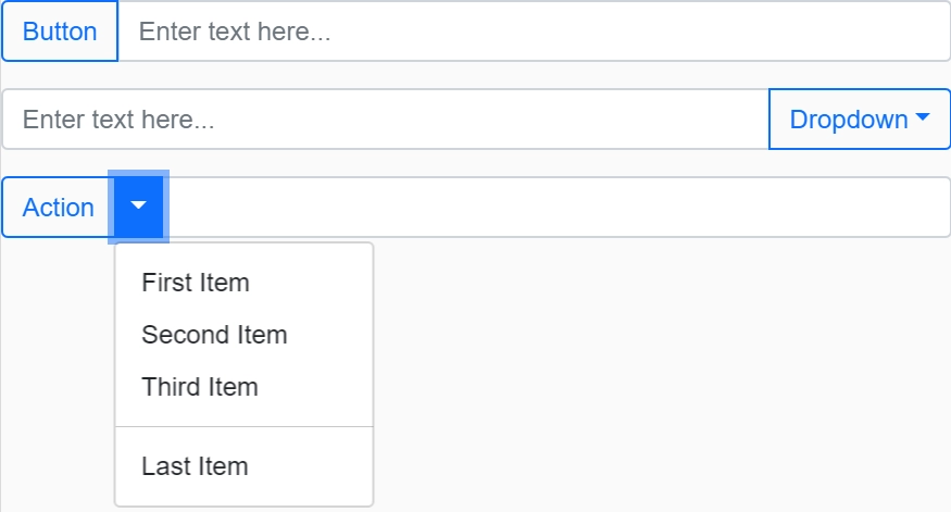
Bootstrap Input Group is a feature in the Bootstrap framework that allows us to add an input element along with text or buttons before, after, or on both sides of the input element. This helps to provide better context for the user on what information is required or what action they can perform. Input groups are created using the “input-group” class in HTML and are fully responsive and flexible. We can use the “input-group-prepend” or “input-group-append” classes to add text or buttons.
How it works
First of all, we need to get started with bootstrap to implement Input groups. To start using bootstrap on a website, we need to include its CSS in the <head> of the HTML code.
Many of the bootstrap components need the use of JavaScript to function to add functionality to the website. So, we have to place the below script in the HTML code just before the </body>.
Now, after adding bootstrap to the website. Let us see how to add input groups to the website. We do the following steps to add the Input group to our website.
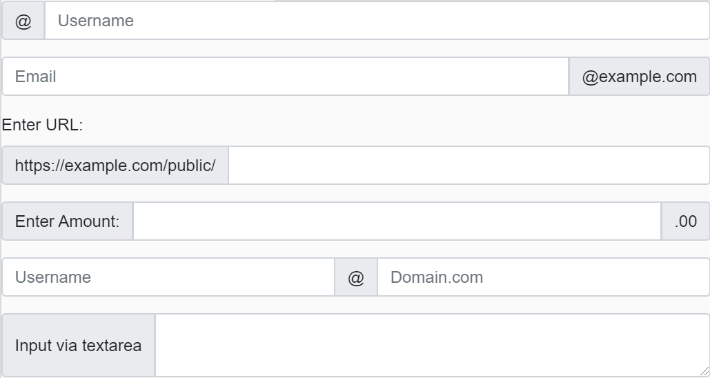
Wrap the input element and any addons in a container with the class "input-group".
Use the class "input-group-text" on the span element to give it the appropriate styling for an addon.
After that, we make <input> tag with the class “form-control” for your input field.
That’s it. We have created a Bootstrap Input group. We rearrange or add more <span> or <input> as we need. We can add any desired classes to the input element to customize its appearance.
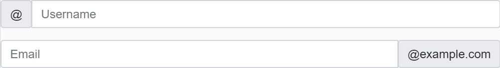
Traditionally, we used the classes “input-group-prepend” and “input-group-append” for adding text before and after the input field, respectively. Here is what it looks like.
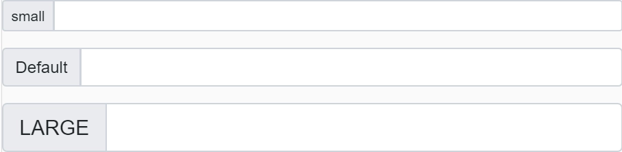
We can change the size of the input groups on our wish. We can achieve it by using classes like xs, sm, and lg. We must add them to the class “input-group” to use them.
A Bootstrap Input Group is a feature in the Bootstrap framework that allows you to add text or buttons before, after, or on both sides of an input element. It provides a better context for the user on what information is required or what action they can perform.
How to create a Bootstrap Input Group?
We can create a Bootstrap Input Group by wrapping an input element with a .input-group class and adding text or buttons.
How to control the size of Bootstrap Input Groups?
We can control the size of Bootstrap Input Groups by using Bootstrap's sizing classes, such as “input-group-lg” for large sizes and “input-group-sm” for small sizes.
Are Bootstrap Input Groups responsive?
Yes, Bootstrap Input Groups are fully responsive and flexible, and they automatically adjust to different screen sizes.
What are some common use cases for Bootstrap Input Groups?
Some common use cases for Bootstrap Input Groups include adding currency symbols, providing search functionality, adding action buttons, and formatting input elements. Bootstrap Input Groups are a useful tool for improving the user experience of your web applications.
Conclusion
In this article, we learned about the bootstrap input groups. How to insert them in codes using Bootstrap. We learned the basics of the several sub-topics through some simple examples. We also read about some special classes and their uses. Check out our articles if you think this blog has helped you enhance your knowledge and want to learn more. Visit our website to read more such blogs.


 18+ registered

