Do you think IIT Guwahati certified course can help you in your career?
Introduction
As we know that Bootstrap is a popular open-source front-end framework that is widely used for creating responsive and mobile-ready websites and web applications. It provides a wide range of pre-designed components and CSS classes that make it easy for developers to quickly create visually appealing and consistent layouts, forms, buttons, tables, and other elements.
In this blog, we will discuss Bootstrap Media Object.
Bootstrap Media Object
A Bootstrap Media Object is a pre-designed component in the Bootstrap framework that is used to create a media element, such as an image or video, along with a content block, such as text or a heading. The media object is typically used to create a consistent layout for displaying information in a list or grid format. It is commonly used to create a media card style.
The Bootstrap Media Object has been discontinued from version 5. But we can still create a layout that can contain left- or right-aligned media objects like images or videos and textual content like Tweets and blogs by using the flex and spacing utility classes. For exploring the things in this blog, we will be using Bootstrap 4. Let's discuss these in detail.
Media Object Classes
As per the introduction, you know that Bootstrap Media Objects are used to position the media on our websites and the textual content. The two available media object classes are:
Media
.media - This class allows you to float a media object( images, video, and audio) to either the left or the right side of the content block.
Media Body
.media-body - This class is used to create an unordered list for comment threads or articles.
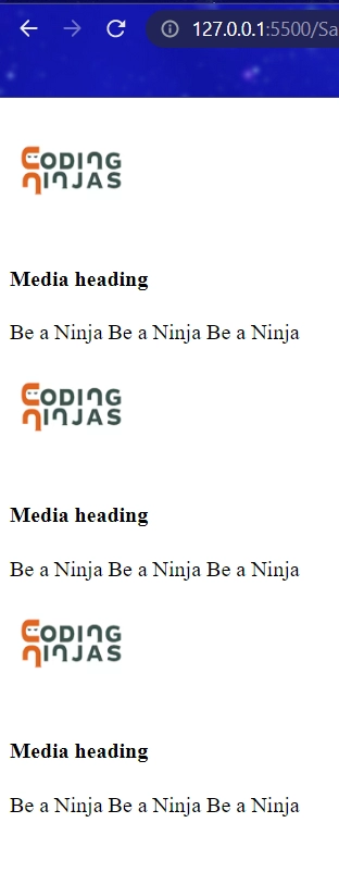
Below is an example illustrating a default media object,
<!DOCTYPE html>
<html>
  <head>
    <title>Coding Ninjas</title>
    <link href="/bootstrap/css/bootstrap.min.css" rel="stylesheet" />
  </head>
  <body>
    <div class="media">
      <a class="pull-left" href="#">
        <img
          class="media-object"
          height="10%"
          width="12%"
          src="https://res.cloudinary.com/crunchbase-production/image/upload/c_lpad,h_256,w_256,f_auto,q_auto:eco,dpr_1/v1500550935/qigpiu6kicm4phqbi2il.png"
          alt="Media Object"
        />
      </a>
      <div class="media-body">
        <h4 class="media-heading">Media heading</h4>
        Be a Ninja Be a Ninja Be a Ninja
      </div>
    </div>
  </body>
  <script src="/bootstrap/scripts/jquery.min.js"></script>
  <script src="/bootstrap/js/bootstrap.min.js"></script>
</html>
Output
Alignment of Media Objects
Bootstrap spacing allows us to control the padding and margin. We can align our objects either to the left or right, using the available classes.
To align our objects, we have three available classes,
media-left: This class is used to left-align our media objects.
media-right: This class is used to right-align our media objects.
media-body: This class is used to place our content.
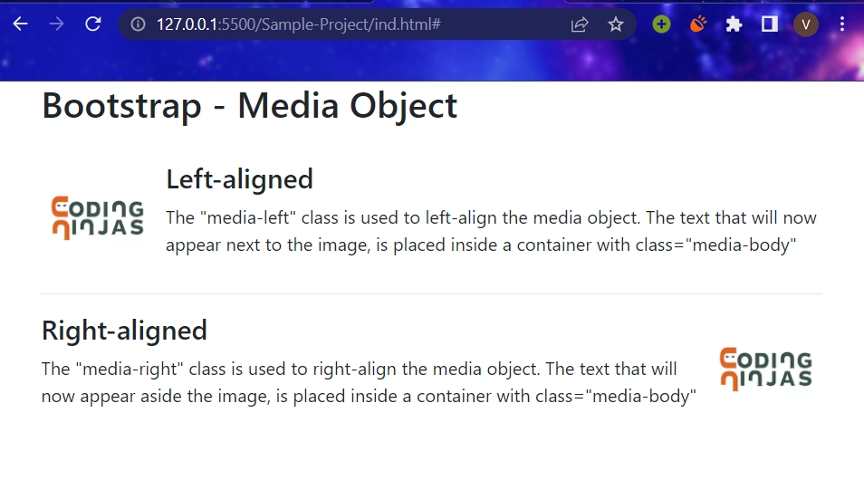
Below, we have an example that illustrates the left and right alignment.
<!DOCTYPE html>
<html lang="en">
  <head>
    <!-- Link Bootstrap CSS -->
    <link
      rel="stylesheet"
      href="https://stackpath.bootstrapcdn.com/bootstrap/4.2.1/css/bootstrap.min.css"
      integrity="sha384-GJzZqFGwb1QTTN6wy59ffF1BuGJpLSa9DkKMp0DgiMDm4iYMj70gZWKYbI706tWS"
      crossorigin="anonymous"
    />

    <style>
      .media-left img {
        width: 100px;
        margin-right: 10px;
      }
      .media-right img {
        width: 100px;
        margin-left: 10px;
      }
    </style>

    <title>Ninjas Playground</title>
  </head>
  <body>
    <div class="container">
      <h2>Bootstrap - Media Object</h2>
      <br />
      <!-- Left-aligned media object -->
      <div class="media">
        <div class="media-left">
          <img
            src="https://res.cloudinary.com/crunchbase-production/image/upload/c_lpad,h_256,w_256,f_auto,q_auto:eco,dpr_1/v1500550935/qigpiu6kicm4phqbi2il.png"
            class="media-object"
            style="margin-right: 10px"
          />
        </div>

        <div class="media-body">
          <h4 class="media-heading">Left-aligned</h4>
          <p>
            The "media-left" class is used to left-align the media object. The
            text that will now appear next to the image, is placed inside a
            container with class="media-body"
          </p>
        </div>
      </div>
      <hr />
      <!-- Right-aligned media object -->
      <div class="media">
        <div class="media-body">
          <h4 class="media-heading">Right-aligned</h4>
          <p>
            The "media-right" class is used to right-align the media object. The
            text that will now appear aside the image, is placed inside a
            container with class="media-body"
          </p>
        </div>
        <div class="media-right">
          <img
            src="https://res.cloudinary.com/crunchbase-production/image/upload/c_lpad,h_256,w_256,f_auto,q_auto:eco,dpr_1/v1500550935/qigpiu6kicm4phqbi2il.png"
            class="media-object"
          />
        </div>
      </div>
    </div>
  </body>
  <!-- Link Bootstrap JS and JQuery -->
  <script src="https://code.jquery.com/jquery-3.3.1.slim.min.js"></script>
  <script src="https://cdnjs.cloudflare.com/ajax/libs/popper.js/1.14.6/umd
                    /popper.min.js"></script>
  <script src="https://stackpath.bootstrapcdn.com/bootstrap/4.2.1/js/bootstrap.min.js"></script>
</html>
Output
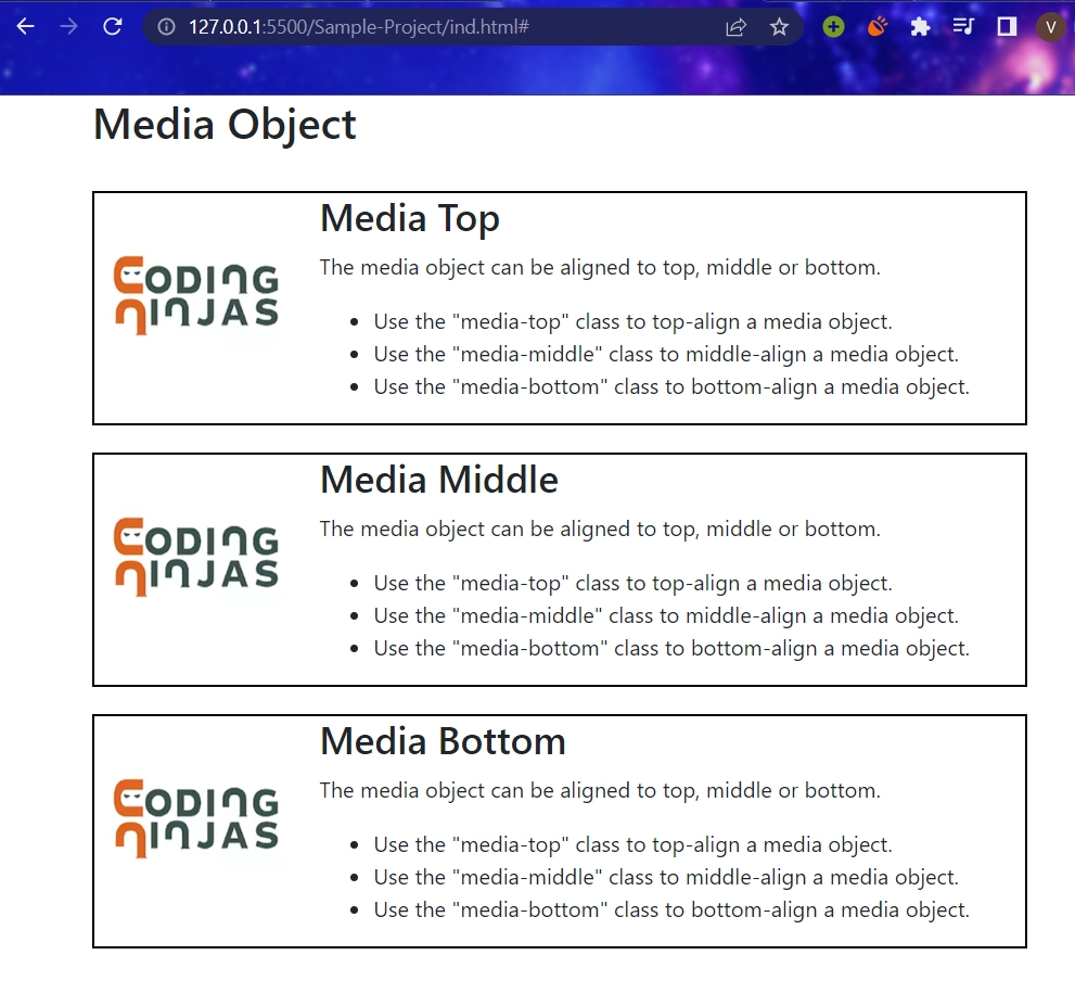
We can also align our media objects on the top, bottom, or middle, let’s see the classes we can use to do so,
We can use classes like media-top, media-bottom, or media-middle.
Below is an illustrative example of the discussed classes,
<!DOCTYPE html>
<html>
  <head>
    <!-- Link Bootstrap CSS -->
    <link
      rel="stylesheet"
      href="https://stackpath.bootstrapcdn.com/bootstrap/4.2.1/css/bootstrap.min.css"
      integrity="sha384-GJzZqFGwb1QTTN6wy59ffF1BuGJpLSa9DkKMp0DgiMDm4iYMj70gZWKYbI706tWS"
      crossorigin="anonymous"
    />

    <title>Ninjas Playground</title>
  </head>
  <body>
    <div class="container">
      <h2>Media Object</h2>
      <br />

      <div class="media" style="border: 2px solid black; margin-bottom: 20px">
        <div class="media-top">
          <img
            class="align-self-end mr-3"
            src="https://res.cloudinary.com/crunchbase-production/image/upload/c_lpad,h_256,w_256,f_auto,q_auto:eco,dpr_1/v1500550935/qigpiu6kicm4phqbi2il.png"
            style="width: 150px"
          />
        </div>
        <div class="media-body">
          <h3 class="media-heading">Media Top</h3>
          <p>The media object can be aligned to top, middle or bottom.</p>

          <ul>
            <li>Use the "media-top" class to top-align a media object.</li>
            <li>
              Use the "media-middle" class to middle-align a media object.
            </li>
            <li>
              Use the "media-bottom" class to bottom-align a media object.
            </li>
          </ul>
        </div>
      </div>

      <div class="media" style="border: 2px solid black; margin-bottom: 20px">
        <div class="media-middle">
          <img
            class="align-self-end mr-3"
            src="https://res.cloudinary.com/crunchbase-production/image/upload/c_lpad,h_256,w_256,f_auto,q_auto:eco,dpr_1/v1500550935/qigpiu6kicm4phqbi2il.png"
            style="width: 150px"
          />
        </div>
        <div class="media-body">
          <h3 class="media-heading">Media Middle</h3>
          <p>The media object can be aligned to top, middle or bottom.</p>

          <ul>
            <li>Use the "media-top" class to top-align a media object.</li>
            <li>
              Use the "media-middle" class to middle-align a media object.
            </li>
            <li>
              Use the "media-bottom" class to bottom-align a media object.
            </li>
          </ul>
        </div>
      </div>

      <div class="media" style="border: 2px solid black; margin-bottom: 20px">
        <div class="media-bottom">
          <img
            class="align-self-end mr-3"
            src="https://res.cloudinary.com/crunchbase-production/image/upload/c_lpad,h_256,w_256,f_auto,q_auto:eco,dpr_1/v1500550935/qigpiu6kicm4phqbi2il.png"
            style="width: 150px"
          />
        </div>

        <div class="media-body">
          <h3 class="media-heading">Media Bottom</h3>
          <p>The media object can be aligned to top, middle or bottom.</p>

          <ul>
            <li>Use the "media-top" class to top-align a media object.</li>
            <li>
              Use the "media-middle" class to middle-align a media object.
            </li>
            <li>
              Use the "media-bottom" class to bottom-align a media object.
            </li>
          </ul>
        </div>
      </div>
    </div>
  </body>
  <!-- Link Bootstrap JS and JQuery -->
  <script
    src="https://code.jquery.com/jquery-3.3.1.slim.min.js"
    integrity="sha384-q8i/X+965DzO0rT7abK41JStQIAqVgRVzpbzo5smXKp4YfRvH+8abtTE1Pi6jizo"
    crossorigin="anonymous"
  ></script>
  <script
    src="https://cdnjs.cloudflare.com/ajax/libs/popper.js/1.14.6/umd/popper.min.js"
    integrity="sha384-wHAiFfRlMFy6i5SRaxvfOCifBUQy1xHdJ/yoi7FRNXMRBu5WHdZYu1hA6ZOblgut"
    crossorigin="anonymous"
  ></script>
  <script
    src="https://stackpath.bootstrapcdn.com/bootstrap/4.2.1/js/bootstrap.min.js"
    integrity="sha384-B0UglyR+jN6CkvvICOB2joaf5I4l3gm9GU6Hc1og6Ls7i6U/mkkaduKaBhlAXv9k"
    crossorigin="anonymous"
  ></script>
</html>
Output
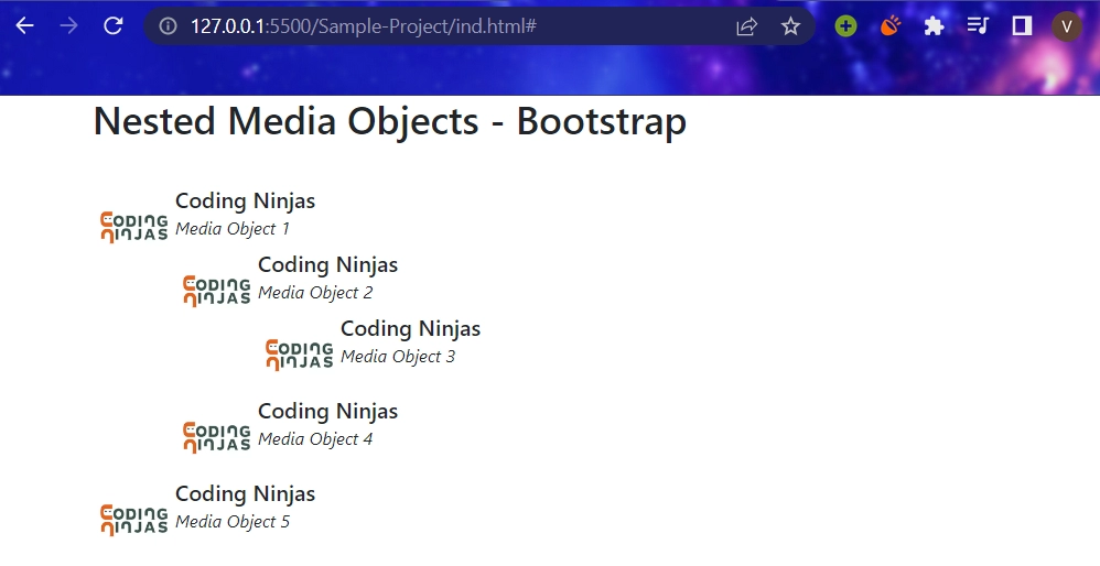
Nesting Media Objects
We can put our media objects one under the other using nesting of our media objects. We can use nested .media within our parent media object body class.
Below is an example of how we can implement nesting of media objects,
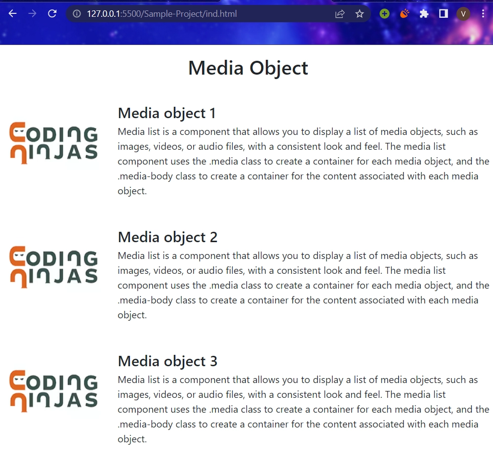
A media list is a component that allows you to display a list of media objects, such as images, videos, or audio files, with a consistent look and feel. The media list component uses the .media class to create a container for each media object, and the .media-body class to create a container for the content associated with each media object.
<!DOCTYPE html>
<html lang="en">
  <head>
    <meta charset="utf-8" />
    <meta name="viewport" content="width=device-width, initial-scale=1" />
    <link
      rel="stylesheet"
      href="https://cdn.jsdelivr.net/npm/bootstrap@4.0.0/dist/css/bootstrap.min.css"
      integrity="sha384-Gn5384xqQ1aoWXA+058RXPxPg6fy4IWvTNh0E263XmFcJlSAwiGgFAW/dAiS6JXm"
      crossorigin="anonymous"
    />

    <script
      src="https://code.jquery.com/jquery-3.2.1.slim.min.js"
      integrity="sha384-KJ3o2DKtIkvYIK3UENzmM7KCkRr/rE9/Qpg6aAZGJwFDMVNA/GpGFF93hXpG5KkN"
      crossorigin="anonymous">
    </script>

    <script
      src="https://cdn.jsdelivr.net/npm/popper.js@1.12.9/dist/umd/popper.min.js"
      integrity="sha384-ApNbgh9B+Y1QKtv3Rn7W3mgPxhU9K/ScQsAP7hUibX39j7fakFPskvXusvfa0b4Q"
      crossorigin="anonymous"
    >
    </script>

    <script
      src="https://cdn.jsdelivr.net/npm/bootstrap@4.0.0/dist/js/bootstrap.min.js"
      integrity="sha384-JZR6Spejh4U02d8jOt6vLEHfe/JQGiRRSQQxSfFWpi1MquVdAyjUar5+76PVCmYl"
      crossorigin="anonymous"
    >
    </script>
  </head>
  <body>
    <h2 align="center" class="my-3">Media Object</h2>

    <ul class="list-unstyled">

      <li class="media">

        <img class="mr-3" src="https://res.cloudinary.com/crunchbase-		production/image/upload/c_lpad,h_256,w_256,f_auto,q_auto:eco,dpr_1/v1500550935/qigpiu6kicm4phqbi2il.png" style="width: 11rem;">

        <div class="media-body my-4">

          <h4 class="mt-0 mb-1">Media object 1</h4>

          Media list is a component that allows you to display a list of media objects, such as images, videos, or audio files, with a consistent look and feel. The 	media list component uses the .media class to create a container for each media object, and the .media-body class to create a container for the content associated with each media object.

        </div>

      </li>

      <li class="media">

        <img class="mr-3" src="https://res.cloudinary.com/crunchbase-production/image/upload/c_lpad,h_256,w_256,f_auto,q_auto:eco,dpr_1/v1500550935/qigpiu6kicm4phqbi2il.png" style="width: 11rem;">

        <div class="media-body my-4">

          <h4 class="mt-0 mb-1">Media object 2</h4>
          Media list is a component that allows you to display a list of media objects, such as images, videos, or audio files, with a consistent look and feel. The media list component uses the .media class to create a container for each media object, and the .media-body class to create a container for the content associated with each media object.

        </div>

      </li>

      <li class="media">

        <img class="mr-3" src="https://res.cloudinary.com/crunchbase-production/image/upload/c_lpad,h_256,w_256,f_auto,q_auto:eco,dpr_1/v1500550935/qigpiu6kicm4phqbi2il.png" style="width: 11rem;">

        <div class="media-body my-4">

          <h4 class="mt-0 mb-1">Media object 3</h4>
          Media list is a component that allows you to display a list of media objects, such as images, videos, or audio files, with a consistent look and feel. The media list component uses the .media class to create a container for each media object, and the .media-body class to create a container for the content associated with each media object.

        </div>

      </li>

    </ul>

    </div>

  </body>

</html>
Output
Frequently Asked Questions
What are Media Objects?
The Media Objects help us build complex and repetitive components to position the media alongside the content.
Name the classes you can use to align the media content to the left and right.
To align our objects, we have three available classes, media-left: This class is used to left-align our media objects, media-right: This class is used to right-align our media objects and media-body: This class is used to place our content.
What are the types of Media Objects?
The media class allows us to float or place a media object which includes, pictures, audio, and videos, in a particular direction within the contents of a block.
Is it possible to add a button to a Bootstrap media object?
Yes, you can add a button to a Bootstrap media object by using the Bootstrap button classes and nesting them within the "media-body" element.
Can I customize the appearance of a Bootstrap media object?
Yes, you can customize the appearance of a Bootstrap media object using CSS. For example, you can change the font size, color, and alignment of the text, or adjust the width and height of the media content.
Hey everyone, let's briefly describe an overview of the use of media objects provided by Bootstrap.
This article covers media objects and how one can use them in their programs.
We have further discussed the alignment of media objects - to the left, right, top, bottom, and middle using elaborative examples.
Further, we have seen how we can nest these components within each other using an example.
Isn’t Web Development engaging? Building new websites and using amazing animations and different APIs, don’t be scared if you cannot grasp the hold of this vast development. We have the perfect web development course to make you stand out from your fellow developers.


 9+ registered

