Do you think IIT Guwahati certified course can help you in your career?
Introduction
Bootstrap is an open-source framework that we can integrate into web projects to make our development easy. Bootstrap helps developers to save time by combining the already done templates of various sections in a website.
This blog will discuss the navigation elements on websites' navigation bars. We will learn how to implement the navigation elements in various styles with the help of the Bootstrap framework.
What is Navigation Element?
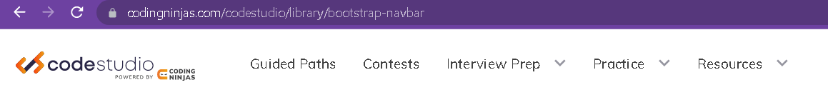
When you visit a website, you must see a row at the top of the website. In that row, some elements or text will be present that will direct you to a new page when you click on them.
Those elements or text are the navigation elements, and the row is called the navigation bar. These navigation elements' role is to navigate the user to the page or URL(Universal Resource Locator) linked to the element the user clicks.
As you can see in the image below, there is a navigation bar. Here guided path, contest, practice, and many more are the navigation elements in the navbar.
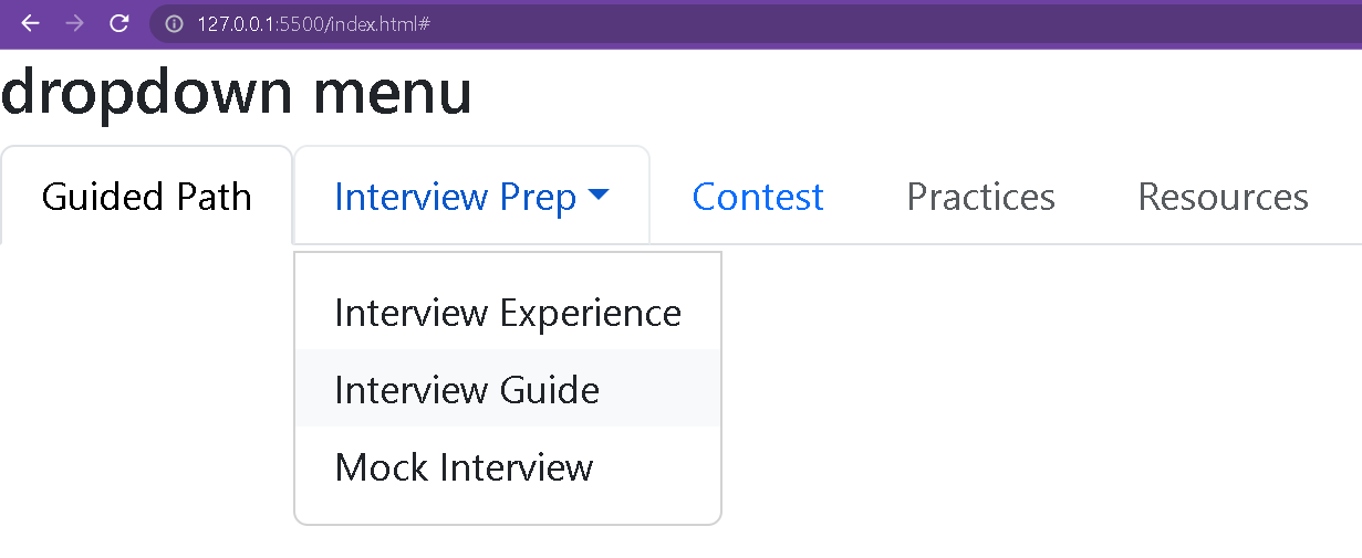
If you hover over the interview prep, practice, or resources navigation element, you will see a dropdown with more elements. We will also learn how to implement the dropdown.
Navigation using Bootstrap
This section will implement the navigation elements using the Bootstrap framework. Before we start, ensure you have installed the Bootstrap framework in our project. If you need help, follow the below instructions.
Install Bootstrap using the console.
npm install bootstrap@5.3.0-alpha1
Or include the following CDN links in your <head></head> tag of the index.html file to use the Bootstrap templates or classes.
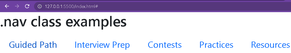
To use the markups and styles available in Bootstrap for the navigation elements, we need to use the .nav class. Add the .nav class and make sure to add the .nav class in the <ul>, which is a root tag.
Ensure that you have included the .nav-item classin each <li> tag and the .nav-link class in each <a> tag because it indicates the Bootstrap to implement the styling to that tag.
Output
If you don't include the .nav-item classand .nav-link classin the respective <li> and <a> tags, you will not be able to execute the styling.
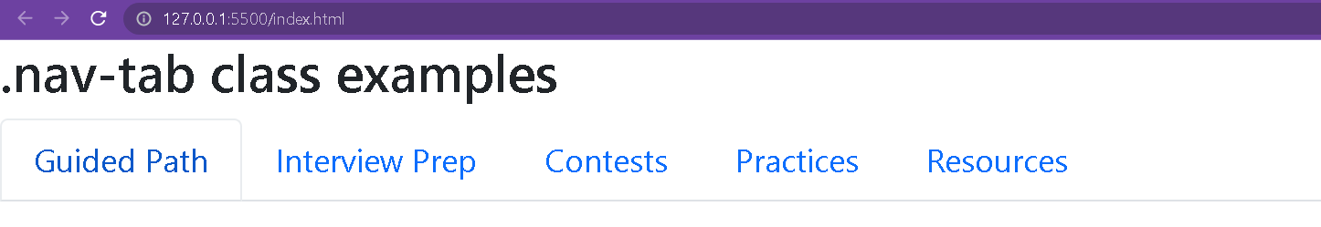
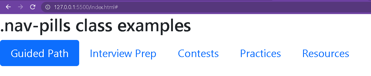
You can also implement pill styling using Bootstrap, similar to tab styling. You need to include the .nav-pills class in the <ul> tag of the navigation elements.
Pills styling is required when you want to highlight the current navbar element in a pill or rectangle box. You need to add the .active class with the currently active page, as we have mentioned in the Guided Path link.
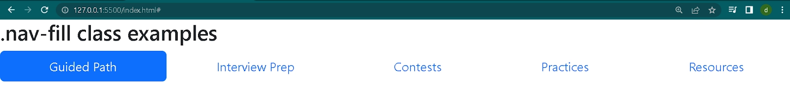
.nav-fill
If you want to add equal spacing between the nav elements and cover the navbar's horizontal length, you need to include the .nav-fill class in <ul> tag along with .nav-pills class.
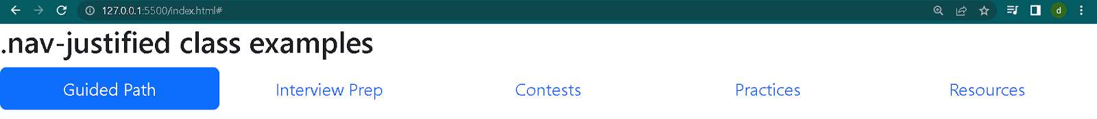
You can also use nav-justified, which works the same as the .nav-fill class. You must add the nav-justified instead of .nav-fill class in the <ul> tag.
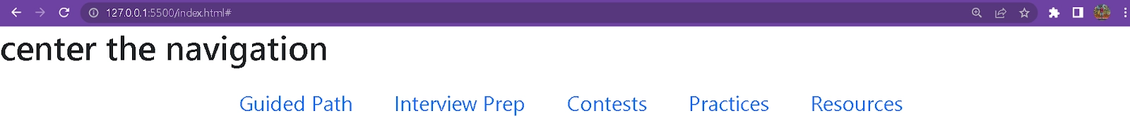
You can also change the position of the navigation elements if you want to add some uniqueness to your website. There are various classes available in Bootstrap that you can include to change the position of elements.
justify-content-center
By default, the display value of the nav class is flex, so you need to add the justify-content-center class to make the navigation in the center of the screen.
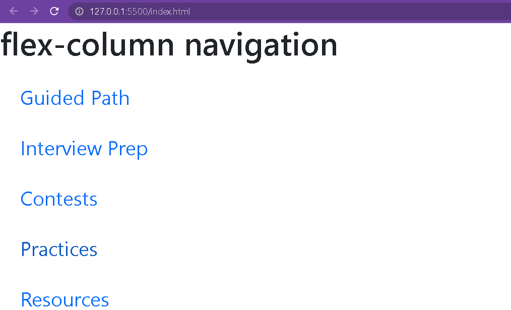
By default, nav elements are flex in nature, and if you add the flex-column class in the root <ul> tag, you can make the nav elements appear in a box or column.
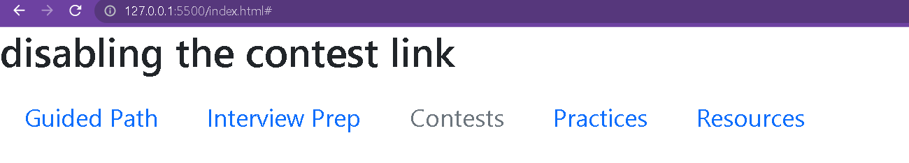
This navigation disables the .nav-item and restricts the user from accessing the content. The .disabled class is used to disable any item in the navbar. It only styles the item to let users know they cannot access it.
We have disabled the contest link by adding the .disabled class in the <a> tag.
Dropdown Navigation
You can add the dropdown navigation with the help of Bootstrap libraries. You need to add the .dropdown class in the tag where you want to add the dropdown effect. And then, you need to add the .dropdown-menu class in the element, representing the dropdown.
Bootstrap is an open-source front-end development framework that creates responsive websites and applications that adjust the width according to the devices.
Why use bootstrap instead of CSS?
Bootstrap simplifies lengthy CSS codes with predefined classes that are not available in CSS and creates responsive websites.
Why do we give .nav, .nav-tabs, or .nav-pills in a class?
The .nav generates navigation in the bootstrap navbar. The .nav-tab indicates tabular navigation, and .nav-pills indicates it should generate pill navigation in the navbar.
What is the difference between pills and tabs?
The .nav-tabs generate a tabbed interface to separate data in the same components/panes, while the .nav-pills generate separate elements to speed up browsing.
How to disable a navigation element?
Add .disbaled class in the navigation element <a> tag to make it disabled.
Conclusion
In this blog, we have learned how to implement the navigation elements using the Bootstrap framework. We have implemented different styles of navigation elements available in Bootstrap.
You can check out the following links for more Bootstrap information.


 8+ registered

