Do you think IIT Guwahati certified course can help you in your career?
Introduction
Bootstrap is an open-source framework that we can integrate into web projects to make our development easy. Bootstrap helps developers to save time by combining the already done templates of various sections in a website.
This blog will tell you about pagination and how to implement the pagination component in your website with the help of bootstrap. We will also learn how to implement various styles in pagination using bootstrap classes.
Searching for something on google or any web browser will show you the result of your question. Google will show you the multiple solutions for the query with numerous pages. When you scroll down on the first page, you will see the link to the following pages. These numbers depend on the pages you have linked to your websites.
This technique of linking web pages to navigate from one page to another is called pagination. The pagination technique is effective when you have multiple results to show in an organized way and only require the same template to display the data, like google links.
Links can be skipped, and you can jump to an x,y, or z page without going to one page at a time.
Pagination using Bootstrap
This section will implement the pagination using the Bootstrap framework. Before we start, ensure you have installed the bootstrap framework in our project. If you need help, follow the below instructions.
Install bootstrap using the console.
npm install bootstrap@5.3.0-alpha1
Or include the following CDN links in your <head></head> tag of the index.html file to use the Bootstrap templates or classes.
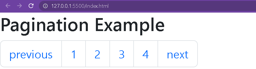
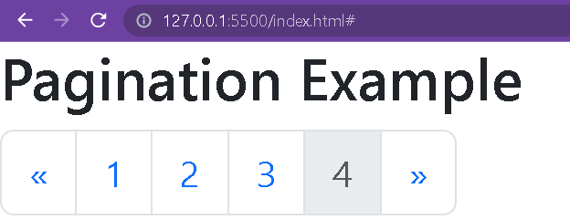
To implement the pagination technique, you need to include the .pagination class in the <ul> tag. Then include the .page-item class in <li> and the .page-link class in <a> tags.
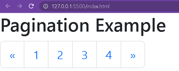
You can include the backward and forward arrow icons in your pagination component; just add ‘«’ for backward and ‘»’ for the forward arrow at the start and end of the pagination component.
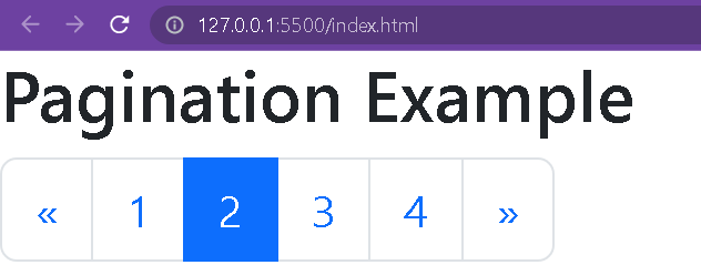
You can add the active and disabled states in your pagination component. Add the .active or .disabled class in the <li> tag you want to make the current page active or disabled.
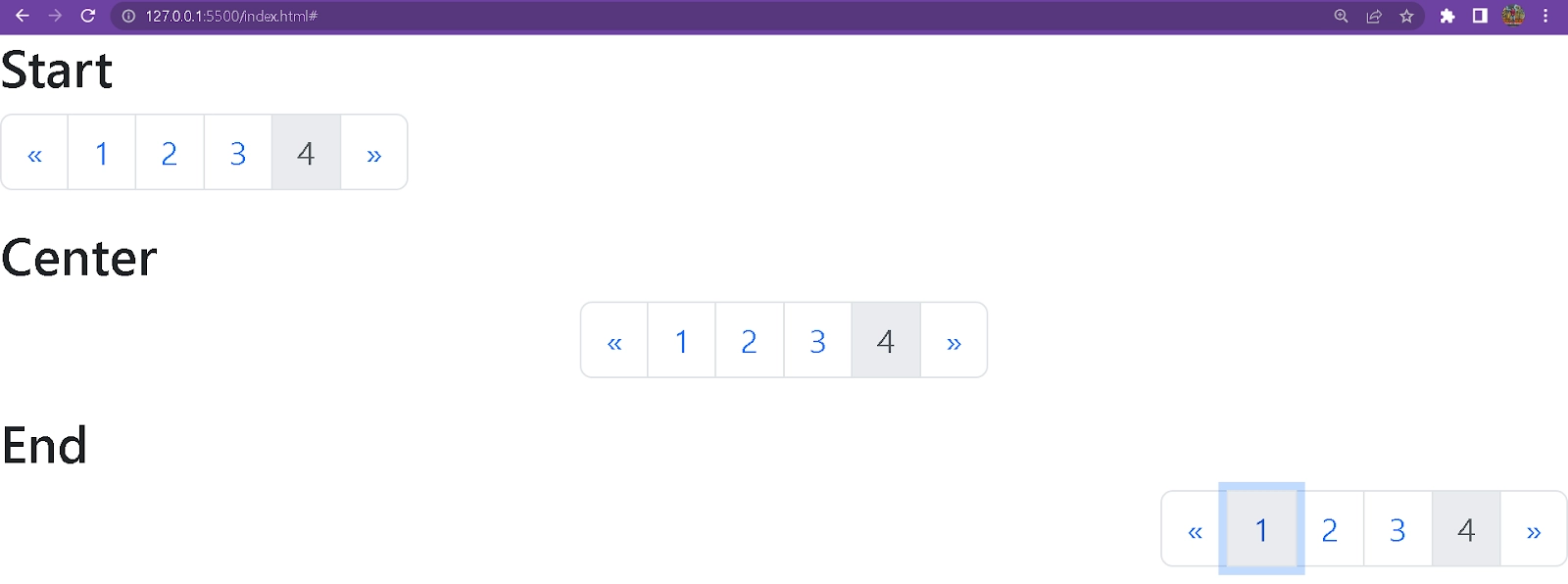
To change the alignment or position of the component, you need to include some classes. Bootstrap has classes you can use in your component to change its positions.
Alignment at Start
Add justify-content-start in the <ul> tag to make the pagination component appear at the start and is the default position for the pagination.
Pagination is the technique of linking web pages to navigate from one page to another.
In Bootstrap, which class is used for pagination?
To implement the pagination component, we need to use .pagination class and link each element with .page-item to apply the styling.
Can we disable a link in pagination?
With the .disabled class, you can disable any link. You must include it in that page's <li> tag.
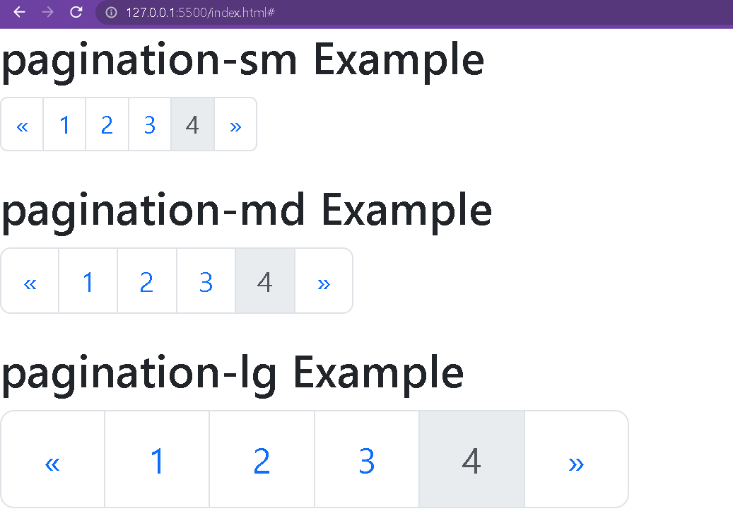
Can we change the size of the component?
Yes, you can change the size of the pagination component. To make it small, use .pagination-sm class; to make it larger, use the .pagination-lg class in the code.
How to center the pagination component?
With .justify-content-center, you can center the component.
Conclusion
In this blog, we have learned how to implement pagination using the bootstrap framework. We have implemented different styles of pagination available in bootstrap.
You can check out the following links for more bootstrap information.


 9+ registered

