How To Use Plugins?
All the Bootstrap plugins can be used via Data Attributes or Javascript.
Via Data Attributes: We can quickly render the particular plugin features into our project by adding and modifying the data attribute in the different HTML tags. In this way, we don’t need to include a single line of JavaScript to invoke any of the plugin features.
We add the Scrollspy plugin using the data attribute in the example below.
To add Scrollspy to the topbar navigation, we can add data-bs-spy="scroll" to the element you want to spy on(In most of the cases, it would be the <body>). Then add the data-bs-target attribute with the ID or class of the parent element of any bootstrap .nav component.
<body data-bs-spy="scroll" data-bs-target="#navbar-example">

  <div id="navbar-example">
    <ul class="nav nav-tabs" role="tablist"></ul>
  </div>
</body>
Via Javascript: To invoke the plugin features, we can also use pure Javascript functions. This could be included in the <script> tag at the end of the <body> tag and right before the closing </body>tag.
In the example below, we are adding the Scrollspy plugin via Javascript.
After adding position: relative; in the CSS, call the scrollspy via JavaScript:
var scrollSpy = new bootstrap.ScrollSpy(document.body, {
  target: '#navbar-example'
})

You can also try this code with Online Javascript Compiler
Types of Plugins
There are more than ten different plugins are there in Bootstrap 5; some of them are:
1.) Transition - It provides simple transition effects like Sliding, Fading.
2.) Modal - It adds dialogs to the site for user notification, lightboxes, or custom content.
3.) Dropdowns - Dropdowns are toggleable, contextual overlays for displaying lists of links and more. They only toggled by clicking, not by hovering.
4.) Scrollspy - It will automatically update the navigation bar or list group based on scroll position to indicate which link is currently active.
5.) Tooltip - The Tooltip component is a small pop-up box that appears when the user hovers over an element.
6.) Popover - The Popover component is quite similar to tooltips; they are also a pop-up box, but the difference is that they contain much more content, and it appears only after clicking on an element.
7.) Collapse - They are useful to hide large amounts of content in a button or box. They are also referred to as Accordions.
8.) Carousel - It is the slideshow component for cycling through elements. Usually, it is used to make a Gallery of images.
9.) Alert - Alert messages are most commonly used to show warning or confirmation messages to the end-users. The alert message plugin adds dismiss functionality to all alert messages.
10.) Affix - The affix plugin is used to fix an element to a specific position when the page is scrolled to a particular place.
In this article, we will cover only one plugin, i.e., Scrollspy Plugin, to show how the plugin works, its code implementation, and having this idea; you can implement other plugins as well.
Scrollspy Plugin
As we explained earlier, the Scrollspy plugin automatically updates the navigation bar or list group based on scroll position to indicate which link is currently active.
Let’s see how it works.
Scrollspy has a few requirements to work properly:
1.) It must be used on a Bootstrap nav component or list group.
2.) It requires position: relative; on the element that you are spying on, it usually is <body>.
3.) Anchors (<a>) are mandatory and must point to an element with that id.
Upon successful implementation, the nav or list group will update accordingly, moving the .active class from one item to the next based on their associated targets.
Let’s now actually implement the Scrollspy plugin.
Implement in Navbar: We can implement the scrollspy in Navbar using data attributes or javascript functions.
1.) Using Data Attribute:
To easily add scrollspy behavior to the topbar navigation, add data-bs-spy="scroll" to the element you want to spy on (most typically, this would be the <body>). Then add the data-bs-target attribute with the ID or class of the parent element of any Bootstrap .nav component.
In the code below, we can see that body tag is added with data-bs-spy="scroll" and data-bs-target="#myNavbar", where id = myNavbar is the id which we used in the navbar component.
<!DOCTYPE html>
<html lang="en">
<head>
    <meta charset="UTF-8">
    <meta http-equiv="X-UA-Compatible" content="IE=edge">
    <meta name="viewport" content="width=device-width, initial-scale=1.0">
    <title>Coding Ninjas</title>

<link href="https://cdn.jsdelivr.net/npm/bootstrap@5.1.3/dist/css/bootstrap.min.css" rel="stylesheet">

    <style>
        body{
            position: relative;
        }
        #scrollspyHeading1{padding-top: 80px;height:  400px;color:white;background-color: blue;}
        #scrollspyHeading2{padding-top: 60px;height: 400px;color:white;background-color: green;}
        #scrollspyHeading3{padding-top: 60px;height: 400px;color:white;background-color:chocolate;}
        #scrollspyHeading4{padding-top: 60px;height: 400px;color:white;background-color:blueviolet;}
        #scrollspyHeading5{padding-top: 60px;height: 400px;color:white;background-color:crimson;}
    </style>
</head>

<body data-bs-spy="scroll" data-bs-target="#myNavbar" data-bs-offset="30">

  <nav id="myNavbar" class="navbar navbar-light bg-light fixed-top">
  <a class="navbar-brand" href="#">Coding Ninjas</a>
  <ul class="nav nav-pills">
    <li class="nav-item"><a class="nav-link" href="#scrollspyHeading1">First</a></li>
    <li class="nav-item"><a class="nav-link" href="#scrollspyHeading2">Second</a></li>

    <li class="nav-item dropdown">
      <a class="nav-link dropdown-toggle" data-bs-toggle="dropdown" href="#" role="button" aria-expanded="false">Dropdown</a>
      <ul class="dropdown-menu">
        <li><a class="dropdown-item" href="#scrollspyHeading3">Third</a></li>
        <li><a class="dropdown-item" href="#scrollspyHeading4">Fourth</a></li>
        <li><hr class="dropdown-divider"></li>
        <li><a class="dropdown-item" href="#scrollspyHeading5">Fifth</a></li>
      </ul>
    </li>
  </ul>
</nav>
<div id="scrollspyHeading1">
  <h4>Heading1</h4>
  <p>...</p>
</div>
<div id="scrollspyHeading2">
  <h4>Heading2</h4>
  <p>...</p>
</div>
<div id="scrollspyHeading3">
  <h4>Heading3</h4>
  <p>...</p>
</div>
<div id="scrollspyHeading4">
  <h4>Heading4</h4>
  <p>...</p>
</div>
<div id="scrollspyHeading5">
  <h4>Heading5</h4>
  <p>...</p>
</div>

<script src="https://cdn.jsdelivr.net/npm/bootstrap@5.1.3/dist/js/bootstrap.bundle.min.js"></script>
</body>
</html>
Output:
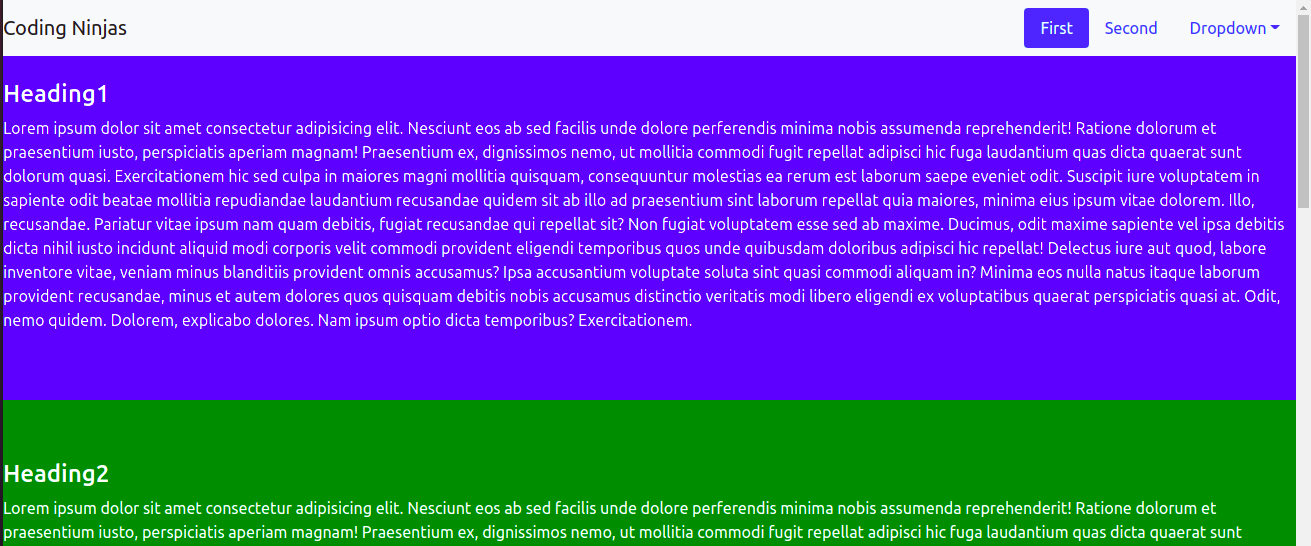
When we are at the Heading1, it highlights the First link in the navbar:
When we are at the Heading2, it will highlight the Second link in the navbar:
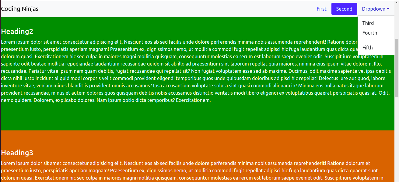
When we are at the dropdown menu link, it will highlight those links as well:
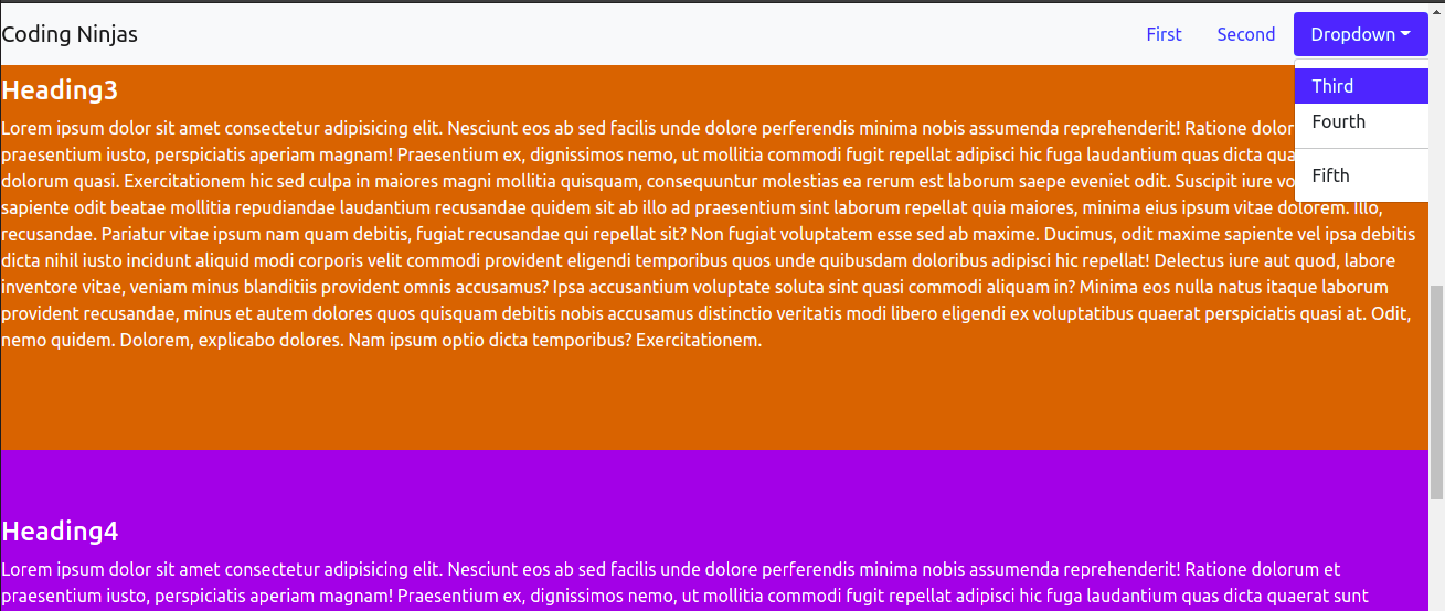
At the Heading3, it highlights the Third link from the dropdown menu.
To see all these outputs in your browser. Create an index.html file and paste the HTML code we have provided above. Run that file in the browser, and you will get to see all these outputs and the working of the Scrollspy plugin.
2.) Using JavaScript: After adding position: relative; in the CSS, we can call the scrollspy via JavaScript.
<script>
var scrollSpy = new bootstrap.ScrollSpy(document.body, {
  target: '#myNavbar'
})
</script>
You can also try this code with Online Javascript Compiler
Add the above Javascript code just before the end of the </body> tag. In this way, we don't need to add data attributes in the <body> tag, and still, our scrollspy will function properly.
Frequently Asked Questions
-
Jquery necessary to run all the bootstrap plugins?
No, Jquery is not necessary to run the bootstrap plugins from the bootstrap version 5 onwards. But they are necessary to include in the Bootstrap version lower than 5.
-
How to include all the bootstrap plugins at once?
We can include all the plugins at once using bootstrap.bundle.js or bootstrap.bundle.min.js.
-
Difference between Tooltip and Popover?
Tooltip appears when we hover over an element, while Popover appears when clicking on a particular element.
Key Takeaways
In this article, we learned about the working of different bootstrap plugins, including plugins, and a brief explanation about the Scrollspy plugin.
If you want to read more exciting web development blogs, you can visit Coding Ninjas Web Blogs.
Happy Learning!


 9+ registered

