Do you think IIT Guwahati certified course can help you in your career?
Introduction
Hello Ninjas! You must have experienced the overlays of content that appears on the website when you click a specific element. This feature is known as a popover. In this article, we will look at the Bootstrap popover plugin with examples and discuss its options, methods and events.
Bootstrap is a front-end development framework which is used to develop the front-end of the webpage using the pre-styled components. It is used to create attractive web pages with responsiveness. It provides a large number of features to create user-friendly websites.
Let's learn about Bootstrap Popover and see examples of it.
Bootstrap Popover
The popover component is used to display the additional content using an overlay on a web page. The popovers can be triggered upon clicks, hover, focus, etc. Bootstrap provides a popover plugin that can be used to create popovers.
Let's now discuss the examples of how to create different popovers.
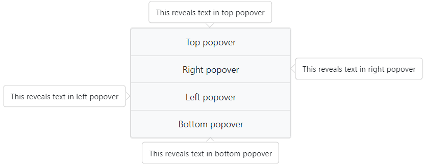
Popovers with Different Directions
We can provide the direction to the popover according to our choice. Let's see how we can create them:
Create an HTML document and include the CSS and JS files provided by Bootstrap. Refer to this.
Create a div with the class card; inside it, create a list using the class list-group. We can also create other components, like buttons, to trigger the popover.
Create individual list items and set the following attributes:
data-toggle = "popover"
data-placement = "direction"; it can be top, left, right, or bottom
data-content = "display_text"
Data-trigger = "event"; it can be set to click, hover, or focus.
Last, inside the script tag, we need to initialize the popovers. It can be done by writing $('[data-toggle="popover"]').popover().
Code
<!DOCTYPE html>
<html>

<head>
	<title>Bootsrap Popover</title>
	<link rel="stylesheet" href="pathToYour/bootstrap.min.css">
	<script src="pathToYour/bootstrap.bundle.min.js"></script>
</head>

<body>
	<center>
		<div class="card mt-5" style="width: 18rem;">
			<ul class="list-group">
				<li class="list-group-item bg-light"
				 data-toggle="popover" data-placement="top"
				 data-content="This reveals text in top popover">Top popover
				</li>


				<li class="list-group-item bg-light"
				 data-toggle="popover" data-placement="right"
				 data-content="This reveals text in right popover">Right popover
				</li>


				<li class="list-group-item bg-light"
				 data-toggle="popover" data-placement="left"
				 data-content="This reveals text in left popover">Left popover
				</li>


				<li class="list-group-item bg-light"
				 data-toggle="popover" data-placement="bottom"
				 data-content="This reveals text in bottom popover">Bottom popover
				</li>
			</ul>
		</div>
	</center>

	<script>
		$(() => {
			$('[data-toggle="popover"]').popover()
		})
	</script>
</body>

</html>
Output
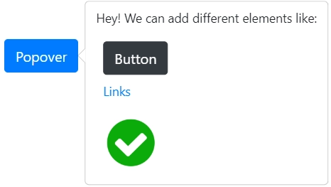
Popover with HTML
We can add HTMLelements inside the popover. Let's create a popover with a button, link, and image inside it. Follow these steps:
Create an HTML document and include the CSS and JS files provided by Bootstrap. Refer to this.
Use <a> tag, and as usual, set its role as a button and data-toggle as a popover.
To add an HTML element inside the popover, we need to set data-html = "true".
Now we can create any element inside the data-content attribute. Simply add some text, a button, a link, and an image.
Inside the script tag, initialize the popover by writing $('[data-toggle="popover"]').popover()
Bootstrap provides some configuration options that can be used to customize the popover. They can be passed through data attributes. We have to write data- before the option to use them for data attributes. For example, data-html is used to insert HTML in the popover.
Let's discuss some of them:
animation: It specifies the animation when the popover is shown or hidden. Its default value is true.
container: It defines the container element to which the popover should be appended. The default value of this option is false, which specifies that the popover will be appended to the body element.
delay: It defines the delay before the popover is shown or hidden. It can be provided as a number or an object with keys as show and hide. Its default value is 0.
html: To insert HTML in popovers, the value of this option should be set to true. Its default value is false, that means text will be inserted in the popover.
placement: It defines the position of the popover. The default position is right. We can specify it as left, right, top, bottom, or auto.
selector: It defines the selector for the elements that should trigger the popover. Its default value is false.
title: It is used to set the title of the popover. It can be set to a string, object, or function that returns text.
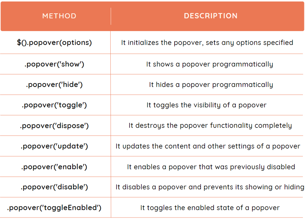
Bootstrap Popover Methods
We can control the Popover using several methods provided by Bootstrap. They are used to trigger the popover on the basis of events or user input. For example, the method $('#element_ID').popover('hide'); is used to hide the popover by specifying its ID.
We can use the following methods to control it using JavaScript:
Example
We can also initialize the popover using the method $().popover(options). Let's see how it can be done.
We have created a button and provided it with an ID. The code written in the script tag creates a popover when the document is ready. The ID of the button is used to select it, and the .popover method will create the popover with the specified content and placement.
Output
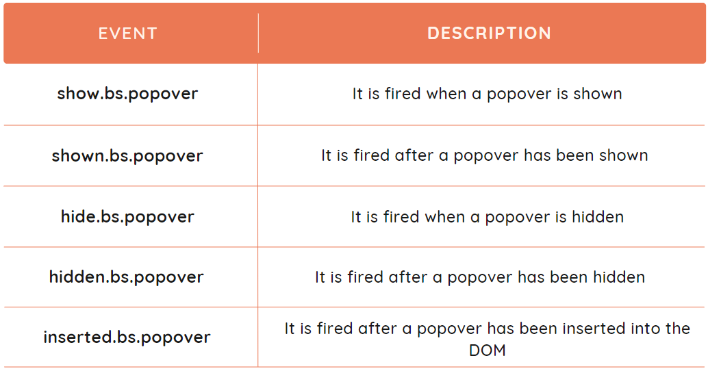
Bootstrap Popover Events
The events are actions which occur in a browser, like clicking a button. The Bootstrap popover provides certain events that are used to perform the additional actions when the popover element is shown or hidden.
The events provided by the Bootstrap Popover component are listed below.
Example
Let's discuss an example to show the implementation of show.bs.popover and hide.bs.popover events.
Code
<!DOCTYPE html>
<html>
<head>
<title>Bootsrap Popover</title>
<link rel="stylesheet" href="pathToYour/bootstrap.min.css">
<script src="pathToYour/bootstrap.bundle.min.js"></script>
</head>
<body>
<center>
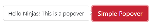
<button class="btn btn-danger" id="simple_popover">Simple Popover
</button>
</center>
<script>
$(() => {
$('#simple_popover').popover({
content: 'Hello Ninjas! This is a popover',
placement: 'left'
});
});
$(() => {
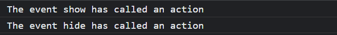
$('#simple_popover').on('show.bs.popover', () => {
console.log('The event show has called an action');
})
$('#simple_popover').on('hide.bs.popover', () => {
console.log('The event hide has called an action');
})
});
</script>
</body>
</html>
Explanation
We have used the same example to create a popover. The .popover() method is used to initialize the popover. The other code under the script tag is used to show the implementation of events. The ID of the popover element is used to bind the event listeners to it. The two event listeners are listening to the separate events and will print the message in the console when the event is triggered. Clicking the button twice shows the following output.
Output
Frequently Asked Questions
What are the advantages of using Bootstrap?
Bootstrap provides many pre-styled components like buttons, forms, etc. It is used to create responsive designs without any effort. The pages made using bootstrap components are faster and have more functionality.
What is the difference between CSS and Bootstrap?
CSS (Cascading Style Sheets) is a styling language that is used to customize the layout and styles of HTML documents. While Bootstrap is a front-end framework built on top of CSS, and it provides pre-designed UI components.
How can we update the content of the popover?
Bootstrap provides various methods to control the popover programmatically. One of the methods is .popover('update'). We can update the contents through this method.
When is the method .popover('hide') useful?
When our webpage contains multiple popovers, it is better to display only one popover at a time. The .popover('hide') method is used to hide all popovers when one is shown.
What is the use of inserted.bs.popover event?
The inserted.bs.popover can manipulate the custom styles to the popover after it has been inserted into the DOM.
Conclusion
This article discussed the Bootstrap Popover Plugin. We have seen different examples regarding the same. We have also discussed the options, methods and events provided by Bootstrap in the Popover Plugin.


 8+ registered

