How to implement?
If we want to include this plugin functionality individually, you will need transition.js once alongside the other JS files. Otherwise, you can have bootstrap.js or the minified bootstrap.min.js.
Transition.js is a basic helper for transitionEnd events and a CSS transition emulator. It is used by the different plugins to check for CSS transition support and to catch hanging transitions.
We can implement the transition plugin using Modals, Tabs, Alerts and Carousel in Bootstrap. We can learn more about these components in Bootstrap from the links mentioned below.
Usage
We will learn about the common concepts which use the transition plugin in Bootstrap.
Modal Plugin
A Bootstrap Modal Plugin is a separate child window floating over the parent window. Its purpose is to provide additional information and interaction to the user without leaving the parent window.
Implementation of Modal Plugin
<!-- Button trigger -->
<button type="button" class="btn btn-primary btn-lg" data-toggle="modal" data-target="#idName">
Modal Button
</button>
<!-- Modal -->
<div class="modal fade" id="idName" tabindex="-1" role="dialog" aria-labelledby="exampleModalLabel" aria-hidden="true">
<div class="modal-dialog" role="document">
<div class="modal-content">
<div class="modal-header">
<h5 class="modal-title" id="exampleModalLabel">Modal title</h5>
<button type="button" class="close" data-dismiss="modal" aria-label="Close">
<span aria-hidden="true">×</span>
</button>
</div>
<div class="modal-body">
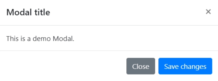
This is a demo Modal.
</div>
<div class="modal-footer">
<button type="button" class="btn btn-secondary" data-dismiss="modal">Close</button>
<button type="button" class="btn btn-primary">Save changes</button>
</div>
</div>
</div>
</div>
Output

On clicking the button, we get the following modal box.

Alerts in Bootstrap
Alerts provide contextual feedback messages for typical user actions with a handful of available and flexible alert messages.
Implementation of Alerts
<div class="alert alert-primary" role="alert">
 This is a primary alert—check it out!
</div>
<div class="alert alert-secondary" role="alert">
 This is a secondary alert—check it out!
</div>
Output

Some of the more examples of the transition plugin are:
Fading out tabs: We can find an example in the article Bootstrap Tab Plugin.
Sliding carousel panes: We can find an example in the article Bootstrap Carousel Plugin.
Frequently Asked Questions (FAQs)
-
What are transitions in Bootstrap?
Transitions are the animated changes between two pages or views. Transitions are developed through any kind of design element and can obtain more than what meets the eye.
-
What are transition plugins in Bootstrap?
Bootstrap's Transition plug-in enables transitions, smoother transition animations, easier and more flexibility to use and consume fewer resources.
Key Takeaways
We have learned about the various types of transitions in Bootstrap. We also learned about the transition plugins in Bootstrap. We also learned about the different methods and events of the transition plugin in Bootstrap. This article also explained the implementation of the usage of the transition plugin available in Bootstrap.
For additional information about the react framework for frontend development, get into the entire Frontend web development course.
Happy Learning!


