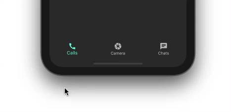
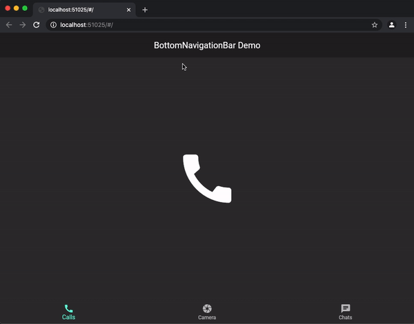
Displaying Bottom Navigation Bar
The BottomNavigationBar widget is assigned to Scaffold's bottomNavigationBar property:
Scaffold(
  appBar: AppBar(
    title: const Text('BottomNavigationBar Demo'),
  ),
  bottomNavigationBar: BottomNavigationBar(
    items: const <BottomNavigationBarItem>[
      BottomNavigationBarItem(
        icon: Icon(Icons.call),
        label: 'Calls',
      ),
      BottomNavigationBarItem(
        icon: Icon(Icons.camera),
        label: 'Camera',
      ),
      BottomNavigationBarItem(
        icon: Icon(Icons.chat),
        label: 'Chats',
      ),
    ],
  ),
);
The items property on the BottomNavigationBar is necessary. Entities accept the widget type BottomNavigationBarItem. BottomNavigationBarItem's sole purpose is to display the actual item contained within BottomNavigationBar.
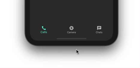
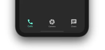
The code above shows the BottomNavigationBar with the first item set to default. As we click on the other things, the selection does not change:
Displaying Selection of Objects
We'll utilise two properties: ‘onTap’ and ‘currentIndex’, to show the selection of other objects.
int _selectedIndex = 0; //New
BottomNavigationBar(
  items: const <BottomNavigationBarItem>[
    ...
  currentIndex: _selectedIndex, //New
  onTap: _onItemTapped,         //New
)
//New
void _onItemTapped(int index) {
  setState(() {
    _selectedIndex = index;
  });
}
The value of the presently selected item is stored in the _selectedIndex variable. The currentIndex attribute is assigned the value _selectedIndex.
OnTap of BottomNavigationBar is assigned the _onItemTapped() callback, which returns the index when the item is tapped. Simply posting a currently selected item index to _selectedIndex and setting the state to selected will display the item in the BottomNavigationBar.
Showing the Selected Object’s Page
We don't have any pages to show based on the selected item right now.
//New
static const List<Widget> _pages = <Widget>[
  Icon(
    Icons.call,
    size: 150,
  ),
  Icon(
    Icons.camera,
    size: 150,
  ),
  Icon(
    Icons.chat,
    size: 150,
  ),
];
Scaffold(
  appBar: AppBar(
    title: const Text('BottomNavigationBar Demo'),
  ),
  body: Center(
    child: _pages.elementAt(_selectedIndex), //New
  ),
  bottomNavigationBar: BottomNavigationBar(
    ...
  ),
);
A list of widgets is kept in _pages. We're only showing a massive icon of the item to keep things simple.
The remainder of the magic is done by displaying one page in the center of the screen from _pages based on the item's _selectedIndex.
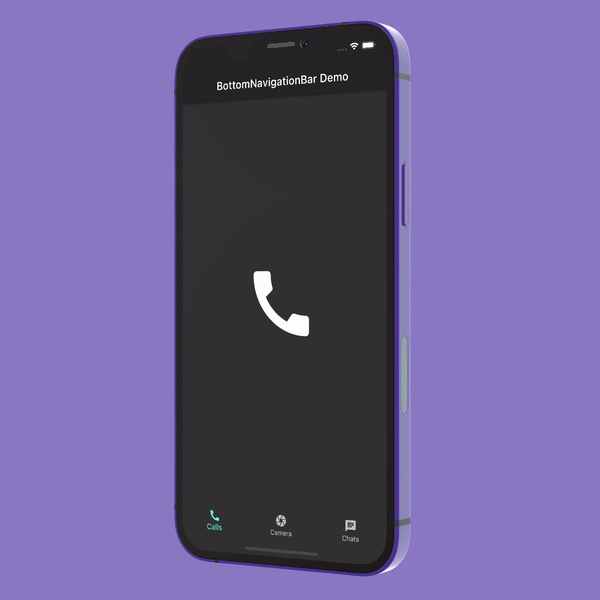
BottomNavigationBar is now up and running:

BottomNavigationBar Customization
BottomNavigationBar features a lot of customization options to suit your needs. Let's take a closer look at some of the properties you can customize.
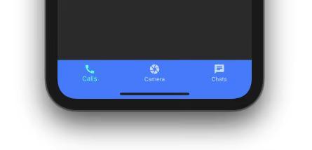
Color of the Background
To fit your brand, you might wish to modify the BottomNavigationBar's background color. Simply use the backgroundColor property to accomplish this.
BottomNavigationBar(
  backgroundColor: Colors.blueAccent,
  items: const <BottomNavigationBarItem>[
    ...
  ],
)
Elevation
The BottomNavigationBar is elevated 8 points from the surface by default, making it appear on top of pages. This property can be set to any value:
BottomNavigationBar(
  backgroundColor: Colors.white10,
  elevation: 0,
  items: const <BottomNavigationBarItem>[
   ...
  ],
)

Icon Dimensions
You may use the iconSize property to change the size of all the icons at once:
BottomNavigationBar(
  iconSize: 40,
  items: const <BottomNavigationBarItem>[
    ...
  ],
)
Mouse Pointer
You can adjust the mouse pointer when it lingers over an item on the BottomNavigationBar when running on the web:
BottomNavigationBar(
  mouseCursor: SystemMouseCursors.grab,
  items: const <BottomNavigationBarItem>[
    ...
  ],
)
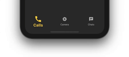
Featured Item
Several selected characteristics of BottomNavigationBar can be used to differentiate a selected item from an unselected one:
BottomNavigationBar(
  selectedFontSize: 20,
  selectedIconTheme: IconThemeData(color: Colors.amberAccent, size: 40),
  selectedItemColor: Colors.amberAccent,
  selectedLabelStyle: TextStyle(fontWeight: FontWeight.bold),
  items: const <BottomNavigationBarItem>[
    ...
  ],
)
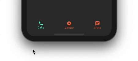
Non-Featured Items
You could also want to alter the appearance and feel of non-selected items. You can utilize the following properties on the BottomNavigationBar:
BottomNavigationBar(
  unselectedIconTheme: IconThemeData(
    color: Colors.deepOrangeAccent,
  ),
  unselectedItemColor: Colors.deepOrangeAccent,
  items: const <BottomNavigationBarItem>[
    ...
  ],
)
Frequently Asked Questions
What is the BottomNavigationBar widget in Flutter?
A bottom navigation bar is a material widget that appears at the bottom of an app and allows users to select or navigate to different app pages. It's frequently utilized in conjunction with a Scaffold, and it's often the Scaffold itself.
Why is BottomNavigationBar used within the Scaffold widget?
Since most apps now use this widget for navigation across different displays, many developers use bottom navigation. Flutter's bottom navigation bar can contain various objects, including text labels, icons, or both. It lets the user swiftly switch between the app's top-level displays.
What is Elevation in BottomNavigationBar in Flutter?
The z-coordinate at which this material should be placed about its parent. This determines the size of the shadow behind the material and the opacity of the elevation overlay color if one is used.
What is Scaffold in Flutter?
The Scaffold is a flutter class that contains numerous widgets or APIs such as Drawer, SnackBar, BottomNavigationBar, FloatingActionButton, AppBar, etc. The Scaffold will extend or take over the entire screen of the smartphone. It will take up all of the available room.
What is the use of mouseCursor property in BottomNavigationBar in Flutter?
When a mouse pointer enters or hovers over things, the cursor changes.
MaterialStateProperty.resolve is used for the following MaterialStates if mouseCursor is a MaterialStateProperty<MouseCursor>:
If the value of BottomNavigationBarThemeData.mouseCursor is null, the value of BottomNavigationBarThemeData.mouseCursor is used MaterialStateMouseCursor.clickable is utilised if that is also null.
Conclusion
In this article, we demonstrated how to integrate and adjust the BottomNavigationBar in this article. We also discussed a variety of use cases and examples that you'll likely come across while building a full-fledged Flutter app.
We hope that this blog has helped you enhance your knowledge regarding BottomNavigationBar in Flutter. If you want to learn more, check out our articles on Flutter TextField, Flutter Stateful and Stateless Widgets, Flutter Forms, and Flutter Card.
Refer to our guided paths on Coding Ninjas Studio to learn more about DSA, Competitive Programming, JavaScript, System Design, etc. Enroll in our courses and refer to the mock test and problems available; look at the Top 150 Interview Puzzles, interview experiences, and interview bundle for placement preparations.
Do upvote our blog to help other ninjas grow.
Happy Coding!


 18+ registered

