


Introduction
Importance of Data Visualization
Data Visualization is the process of taking raw data and transforming it into graphs, charts, or images to derive meaningful insights from it.
It enables us to gain a qualitative understanding of the data by helping us identify new patterns, trends, outliers, and much more from the data. We can demonstrate the key relationships in the data and the numerical measures in different plots and graphs, which can help us and the stakeholders gain an overall sense of the data.
Thousands of rows of data can be easily visualized in graphs and pie charts. It would be straightforward for a product-based company to understand how their product is performing comparatively in different regions by visualizing its sales in a pie chart(in percentage sold in each region) rather than looking at only the sheer numbers of the sales for each region.
Therefore, Data Visualization is a crucial technique for businesses. Data can be visualized in a variety of ways with the help of plots such as the line plot, scatter plot, box and whisker plot, histogram plot, pie charts, and much more.
In this blog, we will study the box and whisker plot.
Terminologies
Before we dive deep into the boxplot, Let us learn about some statistical terminologies which are essential for the complete understanding of the plot.
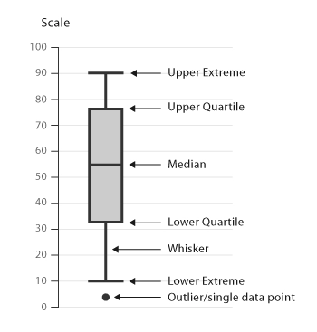
Median
Median is the value separating the higher half from the lower half of the data sample, i.e., it is the middle value of the data sample.
Quartiles
Like the median divides the data so that 50% of the data lies below the median and the other 50% lies above the median, quartiles divide the data into quarters. We will learn about some essential terminologies related to quartiles depicted in the box and whisker plot.
- First Quartile(Q1 or 25th percentile) - The lowest 25% of the numbers lie in the first quarter. The first quartile(Q1) value is the median of the lower half of the dataset.
- Second Quartile(Q2 or 50th percentile)- The 25.1% to 50%(up to the median) of the number lie in the second quarter. The second quartile (Q2) value is the median itself.
- Third Quartile(Q3 or 75th percentile)- The 50.1% to 75% of the numbers lie in the third quarter. The Third Quartile(Q3) value is the median of the upper half of the dataset. The highest 25% of the numbers lie in the fourth quarter.
- Interquartile Range(IQR)- It is the difference between the third quartile (Q3) and the first quartile (Q1). - IQR= Q3-Q1
- Outliers- Outliers are all the data points that do not lie between the range (Q1-1.5*IQR) and (Q3+1.5*IQR).
- Minimum(Q0 or 0th percentile)- It is the lowest data point (excluding any outliers).
- Maximum(Q4 or 100th percentile)- It is the highest data point (excluding any outliers)


 8+ registered

