Do you think IIT Guwahati certified course can help you in your career?
Introduction
Tableauis a business intelligence software used for data visualization and analysis. Tableau software helps us to create interactive components with the help of graphs, charts, reports, etc. This makes it easier to visualize data, observe and analyze the trends in the data. Tableau offers an extended range of features and tools and supports various data formats like spreadsheets, databases, etc. These features help in making the analysis and visualization easier for the user.
Today, Tableau is used widely across many industries. Business intelligence, data visualization, e-commerce, finance, social media monitoring, healthcare etc. are some of the most widely used industries which make use of Tableau for their data operations.
What is a Histogram in a tableau?
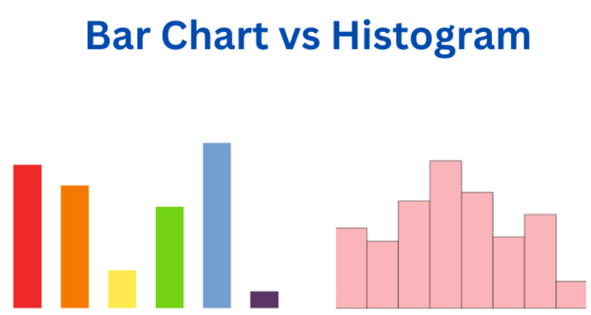
A Histogram is a potent tool for data visualization in Tableau. It helps the user understand the data distribution within a dataset in an easier and more efficient manner. A Histogram shows the user a graphical representation of data within specified ranges and intervals.
Histograms are very similar to Bar Charts, with the distinction being that histograms are used to plot continuous data. On the other hand, Bar charts are used to plot discrete data. Generally, the width of each interval is kept the same to get a better visualization of the dataset. This article will discuss the steps involved in implementing a Histogram in Tableau and how it is used to visualize data. Still, first, we need to understand some of the critical features of Histograms in Tableau.
Features of a Histogram
Histograms in Tableau allow the user various features, which makes it flexible to use and ultimately makes the visualization of the dataset much easier. Here are some of the most valuable parts of histograms in Tableau.
Flexible Range Size - Tableau allows us to adjust the range of each interval and the number of ranges, also known as bins. This makes the Histogram a flexible tool that can be altered per our needs. For example if the data seems to be cramped, we can reduce the interval size to distribute it across more ranges for better visualization.
Customization - Tableau has the features to customize the Histogram according to a user's needs. Tableau provides customizations like colors, size, opacity, gradient, etc. These features allow the user to change the visual appearance of the Histogram to make it look more appealing.
Dynamism - Histograms in Tableau have the feature to change their properties on user interactions. For example, we can click on a specific bar of the Histogram to get an elaborative view of the data that particular bar represents.
Calculations - Histograms can automatically calculate each bar's frequency (height) from the data given in the dataset. This saves a user's time and makes the analysis process more straightforward. For example, we do not have to manually calculate percentages for a particular section of the histogram. We can simply do this with the help of a separate calculation section provided in Tableau.
Miscellaneous Tools - Histogram also provides various tools and filters which are helpful to segregate data during the analysis process.
Implementing a Histogram in Tableau
Now that we have learned about Histograms and their key features in Tableau, we will discuss the steps involved in creating a Histogram in Tableau.
Step 1: Login to Tableau online
To use the Tableau software online, you can head over to the Tableau website and log in using your credentials.
Step 2: Create a new Workbook
To create a new Workbook, click the New dropdown and select the Workbook option.
Step 3: Connect the data to the workbook
To connect your data, you can either upload your custom data or use the sample data on the website. In this example, we will use the Sample-Superstore data source.
Step 4: Add the data to the view
After you have connected your data with the workbook, drag and drop the Quantity field from the Tables section to the Columns section.
Step 5: Select the Histogram chart
Click on the Show Me option on the top right column on the sheet and select the Histogram view.
Quantity measures the number of items in a particular order. The Histogram will look something like this.
Step 6: Explore the features of Histogram
We can also detect relationships between various quantities using Histograms. Let's see the relationship between the customer segment and the number of items per order.
To do this, drag the Segment fieldto Color in the Marks field.
The updated Histogram will look like this: each color shows a different buyer segment like a home office, consumer, and corporate.
Step 7: Show the percentage share of each segment.
The bars do not show a clear trend for each segment. To display the percentages of each segment, we can add the CNT (QUANTITY) from the Rows segment to the Label field.
Now each section of each bar shows its respective frequency. We can also convert this frequency to their respective percentage of the total quantity.
To calculate the percentage, click the dropdown menu on the CNT (QUANTITY) field and select the Add Table Calculation option.
Customizing Histograms
Tableau offers various tools to customize Histograms. These customizations help the user to change the appearance as well as other parameters to visualize the data according to the user's needs. Some of these customizations are listed below.
Adjusting Interval size - We can change the interval size of the histogram to get a more comprehensive view of the data in the histogram. By adjusting the interval size we can also alter the number of bins to make the histogram more compact or large.
Changing Color Scheme - As shown in the previous section, we can assign separate colors to different quantities to clearly distinguish between them. This makes the Histogram look more visually appealing and easier to understand.
Adding Annotations - Annotations can also be added to the Histogram to provide more context regarding the dataset. Annotations may include text, shapes etc. to highlight the important parts of the Histogram.
Calculations - We can also make use of the calculation feature present in the Histogram to enhance the Histogram. For example instead of just indicating just numbers, we can make each bar represent the percentage it is occupying to get a better understanding of the data.
Benefits and Limitations of Histograms in Tableau
Histograms are a handy data visualization tool in Tableau that can make data visualization very easy. But there are also some limitations to it. In this section, we will discuss both benefits and limitations of Histograms.
Benefits
Visualization - Histograms make the data visualization process much easier by providing an overview of the data in the form of bars. Histograms also allow the user to change the interval size to get a more clear visualization of the data. This allows the user to easily observe various factors like percentages and frequency.
Dynamism - Histograms in Tableau also have the features to dynamically change their properties on user interactions, like hovering and clicking over specific bars to see their properties, etc.
Customization - We can use the appearance tools of Histogram to change the color, style, opacity, etc., of individual bars to make the Histogram look more aesthetically appealing.
Multiple Features & Tools - Histograms provide various filters and tools which are helpful for automatic calculation in the dataset. This helps in saving the time and effort of the user.
Limitations
Simplification - Histograms make the data look very simple and easy to understand. Using Histograms we can simplify the data in the form of separate bars to analyze the general trend in the data. But sometimes, this simplification can hide important underlying data, which can be essential for visualization.
Discrete Data - As discussed in the previous sections, Histograms can only be used for visualizing continuous data. If the data is discrete, Histograms cannot be used for visualization.
Single Variable - Tableau Histograms can only plot a single variable's distribution with its frequency. Histograms cannot be used to visualize interdependency between two or more variables.
Frequently Asked Questions
Can we create multiple Histograms in Tableau?
Creating as many Histograms as the user needs in Tableau is possible. The user can create multiple Histograms by using different combinations of data fields for the dimensions of the Histogram and compare them with each other.
How can we export Histograms to other formats from Tableau?
Tableau allows the export of Histograms to other formats like images, PDFs, etc. To export a Histogram from Tableau, head to the file menu and select the required form from the export option.
What are the various types of visualization techniques we can apply to Histograms in Tableau?
Tableau provides multiple visualization techniques that a user can use to make data visualization easier. These techniques include sorting the bars of histograms (ascending and descending), applying animation to the histogram bars, changing the appearance of the bars (color, opacity), etc.
Conclusion
In this article, we discussed building Histograms in Tableau, some key features of Histograms and the steps required to build Histograms in Tableau. In the end, we concluded by discussing some benefits and limitations of Histograms in Tableau. So now that you have learned about building histograms in Tableau, you can also refer to similar articles.


 8+ registered

