Do you think IIT Guwahati certified course can help you in your career?
Introduction
With the volume of data increasing day by day, it has become very difficult to understand the trends in the data. To solve this problem, we have many data processing and visualization tools, and Tableau comes under the umbrella of such tools.
In this article, we will explore the topic of Building Maps in Tableau in detail. We will discuss the features and application of maps in Tableau and discover the different types of Maps offered by Tableau. Further, we will also learn the skill of creating and customizing maps in Tableau.
Data Visualization with Tableau
Tableau is an efficient data visualization software that is widely used by businesses and data analysts. It allows users to connect different datasets and worksheets. Building Maps in Tableau is another important feature that is used to create visually attractive dashboards and charts, which can be used to understand the patterns in data better. The appearance of the dashboards can be customized by adding filters and making them more interactive.
Introduction to Maps in Tableau
Building Maps in Tableau are a powerful feature that can be used to represent data in Tableau. When the complexity of data increases, it becomes more difficult to find patterns in the data, even though they are in the form of organized tables. Data analysis with the help of maps can also be used to find valuable information from large databases. Building Maps in Tableau are used widely when we have to deal with demographic data like population polls, income statistics, etc., or location-based data like the coordinates of latitudes and longitudes. More specifically said, Tableau maps are used to analyze spatial data.
Spatial Data in Data Analysis
Spatial data is the data that includes geographic locations or coordinates. It includes data that can be represented in maps as points, lines, polygons, or raster data.
The spatial data can be analyzed to uncover data trends in large datasets. Spatial data can cover questions of literacy rate, rate of obesity, movement of storms, location of transportation networks, etc.
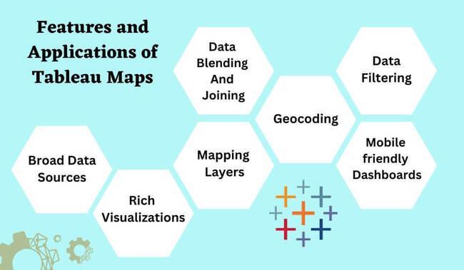
Features and Applications of Maps
Building Maps in Tableau offers a wide range of features and applications. Some of them are:
Broad data sources: Tableau can work easily with different types of data irrespective of whether it is stored in files with CSV or Excel format, cloud systems like Azure, or relational databases like MySQL, Oracle, etc. Thus, users can easily connect Tableau to different types of data sources and see the information with the help of Building Maps in Tableau.
Rich Visualizations: Tableau offers a wide range of visualizations in maps, charts, graphs, etc., thus allowing users to create attractive visualizations to understand and communicate with the data efficiently. Users can select different map styles, including normal, light, and dark themes.
Mapping layers: The process of Building Maps in Tableau can be enhanced by adding extra layers of roads, boundaries, etc. These layers make the maps more informative.
Data blending and joining: Tableau allows users to blend with the help of its wildcard-union feature. Data joining from multiple data sources is also possible through the cross-data join property. This saves a lot of time by eliminating the complexity of data analysis on different datasets.
Geocoding: Tableau also supports geocoding, where the address or the place names can be converted to geographic coordinates. This increases the accuracy of the plotting of locations on the map.
Data filtering: Filters can also be applied to different data sources at the same time without disrupting the consistency of datasets.
Mobile-friendly dashboards: Tableau also offers interactive dashboards that can be viewed on mobile devices, thus allowing users to access and visualize their data anytime and from anywhere using their mobiles or tablets.
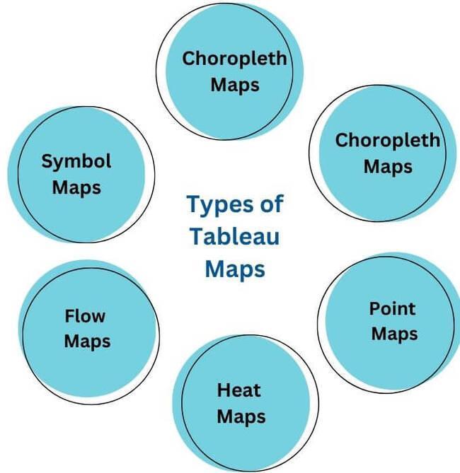
Different Types of Maps in Tableau
Tableau offers six different types of maps to visualize spatial and complex data. They are:
Choropleth maps (filled maps)
Point distribution maps
Heatmaps or density maps
Flow maps
Symbol maps
Spider maps
Now let us explore each of the different types of maps in detail.
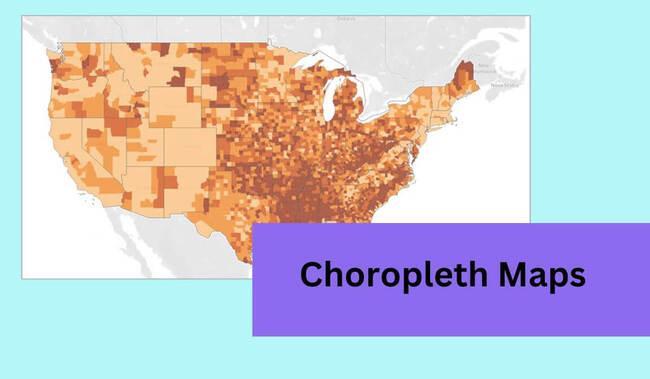
Choropleth maps (filled maps)
Choropleth or filled maps use different color intensities to represent statistical data within geographic boundaries, like countries, states, or regions that can be geocoded in Tableau. Each color shade represents a different ratio or attribute.
(src: tableau.com)
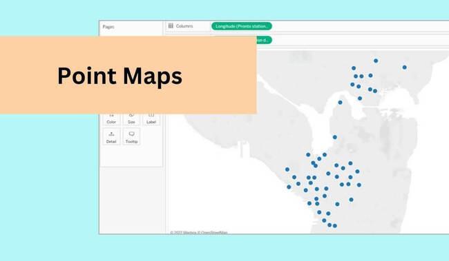
Point distribution maps
Point maps display each data point as a marker on the map. Point maps are used to show the distribution and clustering of data points across different geographical locations. They give an approximate idea of where the specific data points are located, thereby helping in recognizing patterns.
For example, point distribution maps can be used in retail to analyze the location of stores and identify areas with a higher concentration of customers.
For point distribution maps, your data sound includes the latitude and longitude coordinates.
(src: tableau.com)
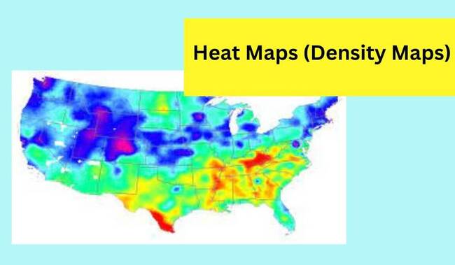
Heat maps or density maps
Heat maps, or density maps, are used to visualize large volumes of data and find their trends. These maps provide a clear understanding of data patterns by using different color gradients to show the density of a specific attribute in an area.
Heat maps can be used in website analytics for user interaction. Because of their quick self-explanatory nature, heat maps are considered more valuable for understanding complex data patterns.
(src: tableau.com)
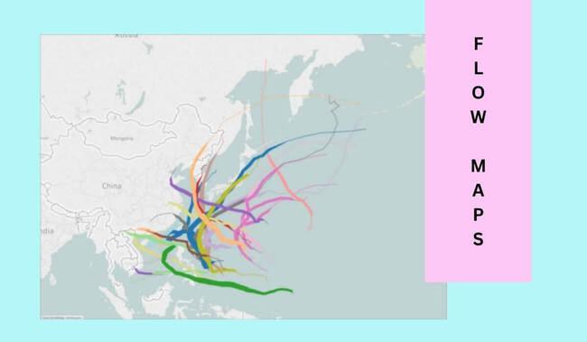
Flow maps
Flow maps are also known as path maps in Tableau. They are used to show the flow of data or the occurrence of an event from one location to another with time. They are more specifically used to show the path of movement, for example, the movement of monsoon wind or thunderstorms. Here the data points in the map are connected using lines and arcs to understand the flow. Hence they can also be used to show transportation networks.
(src: tableau.com)
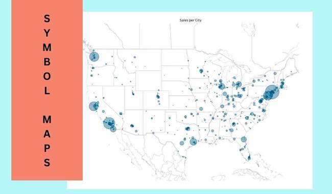
Symbol maps
Proportional symbol maps are also called graduated symbol maps. Symbol maps are the most interesting type of Maps in Tableau. Here Users can use custom symbols or icons to represent the data points. Tableau offers many symbols for the same.
Symbol maps are good for visualizing quantitative data associated with different locations. For example, regions in India where rice crops are grown can be represented using symbol maps.
(src: tableau.com)
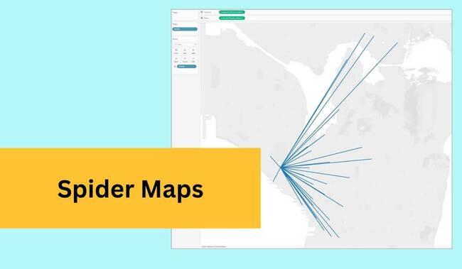
Spider maps
Spider maps are widely used to define the connectivity between various points or locations. They give a clear representation of paths from one point to many points.
Spider maps are used in Tableau to find migration patterns and connections between different locations with respect to suppliers and customers in businesses. Users can also perform spatial calculations to create spider maps.
(src: tableau.com)
Creating a Map in Tableau
To create a map in Tableau, you can follow the steps below:
Step 1:
Connect to your data source containing the data points to be visualized on a map.
Step 2:
Identify the geographic fields in the data. Geographic fields include countries, states, cities, or coordinates of latitudes and longitudes. Now drag and drop this field into Tableau's rows or columns shelf.
Step 3:
By default, Tableau creates a map using the filled map mark type. However, this can be changed to other mark types depending on the visualization you want to create. To do this, you can click on the "Show me" button in the top right corner of the Tableau desktop and select the desired mark type.
Step 4:
You can customize the appearance of your map by changing the map style, labels, colors, and background.
Step 5:
Now apply the filters to focus on specific regions or sets of data.
Step 7:
Once you are done with customizing your map, you can save it as a Tableau workbook file and publish it to the Tableau server. You can also export it and add it to your documents or presentations.
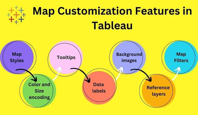
Customizing a Map in Tableau
While customizing a map in Tableau, you can have many options to make it more appealing and interactive. Some of the customization features for Building Maps in Tableau are:
Map styles: Tableau provides different map styles, including normal, light, dark, and satellite. One can select map styles from the map menu.
Color and size encoding: You can also format the data points in your maps with different colors and sizes. This can be done with simple drag and drop.
Data labels: You can also add labels to your map to display information associated with each data point.
Background images: You can customize your map by changing the background images. Tableau enables you to import and overlay custom images.
Reference layers: Tableau comes with the feature of reference layers. By adding reference layers to your maps, such as boundaries, roads, terrain, coastlines, zip codes, or other geographic attributes. These layers help in understanding the spatial relationships of your data better.
Map filters: Map filters can be added to your map to focus on specific sets of data on the map. These filters act as limitations to the data on the map.
Tooltips: Tooltips provide additional information when you hover over a particular point on the map. You can customize the content of the data of tooltips.
Frequently Asked Questions
What is Tableau?
Tableau is an efficient data visualization tool that is widely used by businesses and analysts. It allows users to connect different databases and Excel sheets. Tableau offers different types of maps to represent data and spot patterns in them.
What are the different types of Building Maps in Tableau?
Tableau offers six different types of maps to visualize spatial and complex data. They are:
Choropleth maps (filled maps), Point distribution maps, Heatmaps or density maps, Flow maps, Proportional symbol maps, and Spider maps.
Briefly explain the purpose of spider maps in Tableau?
Spider maps are used to mark the connectivity between various points or locations. They give a clear representation of paths from a single point to many points. Spider maps are used in Tableau to find migration patterns and connections between different locations.
Can you customize Building Maps in Tableau?
Yes, Building Maps in Tableau can be customized to make them more appealing and interactive. The different customization options available in Tableau are map styles, color and size encoding, adding labels, tooltips, importing background images, adding reference layers, map filters, etc.
Conclusion
Congratulations, Ninja, on finishing this article! Building Maps in Tableau are an important feature used to visualize data and identify data trends in the datasets.
We hope this blog has helped you understand Tableau maps better. Keep learning! We suggest you read some of our other articles on Data Analytics:
But suppose you are just a beginner and are looking for questions from tech giants like Amazon, Microsoft, Uber, etc. For placement preparations, you must look at the problems, interview experiences, and interview bundles.


 8+ registered

