Introduction
A chart axis serves as a scale or reference line for data plotted in a chart.
There are two types of chart axes in Excel.
- A value axis is used to plot numeric data and is the first type. A value axis is frequently used as the vertical axis in a chart.
- A category axis, which generally appears as a horizontal axis, is the other primary axis type. To organise dates or text, a category axis is employed.
Excel displays the axis name when you hover your cursor over an axis in an Excel chart. This kind of axis will always be in parentheses.
The number of axes in a chart varies depending on the chart type. There are no axes in pie, doughnut, sunburst, or treemap charts. Excel's conventional two-dimensional charts have two axes in these examples: a bar chart, line chart, and area chart. A supplementary vertical axis is available in many chart formats. A secondary vertical axis is utilised to represent net profit in this example. As a result, the chart has three axes in this situation. The depth axis is the third axis in Excel three-dimensional charts. The depth axis is sometimes known as the z-axis or series axis. It permits data to be plotted along with a chart's depth.

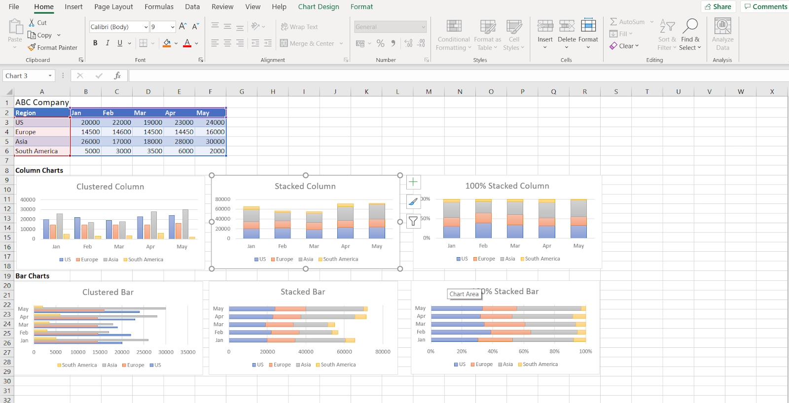
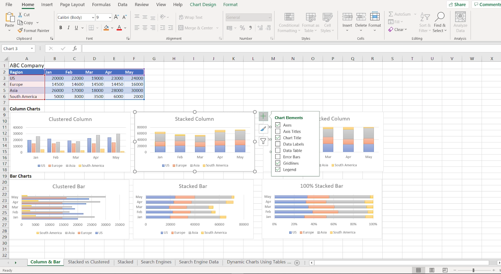
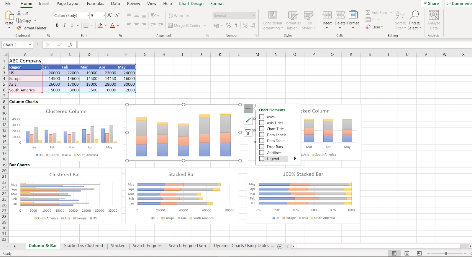
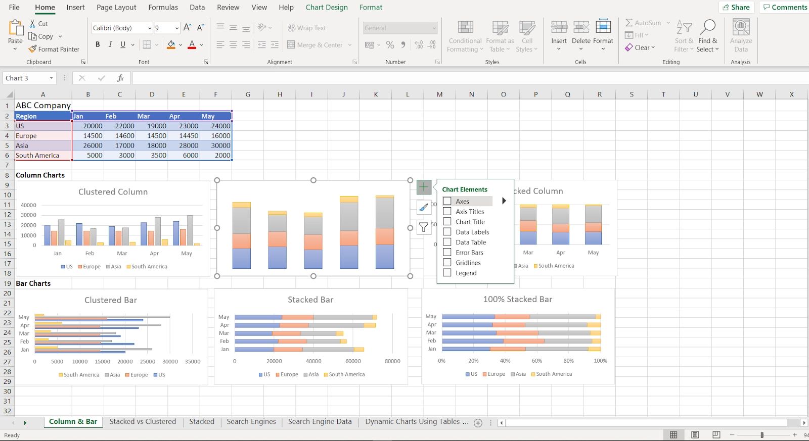
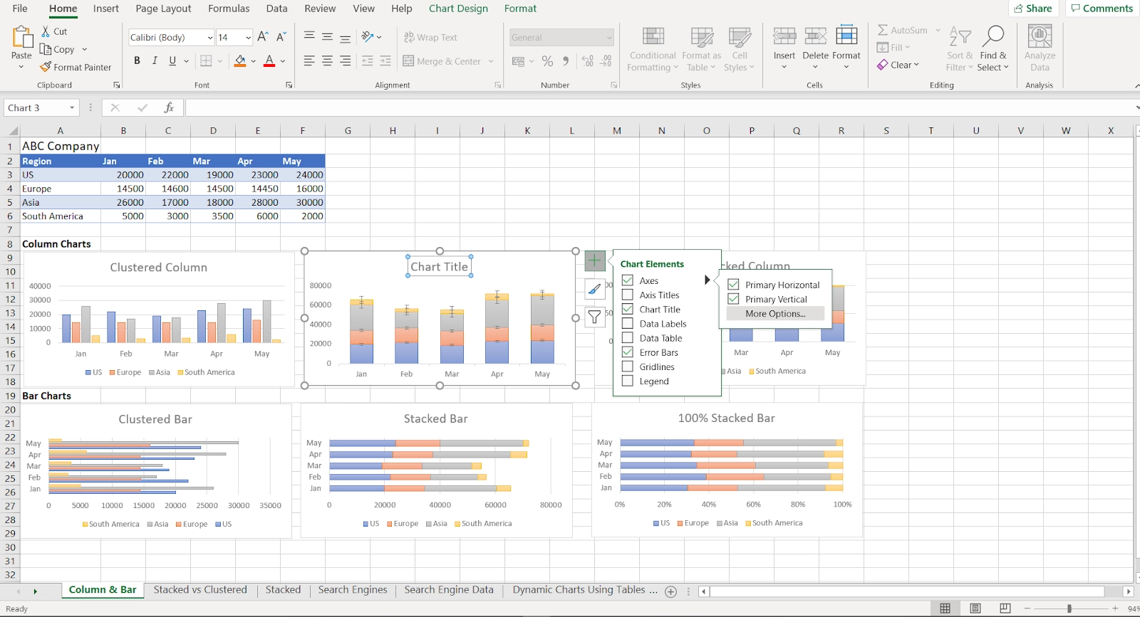
Axes are not displayed in the same way in all chart formats. Numeric values are displayed on both the horizontal and vertical axes in XY scatter charts and bubble charts. This XY spreads chart, for example, demonstrates how the cost of a hiking tent decreases as weight increases. These components have numerical values in the chart, and the data points are shown on the x and y axes about those values. Numeric numbers appear on the vertical axis while categories appear on the horizontal axis in column, line, and area charts. The vertical axis in this column chart, for example, is a value axis that plots sales, while the horizontal axis is a category axis that plots quarters. The interest rate is represented vertically, while time is planned across the horizontal category axis in this line chart. The Chart Elements menu may show or hide the chart axes. For example, we may use the checkbox to hide and show the vertical axis in this chart. Excel gives you a lot of flexibility regarding how axes are structured and displayed.
What are Axes
An axis is a horizontal or vertical line that contains units of measure in a chart or graph in Excel or Google Sheets. Axes run along the plot area of column charts, bar graphs, line graphs, and other charts. The units of measure are shown on an axis, which serves as a frame of reference for the data in the chart. The axes used to measure and categorise data in most charts, such as column and line charts, are:
- The Y or value axis is the vertical axis.
- The X or category axis is the horizontal axis.
An axis title that contains the units displayed in the axis is used to identify all chart axes. Some chart formats do not require axes to represent data, such as bubble, radar, and pie charts.
3-D Chart Axes
Three-dimensional charts feature the third axis and the horizontal and vertical axes. The z-axis, the secondary vertical or depth axis, depicts data on a chart's third dimension (depth).
Vertical Axis
The y-axis runs vertically along the left side of the plot area. This axis scale usually is determined by the data values presented in the chart.
Horizontal Axis
The horizontal x-axis, located at the bottom of the plot area, has category titles derived from the worksheet data.
Secondary Vertical Axis
On the right side of a chart, a second vertical axis presents two or more data types in a single chart. It's also used to make graphs of data values.
A climate graph, also known as a climatograph, is a combination chart that utilises a second vertical axis to represent temperature and precipitation data across time.

 5+ registered