Get a skill gap analysis, personalised roadmap, and AI-powered resume optimisation.
Introduction
When we require two different sets of data to be represented on a single chart we can achieve that using the combination chart. A combination chart is a graph that combines two different types of charts into one. The combination chart can depict two independent kinds of data that are tied to a common point on a single graph. This is a column chart with a line chart placed over it. A dual Y-axis can be used in a combination chart to depict two separate measurement scales. The dual Y-axis can be enabled in the chart display options.
Combination Chart
Multiple series and dual axes make up a combination or dual Y-axis. Although additional chart combinations are conceivable, they consist of a line chart overlaid on a column chart. Combination charts are a versatile way to display data and the foundation of analytical tools like the Pareto Analysis.
You have the option of using area, column, line, or dot charts, and you can mix and match them as needed. Keep in mind the order in which charts are layered on each other while selecting chart kinds. Area charts are always at the bottom of the chart, followed by column charts, line charts, and dot charts at the top. A combination of column and line charts is utilized in these instances.
Creating Combination Chart
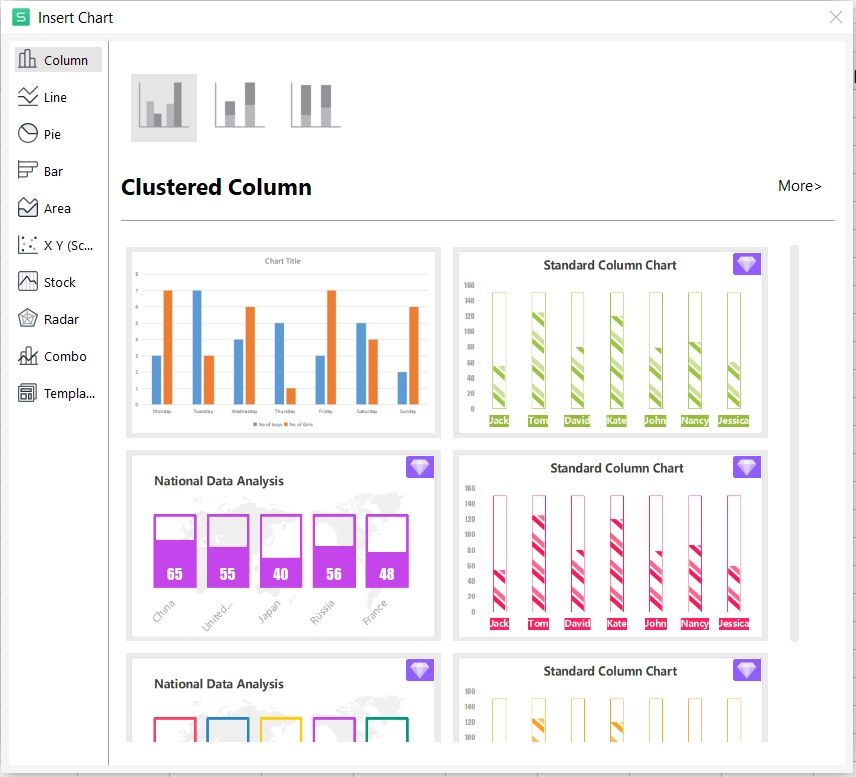
In the following example, we are going to make a combination chart of the table of the attendance of the class for data of a week. The data represents the number of boys and the number of girls present on a particular day.
Select the data range in the spreadsheet for which you want to create the chart.
2. Go to the Insert button to insert a chart.
3. Now you can see a lot of types of charts that you can create.
4. Chose the combo chart (Combination Chart) you want to create and then fill all the entries of the rows and columns. Here we are selecting the Clustered Column for the No of boys and Line for No of Girls.
5. Now you have successfully created the desired Combination chart for the attendance of boys and girls in a particular week.
Zero Values of Combination Charts
Line charts do not show zero values at the end of a data collection. On a combination chart, the first series, a column chart, is set to display zero values by default. The line chart will display zero values at the conclusion of the data series if you change it from a column to a line chart. This is because the Line chart will follow the Column chart's default behavior.
The last series selected, which is displayed as a line chart by default, will not have any zero values at the end of the data series. Even if you alter the chart type to a column chart, the default behavior remains. Because the default behavior of the source chart, the Line chart, is to not display trailing zeros, trailing zero values will not be displayed.
Requirement of Combination Chart
When comparing numbers in different categories, a representation that combines bars and lines can be useful since it provides a clear image for comparison. For instance, compare anticipated and actual sales for different time periods using the combination chart.
Combination charts can only be created for data with the format Number in a module grid, not in a dashboard or nested grid. A notification notifies you that your data selection is invalid if you try to produce a chart using data in a format other than Number. Only the Number format items will be displayed on the chart if you select a range of line items that include both Number and other format items.
Only line items and line item subsets can be used to create charts. On a combination chart, line items take precedence over line item subsets, and they will always be shown as series.
The order in which the series are selected determines the order in which they appear in the chart. If you use the ctrl or cmd key to make a discontinuous selection, the last series selected will appear as a line graph or whatever chart type you have selected for the right axis.
Before generating the chart, you can hide aggregate numbers or sub-totals using the Hide option or level-based options.
FAQs
In a combination chart, what can you change? On the same chart, combination charts allow you to present different types of data in different ways. Columns, lines, regions, and steps can all be displayed on the same combination chart. Make use of them to visually distinguish between different sets of data.
How does a combo chart help with data presentation? The combination charts in Excel allow the user to compare two graphs of distinct categories as well as mixed types of data, allowing them to view and highlight higher and lower values within the charts.
What exactly does a combo chart do? The combination chart combines the properties of a bar chart and a line chart into one visualization. The data is represented in the combination chart by a number of bars and/or lines, each of which represents a different category.
What is the most common application of a combination chart? A combo chart is a combination of a line and a bar chart. Combo charts, which combine bar and line choices and the same variables as bar and line charts, are commonly used to contrast data sets.
What can you alter in an Excel combo chart? By combining two or more chart types in one Combo chart, you can emphasize distinct sorts of data, such as temperature and precipitation. Multiple types of data generally have different value ranges, and you can incorporate a secondary axis in a Combo chart.
Key Takeaways
To summarize the above blog we have gained a fine knowledge of Combination charts, we can now easily create and modify the charts. Also, we know properly when to use a combination chart. We now know all the knowledge required to create charts with multiple data entries.
Hope you learned something. But the knowledge never stops, So to learn more you can visit our website for more articles. Check out our articles on Scatter Plot, Pareto Chart, and Chart Sheet.


 8+ registered

