Table of contents
1.
Introduction
2.
What is Border Animation?
3.
Examples of Border Animations
3.1.
Animation at Hover
3.1.1.
Algorithm
3.1.2.
HTML Code
3.2.
Loading Border
3.2.1.
Algorithm
3.2.2.
HTML Code
3.3.
Changing Border Length
3.3.1.
HTML Code
3.4.
Gradient CSS Border
3.4.1.
HTML Code
4.
Frequently Asked Questions
4.1.
What is CSS?
4.2.
What are keyframes?
4.3.
What is the role of creating border animation using CSS?
5.
Conclusion
Last Updated: Mar 27, 2024
Easy

Creating Border Animation using CSS

Career growth poll
Do you think IIT Guwahati certified course can help you in your career?

Introduction

Cascading Style Sheet (CSS) is used to design the web page. It provides many properties to style the pages, such as border, margin, hover, etc. These properties have many functionalities in themselves to make them more attractive. Some of these functionalities are the colors, styles, and animations.

Creating Border Animation using CSS

In this article, we will discuss creating border animation using CSS.

What is Border Animation?

Border animation means creating animations at the border of any image or div. These animations are applied by changing the transition time, and we can also apply animations by hovering on that particular border. 

Examples of Border Animations

We can add these animations in many ways using CSS. Some of these ways used for creating border animation using CSS are as follows.

Animation at Hover

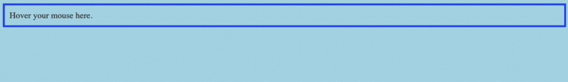
Let's see the animation on the border when we hover over an element on the web page.

Algorithm

  • Create a document in HTML and create a div.
     
  • Name the div class as a block and write some text in it.
     
  • Create a style tag inside the head.
     
  • Give a background color to the body.
     
  • Use .block for the block class and apply some padding, color, and font size.
     
  • Use .block: hover property and put some other color to it.
     
  • Now, the color will change when we hover on that particular block.


HTML Code

<!DOCTYPE html>
<html>
<head>
   <title> Animation at hover </title>
   <style>
      body {
         background-color: lightblue;
      }
      .block {
         padding: 10px;
         font-size: 18px;
         color: #333;
         border: 4px solid blue;
         transition: border 0.5s ease;
      }
      .block:hover {
         border: 4px solid orange;
      }
    
   </style>
</head>
<body>
   <div class="block">
      Hover your mouse here.
   </div>
</body>
</html>


Output

Animation at hover in css

The above code is used to change the color of the border when we hover over it.

Loading Border

Let’s create a loading symbol with the help of CSS.

Algorithm

  • Create a document in HTML and create a div.
     
  • Name the div class as load.
     
  • Use .load for load class and mention some width and height of the circle.
     
  • Also, add some border in it and make its radius 50%.
     
  • Set keyframes spin to 360deg rotate with the help of the spin keyword.
     
  • Add linear animation of 1.5s for infinite time.


HTML Code

<!DOCTYPE html>
<html>
<head>
   <title>Loading Border </title>
   <style>
      .load {
         width: 50px;
         height: 50px;
         border: 5px solid black;
         border-top-color: white;
     
         border-radius: 50%;
         animation: spin 1.5s linear infinite;
         margin: 50px auto;
      }

      @keyframes spin {
         to {
            transform: rotate(360deg);
         }
      }
   </style>
</head>
<body>
   <div class="load"></div>
</body>
</html>


Output

Loading Border animation in css

From the above code, an infinite running loader is made with the help of CSS animation and keyframes.

Changing Border Length

Let’s create a webpage to change the border length on hover.

Algorithm

  • Create a document in HTML and create a div.
     
  • Name the class of that div as border.
     
  • The first step is to make the display of the body flex.
     
  • Then use .border and defines the position, length, and width of the border of that div.
     
  • Use &::before and &::after to add an extra border at the div and make some transitions on it.
     
  • The last step is to use  &:hover::before and &:hover::after to change the length of the border on hover.


HTML Code

<!DOCTYPE html>
<html>
<head>
   <title> Length Change </title>
   <style>
     html, body {
    width: 100%;
    height: 100%;
    display: flex;
}

.border {
    position: relative;
    width: 100px;
    height: 50px;
    margin: auto;
    border: 2px solid;
    cursor: pointer;
    
    &::before,
    &::after {
        content: "";
        position: absolute;
        width: 10px;
        height:10px;
        transition: .3s ease-in-out;
    }
    
    &::before {
        top: -16px;
        left: -16px;
        border-top: 2px dotted;
        border-left: 2px dotted;
    }
    
    &::after {
        right: -16px;
        bottom: -16px;
        border-bottom: 2px dotted;
        border-right: 2px dotted;
    }
    
    &:hover::before,
    &:hover::after {
        width: calc(100% + 28px);
        height: calc(100% + 28px);
    }
}   
 </style>
</head>
<body>
   <div class="border">
      
   </div>
</body>
</html>


Output

Changing border length animation in css

This code is used to change the length of the border when hover the mouse on the element.

Gradient CSS Border

Let’s create a webpage to change the gradient color by hovering on the element.

Algorithm

  • Create a document in HTML and create a div.
     
  • Name the div class as gradient.
     
  • Make a style tag inside the head and use the .gradient to define the properties inside the gradient class.
     
  • Give style, width, and gradient color to the class.
     
  • Use the hover keyword to make a change by hovering on that div.


HTML Code

<!DOCTYPE html>
<html>
<head>
   <title> Change Gradient </title>
   <style>
 .gradient{
  border-style: solid;
  height: 50px;
  border-width: 10px;
  border-image: linear-gradient(90deg, lightblue, black) 1;  
}
  .gradient:hover{
     border-style: solid;
  height: 50px;
  border-width: 10px;
  border-image: linear-gradient(-90deg, lightblue, black) 1;  
     }
    
   </style>
</head>
<body>
   <div class="gradient">
      
   </div>
</body>
</html>


Output

Gradient CSS Border animation in css

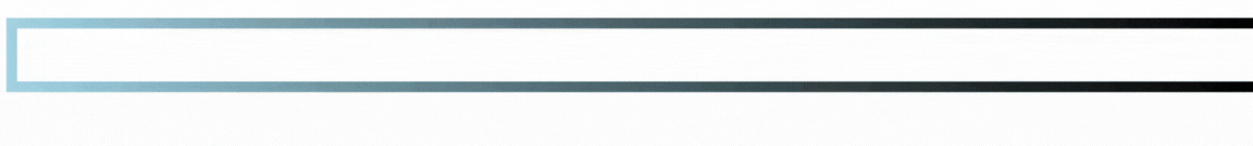
This code is used to change the color of the gradient.

The above methods indicate the different ways of creating border animation using CSS. In the above examples, we saw two examples of border animation: one used the border on hover, and the other used to load the border in CSS.

Similarly, we can use any property by using the same procedure.

Frequently Asked Questions

What is CSS?

CSS stands for Cascading Style Sheets, used to design the web page. It is used to style the HTML web page by providing many properties like color, font, margin, padding, and many more.

What are keyframes?

Keyframes signify the beginning and the end action, which has to be used in the animation. In CSS, it gives the user more control over the animation that must be performed.

What is the role of creating border animation using CSS?

Border animations are used to make our webpage more interactive and user-friendly. It is also used to reduce the javascript task and gives some unique effects on our web page.

Conclusion

In this article, we have learned about creating border animation using CSS. We have also seen some ways to use these animations on the border with the help of Cascading Style Sheets (CSS).

To learn more, go through the following articles.


Enhance your skills in Data Structures and AlgorithmsCompetitive ProgrammingJavaScriptSystem Design, and more with our Coding Ninjas Studio  Guided Path. If you want to sharpen your coding skills for the test, check out the mock test series and enter the contests on Coding Ninjas Studio! 

Check out The Interview Guide for Product Based Companies and some Popular Interview Problems from Top companies like AmazonAdobeGoogleUberMicrosoft, etc., on Coding Ninjas Studio.


Live masterclass