Do you think IIT Guwahati certified course can help you in your career?
Introduction
Hey Ninjas! You must have seen the animations on different websites. Have you ever tried to do the same on your web page using HTML and CSS? If not, then you are at the right place. We will try to make different types of animation today.
In this blog, we will discuss CSS Animations in detail. The prerequisites required for this blog are HTML, CSS, and jQuery (Optional). Let's start with the definition.
Animations
As you can guess from the name, animations are moving objects that make the web page look more attractive. Animation is a property in CSS3 (an upgraded version of CSS) used to style the elements that change gradually over time. It has a lot of variations that can be customized according to the user's interest.
Uses of CSS Animations
CSS animations help the user in many ways. Let's check them out:
It helps in making the movement of elements of the web page easier.
Spinning elements around, changing the colour, size, shape, etc.
Eliminating the need for Javascript/ jQuery for a lot of animation effects.
It helps in designing the webpage in a more interactive manner and is easy once we get the hang of it.
Now let's discuss different types of animations present in CSS.
Transition
Transitions work as the foundation of animations because they specify the duration of the element changing its state smoothly over time. This state change would be abrupt and take effect immediately if there was no transition. When using transforms, one should use transitions to create a smooth and gradual animation.
There are mainly four transition methods available in the CSS. Let's check them out.
transition-property: Here, you can specify the property of the element where you want to set the transition, e.g. width, height, etc.
transition-duration: Here, you can specify the time to complete the transition on the targeted property. You can give the time in 's' or 'ms', where 's' refers to the second and 'ms' refers to the millisecond. Examples of this can be '2s' or '200ms'.
transition-delay: Here, you can specify the delay in transition, which will take a pause before starting the transition. You can give the delay time in 's' or 'ms', where 's' refers to the second and 'ms' refers to the millisecond. Examples of this can be '3s' or '300ms'.
transition-timing-function: Here, you can control the speed of transition. It is linear by default, but you can change it to many functions like ease, ease-in, ease-out, etc.
Let's check an example that will clarify all four transitions' concepts.
In this example, we have used all four transitions, that is, property, duration, delay, and time function. Instead of declaring all four methods separately, you can do this in a single line. Let us see the shortcut for this.
As the name says, transform means changing in shape and size. Similarly, in animation, Transforms allow us to visually manipulate an element by rotating, skewing, scaling or translating.
scale()
The scale() property impacts the size of the element since it is applied to the font size of the element, padding, width and height. It also serves as a shortcut function for the scaleX and scaleY functions.
<!DOCTYPE html>
<head>
<style>
.item {
background-color: rgb(253, 207, 166);
height: 25px;
width: 25px;
transform: scale(15);
font-size: 1px;
padding: 1px;
color: black;
line-height: 2px;
}
body, html {
height: 75%;
width: 52%;
}
body {
display: flex;
align-items: center;
justify-content: center;
padding: 0;
font-family: Arial, Helvetica, sans-serif;
}
</style>
</head>
<body>
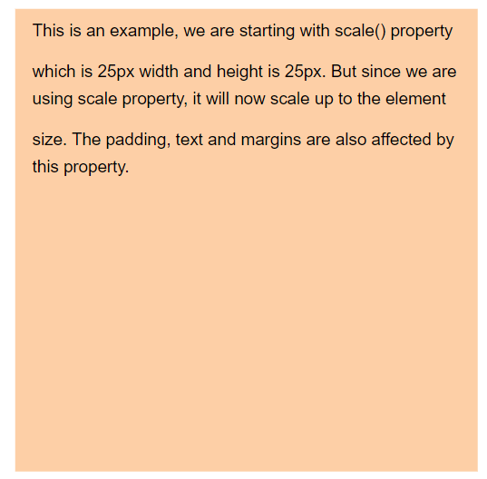
<div class = "item">
This is an example, we are starting with scale()
property which is 25px width and height is 25px. But
since we are using scale property, it will now scale up
to the element size. The padding, text and margins are
also affected by this property.
</div>
</body>
</html>
Output:
Explanation:
In this example, we have used scale(15), which means the height and width of the item class are 15 times bigger in size than the original. You can try the scale() properties with different values to understand the difference.
translate()
The translate() property moves an element from left to right or up and down. The movement is based on the parameters given for the X, which is the horizontal axis, and the Y, which is the vertical axis of the page.
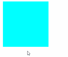
In this example, we took two div in green and blue colour and set a translate() property with 25px on the X axis and 25px on the Y axis. As you can see in the output screen, after hovering the cursor on the div, it moves 25px right and 25px down. You can also move the divs in opposite directions by taking the parameters in negative.
rotate()
With the rotate() property, you can rotate an element clockwise or anti-clockwise a specified number of degrees. Let's take an example of this.
In the above example, we used the rotate() property to turn the div 360 degrees clockwise. If you want to rotate the div anti-clockwise, you can use the degrees in negative.
skew()
With the skew() property, you can tilt the element in one direction or the other based on the values given for the X and Y axis. You can pass one and two values (X and Y axis) as parameters in the skew() property.
In the above example, we have used the skew() property to describe the tilt of the div in degrees. Here, the div is tilting 20 degrees. You can also tilt the div in the opposite direction by giving the degrees in negative.
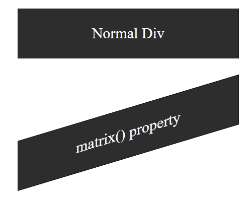
matrix()
A matrix in math terminology is a set of numbers arranged in rows and columns, which form a rectangular array, but in CSS matrix works differently. The matrix() property is used for projecting linear transformations and displaying 3D images on a 2D screen. It integrates all the transform functions into one, that is, rotate(), scale(), translate(), and skew().
The matrix() property takes up to 6 parameters, and the syntax goes like this:
As you can see in the output screen, the second div is tilt because of the matrix() property defined in the style tag.
Keyframes
Keyframes are very important in the animation process. It includes information about an action's beginning and finishing points. A keyframe tells us two things:
Frame's action at a specific point in time.
And when that action occurs.
A keyframe is a point in the timeline where a new symbol instance appears.
Let's check an example that will clarify the concepts.
In this example, we broke the complete transition into five parts, that is, 0%, 25%, 50%, 75%, and 100% using keyframes. Also, we added different types of sub-transitions to it. Hence it looks like the circle is moving to each corner clockwise.
CSS Animation Properties
There are many CSS animation properties. Let's have a look.
animation: It sets up all the animation properties.
@keyframes: It is used to define the animation code.
animation-delay: It specifies the animation's start duration by making it delayed at the start.
animation-duration: This property is used to specify the duration of the animation to complete.
animation-direction: It helps specify the animation's motion, for example, if the animation will move forward or backward or in alternate cycles.
animation-iteration-count: It helps in counting the number of times an animation should play on.
animation-play-state: It indicates whether the animation is paused or running
animation-fill-mode: It is generally used to specify the style of animation when the animation is paused or stopped.
animation-timing-function: It specifies the speed of animation.
animation-name: It helps in specifying the name of the animation in the @keyframes.
Frequently Asked Questions
What is the syntax for the animation CSS property?
The syntax is as follows: @keyframes: keyframe-name{percentage | from | to {cssrules}}.
Why do we need animations in CSS3?
CSS animation is generally helpful as it reduces the use of Javascript / jQuery / Flash code. It also helps to create a webpage which is user-friendly and interactive. It helps to create unique effects on the website.
Transitions in CSS3 allow us to change the property values very smoothly (from one value to another or from the beginning to the endpoint) over a given duration of time specified.
Define Animations.
Animation is a property in CSS3 (an upgraded version of CSS) used to style the elements that change gradually over time.
Conclusion
This article discusses the topic of CSS animations. In detail, we have seen the definition of animation. Along with this, we have seen the usage of animations, transitions, transforms, and keyframes with codes, outputs, and proper explanations.
We hope this blog has helped you enhance your knowledge of CSS animations. If you want to learn more, then check out our articles.
But suppose you have just started your learning process and are looking for questions from tech giants like Amazon, Microsoft, Uber, etc. In that case, you must look at the problems, interview experiences, and interview bundles for placement preparations.
However, you may consider our paid courses to give your career an edge over others!


 18+ registered

