Linear Gradients
A linear gradient is a form of CSS gradient that generates a seamless colour transition from one point to another in a straight line. This approach allows for the progressive blending of two or more colours along an axis, such as horizontal or vertical, or at an angle, giving the design of a website a sense of depth and movement.
Linear gradients are a popular choice for backgrounds, borders, and text because of their ability to generate both subtle and bold visual effects. They can also be modified to meet any design taste. The various linear gradients with their code snippets in CSS are as follows:
Top to Bottom Gradient
This is the default type of CSS gradient. As the name suggests, the gradient travels from top to bottom. We use the background-image property to create an image that can be used as the background of an element. The pseudo-code for the same is-
a. Using two colors as arguments:
CSS
.box {
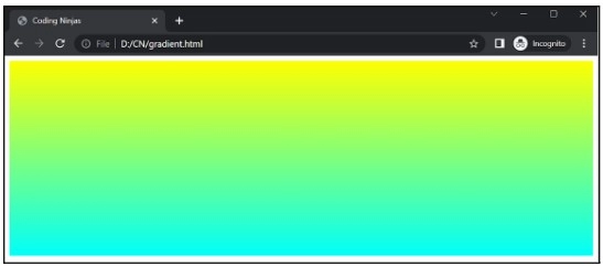
	background-image: linear-gradient(yellow, #00fffb);
	width: 900px;
	height: 300px;
}
Output

Explanation: We can observe a box of 900X300 px displayed on our web page with the beautiful blend of two colors yellow and sky blue(represented in form of color code #00fffb)
b. Using multiple colors as arguments:
CSS
.box {
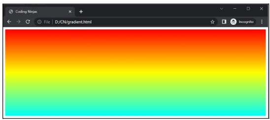
	background-image: linear-gradient(red, yellow, #00fffb);
	width: 900px;
	height: 300px;
}
Output

Explanation: We can observe in this example how the colors defined have been blended from top to bottom of a given order, we can add as many colors we want.
If you want to set where the colors stop, you can do so by passing in arguments as shown:
CSS
.box {
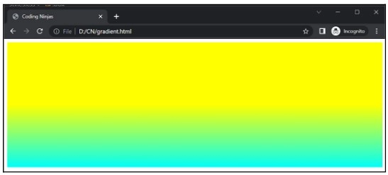
	background-image: linear-gradient(yellow 50%, #00fffb);
	width: 900px;
	height: 300px;
}
Output

Explanation: We can see how the yellow hue has dominated 50% of the whole accessible space, and then the blending has been as normal after that. We can also use “px” in place of the percentage to decide the color limit.
To Left or to Right Gradient
In this type of CSS gradient, we can control the direction of the color. This can be done by adding ‘to left’ or ‘to right’ words in the arguments. The examples for the same are as follows:
a. Example of ‘to right’:
CSS
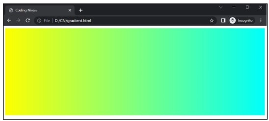
.box {
	background-image: linear-gradient(to right, yellow, #00fffb);
	width: 900px;
	height: 300px;
}
Output

Explanation: Everything has been normal as above except the direction of the color blend. Here, the order has defined as ‘to right’ which says the further color order will appear in the “left to right” direction.
b. Example of ‘to left’:
CSS
.box {
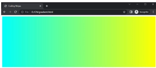
	background-image: linear-gradient(to left, yellow, #00fffb);
	width: 900px;
	height: 300px;
}
Output

Diagonal Gradient
If we want more control over the direction of our CSS gradients, we can specify the direction or angle to do so. The following examples will help you to understand better.
a. By specifying the direction: ‘to right top’ or ‘to left top’:
CSS
.box {
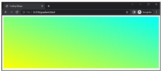
	background-image: linear-gradient(to right top, yellow , #00fffb);
	width: 900px;
	height: 300px;
}
Output

Explanation: In this output, the direction of color defined under linear gradient is from the “left bottom to right top” using ‘to right top’ parameter.
CSS
.box {
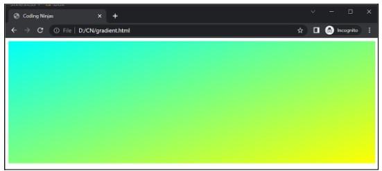
	background-image: linear-gradient(to left top, yellow, #00fffb);
	width: 900px;
	height: 300px;
}
Output

Explanation: Here, the gradient direction is from the bottom right to the left top, as shown in the output image below.
b. By specifying the degree of the gradient:
CSS
.box {
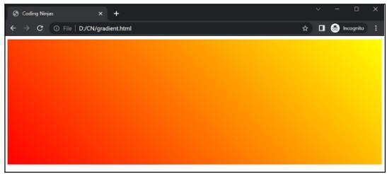
	background-image: linear-gradient(45deg, red, yellow);
	width: 900px;
	height: 300px;
}
Output

Explanation: Here we have specified the degree of the gradient as 45 degrees. So the output is generated accordingly.
We can perform a few more operations on the CSS gradients, such as setting some transparency value or producing a repeating gradient.
c. By setting the transparency value:
CSS
.box {
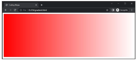
	background-image: linear-gradient(to left, rgba(255,0,0,0), rgba(255,0,0,1));
	width: 900px;
	height: 300px;
}
Output

Explanation: Here, we set the transparency value for the red color. The gradient travels from the left to the right direction, gradually decreasing in intensity.
d. By producing a repeating gradient:
CSS
.box {
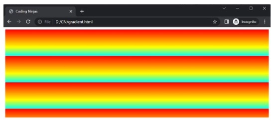
	background-image: repeating-linear-gradient(red, yellow 20%, #00fffb 30%);
	width: 900px;
	height: 300px;
}
Output

Explanation: In this case, we have made a repeating sequence of red, yellow, and #00fffb.
Radial Gradients
A radial gradient is a form of CSS gradient that generates a seamless colour transition in the shape of a circle or an ellipse. This approach allows for the progressive blending of two or more colours from the shape's centre outward or from an offset point, resulting in a three-dimensional impression that adds depth and aesthetic interest to the design of a website.
Radial gradients are a flexible choice for backgrounds, borders, and text since they can be adjusted with varied forms, sizes, and placements. Radial gradients are a popular technique for adding dimension and texture to any design project because of their flexibility to produce a soft or dramatic effect.
Evenly Spaced Radial Gradient
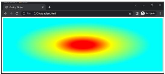
This can be considered the default radial gradient type. We just call the radial gradient command, pass the color/s of our choice, and run our code. An example code snippet is given below:
CSS
.box {
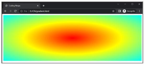
	background-image: radial-gradient(red, yellow, #00fffb);
	width: 900px;
	height: 300px;
}
Output

Explanation: The above example shows an evenly spaced radial gradient of red, yellow, and #00fffb.
Differently Spaced Radial Gradient
In this type of CSS gradient, we can control the amount of color we want by either specifying the percentage or pixels. An example code snippet is given below:
CSS
.box {
	background-image: radial-gradient(red 10%, yellow 25%, #00fffb 60%);
	width: 900px;
	height: 300px;
}
Output:

Explanation: In this case, everything is like the last example except for the differently spaced stops.
Setting Shape
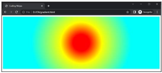
This is an additional parameter like the direction in linear-gradient; here, we can define among circle and ellipse. Ellipse is the default shape.
CSS
.box {
	background-image: radial-gradient(circle, red 10%, yellow 25%, #00fffb 60%);
	width: 900px;
	height: 300px;
}
Output

Explanation: This is the same example as above, here we can observe how the default shape of ellipse set into a circle.
Using different size keywords
In this type of CSS gradient, we can define the size parameter as:
-
closest-side: In this option, the gradient will meet the closest side of an element.
-
farthest-side: In this option, the gradient will meet the farthest side of an element.
-
closest corner: In this option, the gradient will meet the closest corner of an element.
-
farthest-corner: In this option, the gradient will meet the farthest corner of an element.
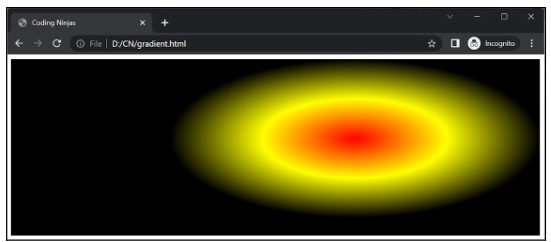
An example of the same is given below:
CSS
.box {
	background-image: radial-gradient(closest-side at 65% 45%, red, yellow, black);
	width: 900px;
	height: 300px;
}
Output

Repeating Radial Gradient
Just like we did in the repeating linear gradient, here too, we can make repeating circles with colors of our choice. An example code snippet is given below:
CSS
.box {
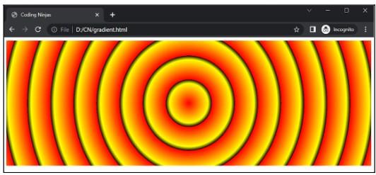
	background-image: repeating-radial-gradient(circle, red, yellow 10%, black 12%);
	width: 900px;
	height: 300px;
}
Output

Explanation: Exactly like repeating-linear-gradient, repeating-radial-gradient also works. In this code, a circle shape is explicitly defined to get a circle shape otherwise, it would have been an ellipse by default.
Conic Gradients
A conic gradient is a type of CSS gradient that uses a circular pattern to create a smooth colour transition. This approach combines two or more colours in a spiral-like pattern, adding a distinctive and eye-catching appearance to the design of a website.
Conic gradients are a versatile choice for backgrounds, borders, and text because they can be customised with different angles and positions. Conic gradients are a popular technique for adding a touch of originality and refinement to any web design project due to their ability to produce a dynamic and compelling look.
There is no further classification of the conic gradient but we can still customize it using different parameters.
Conic Gradient Using Three Colors
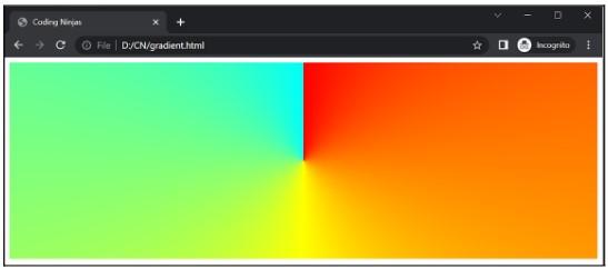
The given example of code shows three color conic gradient.
CSS
.box {
	background-image: conic-gradient(red, yellow, #00fffb);
	width: 900px;
	height: 300px;
}
Output

Explanation: The above output shows the three colour conic gradient effect, the same can be done for any number of colours.
Create a Pie Chart
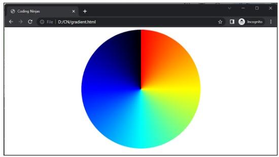
We can create this by simply fixing our border-radius with multiple colours.
CSS
.box {
	background-image: conic-gradient(red, yellow, #00fffb, blue, black);
	width: 400px;
	height: 400px;
	margin-left: auto;
	margin-right: auto;
	border-radius: 50%;
}
Output

Explanation: In this above example, the radius of the box has changed to 50% since the box was square, so it leads to a circle shape. Otherwise, it would have been an ellipse, and proper alignment has been implemented to print it beautifully.
Repeating Conic Gradient
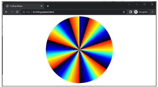
A repeating conic gradient is a colour gradient that radiates outward in a circular pattern from a central point, with the colours changing progressively as they go out from the center. This gradient pattern is then repeated numerous times to get the conic appearance. This strategy is commonly used in graphic design and internet design to produce dynamic and eye-catching backgrounds or textures.
CSS
.box {
	background-image: repeating-conic-gradient(red 5%, yellow 10%, #00fffb, blue 15%, black 20%);
	width: 400px;
	height: 400px;
	margin-left: auto;
	margin-right: auto;
	border-radius: 50%;
}
Output

Explanation: The above example consists of five colours red, yellow, sky blue, blue, and black. The mentioned percentage shows the position of a color stop along the circle.
Frequently Asked Questions
What exactly is a CSS gradient?
A CSS gradient is a design technique that generates a seamless transition between two or more colours when applied to the background or border of an element on a webpage.
What are the three different kinds of CSS gradients?
CSS gradients are classified into three types: linear, radial, and conic.
What exactly is a linear gradient?
A linear gradient is a form of CSS gradient that generates a seamless colour transition from one point to another in a straight line.
What exactly is a radial gradient?
A radial gradient is a form of CSS gradient that generates a seamless colour transition in the shape of a circle or an ellipse.
What exactly is a conic gradient?
A conic gradient is a form of CSS gradient that uses a circular pattern to achieve a seamless colour transition.
Conclusion
In a nutshell, this article covered the topic of CSS gradients. We briefly discussed CSS and then did a detailed study of CSS gradients by learning about the two major types of CSS gradients with ample examples.
Want to become a front-end developer but need some practice? Here are some of the interview questions related to CSS: CSS Interview Questions
To read more about CSS, you can refer to the following blogs
- Introduction to CSS
- CSS Position
- CSS Selectors
-
Versions of CSS
Want to ace the coding rounds of big tech companies? Try our Attempt Unlimited Online Mock Test Series to start your preparation.
Try practicing this question here on your own. Do share this blog with your friends.
And many more on our platform Coding Ninjas Studio.Refer to our Guided Path to upskill yourself in DSA, Competitive Programming, JavaScript, System Design, and many more! If you want to test your competency in coding, you may check out the mock test series and participate in the contests hosted on Coding Ninjas Studio! If you have just started your learning process and are looking for questions from tech giants like Amazon, Microsoft, Uber, etc. In that case, you must look at the problems, interview experiences, and interview bundles for placement preparations.
You may consider our paid courses to give your career an edge over others!
Happy Learning, Ninjas!
