Do you think IIT Guwahati certified course can help you in your career?
Introduction
The CSS Grid Layout offers a two-dimensional, grid-based layout system that allows controlling rows and columns, making it convenient to design web pages without floats and positioning. Many methods have been developed to solve the grid layout over the years, but the CSSGrid is straightforward and helps combine the controls of extrinsic sizing along with the flexibility of intrinsic sizing.
CSS Grid properties are supported by all modern browsers such as Google Chrome, Microsoft Edge, Firefox, Safari and Opera.
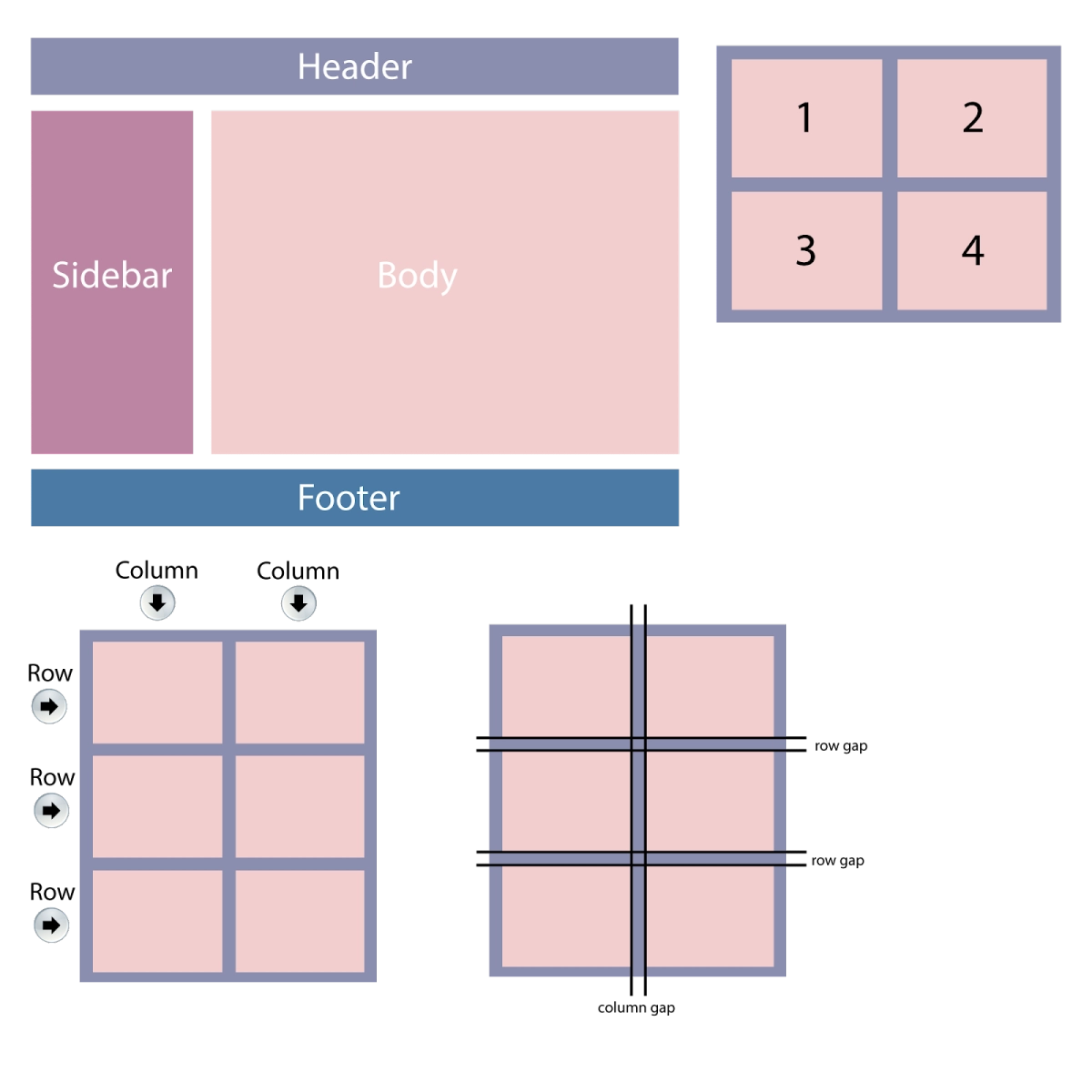
The most common web design layout contains a header, body, sidebar and footer.
Grid elements
CSS grid contains a parent element and one or more child elements.
Here, the parent element is the grid container and 1, 2, 3, 4 are child elements.
Grid containers or display property
HTML elements become grid containers if their display property is set to ‘inline-grid’ or ‘grid’.
Grid:
.grid-container { display: grid; }
Inline-grid:
.grid-container
{ display: inline-grid; }
Grid-Template Properties
The grid-template-columns property is used to define the number of grid columns and their width using a space-separated list that specifies the width of each respective column.
Making a grid with 5 columns:
.grid-container
{ display: grid; grid-template-columns: auto auto auto auto auto; }
Making a grid with 5 columns with specific height:
.grid-container
{ display: grid; grid-template-columns: 60px100px auto 30px; }
The grid-template-rows property is used in the grid layout to define the height of each row. This too is a value separated list.
Making a grid with 2 rows with specific height:
.grid-container
{ display: grid; grid-template-rows: 80px200px; }
Grid-template area
Grid areas can be named, and items can be placed on the named areas in CSS Grids. This technique lets the user see what their component would look like, in CSS itself.
The direct children in the grid container are given a name using the grid-area property:
header
{ grid-area: header; }
.sidebar
{ grid-area: sidebar; }
.content
{ grid-area: content; }
footer
{ grid-area: footer; }
Grids can be named anything except for the keywords ‘auto’ and ‘span’. After naming all the areas in the grid, the grid-template-areas property is used to define which grid cell will be spanned by each item. Every row is defined within quotes.
The horizontal lines of grid items are grid rows, and vertical lines are grid columns. The spaces between every grid row and column are called grid gaps. Gap size can be adjusted using:
grid-row-gap
grid-column-gap
grid-gap
To set the gap between the rows:
.grid-container
{ display: grid; grid-row-gap: 20px; }
To set the gap between the columns:
.grid-container
{ display: grid; grid-column-gap: 20px; }
The shorthand property to set the gap between rows and columns respectively is grid-gap:
.grid-container
{ display: grid; grid-gap: 20px40px; }
Rows and columns can also be set up in one value:
.grid-container
{ display: grid; grid-gap: 50px; }
Grid lines
Grid lines run horizontally and vertically. The ones between rows are row lines, and the ones between columns are column lines. A grid with five columns will have six column lines since there is one after the last column. Lines are numbered according to the script description-column line 1 will be on the left in languages such as English and on the right in languages like Arabic.
Grid item starting at column line 1 and ending on column line 3:
.item1
{ grid-column-start: 1; grid-column-end: 3; }
Grid item starting at column line 1 and ending on column line 3:
.item1
{ grid-row-start: 1; grid-row-end: 3; }
Grid tracks, grid cell and grid area
The space between two grid lines is called the grid track. While creating a grid, these tracks are created by assigning them a size.
The intersection of row and column tracks makes a grid cell, the smallest space on a grid. If the user doesn’t place any items after defining a grid, one item will be automatically laid out into each grid cell.
When an item spans over multiple tracks, the several grid cells together are referred to as the grid area.
Alignment
Grid properties beginning with ‘justify-’ are always used on the inline axis, i.e., the direction of sentences in writing mode. Grid properties beginning with ‘align-’ are used on the block axis, i.e., the direction of blocks laid out in writing mode.
‘justify-items’ and ‘align-items’: applied to the grid container for all justify-self properties on the items.
justify-self and align-self: applied to individual grid items to move them around in their grid area.
justify-content and align-content: they are used to distribute additional space in the grid container around or between tracks.
Moving content using justify-content and align-content
The justify-content property aligns the entire grid inside the container. The width of the grid must be lesser than that of the container for the justify-content property to be effective.
.grid-container
{ display: grid; justify-content: space-evenly; }
.grid-container
{ display: grid; justify-content: center; }
The align-content property aligns the entire grid inside the container vertically. The height of the grid must be lesser than that of the container for the align-content property to be effective.
The fr unit is a flexible length describing a portion of the space available in the grid container. It distributes the space between items after they have been laid out. For three columns to have the same share of space available:
Using different fr values will result in items sharing the space in proportion, resulting in the larger values getting more of the spare space. The fr unit can be combined with fixed-size tracks or fixed size gaps. For one element to be fixed size and the second track to take up the leftover space, the solution is the tracklisting of
grid-template-columns: 100px 1fr
The minmax() function
This lets the user set a minimum and a maximum size for a given track. For functions where fr unit distributes remaining space in a grid, the minmax() function could be used too as minmax(auto, 1fr).
Moreover, minmax() can be used to force equal space for a track in the grid container minus the gaps. This can be done by replacing 1fr as a track size with minmax(0, 1fr), meaning the minimum track size 0, but not the min-content size. All the available space in the container will then be taken by the grid, and the size needed for any gaps is deducted while sharing the rest according to the fr units.
The repeat() notation
For a track with multiple equal columns, the given CSS could be written:
Track sizing, repeat() and minmax() can all be used to make a pattern with CSS Grid. In cases where the users don’t want to define number of row or column tracks and create just as many as they could fit in the container, we need to combine some functions in CSS.
This can be done with repeat() and the auto-fill or auto-fit keywords. The following grid will create as many 100 pixel tracks as possible to fit in the container.
However, the tracks created above are not flexible and will cause a gap at the end unless there’s space for another 100 pixel track. The solution for this would be adding the minmax() function and writing for as many tracks as possible with the minimum size being 100 pixels and the maximum being 1fr. The grid will then lay out 100 pixel tracks and the leftover space will be equally distributed to them.
This will create a 2D responsive layout, not needing any media queries.
Now to understand the difference between auto-fill and auto-save, we will take an example with two grid items in the grid container. Both the keywords act in the same way once the first track is filled. But first, the auto-fill keyword creates empty tracks, while auto-fit causes the tracks to collapse down to 0 size-meaning that flexible tracks will grow and consume the space.
CSS Grid was built keeping in mind the responsiveness of grids, therefore it is very convenient to make a grid layout responsive using less code.
How can we centre a grid in CSS?
The use of margin will allow centring CSS grids. The item must first be converted into a grid container; anonymous items must then be wrapped into their own elements as they can’t be targeted by CSS directly, and then margins can be applied to the new elements.
What is fr in CSS Grid?
Fr unit is a unit of length in CSS Grid layout. It is short for “fraction” and represents a fraction of the space available in the grid container.
What does 1fr mean in CSS?
The flexible length unit, fr, is a fractional unit in CSS Grids. 1fr represents 1 part of the space available in the grid.
What is the difference between auto-fit and auto-fill?
Auto-fit and auto-fill are only different when the rows are wide enough to fit even more columns in them. In such a case, using auto-fit will make the content stretch and fill the entire width of the row. In case of auto-fill, the empty columns will be allocated a fraction of the available space even if they contain no grid items. In this case, the width of the latter will be affected.
Key takeaways
In this article, we learned about the principles of CSS Grid, the terminology for them and adding, positioning and aligning items in the same with the help of examples.
You can go to Coding Ninjas Studio to try and solve more problems for practice. Share this blog with your friends if you found it helpful! Until then, All the best for your future endeavours, and Keep Coding.
By Reet Maggo
Live masterclass
Prompt Engineering: Must-have GenAI Skill for 30L+ Roles at Amazon
by Anubhav Sinha
16 Jul, 2026
12:30 PM
Using Netflix Data to Master Power BI
by Ashwin Goyal
13 Jul, 2026
12:30 PM
Top GenAI Skills to crack 30L+ CTC at Amazon & Google
by Sumit Shukla
14 Jul, 2026
11:30 AM
JioHotstar Sports Analytics using IPL Dataset
by Prerita Agarwal
15 Jul, 2026
12:30 PM
Prompt Engineering: Must-have GenAI Skill for 30L+ Roles at Amazon


 8+ registered

