Do you think IIT Guwahati certified course can help you in your career?
Introduction
CSS stands for Cascading Style sheet.CSS is a presentation language that is used to format, layout, and style documents that are in HTML. CSS can be used to change the border, color, backgrounds, margins, fonts, icons, padding, and many other properties. CSS is the most used language on the web; the reason behind this is that it makes web pages more presentable.
What is CSS?
CSS (Cascading Style Sheets) is a style sheet language used to describe the presentation and layout of web pages written in HTML or XML. CSS controls how HTML elements are displayed on the screen, enabling developers to separate content from design. By defining styles for elements like fonts, colors, margins, and positioning, CSS allows for flexible and visually appealing web pages that can be easily maintained and scaled.
In this blog, we have consolidated the top 70 CSS interview questions and answers.
CSS Interview Questions For Freshers
1. Name some CSS Frameworks.
CSS framework is a library used to design a website easily, and more functional frameworks come with more features and additional javascript-based functions. Some of them are Foundation, Blueprint, Bootstrap, Gumby, etc.
2. What are the different types of CSS?
The different types of CSS are- Inline- It is used to style a specific HTML element. Embedded- Also known as Internal CSS, it is used to add <style> tag in the <head> section of HTML. Linked- Also known as External CSS, it is used to link the webpage to an external .css file.
3. Define Universal Sector
The universal selector selects all the elements and applies the CSS properties to them.
Syntax:
* { style properties }
Example:
* {
  color: blue;
}
4. What is the CSS Ruleset?
A CSS ruleset is used to apply a set of properties with some definite values to a single or a specific set of elements in the linked HTML page.
There are two parts of the CSS ruleset-
Declaration Block- Contain one or more declarations that are separated by semicolon and specify the CSS property and property's value applied to the element.
Selector- Indicates the HTML element that is needed to be styled.
5. What are the elements of the CSS Box Model?
The CSS box model is used to create the design and layout of the web pages. The box contains multiple properties like Content, Padding, Border, and Margin.
Content- The text and the images appear in the content of the box.
Padding- Clears an area around the content.
Border- It is a border that goes around the padding and content.
Margin- Clears an area outside the border.
Both padding and margin are transparent.
6. What are the advantages of using CSS?
Below are some of the advantages of CSS-
Multiple device compatibility: CSS allows websites to adapt seamlessly to various screen sizes and devices, ensuring a consistent user experience across desktops, tablets, and smartphones.
Better website speed: By reducing file sizes and separating content from presentation, CSS helps improve load times, enhancing overall website performance.
Easy to maintain: CSS enables centralized styling across multiple web pages. Modifications to stylesheets affect all associated pages, making updates and maintenance efficient.
Flexible positioning of design elements: CSS provides precise control over the layout and positioning of elements on web pages, facilitating creative and functional design choices.
Offline Browsing: CSS can be used in conjunction with technologies like Service Workers to enable offline browsing capabilities, improving user accessibility and experience.
7. What is VH/VW in CSS?
VH stands for viewport height, and VW stands for viewport width. They are used to measure CSS units. It is used to improve the responsiveness of the design. The measure VW is equal to 1/100 of the width of the viewport. Similarly, VH is equal to 1/100 of the height of the viewport.
8. What are the different components of CSS style?
The components of CSS style are:
Selectors- The target is a class name, element name, and id name.
Property- The name of the attribute to be styled like border, background color, position, etc.
Values- values allocated to the property.
9. What is the difference between a class and an ID?
Class is an attribute that defines a group of HTML elements to apply unique styling and formatting to those elements. Class is not unique and has multiple elements. The ID selectors style the element with the specified ID. ID is unique, and it can be assigned to a single element.
10. Is it possible to make a class selector for a particular element? If so how?
Yes, it is possible to make a class selector for a particular element- write a period (.) character, followed by the name of the class.
Grouping is used for applying CSS styles for more than one HTML element, and this can be done with a single declaration.
Example:
h2,h3
{
Color: #FFFFFF;
}
13. What is the difference between reset and normalize CSS?
Reset CSS: It aims to remove all built-in browser styling. For example, margins, paddings, and font sizes of all elements are reset to be the same.
Normalize CSS: It aims to make built-in browser styling consistent across browsers and correct bugs for common browser dependencies.
14. Define gradients in CSS.
The gradient is a property of CSS that allows displaying smooth transformation between more than one specified color.
There are three types of gradients: Linear- Goes down/up/left/right/diagonally Radial- Defined by the center Conic- Rotated around a center point
15. What is the use of the “float” property in CSS?
The float property allows an HTML element to be positioned horizontally. It can only take “left” or “right” values.
Example:
h1,h2
{
Float: left;
}
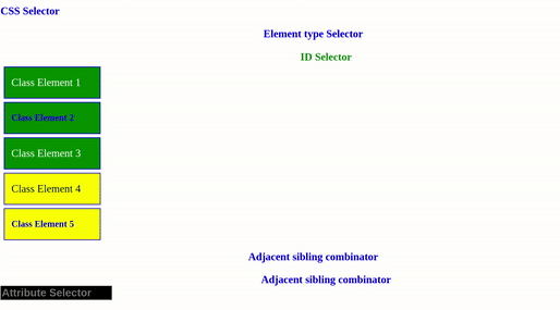
16. Explain the different types of selectors in CSS?
A CSS selector is a string that identifies the elements to which a particular CSS property is applied. The different types of selectors are:-
Universal Selector: The universal selector selects all the elements and applies the CSS properties to them.
Element Type Selector: It matches one or more HTML elements of the same element type.
ID Selector: It matches the HTML element with an ID attribute the same as the selector value.
Class Selector: It matches all page elements with their class attribute same as the selector value.
Descendant Combinator: The descendant combinator combines two or more selectors so that elements can be selected more specifically. It selects all HTML elements: children, grandchildren, great-grandchildren, and so on.
Child Combinator: A child combinator targets immediate child elements of a parent element.
General Sibling Combinator: It matches elements based on sibling relationships. The selected elements stay beside each other in the HTML document.
Adjacent Sibling Combinator: It targets an element that must be an immediate sibling.
Attribute Selector: It targets elements based on HTML attributes' presence and/or value.
Pseudo-class: It uses a colon character to identify a pseudo-state that an element might be in, for example, the stage of being hovered.
<body>
  <h1>CSS Selector</h1>
  <p>Element type Selector</p>
  <p id = "idElement">ID Selector</p>
  <div class="classElement">Class Element 1</div>
  <div class="classElement"><p>Class Element 2</p></div>
  <div class="classElement">Class Element 3</div>
  <div id = "container">
   <div class="classElement">Class Element 4</div>
   <div class="classElement"><p>Class Element 5</p></div>
  </div>
  <p>Adjacent sibling combinator</p>

  <p>Adjacent sibling combinator</p>
  <input type="text" placeholder = "Attribute Selector"/>
</body>
Output:
17. What are the different ways to hide the element using CSS?
The different ways to hide the element using CSS are:
(display: none)- The element will not exist in the DOM if this property is used and it is not available for screen users. (visibility: hidden)- The element that will be present in the DOM bus is not shown on the screen, and it is available to the screen users. (position: absolute)- Make it available outside the screen.
18. Explain browser style sheets, user style sheets, and author style sheets in brief.
Browser style sheets: The browsers, by default, apply style sheets to all web pages. This style sheet varies from browser to browser. Common characteristics in all browser style sheets include black text, blue links, purple visited links, etc. The author style sheet overrides the browser's style sheet. User style sheets: Most browsers allow users to set their style sheets within their browser. These style sheets will override the browser's default style sheets - for that user only.
Author style sheets: The style sheet created by the developer is the author style sheet. Choosing fonts, colors, etc., in CSS is done using author style sheets.
19. What do CSS Custom properties variables mean?
Custom properties are also called CSS variables or cascading variables, and they are defined by users that contain some specific values to be reused throughout a document. -- notion is used to set the value, and the values are accessed using the var() function.
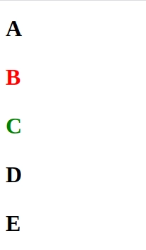
20. Mention the difference between the nth-child() and nth-of-type() selectors?
The nth-child() pseudo-class matches an element based on a number, where the number represents the number of siblings that exist before the element in the document tree.
The nth-of-type() pseudo-class matches an element based on a number, where the number represents the element's position within only those of its siblings of the same element type.
Style Code:
p {
     font-size: 2rem;
     font-weight: bold;
    }

    /* works if the second child element is of type p */
    p:nth-child(2) {
     color: red;
    }


    /* does not work as the fourth child element is not of type p */
    p:nth-child(4) {
     color: blue;
    }

    /* applied to second p element */
    p:nth-of-type(2) {
     color: green;
   }
Body Code:
<h1>A</h1>
 <p>B</p>
 <p>C</p>
 <h1>D</h1>
 <p>E</p>
Output:
21. What are CSS selectors?
CSS selectors are patterns used to select and apply styles to specific HTML elements. Some common types of selectors include:
Element Selector: Targets all instances of a specific HTML tag.
Class Selector: Targets elements with a specific class attribute.
ID Selector: Targets a unique element with a specific ID.
Attribute Selector: Targets elements with specific attributes.
22. What is the purpose of media queries?
Media queries allow you to apply CSS styles based on device characteristics, such as screen size, resolution, or orientation. They are used for:
Creating responsive designs
Optimizing layouts for different devices
Adjusting content for print or screen reading
23. What is Flexbox in CSS?
Flexbox (Flexible Box Layout) is a layout model in CSS that allows for the creation of responsive and flexible layouts. It helps align items vertically and horizontally and distribute space within a container. Flexbox makes it easier to design complex layouts with less code.
24. What is the difference between display: none and visibility: hidden?
display: none removes the element from the document flow and hides it completely.
visibility: hidden hides the element but keeps its space in the layout.
25. What is the difference between em and rem units in CSS?
em: The em unit is relative to the font size of the parent element. For example, if the parent element's font size is 16px, 1em will equal 16px.
rem: The rem unit is relative to the root element (<html>) font size. If the root font size is 16px, 1rem equals 16px, regardless of the parent element’s font size.
26. Explain the difference between position: relative and position: absolute.
position: relative positions an element relative to its normal position in the document flow.
position: absolute positions an element relative to its nearest positioned ancestor or the initial containing block.
27. What are CSS Grid and how is it different from Flexbox?
CSS Grid is a two-dimensional layout system that allows for the creation of complex web layouts using rows and columns. It provides control over both vertical and horizontal layouts, unlike Flexbox, which is primarily a one-dimensional layout system (row or column).
28. What is a CSS reset?
A CSS reset is a set of CSS rules used to remove browser-specific styling and create a consistent starting point for your CSS. It helps eliminate differences in default styles across different browsers.
29. What is the difference between min-width and max-width properties in CSS?
min-width: Specifies the minimum width an element can be, ensuring it doesn't shrink below this value.
max-width: Specifies the maximum width an element can be, preventing it from growing larger than this value.
30. What is the box-sizing property used for?
The box-sizing property is used to alter the default CSS box model. It has two main values:
content-box (default): Width and height only apply to the content area
border-box: Width and height apply to content, padding, and border
CSS Interview Questions for Experienced
31. Name media types allowed by CSS.
Media type specifies how a document is to be presented on different media. Given below is a list of various media types−
All- Used for all media type devices.
Aural- Used for speech and sound synthesizers.
Braille- Used for braille tactile feedback devices.
Embossed- Used for paged braille printers.
Handheld- Used for small or handheld devices — usually small screen devices such as mobile phones or PDAs.
Print- Used for printers.
Projection- Used for projected presentations, for example projectors.
Screen- Used primarily for color computer screens.
Tty- Used for media using a fixed-pitch character grid — such as teletypes, terminals, or portable devices with limited display capabilities.
Tv- Used for television-type devices — low resolution, color, limited-scrollability screens, sound available.
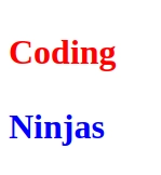
32. How does! Important work in CSS?
!important gives the highest priority to the style rule and overrides the cascaded property.
Style Code:
p {
     font-size: 2rem;
     font-weight: bold;
     color: red;
}

.important {
color: blue !important;
}
Body Code:
<p>Coding</p>
/* color is blue instead of red */

<p class="important">Ninjas</p>
Output:
33. What are the benefits of CSS Sprites?
CSS image sprites are used for merging multiple images into a single larger image. The main advantages of using sprites are:
Reduces the number of HTTP requests to get data of multiple images as they are acquired only by sending a single request.
Helps in downloading assets in advance that help display icons or images upon hover or other pseudo-states.
The browser makes separate calls to get the image for each of them when there are multiple images. Using sprites, the images are combined in one, and we can call for that image using one call.
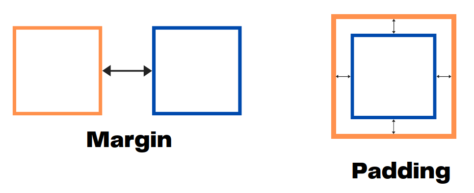
34. Explain the difference between margin and padding
Margin is applicable outside the element and affects the distance with the nearby elements.
Padding is applicable inside elements and affects how far the element's content is away from the border.
35. Define z-index
Z-index is used to specify the stack order of elements that overlap each other. Its default value is zero and can take both negative and positive values. A higher z-index value is stacked above the lower index element. It takes the following values- auto, number, initial, and inherit.
36. What are the limitations of CSS?
Some of the limitations of CSS include difficulties adapting to a browser as different browsers tend to interpret the CSS differently, limited layout options, inability to generate dynamic content, inability to perform any logical operations, etc.
37. What is a CSS Preprocessor?
A CSS Preprocessor extends the basic functionalities of CSS as it is a kind of scripting language. Saas, Less and Stylus are some of the popular CSS preprocessors. It allows you to use various programming elements like functions, variables, code nesting, inheritance etc.
38. What is the difference between inline, inline-block, and block?
The inline elements dont always start from a new line. They can start from the same line beside the contents and tags. Some of the inline elements include <a>, <span> , <strong>, <img>, <cite>, <button>,etc.
while
The inline-block elements are similar to inline elements but we can apply padding, margins, and set their height and width.
while
The block elements always begin from a new line. Examples of block elements include <div>, <p>, etc. They need space for an entire row or width.
39. What are Pseudo-elements?
In CSS, the pseudo elements style specific parts of an element. For example, you can capitalize the first letter of an element or insert some content before, or after some specified element. The syntax of a pseudo element can be seen as:
selector::pseudo-element {
  property: value;
}
Some of the pseudo-elements defined in CSS include:
::after
::backdrop
::before
::first-letter
::first-line
::file-selector-button, etc.
40. What are Pseudo classes?
In CSS, a pseudo-class defines a special state of an element.
The syntax of a pseudoclass is as follows:
selector:pseudo-class {
  property: value;
}
You can express a pseudo class adding a colon (:) after a selector in CSS, followed by a pseudo-class such as "hover", "focus", or "active", like this:
a:hover { /* style */ }.
Some of the examples of pseudoclasses include:
:fullscreen
:modal
:picture-in-picture
:autofill, etc.
41. Describe the "stacking context" in CSS and how it's created.
A stacking context is a three-dimensional conceptualization of HTML elements along an imaginary z-axis relative to the user. It's created by certain CSS properties like opacity, transform, filter, or z-index on positioned elements. Elements within a stacking context are stacked together, and multiple stacking contexts can be nested.
42. What are the advantages of using CSS preprocessors?
The advantages include:
Code Reusability: Variables and mixins allow for reusable code snippets.
Modular Code: Preprocessors help break the CSS into smaller, manageable files.
Nesting: More readable structure with nested rules.
Maintenance: Preprocessors help keep styles more organized and easier to update.
43. What are CSS Custom Properties (CSS Variables) and how do they work?
CSS Custom Properties, also known as CSS Variables, are entities defined by developers that contain specific values to be reused throughout a document. They are set using double-dash notation (e.g., --main-color: #06c;) and are accessed using the var() function (e.g., color: var(--main-color);). They can be changed dynamically with JavaScript and cascade, making them powerful for creating themes and responsive designs.
44. What is the difference between px, em, and rem units?
px: An absolute unit; it remains the same size regardless of parent elements or user settings.
em: A relative unit based on the font size of its nearest parent. 1 em is equal to the parent’s font size.
rem: A relative unit based on the root element (<html>) font size. 1 rem equals the root font size.
45. What are CSS variables, and how do you use them?
CSS variables, also known as custom properties, allow you to store values in reusable properties. Example:
:root {
  --main-color: blue;
}

body {
  color: var(--main-color);
}
46. What are CSS Containment and the contain property?
CSS Containment is a performance optimization technique that isolates a subtree of the document from the rest of the page. The contain property allows developers to indicate that an element and its contents are, as much as possible, independent of the rest of the document tree. This can result in significant performance improvements. Values include layout, paint, size, and content.
47. What are CSS Logical Properties and how do they differ from physical properties?
CSS Logical Properties are writing-mode-relative alternatives to physical properties like left, right, top, and bottom. They adapt to the text direction and writing mode, making it easier to create internationalized layouts. For example, margin-inline-start is used instead of margin-left for left-to-right languages and margin-right for right-to-left languages.
48. What is BEM in CSS, and why is it useful?
BEM (Block, Element, Modifier) is a CSS naming convention that provides a structured approach to naming classes. It ensures consistency and helps avoid naming conflicts. Example:
.block {}
.block__element {}
.block--modifier {}
BEM improves code readability and reusability.
49. Describe the difference between progressive enhancement and graceful degradation.
Progressive enhancement starts with a basic, functional version of a website that works for all users, then adds advanced features for browsers that support them. Graceful degradation starts with a fully-featured website and ensures it remains functional (albeit with reduced features) on older browsers. Progressive enhancement is generally preferred as it ensures a base level of functionality for all users.
50. How do you optimize CSS for performance?
CSS optimization strategies include:
Minification: Remove unnecessary whitespace and comments.
GZIP Compression: Compress CSS files.
Critical CSS: Inline the CSS required for above-the-fold content.
Remove Unused CSS: Use tools like PurgeCSS to eliminate unused styles.
51. What are CSS Counters and how are they used?
CSS Counters are variables maintained by CSS whose values can be incremented by CSS rules to track how many times they're used. They're often used for automatically numbering sections of a document or for creating complex numbered lists. They're manipulated using the counter-reset, counter-increment, and counter() properties and functions.
52. How does the ::before and ::after pseudo-elements work in CSS?
The ::before and ::after pseudo-elements allow you to insert content before or after the actual content of an element. They are often used for adding icons, decorative elements, or layout purposes. Example:
p::before {
  content: "Note: ";
  color: red;
}
53. Describe the CSS Box Alignment properties and their use in Flexbox and Grid.
CSS Box Alignment properties control alignment and distribution of space between and around content items within a flex or grid container. Key properties include:
justify-content: Aligns items along the main axis
align-items: Aligns items along the cross axis
align-self: Allows individual items to be aligned differently
align-content: Aligns flex lines or grid tracks These properties provide powerful control over layout in both Flexbox and Grid contexts.
54. How do you make a CSS animation loop infinitely?
You can use the animation-iteration-count property to loop a CSS animation infinitely:
CSS Shapes allow you to wrap content around custom shapes or images, rather than just rectangular boxes. The shape-outside property defines a shape (like circle(), ellipse(), or polygon()) that text will flow around. This can be used to create more interesting and dynamic layouts.
56. Explain how you would implement CSS Grid for a simple 3-column layout.
You can create a 3-column layout using CSS Grid by defining columns with the grid-template-columns property:
The clip-path property is used to define a visible region of an element, clipping away the rest. It can create shapes like circles, polygons, or complex custom shapes. Example:
img {
  clip-path: circle(50%);
}
58. What is the CSS paint API and how is it used?
The CSS Paint API is part of the CSS Houdini project. It allows developers to programmatically generate an image whenever a CSS property expects an image. This is done by creating a paint worklet, which can be used as a value for properties like background-image or border-image.
59. What is object-fit, and how is it useful?
The object-fit property controls how content (like images or videos) fits within a container, especially when the container’s aspect ratio differs from the content's aspect ratio. Example:
The type of questions that are asked more frequently in CSS are What are the types of CSS? What uses of an embedded style sheet? How to use selectors in CSS, Which stage is used to add border images to an HTML element, etc.
How many types of CSS are there?
There are three main types of CSS: inline CSS, internal or embedded CSS, and external CSS. Each type serves different purposes but shares the common goal of styling HTML elements.
What is a CSS rule?
A CSS rule consists of a selector and a declaration block. The selector identifies which HTML elements the rule applies to, while the declaration block contains one or more property-value pairs defining how those elements should be styled visually.
What is CSS used for?
CSS is a style sheet or presentation language that stands for Cascading Style Sheet and is used to Style HTML documents. CSS is designed specifically to separate the presentation and content, including color, fonts, and layout.
Conclusion
In this article, we discussed the CSS Interview Questions. Mastering CSS is an essential skill for any web developer, and being well-prepared for CSS-related interview questions can significantly boost your chances of landing your dream job. This article has covered a wide range of CSS topics, from basic concepts for freshers to advanced techniques for experienced developers.
Check out more articles based on interview questions:


 9+ registered

