Do you think IIT Guwahati certified course can help you in your career?
Introduction
The justify-content property of CSS is a sub-property of the flexbox yet a powerful tool that is used to align the elements and distribution of items within the flex container. When building responsive layouts and design, using justify content can improve the web page's appearance and flexibility.
In this blog, we will learn how to use justify-content property and its different pseudo-classes with examples. Understanding each property will help you to create a modern and dynamic web page.
Justify-content property in CSS is a property of CSS that is used to align the elements when it does not use the complete space on the main axis i.e. (the horizontal axis). It aligns these elements to utilize the flex container's main axis fully.
This alignment is possible when we apply the length and auto margins properties. That also means when one or more elements in the flexbox have a flex-grow value greater than 0, it will take up all the available space. So when this occurs, the length and auto margins property won’t have any effect as there won’t be any extra space left for margins or fixed lengths to be applied.
This property cannot be used to align elements on the vertical axis. To align elements in this axis, the align-items property is used.
Syntax of justify-content in CSS
Let’s look at how to use the justify-content property in CSS. Below is the syntax for using the justify-content property.
justify-content: start | end | center | space-between | space-around | space-evenly | initial | inherit | left | right
Property Values
Value
Description
start
The default value of justify-content. Flex items are aligned at the beginning of the container.
end
Flex items are aligned at the end of the container.
center
Flex items are aligned at the center of the container.
space-between
Flex items are evenly distributed along the main axis, with equal space between them, starting from the container's edges.
space-around
Items are equally spaced with equal space before, between, and after them. If only one item exists, it is centered.
space-evenly
Items are equally spaced with equal spacing from the edges of the container and between each item.
initial
Sets the property to its default value.
inherit
Inherits the property value from the parent element.
left
Items are aligned toward the left edge of the alignment container.
right
Items are aligned toward the right edge of the alignment container.
Understanding Property in Detail
Now, let's try to understand some of these properties with examples.
1. Flex-start
This aligns the items to the start of the container which means positioning it to the left side or top when vertical alignment is used.
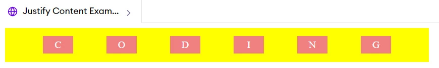
Flex items are aligned in a way in which there is equal space between them in the container. The space is equal from all the ends which means from the start, middle, and end elements have equal space.
Justify-content property should be use when you explicitly want to customize the alignment of the elements. There are various properties of justify-content that can be used to position the alignment according to the requirement. 1. Center-spacing: When you want to position the elements in the center, use justify-content property as the center and it will position the elements in the center of the container.
2. Equal-spacing: When you want to position the elements so that it has equal space between them, use justify-content property either as space-around, space-evenly, or space-between and it will position the elements in a way that it must have equal space around them.
3. Alignment: When you want to align the elements either to the start or end of the container, use justify-content property as start or end and it will shift the alignment either to the beginning or end of the container.
Supported Browsers
Below are the mentioned browsers with their versions that support justify-content functionality.
Google Chrome 29.0 and above
Firefox 20.0 and above
Opera 12.1 and above
Internet Explorer 11.0 and above
Safari 9.0 and above
Microsoft Edge 12.0 and above
Frequently Asked Questions
Can justify-content be used in CSS grid layouts?
Yes, justify-content can be used in CSS grid layouts. It is used to align the elements when it does not use the complete space on the main axis i.e. (the horizontal axis). It aligns these elements to utilize the flex container's main axis fully.
Which layout model uses justify-content?
Justify content is widely used in both models. Flexbox uses justify-content to control the horizontal alignment of items within a flex container and grid layout uses this to align gird items within the grid container.
What is the difference between space-between and space-around?
Space between and space around differs in terms of spacing they provide in elements. Space-between makes the spaces only between the elements ensuring they have equal space between them whereas space-around makes the spaces around the objects i.e. the start, or the end.
What is the difference between justify content and align items?
The most significant differentials between justify-content and align items include the axis they align elements on regarding the two alignment possibilities provided by Flexbox or Grid in CSS regarding the container:
Conclusion
In summary, the justify-content property in CSS plays a vital role in aligning and distributing items within a flex container. Mastering its various values and applications enables developers to create visually appealing, responsive web layouts. Explore more CSS techniques and tips on Code360 to elevate your web design skills!


 18+ registered

