Do you think IIT Guwahati certified course can help you in your career?
Introduction
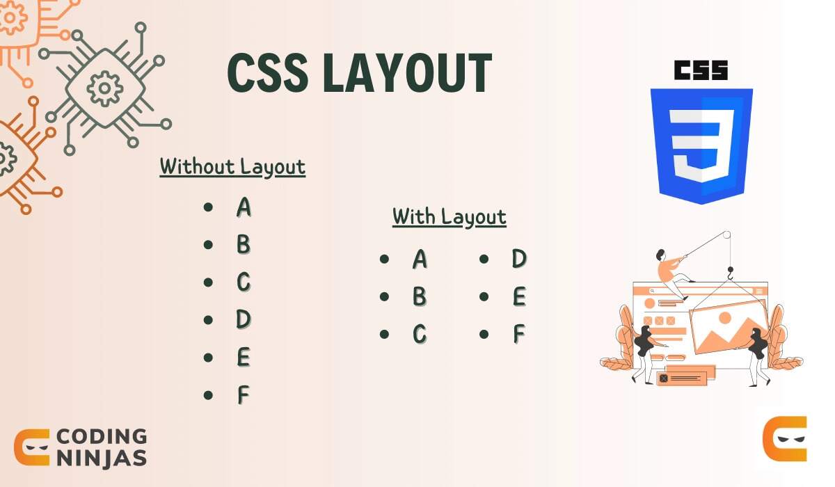
If you only desire one large column of content, then having no layout may be acceptable. But, reading becomes difficult if a user increases the browser window size because your eyes have to go far from right to left after each line to reach the next line. To observe the problem, you can resize your browser.
CSS layout uses CSS to arrange content on a web page. CSS Layout is essential in web design because it enables us to produce aesthetically pleasing and user-friendly online pages. We can adjust items' placement, size, and spacing on a web page using CSS layout techniques, simplifying user navigation and interaction with the content.
Normal Flow
Normal flow is the default layout mode in CSS, which places each element in the order it appears in the HTML code. Elements are displayed one after the other, taking up the entire width of their parent container. Normal flow helps create simple layouts and is easy to work with, but it can be limiting when creating more complex designs.
Here, we can see that HTML is displayed in the same order as the source code, with elements stacked on top of one another. The resultant web page has contents in the following order: the first paragraph, the unordered list, and the second paragraph.
Display Property
The display property in CSS controls the display of an element on a web page, including its position and how other elements flow around it, along with determining the type of box used for the element.
The display property can take on various values, including:
“block”: This value generates a rectangular box that spans the entire width of its parent container and forces any subsequent content to start on a new line.
“inline”: This value generates an inline-level box that flows within a line of text and takes up only the width required.
“inline-block”: This value generates a rectangular box with a specified width and height that flows within a line of text.
“none”: This value hides the element from the web page, making it invisible.
“flex”: This value enables flexbox layout, allowing easy alignment and content distribution within a container.
“grid”: This value enables grid layout, allowing us to easily create complex, multi-column layouts.
Thus, we use the display property to change the layout and appearance of an HTML element. We will discuss the flex and grid values in detail later.
Now, Let us look at the complete code for the above examples.
We use several CSS layout techniques to create different layouts for web pages. The four most common CSS layout techniques are floats, positioning, Flexbox, and grid.
Floats
The float property positions an element to the left or right of its parent container. We commonly use floats to create layouts with columns or wrap text around images (like in a newspaper). When we add the float property to an element, it is removed from the document’s normal flow.
The syntax for using floats:
.my-element {
  float: left;
}
Let’s look at the complete code for an example.
HTML
<!DOCTYPE html>
<html lang="en">

<head>
   <meta charset="UTF-8">
   <meta http-equiv="X-UA-Compatible" content="IE=edge">
   <meta name="viewport" content="width=device-width, initial-scale=1.0">
   <link rel="stylesheet" href="style.css">
   <title>Document</title>
</head>

<body>
   <div class="img">
       <img src="https://cdn.shopify.com/s/files/1/0709/7774/9269/files/download.jpg?v=1675416758&width=1500" />
       <p>Sample text to observe float.</p>
       <p>This is another paragraph.</p>
   </div>
</body>

</html>
CSS
img {
  width: 100px;
  height: 100px;
  float: left;
}
Output
Without a float, the text appears as in the normal flow.
With float, the text wraps around the image. As visible in the example, the image floats left, and paragraphs wrap around it.
Positioning
The position property affects how an element behaves and interacts with other elements in the document's normal flow.
The different options for this property are
“static”: An element is placed in this manner by default, following the natural flow of the page.
“relative”: This position allows an element to be positioned differently from where it would generally be on the page, which means that even if an element is moved up, down, left, or right, it will continue to occupy the same amount of space.
“absolute”: This position allows an element to be placed anywhere on the page, disregarding the page's natural flow. The element is positioned according to the element that is closest to it in the hierarchy.
“fixed”: Regardless of how the page should normally flow, this position allows an element to be positioned relative to the viewport (i.e., the browser window). Even if we scroll the page, the element stays in its original position, anchored to the top left corner.
“sticky”: This position is a combination of fixed and relative. Until a certain point, it allows an element to be positioned relative to its default position on the page. After that point, the element becomes fixed even if we scroll the page.
The syntax for using positioning is:
.my-element {
  position: relative;
}
Let’s look at the complete code for an example.
HTML
<!DOCTYPE html>
<html lang="en">

<head>
   <meta charset="UTF-8">
   <meta http-equiv="X-UA-Compatible" content="IE=edge">
   <meta name="viewport" content="width=device-width, initial-scale=1.0">
   <link rel="stylesheet" href="style.css">
   <title>Document</title>
</head>

<body>
   <div class="parent">
       <p> First paragraph according to normal flow </p>
       <div class="box">
           <p> Position property will be applied to this paragraph </p>
       </div>
   </div>
</body>

</html>
CSS
.parent {
  padding: 1rem 2rem 2rem;
  height: 1000px;
}

.box {
  top: 0;
  left: 0;
  /*
  Value for the position can be changed here from static to absolute, relative, fixed, and sticky.
  */
  position: static;
}
Output
When we use static positioning, we get the following output.
Flexbox
Flexible box layout, commonly called Flexbox, is a technique designed for a one-dimensional layout used to put the content in rows or columns. Flexbox aligns the element's direct children (or flex items) next to each other in a row and stretches them in the block direction so that they all have the same height.
With the display property set to flex, we can see that all cells are stretched to the same height and appear on the same axis without overlapping, even if they run out of space.
If we don’t use flexbox, cells will be arranged in the following way.
Grid Layout
Grids control multi-axis layout, unlike flexbox, which controls one-dimensional layout. Grids define rows and columns to easily place elements within them, making them ideal for creating responsive designs that adapt to different screen sizes.
This example adds three equally wide columns to the grid using the grid-template-columns property. This grid is flexible because the fr unit shares the available space.
Multi-Column Layout
A multi-column layout allows us to split a long list into many columns. If we don't use it, we will have to scroll a lot, wasting time. We use the column width property to specify the minimum desired width instead of specifying the number of columns into which the content is divided. The number of columns generated depends on the available viewport space, which is helpful in responsive web design.
The positioning and arrangement of elements on a web page using CSS is a CSS layout.
What is a Normal flow?
The position of elements on a web page is set by default to follow the order in which they appear in the HTML code, known as normal flow.
How can I make my CSS layouts responsive to different screen sizes?
You can design responsive layouts that look great on any device by using media queries and adjusting the layout and styles of elements based on the screen size.
What are the different types of CSS Layout techniques?
Floats, positioning, flexbox, grid, and multi-column layout are a few examples of CSS layout techniques.
What is the Box model, and how does it affect CSS Layout?
According to the Box model, a box wraps around every CSS object. It affects CSS layout by defining how much space an element occupies, including its padding, border, and margin.
Conclusion
This article discussed what CSS Layouts are and why we need them. I hope you will experiment with these Layouts yourself to get a better understanding.
If you want to learn more about CSS, check out our courses. Until then, All the best for your future endeavours, and Keep Coding.


 9+ registered

