Do you think IIT Guwahati certified course can help you in your career?
Introduction
A CSS Navigation Bar is a simple way to help users move between different parts of a website. It is created using HTML for structure and styled with CSS to look good. A navigation bar can be horizontal or vertical and can have extra features like dropdown menus or hover effects. It is also designed to work well on phones, tablets, and computers.
In this article, we will discuss CSS navigation bars, their types, how to create them, and customize them using CSS.
Characteristics of CSS Navigation Bar
A CSS navigation bar should be easy to use, visually appealing, & consistent with the overall design of the website. It should be responsive, meaning it should adapt to different screen sizes & devices. The navigation bar should also be accessible, with clear labels & intuitive navigation.
Let’s take a look at some key characteristics of a good CSS navigation bar:
Clear & concise labels: The labels on the navigation bar should be short, descriptive, & easy to understand. Avoid using jargon or technical terms that may confuse users.
Consistent design: The navigation bar should be consistent with the overall design of the website, using the same colors, fonts, & style as the rest of the site.
Responsive design: The navigation bar should be responsive, adapting to different screen sizes & devices. This ensures that users can easily navigate the site regardless of the device they are using.
Accessible: The navigation bar should be accessible to all users, including those with disabilities. This means using clear labels, providing keyboard navigation, & following web accessibility guidelines.
Intuitive navigation: The navigation bar should be intuitive & easy to use, with clear paths to different sections of the site. Users should be able to find what they are looking for quickly & easily.
Example
Let’s take a look at a basic example of a CSS navigation bar:
<!DOCTYPE html>
<html lang="en">
<head>
 <meta charset="UTF-8">
 <meta name="viewport" content="width=device-width, initial-scale=1.0">
 <title>Navigation Bar</title>
 <style>
   /* Style for navigation bar */
   nav {
     background-color: #333;
   }
   nav ul {
     list-style-type: none;
     margin: 0;
     padding: 0;
     overflow: hidden;
   }
   nav ul li {
     display: inline-block;
   }
   nav ul li a {
     display: block;
     color: white;
     text-align: center;
     padding: 14px 16px;
     text-decoration: none;
   }
   nav ul li a:hover {
     background-color: #111;
   }
   /* Responsive design */
   @media screen and (max-width: 600px) {
     nav ul {
       display: flex;
       flex-direction: column;
     }
     nav ul li {
       display: block;
     }
     nav ul li a {
       text-align: left;
       padding: 10px;
     }
   }
 </style>
</head>
<body>
 <nav>
   <ul>
     <li><a href="#">Home</a></li>
     <li><a href="#">About</a></li>
     <li><a href="#">Services</a></li>
     <li><a href="#">Contact</a></li>
   </ul>
 </nav>
</body>
</html>
Output
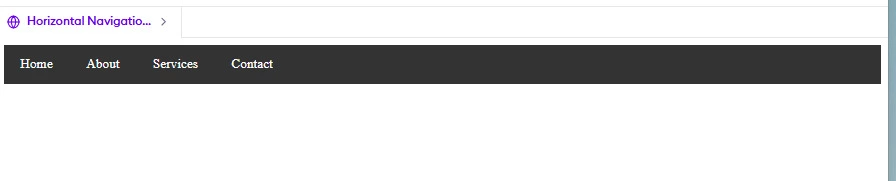
In this example, we have a simple navigation bar with four links: Home, About, Services, & Contact. The HTML structure uses a `<nav>` element to wrap the navigation bar, with an unordered list `<ul>` containing list items `<li>` for each link. The links are created using `<a>` elements with `href` attributes.
The CSS styles the navigation bar with a dark background color (`#333`), removes the default list styling, & sets the list items to display inline. The links are styled as blocks with white text, center alignment, padding, & no underline. On hover, the background color of the links changes to a darker shade (`#111`).
Types of Navigation Bars
Navigation bars can be broadly categorized into two types:
Horizontal Navigation Bar
Vertical Navigation Bar
Each type is suited for different layouts and design preferences.
Horizontal Navigation Bar
A horizontal navigation bar arranges menu items in a row, making it a popular choice for websites. Users can see all menu options at the top of the page.
The @media rule adjusts the layout for screens smaller than 600px.
Menu items switch to a vertical stack on small screens.
Border dividers
Border dividers are a simple and effective way to visually separate navigation items in a CSS navigation bar. By adding borders between navigation items, you can create a clear visual distinction and improve the readability of the navigation bar.
Let’s take a look at an example of how to add border dividers to a navigation bar:
nav ul li {
  display: inline-block;
  border-right: 1px solid #fff;
}
nav ul li:last-child {
  border-right: none;
}
In this example, we add a right border to each navigation item using the `border-right` property. The border is set to a 1-pixel solid line with a white color (`#fff`). To prevent the last navigation item from having a border, we use the `:last-child` pseudo-class to select the last `<li>` element and remove its right border.
Border dividers can be customized to match the design of your website. You can adjust the border color, thickness, and style to achieve the desired look. Additionally, you can add borders to the top, bottom, or left of the navigation items, depending on your layout preferences.
Fixed Navigation bars
A fixed navigation bar, also known as a sticky navigation bar, is a type of navigation bar that remains visible and in a fixed position on the screen as the user scrolls through the page content. This provides easy access to navigation items from anywhere on the page without requiring users to scroll back up.
Let’s discuss an example of how to create a fixed navigation bar using CSS:
In this CSS code, we set the `position` property of the `<nav>` element to `fixed`, which removes it from the normal document flow and positions it relative to the browser window. We then set the `top` and `left` properties to `0` to position the navigation bar at the top-left corner of the screen. The `width` property is set to `100%` to ensure the navigation bar spans the full width of the screen.
It's important to set a high `z-index` value to ensure the navigation bar appears above other elements on the page. In this example, we set the `z-index` to `1000`, which should be sufficient in most cases.
Note: One thing to keep in mind with fixed navigation bars is that they can sometimes overlap with the page content, particularly on smaller screens. To prevent this, you can add padding or margin to the top of the page content, equal to the height of the navigation bar, to create space for it.
Sticky Navbar
A sticky navbar is similar to a fixed navbar, but it becomes fixed only when the user scrolls past a certain point on the page. This allows the navbar to be initially positioned within the page content and then "stick" to the top of the screen as the user scrolls down.
For example:
<!DOCTYPE html>
<html lang="en">
<head>
 <meta charset="UTF-8">
 <meta name="viewport" content="width=device-width, initial-scale=1.0">
 <title>Sticky Navigation Bar</title>
 <link rel="stylesheet" href="styles.css">
 <style>
   /* CSS code is included inline for convenience */
   nav {
     background-color: #333;
     position: sticky;
     top: 0;
     z-index: 1000;
   }
   nav ul {
     list-style-type: none;
     margin: 0;
     padding: 0;
     display: flex;
   }
   nav ul li {
     display: inline-block;
   }
   nav ul li a {
     display: block;
     color: white;
     text-align: center;
     padding: 14px 16px;
     text-decoration: none;
     font-size: 16px;
   }
   nav ul li a:hover {
     background-color: #111;
   }
   .content {
     padding: 20px;
     margin-top: 60px;
     font-family: Arial, sans-serif;
     line-height: 1.6;
   }
 </style>
</head>
<body>
 <nav>
   <ul>
     <li><a href="#">Home</a></li>
     <li><a href="#">About</a></li>
     <li><a href="#">Services</a></li>
     <li><a href="#">Contact</a></li>
   </ul>
 </nav>
 <div class="content">
   <h1>Welcome to the Page</h1>
   <p>This is an example of a sticky navigation bar.</p>
   <p>As you scroll down, the navigation bar stays at the top of the screen.</p>
   <p>You can add more content below, and the sticky navigation bar will remain in place.</p>
 </div>
</body>
</html>
Output
In this example, we set the `position` property of the `<nav>` element to `sticky` and the `top` property to `0`. This means that the navbar will initially be positioned within the page content, but as soon as the user scrolls and the navbar reaches the top of the screen, it will stick there.
We also set a high `z-index` value to ensure the navbar appears above other elements when it becomes sticky.
In the HTML, we have a separate `<div>` element with a class of `content` that represents the main content of the page. We add padding to the top of this element equal to the height of the navbar to prevent the navbar from overlapping with the content when it becomes sticky.
Dropdown Navbar
A dropdown navbar is a type of navigation bar that includes dropdown menus to organize and display a large number of navigation items in a compact and user-friendly manner. When a user hovers over or clicks on a dropdown menu item, a list of related sub-items appears below it.
For example:
<!DOCTYPE html>
<html lang="en">
<head>
 <meta charset="UTF-8">
 <meta name="viewport" content="width=device-width, initial-scale=1.0">
 <title>Dropdown Navigation Menu</title>
 <link rel="stylesheet" href="styles.css">
 <style>
   /* CSS included for demonstration */
   nav {
     background-color: #333;
   }
   nav ul {
     list-style-type: none;
     margin: 0;
     padding: 0;
   }
   nav > ul > li {
     display: inline-block;
     position: relative;
   }
   nav ul li a {
     display: block;
     color: white;
     text-align: center;
     padding: 14px 16px;
     text-decoration: none;
   }
   nav ul li a:hover {
     background-color: #111;
   }
   .dropdown-menu {
     display: none;
     position: absolute;
     background-color: #f9f9f9;
     min-width: 160px;
     box-shadow: 0px 8px 16px 0px rgba(0, 0, 0, 0.2);
     z-index: 1;
   }
   .dropdown:hover .dropdown-menu {
     display: block;
   }
   .dropdown-menu li a {
     color: black;
     padding: 12px 16px;
     text-decoration: none;
     display: block;
     text-align: left;
   }
   .dropdown-menu li a:hover {
     background-color: #f1f1f1;
   }
 </style>
</head>
<body>
 <nav>
   <ul>
     <li><a href="#">Home</a></li>
     <li class="dropdown">
       <a href="#" class="dropdown-toggle">Services</a>
       <ul class="dropdown-menu">
         <li><a href="#">Web Design</a></li>
         <li><a href="#">Web Development</a></li>
         <li><a href="#">Graphic Design</a></li>
       </ul>
     </li>
     <li><a href="#">About</a></li>
     <li><a href="#">Contact</a></li>
   </ul>
 </nav>
</body>
</html>
Output
In this example, we have a navigation item labeled "Services" that acts as a dropdown toggle. When a user hovers over "Services," a dropdown menu appears, displaying three sub-items: "Web Design," "Web Development," and "Graphic Design."
The CSS styles the dropdown menu to be initially hidden using `display: none;`. When the user hovers over the dropdown toggle (`.dropdown:hover`), the dropdown menu becomes visible by changing its `display` property to `block`. The dropdown menu is positioned absolutely relative to its parent `<li>` element and appears below it.
Full-height fixed Vertical Navbar:
A full-height fixed vertical navbar is a navigation bar that is positioned vertically along the side of the page and remains fixed as the user scrolls. This type of navbar is often used for website layouts that require a more prominent and persistent navigation presence.
For example:
<!DOCTYPE html>
<html lang="en">
<head>
 <meta charset="UTF-8">
 <meta name="viewport" content="width=device-width, initial-scale=1.0">
 <title>Vertical Navbar</title>
 <style>
   /* CSS for Vertical Navbar */
   .vertical-navbar {
     width: 200px;
     background-color: #333;
     position: fixed;
     top: 0;
     left: 0;
     height: 100%;
     overflow-x: hidden;
     padding-top: 20px;
   }
   .vertical-navbar ul {
     list-style-type: none;
     margin: 0;
     padding: 0;
   }
   .vertical-navbar li a {
     display: block;
     color: white;
     padding: 16px;
     text-decoration: none;
     font-size: 18px;
   }
   .vertical-navbar li a:hover {
     background-color: #111;
   }
   .content {
     margin-left: 200px;
     padding: 20px;
   }
   body {
     font-family: Arial, sans-serif;
     margin: 0;
   }
 </style>
</head>
<body>
 <nav class="vertical-navbar">
   <ul>
     <li><a href="#">Home</a></li>
     <li><a href="#">About</a></li>
     <li><a href="#">Services</a></li>
     <li><a href="#">Contact</a></li>
   </ul>
 </nav>
 <div class="content">
   <h1>Welcome to My Website</h1>
   <p>This is the content section. The vertical navigation bar remains fixed on the left while you can scroll and interact with this area.</p>
   <p>Add more content here as needed for your webpage.</p>
 </div>
</body>
</html>
Output
In this example, the vertical navbar is created using a `<nav>` element with a class of `vertical-navbar`. The CSS sets the `width` of the navbar to a fixed value (e.g., 200px) and positions it fixed to the left side of the page using `position: fixed;`, `top: 0;`, and `left: 0;`. The `height` is set to `100%` to make the navbar span the full height of the viewport.
The `overflow-x: hidden;` property ensures that any content exceeding the width of the navbar is hidden, preventing horizontal scrolling.
The navigation items are styled as block-level elements with padding and hover effects.
To accommodate the space occupied by the vertical navbar, the main content area is given a left margin equal to the width of the navbar using `margin-left: 200px;`. This ensures that the content does not overlap with the navbar.
Limitation of CSS Navigation Bar
While CSS navigation bars are widely used and offer many benefits, there are certain limitations, like:
1. Limited styling options: CSS alone may not provide all the styling options you need for a highly customized or complex navigation bar. In some cases, you may need to use additional tools or frameworks to achieve the desired look and functionality.
2. Maintenance: As your website grows, maintaining a large navigation bar can become challenging. Adding, removing, or modifying links requires editing the HTML and CSS code, which can be time-consuming and prone to errors.
3. Responsiveness: Although CSS allows you to create responsive navigation bars, it may require additional coding and testing to ensure compatibility across various devices and screen sizes. Complex navigation bars with many items or dropdown menus can be particularly challenging to make fully responsive.
4. Accessibility: Ensuring that your navigation bar is fully accessible to all users, including those using assistive technologies, may require additional effort and testing. Proper labeling, keyboard navigation, and ARIA attributes are important considerations for accessibility.
5. Performance: Complex navigation bars with many items or deep nesting can impact the performance of your website. Large dropdown menus or mega menus may slow down page load times, especially on mobile devices or slower internet connections.
Frequently Asked Questions
What is a CSS navigation bar?
A navigation bar is a menu that helps users navigate different sections of a website.
How can I make a navigation bar responsive?
Use media queries to adjust the layout for different screen sizes.
What are the common types of navigation bars?
Horizontal and vertical navigation bars are the most common types.
Conclusion
In this article, we discussed about CSS navigation bars, including horizontal and vertical types. With examples, we discussed how to customize them with icons and make them responsive. These skills are crucial for creating user-friendly web interfaces.


 18+ registered

