Introduction:
Padding is a property in CSS which allows you to specify how much space should appear between the content of the element and its border. The value of that property is most often specified in pixels(although it is also possible to use percentages or ems). If a percentage is used, the padding is a percentage of the browser window(or of the containing box if it is within another box).
Difficult right!!, don’t worry we will have a detailed discussion on this topic. Come, let’s start.
Also see, Difference Between CSS and SCSS
Approach:
The padding properties in CSS can further be specified into the following types:
- padding-top
- padding-right
- padding-bottom
- padding-left
All the padding properties contains three things:
- Length: It is generally defined in terms of px, pt, cm, etc.
- Percentage(%): It defines padding in terms of the percentage of the containing element.
- Inherit: Padding is always inherited from the parent element.
Note: negative values cannot be used.
Now, let’s have a look through some of the examples of how we can define and use this padding concept. Is it really a magic wand!!
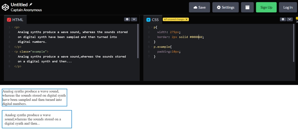
As you can see, the second paragraph here is much easier to read because there exists space between the border and text of the box. The box is also wider because it has padding. Different values can be specified using a different side of the box:
- padding-top
- padding -right
- padding-bottom
- padding-left
Code:
HTML:
|
<p> Hello Coders!! </p> |
CSS:
|
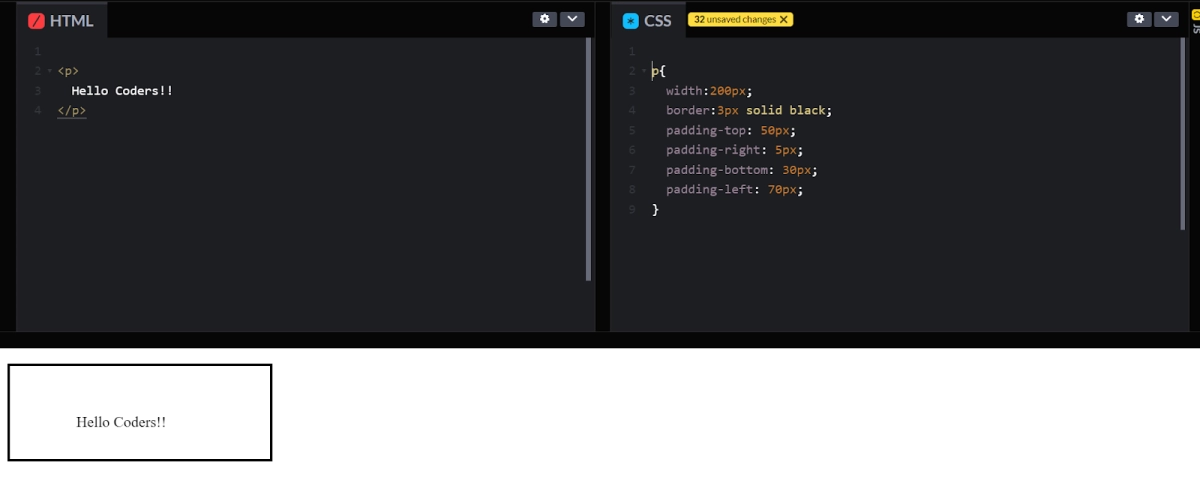
p{ width:200px; border:3px solid black; padding-top: 50px; padding-right: 5px; padding-bottom: 30px; padding-left: 70px; } |
Padding and Element width:
The example given above contains a field ‘width’. The ‘width’ property defines the width of an element’s content area. The content area refers to the portion inside padding, margin, and border of the element.
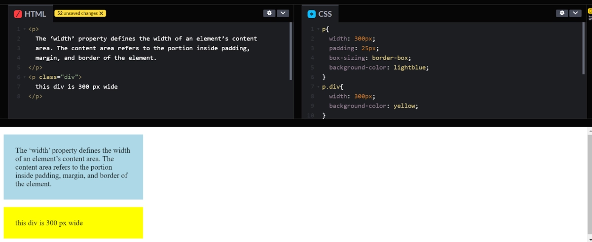
So, if the element has a defined width, then the padding of that element will be added to the element’s total width. This sometimes results in an undesirable ending.
We can use the box-sizing property to keep the width fixed at specific pixels, no matter the amount of padding. This helps to maintain the actual width; if you increase the padding, the available content space will decrease.
HTML:
|
<p> The 'width' property defines the width of an element's content area. The content area refers to the portion inside padding, Margin and border of the element. </p> <p class="div"> this div is 300 px wide </p> |
CSS:
|
p{ width: 300px; padding: 25px; box-sizing: border-box; background-color: lightblue; } p.div{ width: 300px; background-color: yellow; } |
Output:
Padding - shorthand property:
As the name suggests, this feature in padding helps the work and reduces the code size. It acts as a shortcut key for padding. You can use a shorthand(where the values are in clockwise order: top, right, bottom, left.
HTML:
|
<p> Hello Coders!! </p> |
CSS:
|
p{ width:200px; border: 3px solid black; padding: 25px 50px 75px 100px; } |
Output:
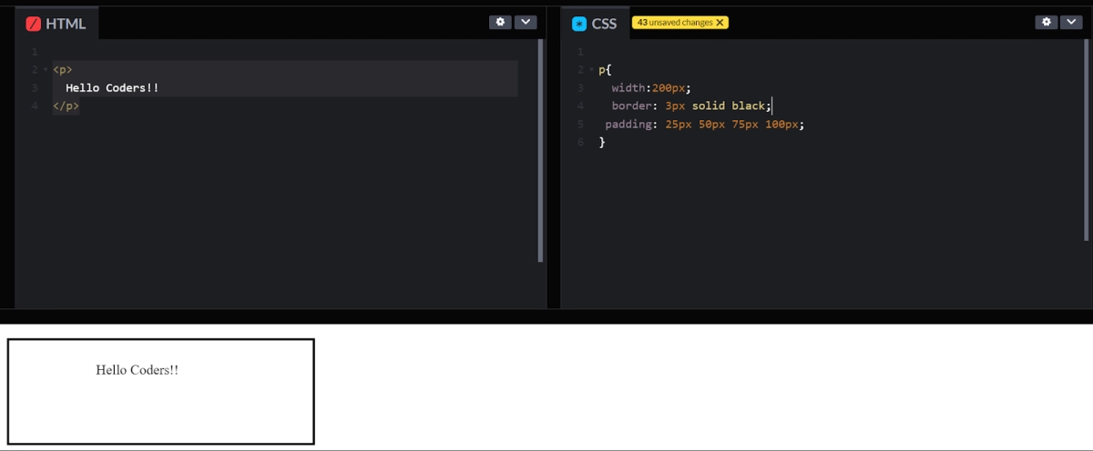
In the example given above, top padding is 25px, right padding is 50px, bottom padding is 75px and left padding is 100px.
- If the padding has three values:
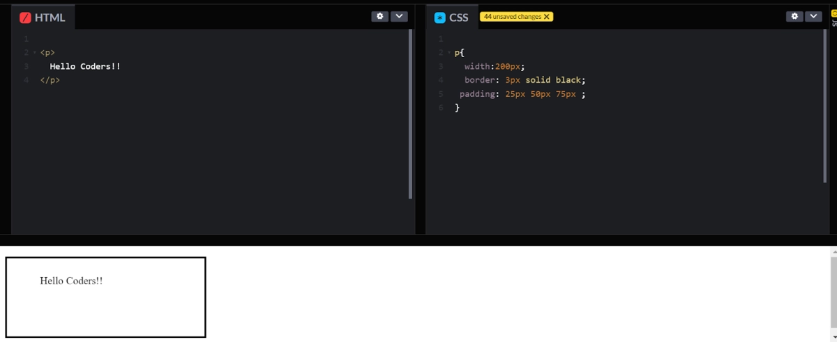
For the example given below, top padding is 25px, right and left padding is 50px and bottom padding is 75px.
HTML:
|
<p> Hello Coders!! </p> |
CSS:
|
p{ width:200px; border: 3px solid black; padding: 25px 50px 75px ; } |
Output:
- If the padding has two values:
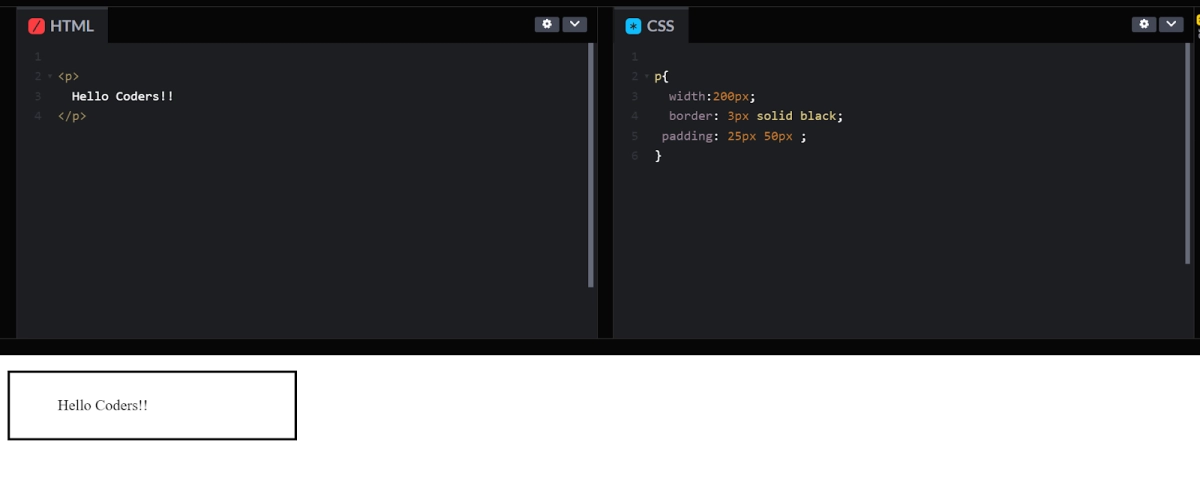
Here, the top and bottom padding is 25px; right and left padding is 50px.
HTML:
|
<p> Hello Coders!! </p> |
CSS:
|
p{ width:200px; border: 3px solid black; padding: 25px 50px ; } |
Output:
- If the padding has one value:
For one value, 25 padding will be applied for all four fields, top, right, bottom, and left.
HTML:
|
<p> Hello Coders!! </p> |
CSS:
|
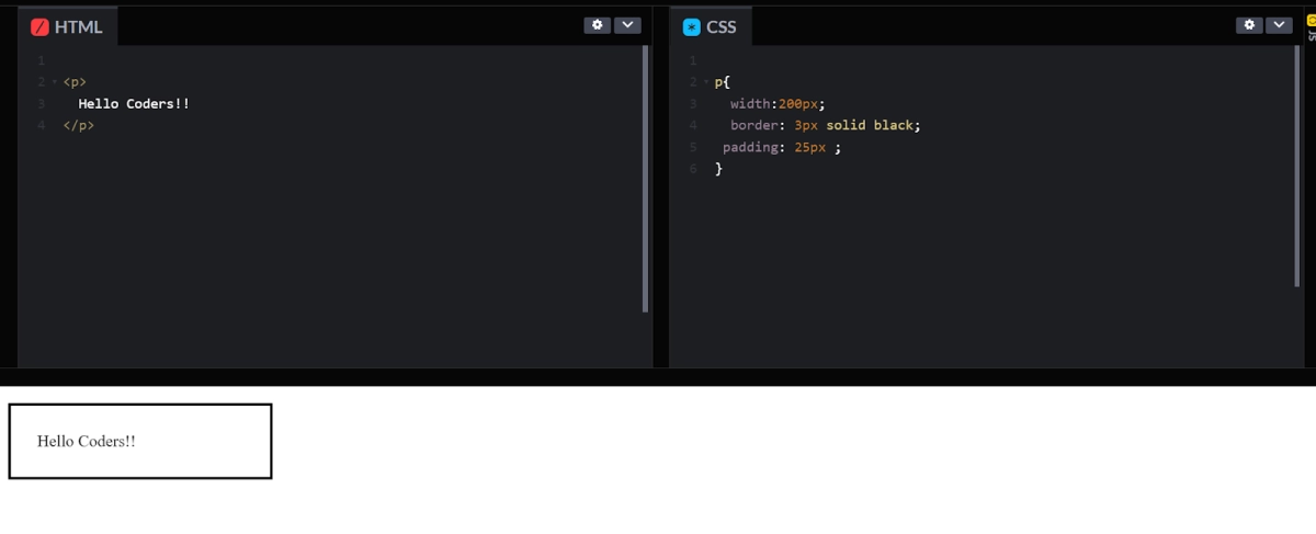
p{ width:200px; border: 3px solid black; padding: 25px ; } |
Output:
