Introduction
CSS pseudo-classes are a powerful feature that allows developers to apply styles to elements based on their state or position within the document. These special selectors enable more dynamic and interactive styling without the need for additional JavaScript or markup. Pseudo-classes can target elements in various states, such as when a user hovers over a link, an element is the first child of its parent, or even when a form input is checked. In this blog, we'll explore the world of CSS pseudo-classes.
Pseudo Class
A pseudo-class in CSS is a keyword added to a selector that specifies a particular state of the selected element(s). For example, a hover can change a button's colour when the user's pointer hovers over it. In simple words, CSS Pseudo Classes are used to add special effects to CSS selectors. They are used to define a particular state of an element, which means the design can react to user input.
Syntax
The syntax of Pseudo Classes is as follows:
selector: pseudo-class {
    property: value;
}
There are a lot of pseudo-classes, but some of them are commonly used in CSS. Let's discuss them in detail.
root
The pseudo-class root property helps you target the highest-level parent element in the document tree or the DOM.
<!DOCTYPE html>
    <head>
        <style>
            .container {
                margin-top: 10%;
                margin-left: 10%;
                background-color: antiquewhite;
                width: 30%;
            }

            .fieldset {
                background-color: beige;
            }

            :root {
                background-color: red;
            }

            p {
                background-color: rgb(89, 229, 126);
                padding: 1%;
            }
        </style>
    </head>
    <body>
        <div class="container">
            <fieldset class="fieldset">
                <h2>Welcome to Coding Ninjas</h2>
                <h3>This is "root" example</h3>
                <p>Hi this is me</p>
            </fieldset>
        </div>
    </body>
</html>
Output:
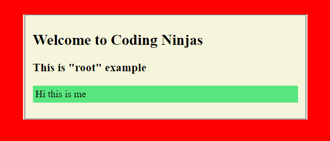
Explanation:
In the above example, there are three layers of colours: green is the child, light peach is the parent, and red is the root colour or the highest parent of the webpage.
placeholder-shown
The "placeholder-shown" is a pseudo-class property in CSS which help us to design the input and textarea attribute under the form. The "placeholder-shown" property works until the placeholder is visible in the input or textarea attribute.
Note: This property doesn't work on date, time and month type.
<!DOCTYPE html>
    <head>
        <style>
            input {
                font-size: 20px;
                border: 3px solid black;
                width: 300px;
                padding: 5px;
            }
            input:placeholder-shown {
                border: 5px solid red;
            }
        </style>
    </head>
    <body>
        <h2>Welcome to Coding Ninjas</h2>
        <h3>This is "placeholder-shown" example</h3>
        <form action="">
            <input type="text" placeholder="Enter Name"><br><br>
            <input type="number" placeholder="Enter Age"><br><br>
        </form>
    </body>
</html>
Output:
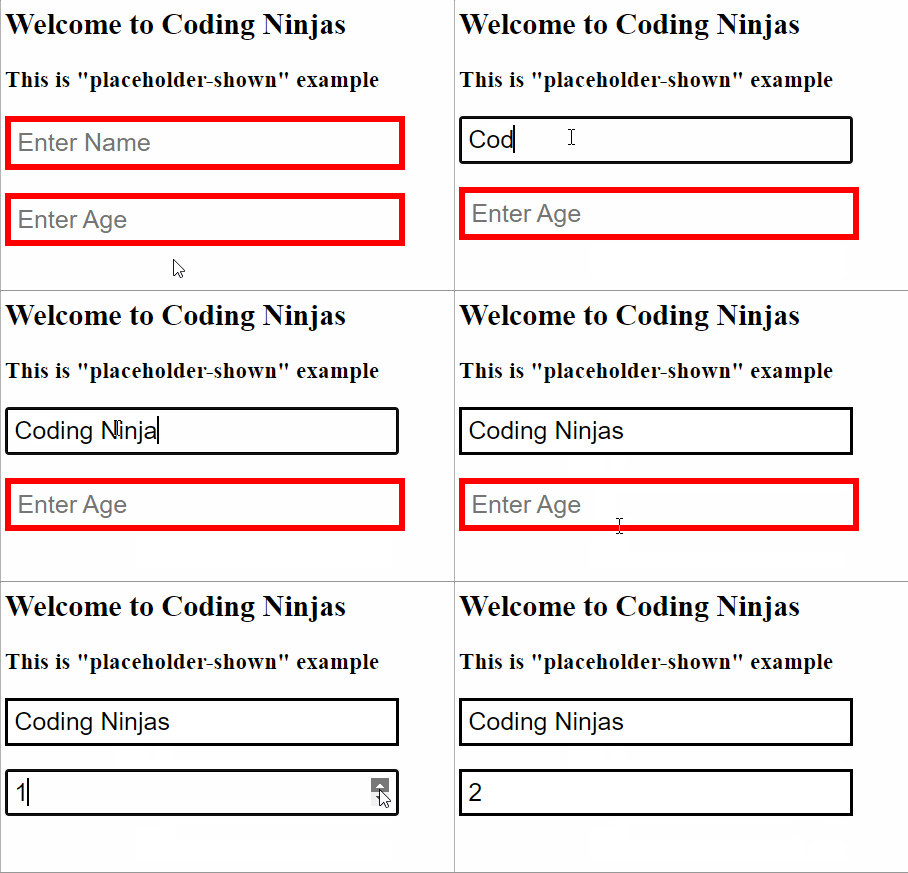
Explanation:
As you can see in the above example, there was a red border that disappeared as soon as the placeholder was removed from the screen. This is how we can style the placeholder.
hover
This is the most common pseudo-class among all. You can see a special effect on the element when you take the cursor or pointer to the element. Let's see an example for more clarity.
<!DOCTYPE html>
<html>
    <head>
        <style>
            h3:hover {
                color: orange;
            }
        </style>
    </head>
    <body>
        <h1>Welcome to Coding Ninjas</h1>
        <h2>This is hover example</h2>
        <h3>Hover on me to see the magic</h3>
    </body>
</html>
Output:
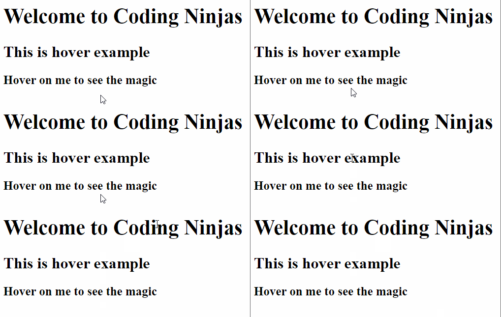
Explanation:
As you can see in the output, the colour of the last line changes from black to orange whenever we take the cursor on it. But at the same time, the colour of the first two lines is not changing because we only used the hover pseudo-class on the third line.
active
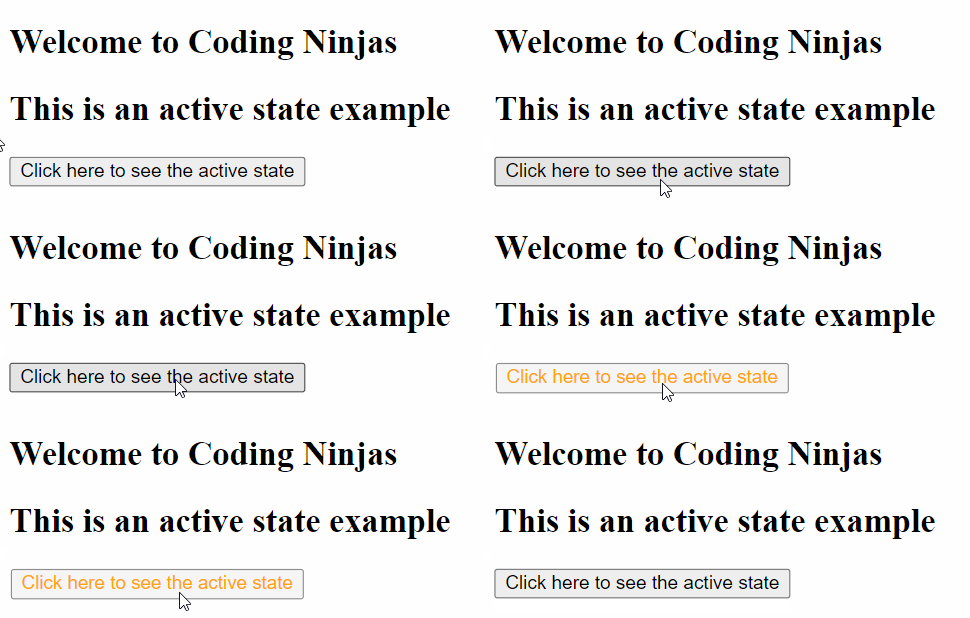
This is an example of a pseudo-classes state. The active state is triggered whenever the user clicks on a specific button, hyperlink, etc., on the web page. You can see the transition between the click and the release time. Let's see this using an example.
<!DOCTYPE html>
<html>
    <head>
        <style>
            .button:active {
                transform: scale(0.99);
                color: orange;
                box-shadow: none;
            }
        </style>
    </head>
    <body>
        <h2>Welcome to Coding Ninjas</h2>
        <h2>This is an active state example</h2>
        <button class="button">Click here to see the active state</button>
    </body>
</html>
Output:
Explanation:
As you can see in the example above, the colour of the text in the button changes from black to orange with every click. This shows the active state of the button.
visited
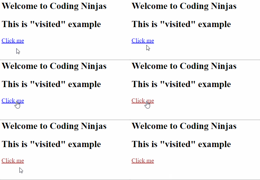
This pseudo-class adds style to the link that is visited. Let's have a look at the example.
<!DOCTYPE html>
<html lang="en">
    <head>
        <style>
            a:visited {
                color: brown;
            }
        </style>
    </head>
    <body>
        <h2>Welcome to Coding Ninjas</h2>
        <h2>This is "visited" example</h2>
        <a href="###">Click me</a>
    </body>
</html>
Output:
Explanation:
As you can see in the output, we can control the colour of a link using the visited pseudo-class. The colour is brown after the click in this example.
required
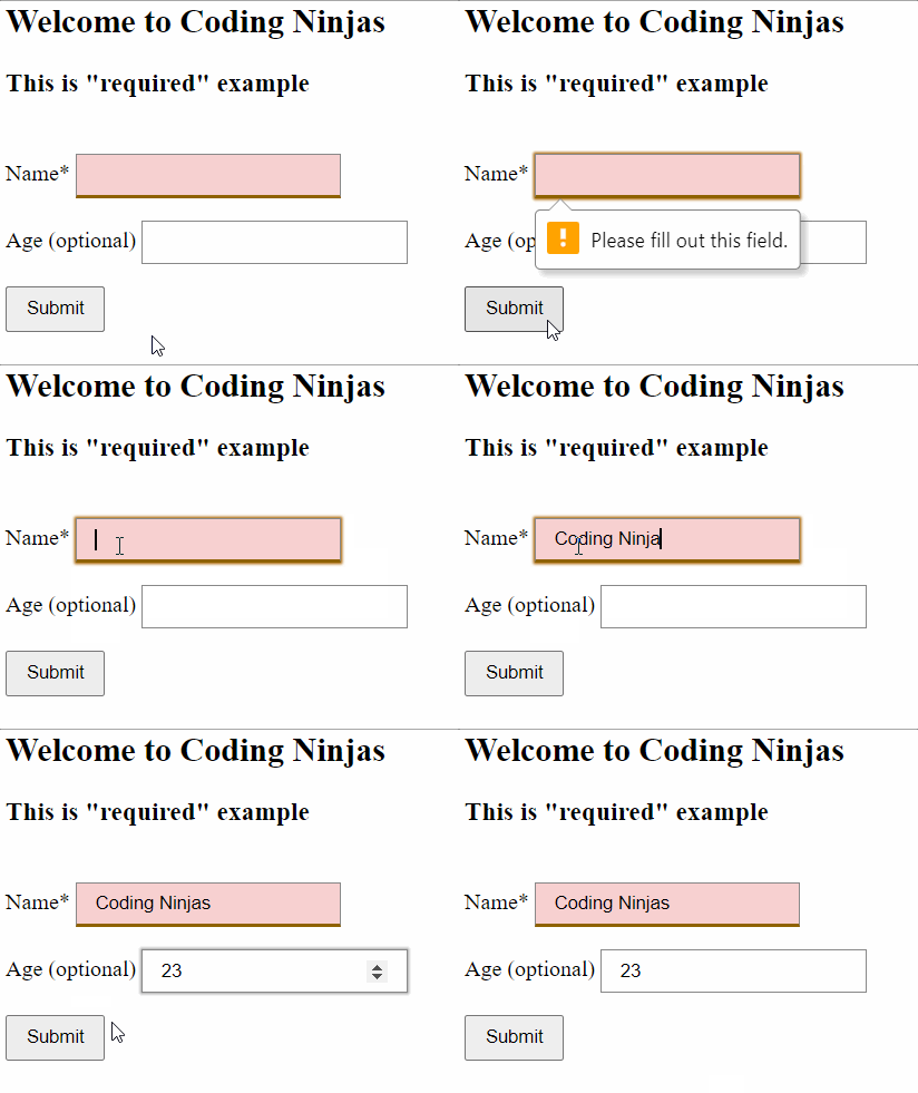
The required property in pseudo-class is used when the form element is required to fill. Let's see this using an example.
<!DOCTYPE html>
    <head>
        <style>
            .container {
                margin: 40px auto;
            }

            label, button {
                display: block;
                margin-bottom: 1em;
            }

            input, select, button {
                padding: .5em 1em;
            }

            input, select {
                border: 1px solid #888;
            }

            input:required {
                border-bottom: 3px solid #8f6201;
            }

            input:focus, select:focus {
                outline: 0;
                box-shadow: 0 0 2px 1px #aa6300;
            }

            input:optional:focus, select:optional:focus {
                box-shadow: 0 0 2px 1px #aaa;
            }
            :required {
                background-color: rgb(247, 208, 208);
            }
        </style>
    </head>
    <body>
        <h2>Welcome to Coding Ninjas</h2>
        <h3>This is "required" example</h3>
        <div class="container">
            <form action="#">
                <label>Name* <input type="name" required> </label>
                <label> Age (optional) <input type="number"> </label>
                <button>Submit</button>
            </form>
        </div>
    </body>
</html>
Output:
Explanation:
As you can see in the output, first, we tried to submit the form without filling the required field (Name). But a pop-up came with an error message to fill the Name field.
checked
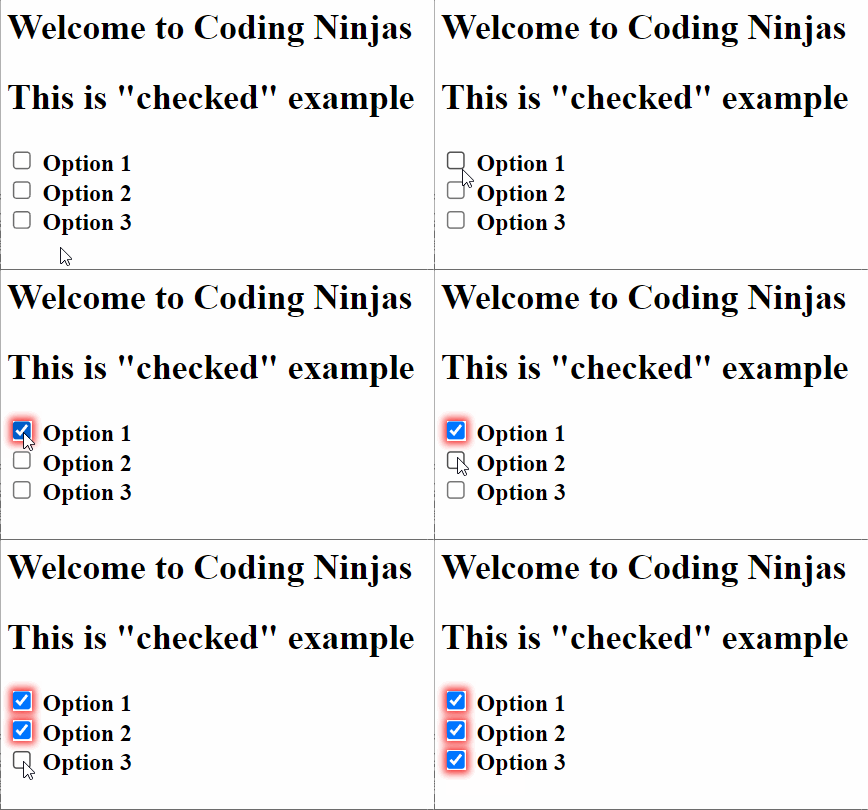
The checked pseudo-class adds effects to the checkbox present in the form. Let's see this effect using an example.
<!DOCTYPE html>
    <head>
        <style>
            :checked {
                box-shadow: 0px 0px 5px 2px rgb(245, 44, 44);
            }
            label {
                font-weight: bold;
            }
        </style>
    </head>
    <body>
        <h2>Welcome to Coding Ninjas</h2>
        <h2>This is "checked" example</h2>
        <div class="wrapper">
            <label>
                <input type="checkbox" />
                Option 1
            </label></br>
            <label>
                <input type="checkbox" />
                Option 2
            </label></br>
            <label>
                <input type="checkbox" />
                Option 3
            </label>
        </div>
    </body>
</html>
Output:
Explanation:
Here you can see three checkboxes with black borders in the beginning. But after the click, all the checkboxes turn with a special red colour on the borders. This is how we can use the checked pseudo-class.
enabled and disabled
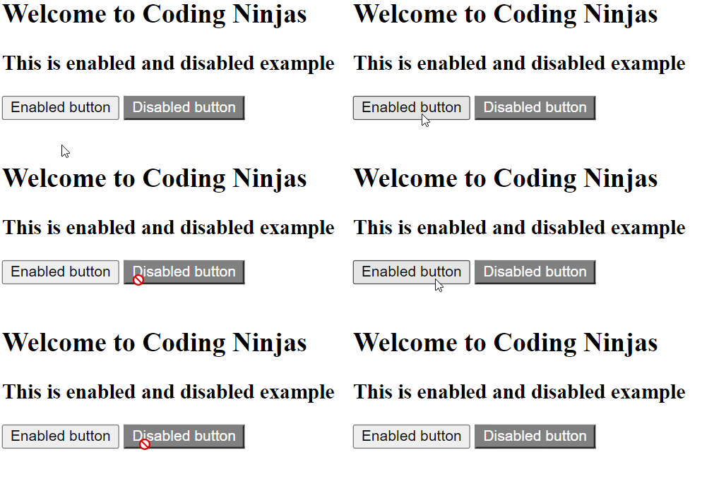
The enabled and disabled are form states. We can use them in the forms to enable or disable any button. The button is enabled by default, but you can set styles to your disabled button. Let's understand with the help of an example.
<!DOCTYPE html>
    <head>
        <style>
                button:disabled {
                background: grey;
                border-color: grey;
                cursor: not-allowed;
                color: white;
                }

                button:enabled {
                }

                button:disabled:hover {
                box-shadow: none;
                }
        </style>
    </head>
    <body>
        <h2>Welcome to Coding Ninjas</h2>
        <h3>This is enabled and disabled example</h3>
        <button>Enabled button</button>
        <button disabled>Disabled button</button>
    </body>
</html>
Output:
Explanation:
As you can see in the output above, the left button is clickable, but at the same time, a red cross sign is coming on the right button, which means the left button is enabled and the right button is disabled.
focus
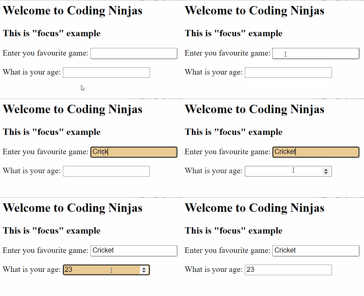
The focus property is triggered when the user taps or clicks the button, link, etc. An example of this is as follows.
<!DOCTYPE html>
    <head>
        <style>
          label {
          display: block;
          margin-top: 1em;
          }

          input:focus {
            background-color: rgb(235, 204, 150);
          }
        </style>
    </head>
    <body>
      <h2>Welcome to Coding Ninjas</h2>
      <h3>This is "focus" example</h3>
      <form>
        <label>Enter you favourite game: <input name="gameName" type="text"></label>
        <label>What is your age: <input name="age" type="number"></label>
      </form>
    </body>
</html>
Output:
Explanation:
As you can see in the output, the colour changes on clicking the text box mean it is focusing the text box after click, but when you try to click outside the text box, the focus gets removed.
in-range
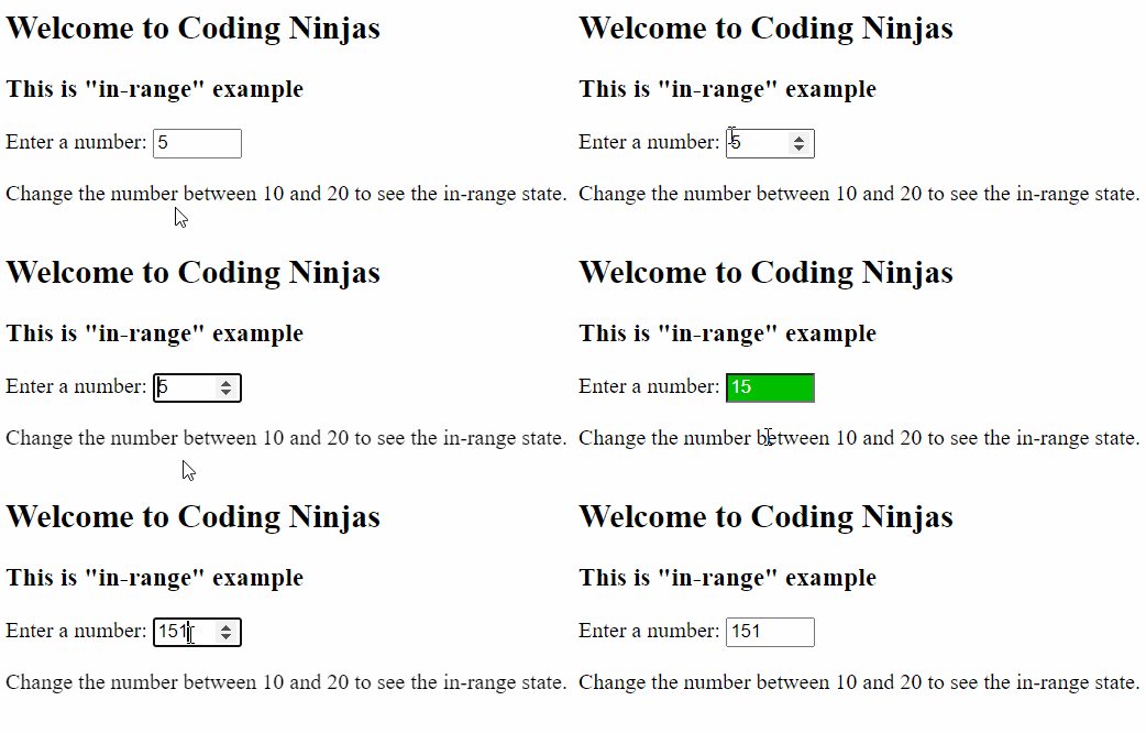
We can use the in-range pseudo-class when an input, such as a numeric input, has a minimum and maximum value, and the value falls inside those bounds.
<!DOCTYPE html>
    <head>
        <style>

            input:in-range {
            background: rgb(0, 190, 0);
            color: white;
            }
        </style>
    </head>
    <body>
        <h2>Welcome to Coding Ninjas</h2>
        <h3>This is "in-range" example</h3>
        <form>
            <label for="number">Enter a number: </label>
            <input type="number" id="number" min="10" max="20" value="5"/>
            <p>Change the number between 10 and 20 to see the in-range state.</p>
        </form>
    </body>
</html>
Output:
Explanation:
As you can see in the example above, when the value in the input is between 10 to 20, the colour changes to green. And if the value exceeds the limit, it again turns white. This is how we can use the in-range pseudo-class to style the web page.
first-child
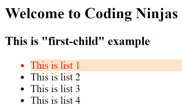
The first child is a type of pseudo-class where we can change the style of the first item in the list. Let's see an example of this.
<!DOCTYPE html>
    <head>
        <style>
            li:first-child{
                color: red;
                background-color: bisque;
            }
        </style>
    </head>
    <body>
        <h2>Welcome to Coding Ninjas</h2>
        <h3>This is "first-child" example</h3>
        <ul>
            <li>This is list 1</li>
            <li>This is list 2</li>
            <li>This is list 3</li>
            <li>This is list 4</li>
        </ul>
    </body>
</html>
Output:
Explanation:
In this example, we took four list items, and after using the first-child pseudo-class, the colour of the text in the first item of the list changed to red with a background colour. This is how we can mark the first item in the list.
last-child
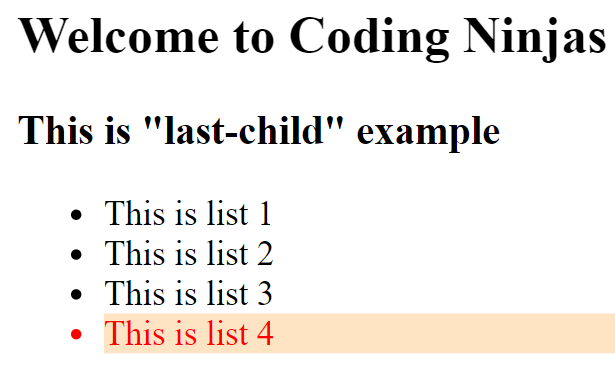
The last-child is a type of pseudo-class where we can change the style of the last item in the list. Let's see an example of this. We took the same example as above for better clarity.
<!DOCTYPE html>
    <head>
        <style>
            li:last-child{
                color: red;
                background-color: bisque;
            }
        </style>
    </head>
    <body>
        <h2>Welcome to Coding Ninjas</h2>
        <h3>This is "last-child" example</h3>
        <ul>
            <li>This is list 1</li>
            <li>This is list 2</li>
            <li>This is list 3</li>
            <li>This is list 4</li>
        </ul>
    </body>
</html>
Output:
Explanation:
In this example, we took four list items, and after using the last-child pseudo-class, the text colour of the last item in the list changed to red with a background colour.
nth-child
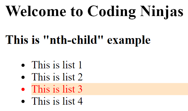
Now, the question is, what if we want to mark the 5th or the 3rd element in the list? To do so, we can use the nth-child pseudo-class. Let's have a look.
<!DOCTYPE html>
    <head>
        <style>
            li:nth-child(3){
                color: red;
                background-color: bisque;
            }
        </style>
    </head>
    <body>
        <h2>Welcome to Coding Ninjas</h2>
        <h3>This is "nth-child" example</h3>
        <ul>
            <li>This is list 1</li>
            <li>This is list 2</li>
            <li>This is list 3</li>
            <li>This is list 4</li>
        </ul>
    </body>
</html>
Output:
Explanation:
In this example, we have marked the third element in the list using the nth-child pseudo-class. To do this, you just have to pass the list number in the nth-child().
Check this out: Versions of CSS


