Table of contents
1.
Introduction
2.
Text Shadow
2.1.
Html
2.2.
CSS
2.2.1.
Output
3.
Box Shadow
3.1.
Parts of the box-shadow property
3.2.
Html
3.3.
CSS
4.
Coloured Shadow
4.1.
Html
4.2.
CSS
4.2.1.
Output
5.
Blurred Shadow
5.1.
Html
5.2.
CSS
5.2.1.
Output
6.
Multiple Shadows
6.1.
Html
6.2.
CSS
6.2.1.
Output
7.
Border Around Text
7.1.
Html
7.2.
CSS
7.2.1.
Output
8.
Coloured and Blurred Shadows
8.1.
Html
8.2.
CSS
8.2.1.
Output
9.
Spread Radius
9.1.
Html
9.2.
CSS
9.2.1.
Output
10.
Border Radius
10.1.
Html
10.2.
CSS
10.2.1.
Output
11.
Inset Keyword
11.1.
Html
11.2.
CSS
11.2.1.
Output
12.
Multiple Shadows
12.1.
Html
12.2.
CSS
12.2.1.
Output
13.
Outlines
14.
Cards
14.1.
HTML
14.2.
CSS
14.2.1.
Output
15.
Best Shadow for Box
16.
Frequently Asked Questions
16.1.
What are CSS shadows?
16.2.
How many types of CSS shadows are there?
16.3.
What is a CSS text shadow?
16.4.
How do I put a background shadow in CSS?
16.5.
Can I apply multiple shadows to an element?
17.
Conclusion
Last Updated: Nov 6, 2024
Easy

CSS Shadows

Career growth poll
Do you think IIT Guwahati certified course can help you in your career?

Introduction

CSS shadows add depth and style to web elements, helping to create engaging, modern designs. By using shadows in CSS, you can enhance visual interest and highlight important parts of a page with just a few lines of code. CSS provides two main types of shadows: box shadows and text shadows. Box shadows add shadow effects around elements like divs and buttons, creating a sense of elevation or depth. Text shadows, on the other hand, enhance text by adding subtle or bold shadowing that can make it stand out on the page.

Introduction

A shadow has been added to the text in the pictures above, but we can also add shadows to a box or an image. This gives us two kinds of shadows:

  1. Text Shadow
  2. Box Shadow

Let’s learn what they are in this article.

Text Shadow

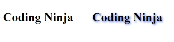
Text shadows in CSS are a styling technique used to add a shadow effect behind text, which enhances its appearance and makes it stand out on a webpage. By adjusting the shadow’s color, blur, and positioning, you can create subtle depth or bold, eye-catching effects. Text shadows are commonly used to improve readability, create visual interest, and give text a more three-dimensional appearance.

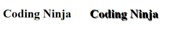
To begin with, let’s see the code for the example shown below above. 

Html

<!DOCTYPE html>
<html lang="en">
<head>
    <meta charset="UTF-8">
    <meta http-equiv="X-UA-Compatible" content="IE=edge">
    <meta name="viewport" content="width=device-width, initial-scale=1.0">
    <title>Coding Ninja</title>
    <link rel="stylesheet" href="style.css">
   
</head>
<body>
   
    <div class="first">
        <h1>Coding Ninja</h1>
    </div>
    <div class="second">
        <h1>Coding Ninja</h1>
    </div>
  </body>
</html>

CSS

body{
    display: flex;
}
.second{
    margin-left: 50px;
    text-shadow: 2px 2px;
}

Output

Output

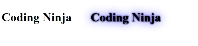
Here, a simple shadow of the same colour is added to the text by only a horizontal and vertical shadow. So the shadow isn’t prominent. Let’s change the colour of the shadow and see how it looks.

Box Shadow

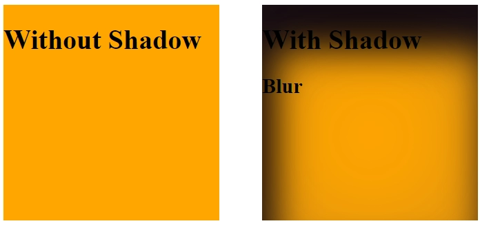
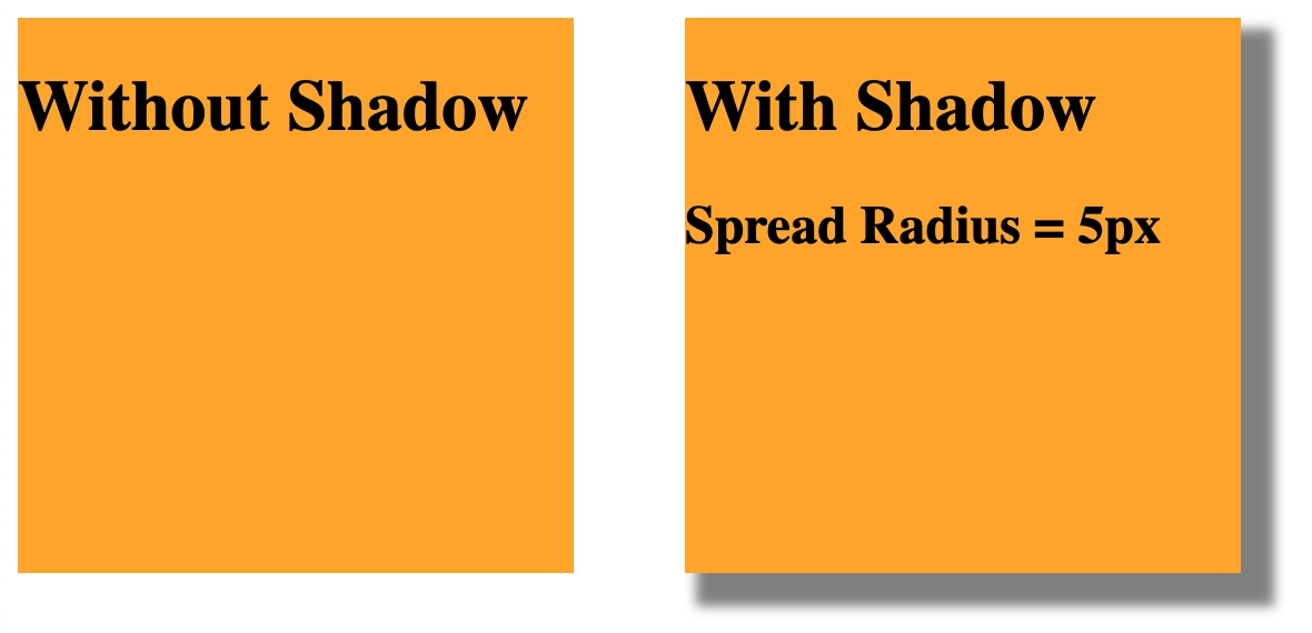
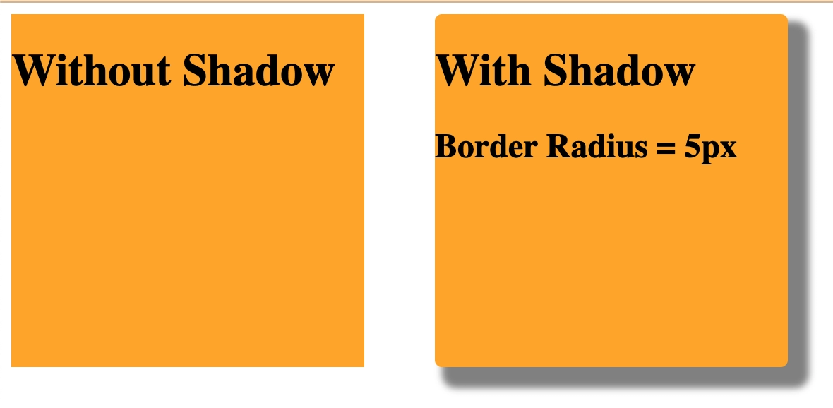
A box shadow in CSS is used to add shadow effects around an element’s frame, creating a sense of depth or highlighting. By customizing the shadow’s offset, blur, spread, and color, you can achieve subtle or dramatic effects to enhance the element’s appearance.

Parts of the box-shadow property

There are four box-shadow numbers to choose from:

offset-x: The horizontal shift of the shadow of the element. Positive values shift the shadow to the right, while negative values move it to the left.
 

offset-y: The perpendicular displacement of the shadow of the element. Positive values make the image smaller, while negative values make it larger.
 

blur-radius: The amount of blur that is used to produce the shadow. Higher values result in a softer, more dispersed shadow.
 

color: The tone of the shadow. This can be specified using keywords (for example, black, white), hexadecimal values (for example, #000000, #fffff), RGB or RGBA values (for example, rgb(0,0,0), rgba(255,255,255,0.5)), or HSL or HSLA values (for example, hsl(0,0%,0%), hsla(0,0%,100%)).
 

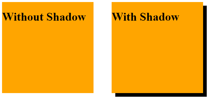
As the name suggests, a box shadow adds a shadow effect to a box, as shown below. 

shadow effect

But how do we use CSS shadows in a box?

Adding shadows to a text and a box aren’t much different. All we need to do is add a horizontal and vertical shadow. 

Html

<!DOCTYPE html>
<html lang="en">
<head>
    <meta charset="UTF-8">
    <meta http-equiv="X-UA-Compatible" content="IE=edge">
    <meta name="viewport" content="width=device-width, initial-scale=1.0">
    <title>Coding Ninja</title>
    <link rel="stylesheet" href="style.css">
   
</head>
<body>
   
    <div class="first">
        <h1>Without Shadow</h1>
    </div>
    <div class="second">
        <h1>With Shadow</h1>
    </div>
  </body>
</html>

CSS

body{
    display: flex;
}
.first{
    height: 250px;
    width: 250px;
    background-color: orange;
}
.second{
    margin-left: 50px;
    height: 250px;
    width: 250px;
    background-color: orange;
    box-shadow: 10px 10px;


}

Coloured Shadow

Html

<!DOCTYPE html>
<html lang="en">
<head>
    <meta charset="UTF-8">
    <meta http-equiv="X-UA-Compatible" content="IE=edge">
    <meta name="viewport" content="width=device-width, initial-scale=1.0">
    <title>Coding Ninja</title>
    <link rel="stylesheet" href="style.css">
   
</head>
<body>
   
    <div class="first">
        <h1>Coding Ninja</h1>
    </div>
    <div class="second">
        <h1>Coding Ninja</h1>
    </div>
  </body>
</html>

CSS

body{
    display: flex;
}
.second{
    margin-left: 50px;
    text-shadow: 2px 2px royalblue;
}

Output

Output

Blurred Shadow

We can also add a blur to the shadow, thus creating a glowing effect around the text. 

In the example below, a blur radius of 5px is added to the shadow. 

Html

<!DOCTYPE html>
<html lang="en">
<head>
    <meta charset="UTF-8">
    <meta http-equiv="X-UA-Compatible" content="IE=edge">
    <meta name="viewport" content="width=device-width, initial-scale=1.0">
    <title>Coding Ninja</title>
    <link rel="stylesheet" href="style.css">
   
</head>
<body>
   
    <div class="first">
        <h1>Coding Ninja</h1>
    </div>
    <div class="second">
        <h1>Coding Ninja</h1>
    </div>
  </body>
</html>

CSS

body{
    display: flex;
}
.second{
    margin-left: 50px;
    text-shadow: 2px 2px 5px royalblue;
}

Output

Output

Multiple Shadows

As shown below, we can add more than one shadow to a text by adding a comma-separated list of shadows. 

Html

<!DOCTYPE html>
<html lang="en">
<head>
    <meta charset="UTF-8">
    <meta http-equiv="X-UA-Compatible" content="IE=edge">
    <meta name="viewport" content="width=device-width, initial-scale=1.0">
    <title>Coding Ninja</title>
    <link rel="stylesheet" href="style.css">
   
</head>
<body>
   
    <div class="first">
        <h1>Coding Ninja</h1>
    </div>
    <div class="second">
        <h1>Coding Ninja</h1>
    </div>
  </body>
</html>

CSS

body{
    display: flex;
}
.second{
    margin-left: 50px;
    text-shadow: 1px 1px 2px black, 0 0 25px blue, 0 0 5px darkblue;
}

Output

Output

Border Around Text

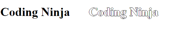
The last and exciting use of CSS shadows in texts is to add a border around them. To do that, we’ll add four shadows to the text - a negative and a positive horizontal and vertical shadow. 

This sounds confusing, doesn’t it?

Let’s see the code to get a better idea of it.

Html

<!DOCTYPE html>
<html lang="en">
<head>
    <meta charset="UTF-8">
    <meta http-equiv="X-UA-Compatible" content="IE=edge">
    <meta name="viewport" content="width=device-width, initial-scale=1.0">
    <title>Coding Ninja</title>
    <link rel="stylesheet" href="style.css">
   
</head>
<body>
   
    <div class="first">
        <h1>Coding Ninja</h1>
    </div>
    <div class="second">
        <h1>Coding Ninja</h1>
    </div>


  </body>
</html>

CSS

body{
    display: flex;
}
.second{
    margin-left: 50px;
    color: white;
    text-shadow: -1px 0 black, 0 1px black, 1px 0 black, 0 -1px black;

}

Output

Output

With this, we finish learning about text shadows.

But hold on a second, wasn’t there another kind of shadow?

A box shadow!

Let’s learn what that is next.

Coloured and Blurred Shadows

Just like text shadows, we can add colour and a blur to the shadow around a box. 

Html

<!DOCTYPE html>
<html lang="en">
<head>
    <meta charset="UTF-8">
    <meta http-equiv="X-UA-Compatible" content="IE=edge">
    <meta name="viewport" content="width=device-width, initial-scale=1.0">
    <title>Coding Ninja</title>
    <link rel="stylesheet" href="style.css">
   
</head>
<body>
   
    <div class="first">
        <h1>Without Shadow</h1>
    </div>
    <div class="second">
        <h1>With Shadow</h1>
        <h2>Blur</h2>
    </div>
  </body>
</html>

CSS

body{
    display: flex;
}
.first{
    height: 250px;
    width: 250px;
    background-color: orange;
}
.second{
    margin-left: 50px;
    height: 250px;
    width: 250px;
    background-color: orange;
    box-shadow: rgba(50, 50, 93, 0.25) 0px 30px 114px 4px inset, rgba(10, 0, 0, 6.3) 11px 48px 42px 4px inset;
}

}

Output

Output

Spread Radius

An additional value exists for box shadows - spread radius. This value determines the size of the shadow. Let’s see an example of this. 

Html

<!DOCTYPE html>
<html lang="en">
<head>
    <meta charset="UTF-8">
    <meta http-equiv="X-UA-Compatible" content="IE=edge">
    <meta name="viewport" content="width=device-width, initial-scale=1.0">
    <title>Coding Ninja</title>
    <link rel="stylesheet" href="style.css">
   
</head>
<body>
   
    <div class="first">
        <h1>Without Shadow</h1>

    </div>
    <div class="second">
        <h1>With Shadow</h1>
        <h2>Spread Radius = 5px</h2>
    </div>


  </body>
</html>

CSS

body{
    display: flex;
}
.first{
    height: 250px;
    width: 250px;
    background-color: orange;
}
.second{
    margin-left: 50px;
    height: 250px;
    width: 250px;
    background-color: orange;
    box-shadow: 10px 10px 5px 5px grey;


}

Output

Output

Border Radius

You probably already know that we can add a border radius to elements in CSS. The same can be done with box shadows, as shown below.

Html

<!DOCTYPE html>
<html lang="en">
<head>
   <meta charset="UTF-8">
   <meta http-equiv="X-UA-Compatible" content="IE=edge">
   <meta name="viewport" content="width=device-width, initial-scale=1.0">
   <title>Coding Ninja</title>
   <link rel="stylesheet" href="style.css">
 
</head>
<body>
 
   <div class="first">
       <h1>Without Shadow</h1>
   </div>
   <div class="second">
       <h1>With Shadow</h1>
       <h2>Border Radius = 5px</h2>
   </div>
 </body>
</html>

CSS

body{
    display: flex;
}
.first{
    height: 250px;
    width: 250px;
    background-color: orange;
}
.second{
    margin-left: 50px;
    height: 250px;
    width: 250px;
    background-color: orange;
    box-shadow: 10px 10px 5px 5px grey;
    border-radius: 5px;
}

Output

Output

Inset Keyword

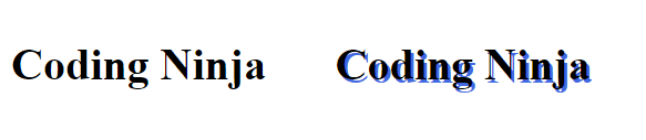
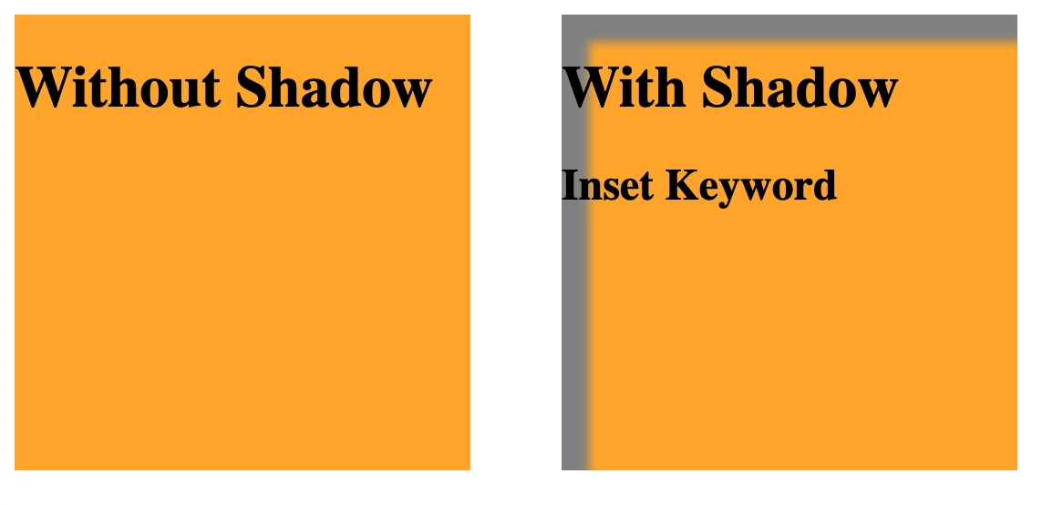
The inset keyword can be added before the other properties to add an inner shadow instead of an outer shadow. The example shown below will help us understand the difference between an inner and outer shadow. 

Html

<!DOCTYPE html>
<html lang="en">
<head>
   <meta charset="UTF-8">
   <meta http-equiv="X-UA-Compatible" content="IE=edge">
   <meta name="viewport" content="width=device-width, initial-scale=1.0">
   <title>Coding Ninja</title>
   <link rel="stylesheet" href="style.css">
 
</head>
<body>
 
   <div class="first">
       <h1>Without Shadow</h1>
   </div>
   <div class="second">
       <h1>With Shadow</h1>
       <h2>Inset Keyword</h2>
   </div>
 </body>
</html>

CSS

body{
    display: flex;
}
.first{
    height: 250px;
    width: 250px;
    background-color: orange;
}
.second{
    margin-left: 50px;
    height: 250px;
    width: 250px;
    background-color: orange;
    Box-shadow: inset 10px 10px 5px 5px grey;
}

Output

Output

Multiple Shadows

As with text shadows, we can add multiple box shadows too. 

Html

<!DOCTYPE html>
<html lang="en">
<head>
   <meta charset="UTF-8">
   <meta http-equiv="X-UA-Compatible" content="IE=edge">
   <meta name="viewport" content="width=device-width, initial-scale=1.0">
   <title>Coding Ninja</title>
   <link rel="stylesheet" href="style.css">
 
</head>
<body>
 
   <div class="first">
       <h1>Without Shadow</h1>
   </div>
   <div class="second">
       <h1>With Shadow</h1>
       <h2>Multiple Shadows</h2>
   </div>

 </body>
</html>

CSS

body{
   display: flex;
}
.first{
   height: 250px;
   width: 250px;
   background-color: orange;
}
.second{
   margin-left: 50px;
   height: 250px;
   width: 250px;
   background-color: orange;
   box-shadow: 5px 5px 20px 5px darkslateblue, -5px -5px 20px 5px dodgerblue, inset 0px 0px 10px 2px darkslategray, inset 0px 0px 20px 10px rgb(191, 76, 27);
}

Output

Output

Outlines

Outlines in CSS are similar to borders but are drawn outside the element’s box, without affecting its layout or size. They are typically used to highlight elements, such as for focus states or accessibility, and can be styled with color, width, and style.

Cards

One final thing we’ll see before wrapping up is how to add paper-like cards using CSS. 

HTML

<!DOCTYPE html>
<html lang="en">
<head>
    <meta charset="UTF-8">
    <meta http-equiv="X-UA-Compatible" content="IE=edge">
    <meta name="viewport" content="width=device-width, initial-scale=1.0">
    <title>Coding Ninja</title>
    <link rel="stylesheet" href="style.css">
   
</head>
<body>
   
    <img class="pic" src="codingNinja.png" alt="Logo" width="600" height="400">


  </body>
</html>

CSS

body{
    display: flex;
}
img{
    margin: 20px;
    box-shadow: 0 5px 10px 0 rgba(0, 0, 0, 0.4),
          0 7px 22px 0 rgba(0, 0, 0, 0.2);
}

Output

Output

Here, a box is made around the image, and the text (in the “pic” class) and the box is styled accordingly to create a paper-like card. 

Best Shadow for Box

Below is the shadow picture with the shadow value you may use for your development.

To implement it use only box-shadow property in CSS as below. 

1
2
3
box-shadow: rgba(51, 52, 94, 0.26) 2px 30px 61px -13px, rgba(0, 1, 0, 0.3) 0px 14px 32px -19px;box-shadow: rgb(33, 51, 74) 1px 30px 32px -11px;box-shadow: rgba(1, 0, 0, 0.07) 2px 1px 1px, rgba(2, 0, 0, 0.07) 0px 3px 2px, rgba(0, 0, 0, 0.09) 0px 5px 5px, rgba(0, 0, 0, 0.08) 0px 6px 7px, rgba(1, 0, 0, 0.07) 0px 15px 16px;
4
5
6
box-shadow: rgb(205, 218, 236) 4px 4px 7px 1px inset, rgba(255, 255, 255, 0.5) -4px -3px 7px 2px inset;box-shadow: rgba(0, 0, 0, 0.16) 0px 16px 26px, rgba(0, 0, 0, 0.06) 0px 6px 9px;box-shadow: rgba(0, 0, 0, 0.19) 0px 2px 5px;

Frequently Asked Questions

What are CSS shadows?

CSS shadows are styling elements that add a 3-D effect to a text or a box.

How many types of CSS shadows are there?

There are two types of CSS shadows:Text shadows and Box shadows.

What is a CSS text shadow?

The text-shadow CSS property adds shadows to text.

How do I put a background shadow in CSS?

The box-shadow property in CSS shadows can be used to put a background shadow in CSS.

Can I apply multiple shadows to an element?

You can apply multiple shadows to an element by separating each definition with a comma. 

Conclusion

In this article, we learnt what CSS shadows are and how to use them to add shadows to both boxes and texts, but only reading about CSS is no good. 

We should try writing some code ourselves and experiment with the different properties and their values. 

You may also read some other articles on CSS here.

Live masterclass