


Introduction
The beauty of things gets enhanced when it is in their proper dimension. In this digital era, it’s essential to organize the look of our websites, applications, line height, etc. The viewer feels it convenient to use our website if the content is in its correct size. A responsive website dynamically adjusts to different screen sizes and viewports. To make one, we'll need a thorough understanding of various sizing units.
In this article, we’ll learn about different types of sizing units that are used in CSS(Cascading Style Sheets) properties. So, without any delay, let’s get started!
Length and Dimension
Dimension refers to numeric data followed by a unit. Length is a dimension related to the distance that can be either absolute or relative.
In CSS, we can’t put whitespace between the number and its unit. But if the value is 0, then we may avoid the unit.
Examples of length units in CSS are rem, px, etc.
In CSS, there are two different types of lengths:
- Absolute length
-
Relative length
It's essential to understand the difference between the two. So, let’s see them one by one.
Absolute Length
It refers to the fixed length. It isn’t measured in relation to anything else and is assumed to be the same size all the time. We use length in width, margin, height, padding, font size, etc.
Refer to the table below to see the various absolute length units with their description.
| Unit | Description | Equivalent to |
| cm | Centimeters | 1cm = 96px/2.54 |
| mm | Millimeters | 1mm = 1/10th of 1cm |
| Q | Quarter-millimeters | 1Q = 1/40th of 1cm |
| in | Inches | 1in = 2.54cm = 96px |
| pc | Picas | 1pc = 1/6th of 1in |
| pt | Points | 1pt = 1/72th of 1in |
| px | Pixels | 1px = 1/96th of 1in |
They are used when the output medium is known, such as for printing.
Note: Absolute length units are not preferred for use on-screen because screen sizes vary, and their dimension doesn’t change with the varying screen sizes.
Example
<!DOCTYPE html>
<html>
<head>
<style>
body{
text-align: center;
}
p {
/*
Adds some space around each paragraph
*/
padding: 10px;
/*
Adds a border around each paragraph
*/
border: 1px solid black;
}
/*
Sets the color of odd-numbered paragraphs to blue
*/
p:nth-child(odd) {
color: blue;
}
/*
Sets the color of even-numbered paragraphs to red
*/
p:nth-child(even) {
color: red;
}
</style>
</head>
<!-- Body for the code specifying different absolute units -->
<body>
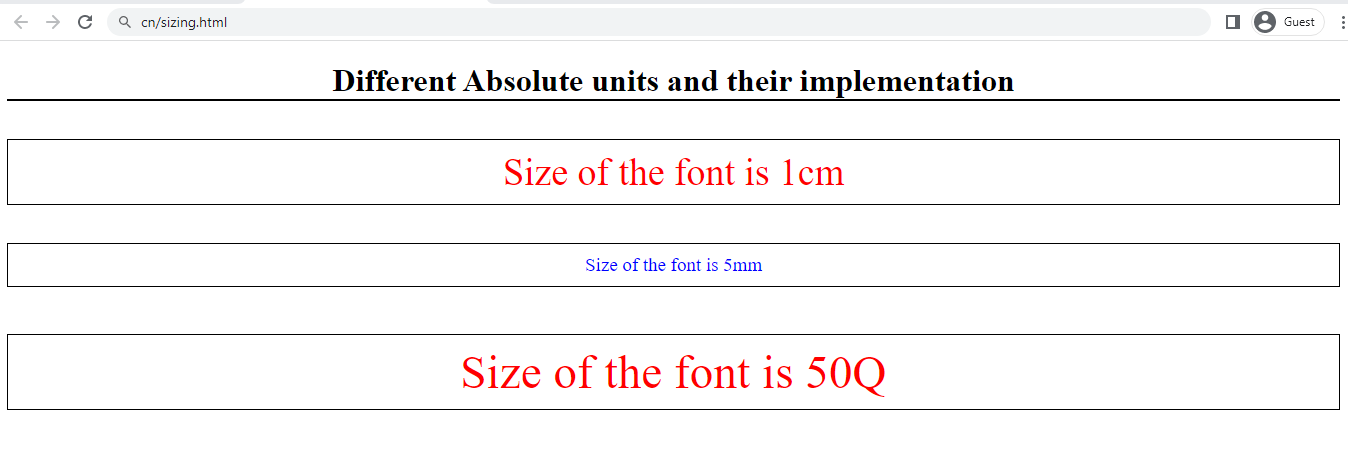
<h1 style="border-bottom: 2px solid black;"> Different Absolute units and their implementation </h1>
<p style="font-size: 1cm;">Size of the font is 1cm </p>
<p style="font-size: 5mm;">Size of the font is 5mm </p>
<p style="font-size: 50Q;">Size of the font is 50Q </p>
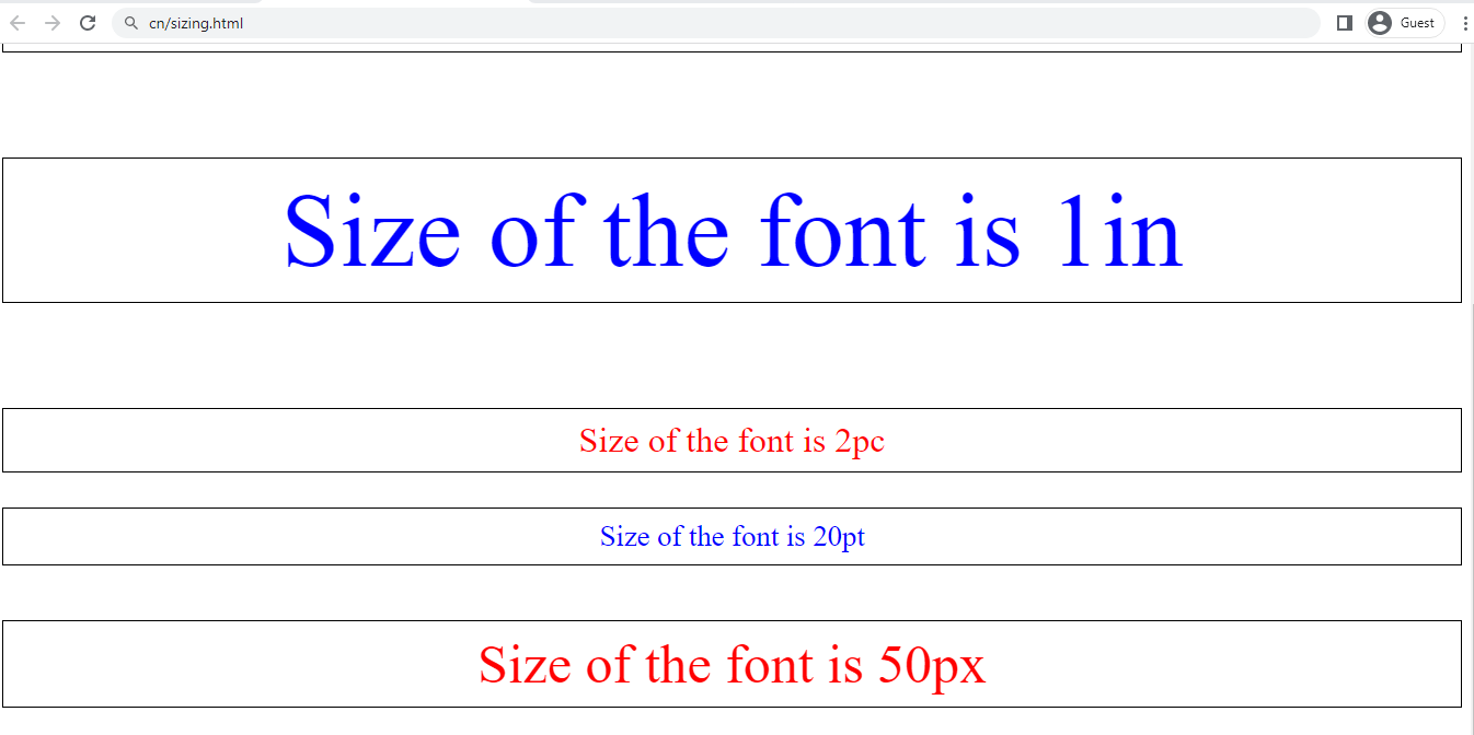
<p style="font-size: 1in;">Size of the font is 1in </p>
<p style="font-size: 2pc;">Size of the font is 2pc </p>
<p style="font-size: 20pt;">Size of the font is 20pt </p>
<p style="font-size: 50px;">Size of the font is 50px </p>
</body>
</html>
Output
Relative Length
Relative length units are described in comparison to another length property such as the viewport size, the parent element’s font size, etc. The advantage of using relative units is that you can scale the text or other elements on the page relative to everything else.
The table shows some of the most useful sizing units.
| Unit | Relative To |
| em | The font size of the element |
| ex | The x-height of the current font |
| cap | Height of capital letters in the present computed font size of the element. |
| ch | Average character advance of a narrow glyph in the element's font (represented by the "0" glyph). |
| ic | Average character advance of a full width glyph in the element's font, as represented by the "水" (CJK water ideograph, U+6C34) glyph. |
| lh | The line height of the element. |
| rlh | The line-height of the root (HTML) element. |
| rem | Font size of its root element (16px is default). |
| % | Its parent element. |
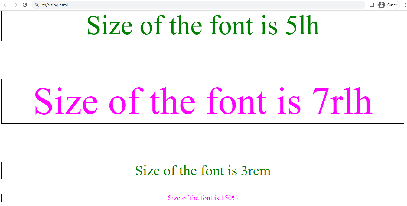
Example
<!DOCTYPE html>
<html>
<head>
<style>
body{
text-align: center;
}
p {
/*
Adds some space around each paragraph
*/
padding: 0.2px;
/*
Adds a border around each paragraph
*/
border: 0.1px solid black;
}
/*
Sets the color of odd-numbered paragraphs to blue
*/
p:nth-child(odd) {
color: green;
}
/*
Sets the color of even-numbered paragraphs to red
*/
p:nth-child(even) {
color: magenta;
}
</style>
</head>
<!-- Body for the code specifying different absolute units-->
<body>
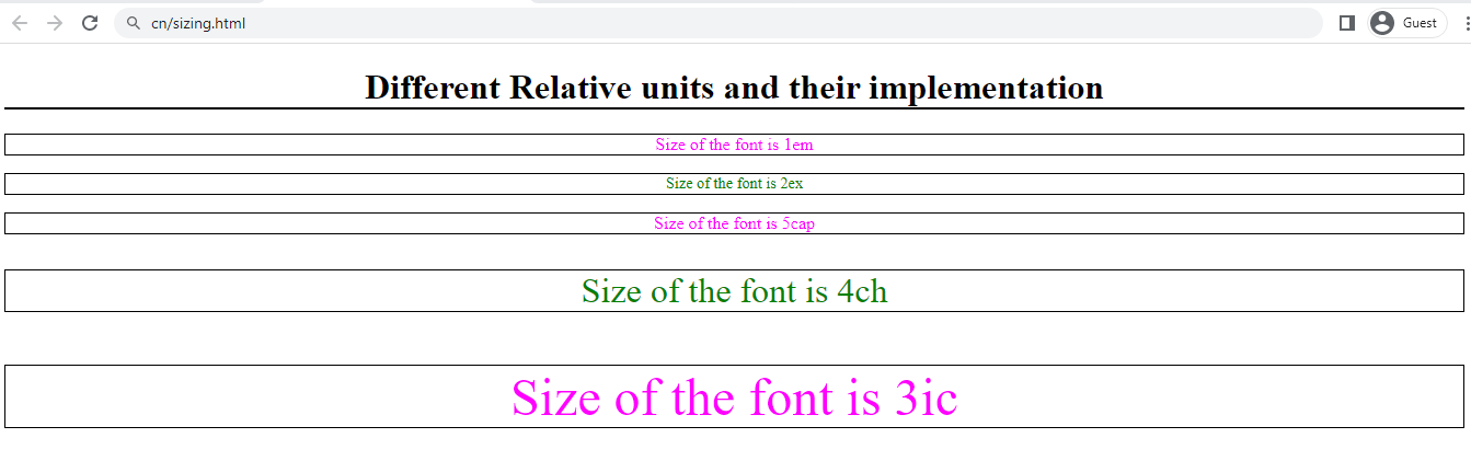
<h1 style="border-bottom: 2px solid black;"> Different Relative units and their implementation </h1>
<p style="font-size: 1em;">Size of the font is 1em </p>
<p style="font-size: 2ex;">Size of the font is 2ex </p>
<p style="font-size: 5cap;">Size of the font is 5cap </p>
<p style="font-size: 4ch;">Size of the font is 4ch </p>
<p style="font-size: 3ic;">Size of the font is 3ic </p>
<p style="font-size: 5lh;">Size of the font is 5lh </p>
<p style="font-size: 7rlh;">Size of the font is 7rlh </p>
<p style="font-size: 3rem;">Size of the font is 3rem </p>
<p style="font-size: 150%;">Size of the font is 150% </p>
</body>
</html>
Output
Differences between Absolute and Relative Lengths
-
Absolute length units are fixed and do not change based on the context, while relative length units are based on the size of other elements in the document and change accordingly.
-
Absolute length units are used when you need to specify the position and exact size of the text while relative length units are used when you want the size and position as per the other elements.
- Relative length units are more scalable than absolute length units, as they adapt to changes in screen size and resolution.
Viewport-relative Units
You can use the viewport’s dimensions, or we can say browser window as a relative unit. The table below lists some of the viewport units available for web development.
| Unit | Relative To |
| vw | 1% of the viewport's width. |
| vh | 1% of the viewport's height. |
| vi | 1% of viewport's size in the root element's inline axis |
| vb | 1% of viewport's size in the root element's block axis. |
| vmin | 1% of the viewport's smaller dimension. |
| vmax | 1% of the viewport's larger dimension. |
Now, let’s discuss in detail the most widely used CSS unit.
Note:
Inline axis refers to the horizontal axis for laying out inline-block elements, and the block axis refers to the vertical axis for laying out block level elements.
CSS em Unit
This unit is dependent on the parent’s font size. It means that if the parent font size is 10px, then 1em = 10px. When em units are declared for child elements that don’t have a predefined font size, it will inherit the same font size from its parent, another ancestor element, or go to the document’s root element.
Example
<!DOCTYPE html>
<html>
<head>
  <!-- Define some CSS styles -->
  <style>
    /*
      Style for the parent element
    */
    .parent {
      font-size: 20px;
      color: white;
      background-color: navy;
      padding: 2px;
    }

    /*
      Style for the child element
    */
    .child {
      font-size: 2em;
      color: navy;
      background-color: yellow;
      padding: 10px;
      margin-top: 10px;
    }
  </style>
</head>
<body>
  <!-- Create parent div element -->
  <div class="parent">
    I am parent
    <!-- Create a child div element -->
    <div class="child">
      I am child
    </div>
  </div>
</body>
</html>
Output
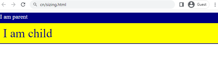
Explanation
The child element has a font-size of 2em, which means it will be twice the size of the parent's font-size, which is 20px. Therefore, the child font appears bigger than the parent font.
CSS rem Unit
This unit is dependent on the root's font size. Unless we explicitly define it, any HTML document's default root size will be 16px. When it comes to margins and padding, this unit is handy.
It is also a convenient unit for making responsive web pages. Simply modify the font size of the root element, and all other elements will adjust accordingly.
Percentage
It is always set relative to some other value. For example, if we set an element's font size unit in percentage, it will be a percentage of the font size of the element's parent.
If we use a percentage for a height value, it will be percentage of the height of the element's parent.
Example
<!DOCTYPE html>
<html>
<head>
   <!-- Define some CSS styles -->
  <style>
    /*
      Style for the parent element
    */
    .parent {
      font-size: 20px;
      color: white;
      background-color: navy;
      padding: 2px;
    }

    /*
      Style for the child element
    */
    .child {
      font-size: 2em;
      color: navy;
      background-color: yellow;
      padding: 10px;
      margin-top: 10px;
    }

    /*
      Style for the third element
    */
    .third {
      font-size: 75%;
      color: white;
      background-color: black;
      padding: 10px;
      margin-top: 10px;
    }
  </style>
</head>
<body>
  <!-- Create parent div element -->

  <div class="parent">I am parent
    <!-- Create a child div element -->

    <div class="child">I am child
        <!-- Create a third div element -->

        <div class="third">I am third
        </div>
    </div>
  </div>
</body>
</html>
Output
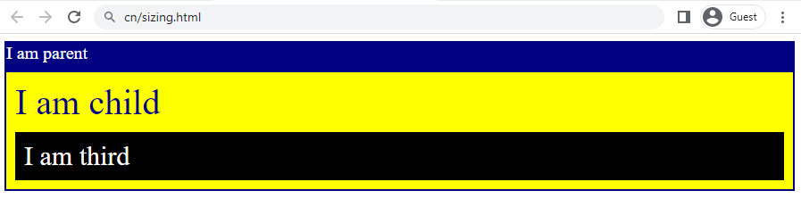
Explanation
The ‘parent’ class sets the font size to 20 px. The ‘child’ class sets the font size to two times the current font size. Now, setting the font-size of the ‘third’ class to 75% reduces the size of the text to 75% of the parent element's font size, resulting in smaller text.
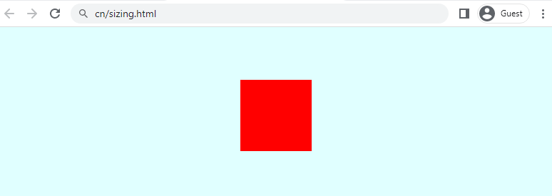
Angle Units
Angle units are helpful for the rotation of any element within transform functions.
Example
<!DOCTYPE html>
<html>
<head>
    <!-- Define some CSS styles -->
    <style>
        /*
            Give a background color
        */
        body {
            background-color: lightcyan;
        }

        /*
            Give some styling and rotate the square by 45 degree
        */
        .box {
            width: 100px;
            height: 100px;
            background-color: red;
            transform: rotate(45deg);
            position: absolute;
            top: 20%;
            left: 50%;
            margin-top: -50px;
            margin-left: -50px;
        }
    </style>
</head>

<body>
    <!-- Define a div class box -->
    <div class="box"></div>
</body>
</html>
Output
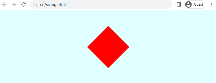
Explanation
It represents a red square with a 45-degree rotation, positioned in the center of the page using absolute positioning and CSS transforms. When we rotate the square to 90-degree by changing the transform function. It looks like:


 8+ registered

