Need for Data Visualization
Let us talk about few technologies that incorporate data processing. Talking about Data Science, the field encompasses the processes of extraction, cleaning and, formulating data. And later, Machine Learning utilizes this refined data for training purposes.
You can check out Data Science and Machine Learning courses at our website However, Data Analytics is a field that helps analysts to typically analyze and process raw data using various tools and techniques and look for patterns, trends and, insights in the data. This eventually helps the organisations to make serious decisions.
But even after taking care of all these steps, if you fail to represent the outcome, all your pain goes in vain. Here is when Data Visualization comes into the picture.
History of Data Visualization
It dates back to as old as the 17th century. Where the expeditors like Napolean used pictures and maps to understand places and plan invasions and sailing paths. Later in the 1800s concepts of charts and analytical graphs were introduced. This today, forms the core of our statistics syllabus.
Why is Data Visualization important?
Data Visualization is important because the human brain finds a visual summary of data, by using charts or graphs to visualize large amounts of complex data much easier than rushing over spreadsheets and lengthy reports. It is a simple and faster way to convey concepts more comprehensively.
As our main objective is to gain insights, data becomes more precious when visualized. Even if the analysts summarize data findings without visualization, it would become hard to communicate their meaning without visualizing it. Thus graphs and charts make the communication of data insights and pattern findings, effortless with visualization.
Impact of Big Data
It is becoming increasingly important for professionals to be able to utilize data to make judgments and visuals to convey stories about how data informs the questions of the person, subject, time, place, and technique. Because of the massive amounts of data, the field of Big Data visualization presents new opportunities and challenges. As a result, new visualization techniques were developed in order to make the data volumes more apparent to the viewer.
Techniques of Data Visualization
Big Data visualization offers a useful set of tools for acquiring qualitative insight.
The fundamental categories are described below.
Charts
Charts utilize elements to match variable values and compare numerous components, demonstrating the relationship between data points.
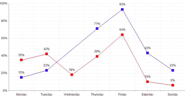
Line chart: similar elements are lines that can be used to examine peak and fall points at an axis variant, such as sales volume over time.
source
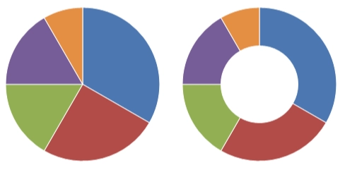
Pie and donut charts: they are used to compare subsets of a larger whole, such as components of a single category. Each sector's angle and arc correlate to the illustrated value, and the distance from the center assesses their significance.
source
Bar chart: Bar graphs and bar charts are pictorial representations of organized data in the shape of vertical or horizontal rectangular bars, where the lengths of the bars are comparable to the measure of data.
source
Plots
Plots assist in the visualization of data sets in 2D or 3D. It could be:
Scatter plot: A scatter plot can also be referred to as a scattergram, scatter chart, or XY graph, scatter plot. The scatter diagram plots numerical data pairings, one variable on each axis, to demonstrate their relationship.
source
Bubble plot: A bubble plot is a scatterplot with a third dimension: the size of the dots represents the value of an additional numeric variable.
You'll need three numerical variables as input: one for the X-axis, one for the Y-axis, and one for the dot size.
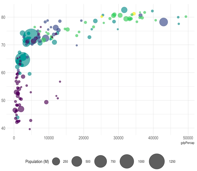
source
Histogram plot: A histogram is mostly used to depict data in the form of groupings. It is a precise way of graphically representing numerical data distribution. It is a sort of bar plot in which the X-axis displays the bin ranges and the Y-axis provides frequency information.
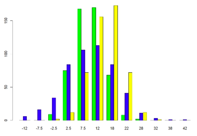
source
Maps
Treemaps: To display hierarchical systems, which are represented by nested rectangles, a treemap or a tile chart is employed. Size ratios may be clearly presented in this manner by choosing the area of the rectangle appropriately to the size of the data unit to be displayed.
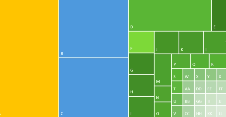
source
Maps: Speaking of states, maps are another excellent method to show a large amount of data. The same data is represented differently in this case, as if it were a map. The size of the bubbles can reflect the number of bottles sold, but it can also represent any other statistic.
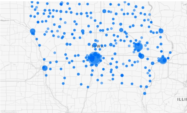
source
Other Plots
Box and whisker plot: It depicts the distribution of enormous data, frequently to explain outliers, in a graphical depiction of five statistics: minimum, lower quartile, median, upper quartile, and maximum.
Extreme values are depicted by whiskers that extend beyond the box's borders.
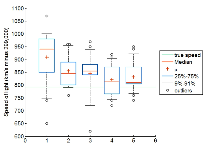
source
Sunburst: The Sunburst chart is an excellent choice for visualizing hierarchical data. Each level of the hierarchy is represented by a ring or circle, with the highest level represented by the innermost circle. Sunburst diagrams with many category levels depict how the outer rings interact with the interior circles. The sunburst diagram is particularly effective for demonstrating how a ring is split into its constituent parts, but the treemap diagram is particularly beneficial for comparing relative sizes.
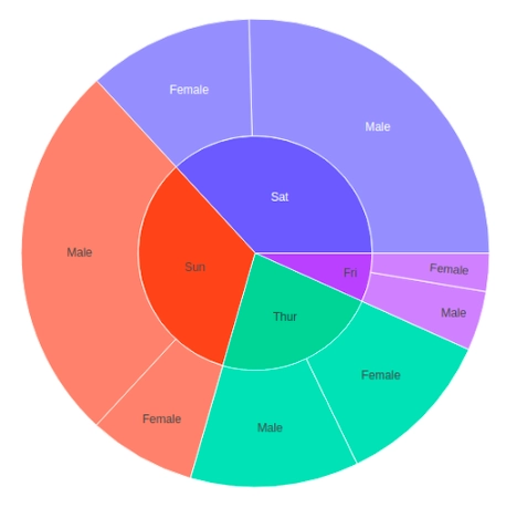
source
Word clouds: It shows a word's frequency inside a body of the text: the larger the word, the more significant it is.

source
Data Visualization Tools
A brief scan of the Big Data tools market reveals the presence of major companies such as Microsoft, SAP, IBM, and SAS. There are, however, a variety of specialized software manufacturers offering leading class data visualization solutions, like Tableau Software, Qlik, and TIBCO Software. Among the leading data visualization products are those provided by Zoho Analytics, IBM Cognos Analytics, QlikSense and QlikView, Microsoft PowerBI, Oracle Visual Analyzer, SAP Lumira, SAS Visual Analytics, Tableau Desktop, TIBCO Spotfire.
FAQs
1. What is the best data visualization?
Google Charts, Chartist. js, Grafana, Tableau, FusionCharts, Datawrapper, Infogram, ChartBlocks, and D3. js are among the greatest data visualization tools.
2. What is data visualization, and why is it important?
The process of putting information into a visual context, such as a map or graph, makes it easier for the human brain to absorb and extract insights. The primary purpose of data visualization is to make identifying patterns, trends, and outliers in huge data set easier.
3. What is an example of visualization of big data?
Pie charts, line charts, bar charts, histograms, graphs, scatter plots, and heat maps are all examples of data visualization.
4. What are the keys to an effective visualization?
Determine the appropriate visual, balancing the design, focusing on essential regions, keeping the visuals basic, using patterns, comparing parameters, and creating interaction are some of the main features of good data visualization.
Key Takeaways
In this article, we have discussed the following topics:
- Visualization of big data
- Impact of big data
- Techniques of data visualization
- Data visualization tools
Want to learn more about Machine Learning? Here is an excellent course that can guide you in learning.
Check out this problem - Largest Rectangle in Histogram
Happy Coding!


 9+ registered

