Do you think IIT Guwahati certified course can help you in your career?
Introduction
We all know results matter, but they will have a minor impact if not interacted properly. Statistical analysis is meaningless if it cannot be communicated with the help of graphs, charts, plots. People like to visualize numbers, and they enjoy seeing results; that is why data visualization became an integral part of statistical analysis. That is where Bokeh comes into the picture,
Bokeh is an open-source python library for creating interactive visualizations that help us build beautiful charts and plots ranging from simple to complex ones. Unlike other data visualization libraries in python like Matplotlib and seaborn, Bokeh renders its plots using HTML and javascript.
Features
Flexibility
Flexible for applying different styling techniques and layouts for
visualization even for complex ones.
Interactivity
It is one of the essential features as it creates non-static plots, thus providing
users to interact with the data.
Sharable
Bokeh visualization can be embedded into the flask and Django app.
Productivity
It can interact with other Python tools such as Pandas and Jupyter Notebooks.
Basics Of Bokeh
The most crucial aspect of Bokeh is, it provides a simple, intuitive interface for those who do not wish to be distracted by intricate details of its working. At the same time, Bokeh provides access to those people who want to control more sophisticated features of Bokeh.
Thus, Bokeh provides two interfaces which we can use,
The primary interface for Data Scientists, i.e., Bokeh. plotting
The low-level Bokeh. models interface for application developers.
Bokeh. plotting
It is a primary or high-level interface that focuses on relating data to glyphs. Glyphs are the basic building block of bokeh plots which draw vectorized graphics to represent data. It includes elements such as lines, rectangles, squares, wedges, or the circles of a scatter plot. It provides functionalities to customize our visualization.
The core of Bokeh. Plots are the figure() function, which includes methods to add different varieties of glyphs to a plot.
bokeh. models
It is a low-level interface where a user controls how Bokeh creates all elements of our visualization; it provides excellent flexibility to application developers.
Basic Steps In Bokeh
The most basic steps for visualization with Bokeh’s Bokeh.plotting are:
Preparing Data
Data is necessary for visualization. There are various ways to provide Bokeh data like python list, NumPy arrays, providing data to ColumnData Source, and so on.
Calling figure() function
figure() helps us create a plot with default options; we can customize our properties for better visualization.
Adding Renders
We can use different types of glyphs to represent data. Basic glyphs used are scattered markers, line glyphs, bars and rectangles, and many more. line() is used to create a line. Renders have plenty of options that help us specify visual attributes such as color, legends, widths.
show() or save()
This function helps us save the plot as an HTML file or display it in our browser.
Implementations
Let us see some of the implementations of its basic steps:
Line Glyphs:
Code:
from bokeh.plotting import figure, output_notebook, show
# output to notebook
output_notebook()
x = [1, 2, 3, 4, 5] y = [10,11,12,14,15]
# creating a new plot p = figure(title="EXAMPLE OF LINE GLYPHS", x_axis_label="x", y_axis_label="y")
# adding line renderer p.line(x, y, legend_label="Temp.", line_width=5)
# show the results show(p)
Output:
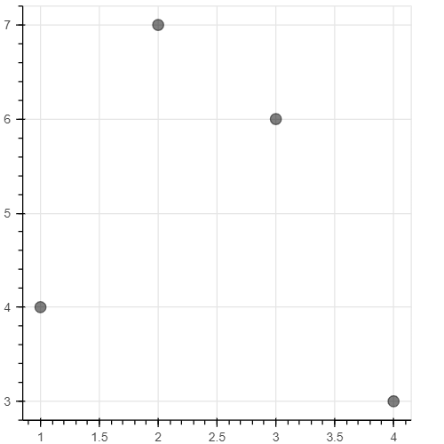
Scatter Plots:
Code:
from bokeh.plotting import figure, output_notebook, show # output to notebook output_notebook() # create figure p = figure(plot_width = 400, plot_height = 400) # adding circle renderer withsize, color and alpha p.circle([1, 2, 3, 4], [4, 7, 6, 3], size = 10, color = "BLACK", alpha = 0.5) # show the results show(p)
Output
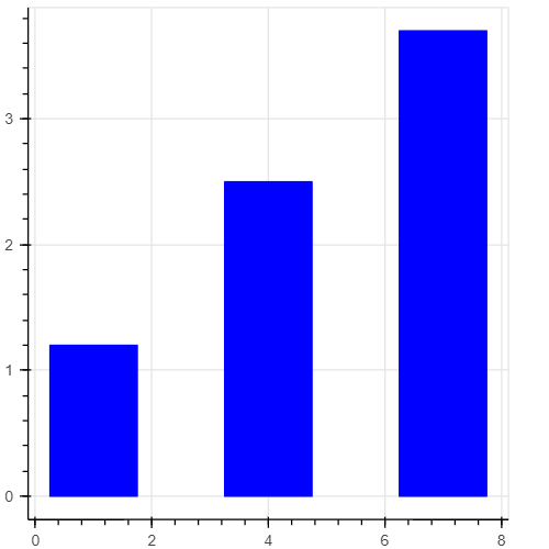
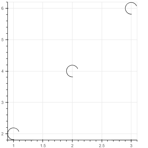
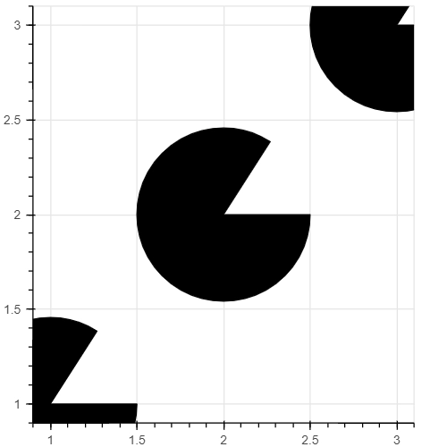
Bars And Rectangles
Code
from bokeh.plotting import figure, output_notebook, show # output to notebook output_notebook()
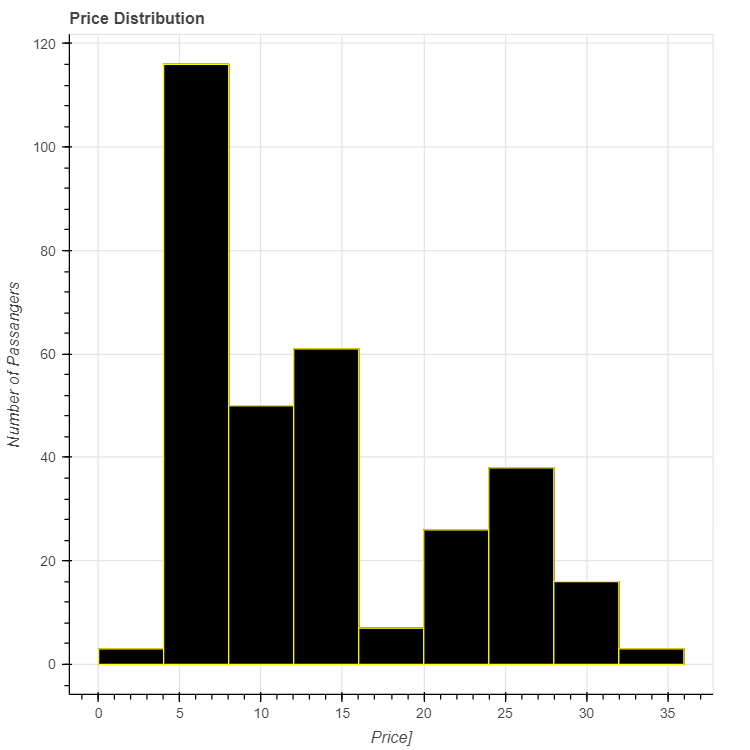
We will have a detailed explanation of visualizing data with the help of a histogram, as it shows the distribution of the data. It is the most commonly used plotting technique. Histograms give a more detailed look at how each variable is dependent on the other one.
So we will use the most famous dataset,i.e., the titanic dataset, to visualize with the help of histograms. We will plot the number of passengers in different Fare ranges. So let us get started.
Step 1:
Import all the required libraries
from bokeh.plotting import figure, output_notebook, show import pandas as pd import numpy as p from math import pi
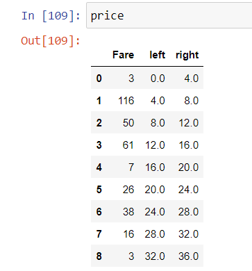
count 417.000000 mean 35.627188 std 55.907576 min 0.000000 25% 7.895800 50% 14.454200 75% 31.500000 max 512.329200 Name: Fare, dtype: float64
To create a histogram, we use a quad glyph in which we have to specify the top, bottom, left, and right. The left and right are the x-extremum coordinates. The x coordinate is divided into groups in intervals called bins, and the height of each bin is the count of data points in that bin.
So, to create data for the histogram, we will use the numpy histogram function. The above output shows that the 75% quantile is at 31.5 $, so we can consider fare over 36 as an outlier.
Bins will be 4$ in width, so the number of bins will be the length of the bin upon the size of the bin, which is 9 in this case. Range is from [0,36].
Therefore our final input data will look like this:
The Fare column counts the number of different passengers in the interval from left to right. From here, we can make a Bokeh figure with a quad glyph specifying the appropriate parameters:
output_notebook()
p = figure(plot_height = 600, plot_width = 600, title = 'Price Distribution',x_axis_label = 'Price]', y_axis_label = 'Number of Passangers')
Those are some of the basic glyphs used for visualization in Bokeh. We can do better visualizations with custom attributes like themes, using hover tools, changing the font, color, and many more attributes.
Frequently Asked Questions
1. Is bokeh better than matplotlib? Ans. While matplotlib is a low-level visualization library, Bokeh is high and level. Therefore, Bokeh can create many sophisticated plots with fewer code lines and a higher resolution.
2. How to get the sample data? Ans. Due to the size of sample data, these are not present in the Bokeh GitHub repository or released packages, but we can download them using the following syntax :
3. Does Bokeh use D3.js? Ans. No, the purpose of D3 is to provide a javascript-based scripting layer for the DOM, which is not the current purpose of Bokeh.
4. Why did we start writing a new plotting library? Ans. The main reason is maximizing flexibility for exploring new design spaces to achieve long-term visualization goals.
Key Takeaways
So that is the end of the article. Let us brief the article:
Firstly we saw the basic features of Bokeh and how Bokeh increases interactivity.
This article taught us why Bokeh has the upper hand over data visualization libraries. The basic steps involved in plotting different glyphs and how we can add renders to achieve better communication. Lastly, we saw that some of the basic implementations of some glyphs and histograms are important for better understanding.
Thus Bokeh is most impactful when we want to extend our vision beyond static figures.
Bokeh is an excellent tool for users who want to explore glyphs in-depth, but for users who want simple visualization, matplotlib is better.
Do not worry if we do not get Bokeh at first; we have a perfect tutor to help us out.


 8+ registered

