Do you think IIT Guwahati certified course can help you in your career?
Introduction
A drop-down menu is a menu that contains a list of options. The user can select one of the options and then operate an operation based on the item selected. You can use a third-party library like react-select to create a dropdown list, or you can customize the dropdown in react js menu component in React.
A Dropdown in React is a graphical user interface element that presents a list of options or actions that a user can select from. The Dropdown component typically consists of a clickable button or link that, when activated, shows a list of items or actions that a user can choose from. Dropdowns are often used in forms and navigation menus to provide users with a convenient way to select from a set of options.
Examples of Dropdown in React
Let's look at some examples to understand it better:
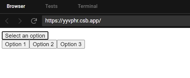
In this example, we define a "Dropdown" component that uses the "useState" hook to keep track of whether the dropdown is open or closed. We render a button that, when clicked, toggles the value of "isOpen" by calling the "setIsOpen" function with the opposite of its current value.
We also conditionally render a list of options by checking the value of "isOpen". If "isOpen" is true, we render the list of options as a series of paragraphs, each with a unique value.
This example is very basic, but it should give you an idea of how to create a simple single button Dropdown in React.
In this example, we define a "Dropdown" component that uses the "useState" hook to keep track of whether the dropdown is open or closed. We also define an array of options that the user can choose from.
We render a button that, when clicked, toggles the value of "isOpen" by calling the "setIsOpen" function with the opposite of its current value. We also conditionally render a list of options by checking the value of "isOpen". If "isOpen" is true, we render the list of options as a series of buttons, each with an "onClick" event listener that logs the corresponding option to the console.
This example should give you an idea of how to create a simple split button Dropdown in React, where the main button serves as a trigger to open the dropdown, and the secondary buttons represent the selectable options.
HTML5 dropdown list
Normally, we can create an html5 dropdown list with CSS styling provided by bootstrap libs, as shown below.
We can see from the above illustrations that it is easy to create a dropdown list in HTML. But as we move forward with the framework, the same thing begins to be complex. For this, we prefer dropdown in react js.
Split button dropdowns
Split button dropdowns consist of a button that executes a default action, such as submitting a form or navigating to a new page, and a dropdown menu that provides additional options related to the default action.
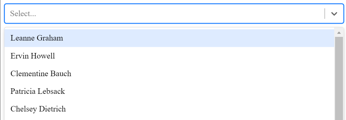
Dynamic search/filtering, async option loading, accessibility, and fast render times are all features of the React-select library. It includes a versatile and appealing ReactJS Select Input control that facilitates multi select, autocomplete, and ajax.
It possesses the following characteristics:
1. A versatile approach to data, with programmable functions.
2. Interpersonal styling API.
3. API for component injection provides complete control over UI behavior.
4. Modular architecture and controllable state props.
5. Long-requested features such as option groups, portal support, graphics, and others are now available.
The prerequisites for this are react-select, JSON placeholder, and Axios.
The steps to be followed for creating a dropdown in react js are as followed:
Navigate to your project's root directory and install react-select and Axios.
npm install axios react-select --save
2. Open your app.js file now. Because we will be using a class component, we must first write a function Object() and initialize some states.
3. Create an asynchronous function called getOptions and use Axios to retrieve user data from the JSON placeholder API. After receiving the response, loop through the array using the JS map function to create an object with a value and a label, and then use setState to change the value of selectOptions.
4. Now, inside the componentDidMount lifecycle method, call the above function.
componentDidMount(){
      this.getOptions()
  }
5. We can see the choices required for react-select if we console.log our selectOptions within our render function.
6. Now, in your file import, import react select. Select'react-select' and call it inside return, then pass selectOptions as selections inside the select tag. Then, refresh your browser to see the changes.
7. Let us now write a function to handle our chosen value. Create a function called handleChange that takes e as a parameter and then uses the setState function to change the value of id and name.
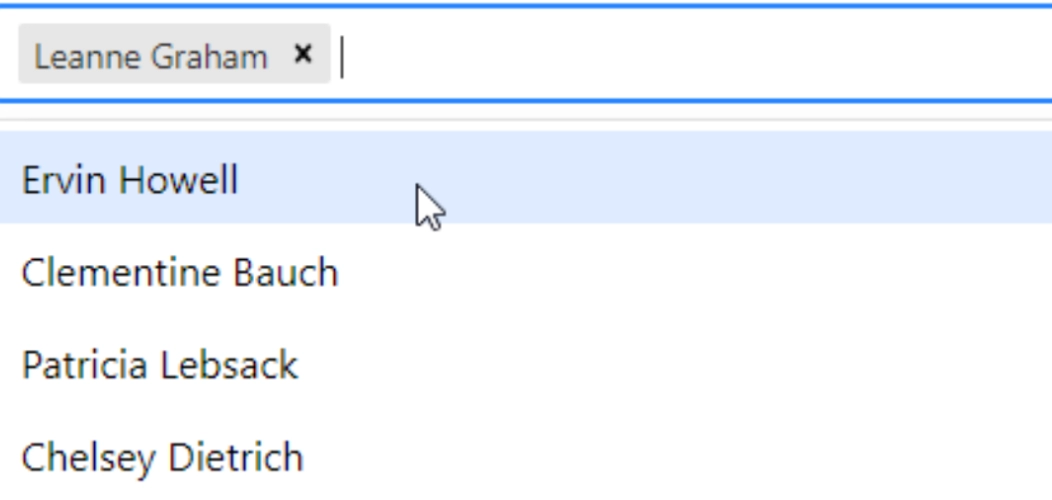
Now it’s time we start creating and selecting multiple choices from our dropdown in react js. We will do this using multi select dropdown in react js. Let us see the steps for that also.
Insert isMulti into the Select tag.
Remove the id and name from step 2 above and replace them with a blank array.
Within the handleChange function, use setState to set the value state to e.
handleChange(e){
   this.setState({value:e})
  }
Now, using the map function, loop through the values inside the render to display all of our options. We're also using the ternary operator to see if the value is null or not, so we don't get an error when we remove the last option.
And here we are done with selecting multiple choices from our dropdown in react js menu.
Sizing in ReactJS
Sizing refers to adjusting the dimensions of UI elements such as buttons, inputs, or containers in ReactJS. This can be achieved using CSS styles like width, height, padding, and margin to control the size of components.
Dark dropdowns in ReactJS
Dark dropdowns are dropdown menus or components with a dark color scheme in ReactJS. This can be accomplished by applying specific CSS classes or styles to the dropdown components to set the background color, text color, and other visual properties to achieve the dark theme.
Directions in ReactJS
In ReactJS, "directions" generally refer to the positioning or alignment of UI elements within a layout or container. This encompasses both horizontal and vertical orientations and determines how elements are arranged relative to each other or to the container itself.
Centered
Centered direction means aligning an element at the center of its container horizontally or vertically. This can be done using CSS styles such as text-align: center for horizontal centering and margin: auto for vertical centering.
Dropup
Dropup is a type of dropdown menu or component that opens upwards instead of downwards. In ReactJS, dropup functionality can be implemented by adjusting the positioning of the dropdown component to open upwards and handling its visibility accordingly.
Dropup centered
Dropup centered combines the concepts of dropup and centered positioning in ReactJS. It means opening the dropdown menu upwards while ensuring it is centered within its container both horizontally and vertically. This can be achieved using a combination of CSS styles and ReactJS component positioning techniques.
Dropend
Dropend is a type of dropdown menu or component that opens towards the end or right side of its parent element. In ReactJS, dropend functionality can be implemented by adjusting the positioning and alignment of the dropdown component relative to its parent, ensuring it opens towards the specified direction.
Dropstart
Dropstart is similar to dropend but refers to a dropdown menu or component that opens towards the start or left side of its parent element in ReactJS. Dropstart functionality can be achieved by adjusting the positioning and alignment of the dropdown component accordingly.
Menu items in ReactJS
In ReactJS, "menu items" typically refer to individual options or choices within a menu component. These menu items represent actions, commands, or links that users can select to navigate through an application or perform specific tasks. Menu items are often displayed as clickable elements within a dropdown menu, navigation bar, or contextual menu.
Active
Menu items in ReactJS are individual options or choices within a menu or dropdown list. Active menu items are those currently selected or highlighted. In ReactJS, active menu items can be managed using state variables or props to track the active item and apply corresponding styles or classes to indicate its active state.
Disabled
Disabled menu items in ReactJS are options or choices within a menu or dropdown list that are not currently available or interactable. This can be achieved by setting the disabled attribute or applying specific styles to visually indicate the disabled state of menu items.
Benefits of Using React Dropdown
React-Select is an extremely simple to use React-only dropdown library. We'll go over some of the cool features that react-select v2 has to offer. Dropdown in react js has many features which we will be discussing.
It is easy to learn and easy to use.
Handles a large number of files.
CSS styling with comfort and support.
API support enables simple customization.
Assist with asynchronous data loading.
Components that support CSS animation.
They save display space. Users are familiar with them because they are classic widgets.
Dropdown boxes, when used in forms and for attribute selection, also prevent users from entering incorrect data because they only display legal options.
Guidelines for dropdown design
Avoid interacting menus, which change the options in one menu when the user inputs something in another on the same page. Users become very confused when options appear and disappear, and it is frequently difficult to make the desired option visible when it is dependent on a selection in a different widget.
Instead of removing any unavailable options, grey them out: any items that cannot be selected should remain visible. Consider displaying a short balloon help message explaining why a grayed-out option is disabled and how to make it active if users hover over it for more than a second. When disabled items are removed from the interface, the interface loses spatial consistency and becomes more difficult to learn.
Very long dropdown in react js that necessitate scrolling make it difficult for users to see all of their options at once. They also necessitate careful mouse control to ensure that the mouse does not leave the dropdown.
Avoid using dropdown boxes when typing is faster.
Avoid using dropdown boxes for data that your users are very familiar with, such as their birth date, month, or year.
When the dropdown is open, keep the menu label or description visible. Menu titles provide context and direction by informing users of the options available.
Allow keyboard navigation within a dropdown. Dropdowns (both menus and boxes) should accept key input in addition to mouse input.
Frequently Asked Questions
How do I set a dropdown value in React?
In React, you set a dropdown value by using the value attribute of a <select> element and managing its state with useState. The selected value is updated via an onChange event handler.
What is the difference between select and dropdown in React?
In React, a <select> element is a native HTML form element used for dropdowns. "Dropdown" is a more generic term, which can also refer to custom components that may include more advanced functionality beyond a basic <select>.
How do I create a dropdown in react?
To create a dropdown in React, use a <select> element for options and an ‘onChange’ event to update state. Employ ‘useState’ for functional components or ‘this.state’ for class components.
How do you populate a dropdown in react?
To populate a dropdown in React, you can fetch data from an API or use a statically defined array and map the options to <option> elements within the <select> tag.
Conclusion
To begin wrapping up this blog, we discussed why Node JS is so popular among web developers. Some of the react frameworks' key features. Then we talked about react projects like a portfolio app, real-time chat app, chatbot, blogging website from scratch, random number generator, books directory, and so on.


 9+ registered

