Do you think IIT Guwahati certified course can help you in your career?
Introduction
Data is everywhere in today's world. From business decisions to scientific research, data plays a crucial role. However, raw data is often messy & difficult to understand. This is where exploratory data analysis (EDA) comes in. EDA is a process of analyzing & visualizing data to gain insights & understand patterns.
In this article, we'll discuss the basics of EDA using Python. We'll cover data preprocessing, univariate analysis, bivariate analysis, & multivariate analysis.
What is Exploratory Data Analysis (EDA)?
Exploratory Data Analysis (EDA) is a crucial step in the data science process. It involves analyzing & visualizing data to uncover patterns, relationships, & anomalies. The goal of EDA is to gain a deep understanding of the data before applying machine learning algorithms or statistical models.
EDA helps us answer questions like:
- What is the structure of the data?
- Are there any missing values or outliers?
- How are the variables distributed?
- Are there any relationships between variables?
By answering these questions, we can make informed decisions about data cleaning, feature selection, & model building.
In Python, there are several libraries that make EDA easy & efficient. The most popular ones are Pandas, Matplotlib, & Seaborn. Pandas is used for data manipulation & analysis, while Matplotlib & Seaborn are used for data visualization.
Here's a simple example of loading a dataset using Pandas:
Python
Python
import pandas as pd

# Load the dataset

df = pd.read_csv('data.csv')

# Print the first 5 rows

print(df.head())
You can also try this code with Online Python Compiler
This code loads a CSV file named `data.csv` into a Pandas DataFrame called `df`. The `head()` function is used to print the first 5 rows of the DataFrame.
EDA is an iterative process. We start by understanding the data, then we visualize it, & finally, we draw conclusions & insights. It's important to keep an open mind & be willing to explore the data from different angles.
What is preprocessing?
Preprocessing is an essential step in EDA that involves cleaning & transforming raw data into a suitable format for analysis. Real-world data is often messy, with missing values, outliers, & inconsistent formats. Preprocessing helps us deal with these issues & prepare the data for further analysis.
The main steps in preprocessing are:
1. Data Cleaning: This involves handling missing values, outliers, & duplicates. We can either remove these entries or fill them with suitable values.
2. Data Transformation: This involves converting data into a consistent format. For example, converting categorical variables into numerical ones or scaling numerical variables to a common range.
3. Data Integration: This involves combining data from multiple sources into a single dataset.
4. Data Reduction: This involves reducing the size of the dataset by removing irrelevant features or aggregating data.
In Python, Pandas provides several functions for preprocessing data. Here's an example of handling missing values:
Python
Python
import pandas as pd

# Load the dataset

df = pd.read_csv('data.csv')

# Check for missing values

print(df.isnull().sum())

# Remove rows with missing values

df = df.dropna()

# Fill missing values with the mean

df = df.fillna(df.mean())
You can also try this code with Online Python Compiler
This code first checks for missing values using the `isnull()` & `sum()` functions. Then, it demonstrates two ways of handling missing values: removing rows with missing values using `dropna()` & filling missing values with the mean using `fillna()`.
Preprocessing is a crucial step in EDA that can greatly impact the quality of our analysis. It's important to take the time to understand the data & apply appropriate preprocessing techniques.
Steps for preprocessing
Now, let’s look into the specific steps for preprocessing data in Python. We'll use a sample dataset to illustrate each step.
1. Loading the dataset
import pandas as pd
# Load the dataset
df = pd.read_csv('data.csv')
2. Checking the structure of the dataset
# Print the first 5 rows
print(df.head())
# Print the shape of the dataset
print(df.shape)
# Print the data types of each column
print(df.dtypes)
These functions give us an overview of the dataset, including the number of rows & columns, the data types of each column, & a glimpse of the actual data.
3. Handling missing values
# Check for missing values
print(df.isnull().sum())
# Remove rows with missing values
df = df.dropna()
# Fill missing values with the mean
df = df.fillna(df.mean())
As discussed earlier, we can either remove rows with missing values or fill them with suitable values like the mean or median.
Outliers can be identified using visualization techniques like boxplots or by using statistical methods like the interquartile range (IQR). Once identified, outliers can be removed or transformed.
5. Handling categorical variables
# Convert categorical variables to numerical using one-hot encoding
df = pd.get_dummies(df, columns=['categorical_column'])
Categorical variables need to be converted to numerical values for most machine learning algorithms. One common technique is one-hot encoding, which creates a new binary column for each category.
Note: These are the main steps in preprocessing data using Python & Pandas. Of course, the specific techniques used will depend on the dataset & the goals of the analysis.
Info()
After preprocessing the data, the next step is to explore it using various functions in Pandas. One useful function is `info()`, which provides a concise summary of the dataset.
Python
Python
# Print the info of the dataset

print(df.info())
You can also try this code with Online Python Compiler
The `info()` function displays the following information:
- The number of rows & columns in the dataset
- The data types of each column
- The number of non-null values in each column
- The memory usage of the dataset
Example output:
From this output, we can see that the dataset has 1000 rows & 5 columns, with 4 columns of type `float64` & 1 column of type `int64`. All columns have 1000 non-null values, which means there are no missing values. The memory usage of the dataset is also displayed.
The `info()` function is a quick & easy way to get an overview of the dataset. It helps us verify that the data has been loaded correctly & that the preprocessing steps have been applied as expected.
It's a good practice to use `info()` after each major step in the EDA process to keep track of how the dataset is changing. For example, after removing missing values or outliers, we can use `info()` to confirm that the number of rows has decreased as expected.
Description of data()
After getting an overview of the dataset with `info()`, we can dive deeper into the statistical properties of each column using the `describe()` function.
Python
Python
# Print the description of the dataset

print(df.describe())
You can also try this code with Online Python Compiler
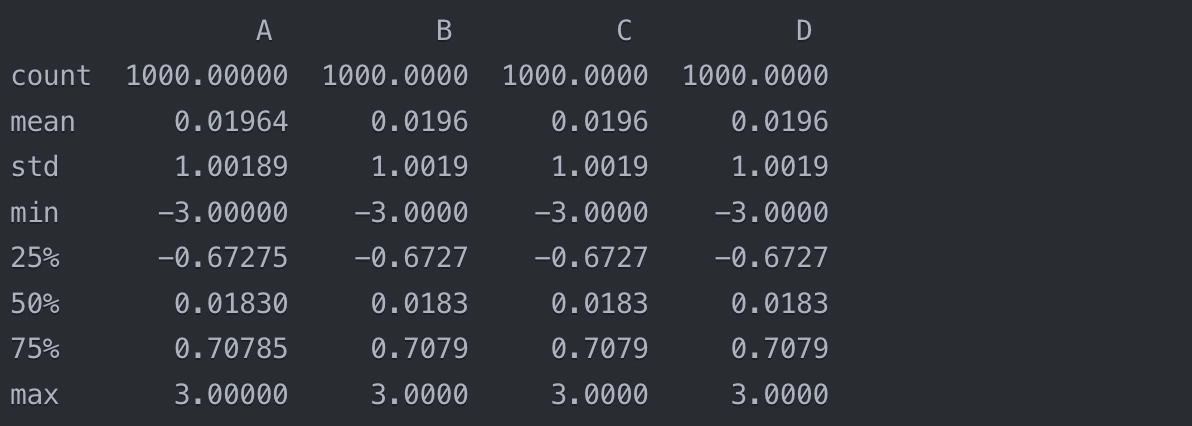
The `describe()` function computes various summary statistics for each numerical column in the dataset, including:
- count: The number of non-null values
- mean: The average value
- std: The standard deviation
- min: The minimum value
- 25%: The 25th percentile (first quartile)
- 50%: The 50th percentile (median)
- 75%: The 75th percentile (third quartile)
- max: The maximum value
Here's an example output:
From this output, we can get a sense of the distribution of each column. For example, we can see that column A has a mean of 0.01964 & a standard deviation of 1.00189. The minimum value is -3 & the maximum value is 3, with 50% of the values falling between -0.67275 & 0.70785.
The `describe()` function is useful for spotting potential issues with the data, such as outliers or highly skewed distributions. If the minimum or maximum values seem extreme, or if the mean is very different from the median, it may indicate the presence of outliers or a non-normal distribution.
For categorical columns, we can use the `value_counts()` function to get a count of each unique value:
Python
Python
# Print the value counts of a categorical column

print(df['categorical_column'].value_counts())
You can also try this code with Online Python Compiler
This gives us an idea of the distribution of categories in the column.
Checking columns
After describing the statistical properties of the dataset, it's a good idea to take a closer look at the individual columns. This helps us understand the content of each column & identify any potential issues or inconsistencies.
First, let's print out the column names:
Python
Python
# Print the column names
print(df.columns)
You can also try this code with Online Python Compiler
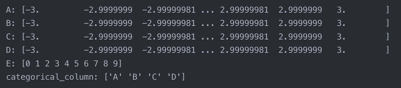
This loop goes through each column & prints out the unique values. This is particularly useful for categorical columns, as it allows us to see all the possible categories. For numerical columns, it can help us spot any unexpected or invalid values.
Example output:
From this output, we can see that columns A, B, C, & D contain continuous numerical values ranging from -3 to 3, while column E contains integer values from 0 to 9. The `categorical_column` contains four categories: A, B, C, & D.
We can also check the data type of each column:
# Print the data type of each column
print(df.dtypes)
This gives us the data type of each column (e.g., int64, float64, object for strings), which can be useful for identifying columns that may need to be converted to a different type.
Note: Checking the columns in this way helps us ensure that the data is consistent & in the expected format. If we spot any issues, such as invalid or unexpected values, we can go back to the preprocessing stage & fix them before proceeding with the analysis.
Checking Missing Values
Missing values can be a common occurrence in datasets & it's important to identify & handle them appropriately. Pandas provides several functions for detecting & dealing with missing values.
First, let's check if there are any missing values in the dataset:
Python
Python
# Check for missing values

print(df.isnull().sum())
You can also try this code with Online Python Compiler
The `isnull()` function returns a boolean mask indicating which cells contain missing values. By applying `sum()` to this mask, we get a count of missing values in each column.
Example output:
From this output, we can see that there are no missing values in any of the columns.
If there are missing values, we have a few options for handling them:
1. Drop rows or columns with missing values
# Drop rows with missing values
df = df.dropna()
# Drop columns with missing values
df = df.dropna(axis=1)
The `dropna()` function drops any rows or columns that contain missing values. By default, it drops rows, but we can drop columns instead by setting `axis=1`.
2. Fill missing values with a specific value
# Fill missing values with 0
df = df.fillna(0)
# Fill missing values with the mean of the column
df = df.fillna(df.mean())
The `fillna()` function fills missing values with a specified value. We can fill with a constant value like 0, or we can fill with a computed value like the mean of the column.
3. Fill missing values with forward or backward filling
# Forward fill missing values
df = df.fillna(method='ffill')
# Backward fill missing values
df = df.fillna(method='bfill')
Forward filling (or `ffill`) propagates the last valid observation forward, while backward filling (or `bfill`) propagates the next valid observation backward.
The choice of method for handling missing values depends on the nature of the data & the requirements of the analysis. In some cases, it may be appropriate to drop missing values, while in others, filling them with a specific value or using forward/backward filling may be more suitable.
Note: After handling missing values, it's a good practice to check again with `isnull().sum()` to confirm that all missing values have been dealt with as expected.
Checking for the duplicate values
Duplicate rows can sometimes sneak into datasets, especially when data is collected from multiple sources. These duplicates can skew our analysis, so it's important to identify & remove them.
First, let's check if there are any duplicate rows in the dataset:
Python
Python
# Check for duplicate rows

print(df.duplicated().sum())
You can also try this code with Online Python Compiler
The `duplicated()` function returns a boolean mask indicating which rows are duplicates. The first occurrence of a set of duplicate rows is considered the original & is marked as `False`, while subsequent occurrences are marked as `True`. By applying `sum()` to this mask, we get a count of duplicate rows.
Example output:
3
This output tells us that there are 3 duplicate rows in the dataset.
To get a more detailed view, we can print the duplicate rows:
Python
Python
# Print duplicate rows

print(df[df.duplicated()])
You can also try this code with Online Python Compiler
By default, `drop_duplicates()` keeps the first occurrence of each set of duplicates & removes the rest. If we want to keep the last occurrence instead, we can set `keep='last'`.
After removing duplicates, it's a good idea to check the shape of the DataFrame to confirm that the expected number of rows were removed:
Python
Python
# Print the shape of the DataFrame

print(df.shape)
You can also try this code with Online Python Compiler
This output tells us that after removing duplicates, the DataFrame has 997 rows & 6 columns, which means that 3 duplicate rows were indeed removed.
Note: Checking for & removing duplicates is an important data cleaning step that helps ensure the integrity & reliability of our analysis. It's especially important when working with large datasets where duplicates may not be immediately apparent.
Exploratory Data Analysis
Now that we've preprocessed our data, it's time to dive into exploratory data analysis (EDA). EDA is a crucial step in understanding the patterns, relationships, & distributions within our data. It involves both statistical analysis & visual exploration.
There are three main types of EDA:
1. Univariate Analysis
This involves analyzing each variable individually. For numerical variables, we can use measures like mean, median, & standard deviation, & visualizations like histograms & box plots. For categorical variables, we can use frequency tables & bar charts.
2. Bivariate Analysis
This involves analyzing the relationship between two variables. For two numerical variables, we can use scatter plots & correlation coefficients. For a numerical & a categorical variable, we can use box plots or violin plots. For two categorical variables, we can use stacked bar charts or heatmaps.
3. Multivariate Analysis
This involves analyzing the relationships among three or more variables. Techniques include scatter plot matrices, parallel coordinates plots, & dimension reduction techniques like Principal Component Analysis (PCA).
Let's start with univariate analysis:
Python
Python
import pandas as pd import matplotlib.pyplot as plt import seaborn as sns
# Load the dataset from the URL url = "https://raw.githubusercontent.com/datasets/finance-vix/main/data/vix-daily.csv" data = pd.read_csv(url, parse_dates=['DATE'])
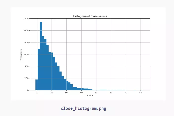
# Plot a histogram of the 'CLOSE' values plt.figure(figsize=(10, 6)) data['CLOSE'].hist(bins=50) plt.title('Histogram of Close Values') plt.xlabel('Close') plt.ylabel('Frequency') plt.savefig("close_histogram.png")
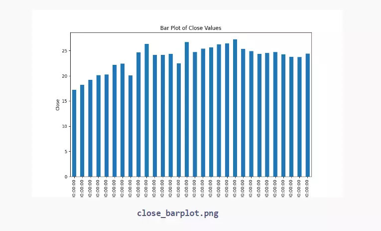
# Plot a bar plot of the 'CLOSE' values plt.figure(figsize=(10, 6)) data.set_index('DATE')['CLOSE'].head(30).plot(kind='bar') # limiting to the first 30 entries for better visualization plt.title('Bar Plot of Close Values') plt.xlabel('Date') plt.ylabel('Close') plt.savefig("close_barplot.png")
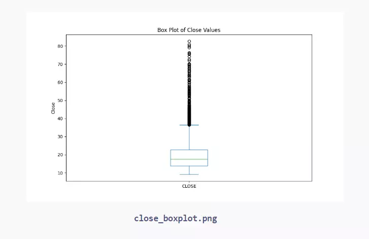
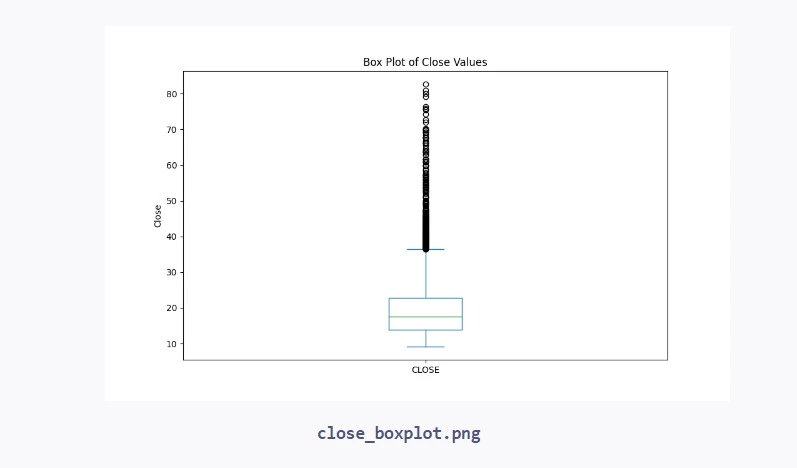
# Plot a box plot of the 'CLOSE' values plt.figure(figsize=(10, 6)) data['CLOSE'].plot(kind='box') plt.title('Box Plot of Close Values') plt.ylabel('Close') plt.savefig("close_boxplot.png") plt.show()
You can also try this code with Online Python Compiler
These are just a few examples of the visualizations we can create for univariate analysis. Histograms & box plots help us understand the distribution of a numerical variable, while bar plots show us the frequency of each category in a categorical variable.
EDA is an iterative process. As we explore the data, we may spot patterns or relationships that lead us to ask new questions, which in turn lead to more exploration. The goal is to thoroughly understand the dataset before moving on to modeling or drawing conclusions.
Univariate Analysis
Univariate analysis is the simplest form of analyzing data. "Uni" means "one", so in other words, your data has only one variable. It doesn't deal with causes or relationships. The main purpose of univariate analysis is to describe the data and find patterns that exist within it.
For example, let's say we want to analyze the distribution of ages in a population. We can use univariate analysis techniques to understand the central tendency (mean, median, mode), dispersion (range, variance, standard deviation), and the shape of the distribution (skewness and kurtosis).
Here are some common univariate analysis techniques in Python:
1. Measures of Central Tendency
- Mean: The average value of the data.
- Median: The middle value when the data is ordered from least to greatest.
- Mode: The most frequent value in the data.
Python
Python
import pandas as pd import matplotlib.pyplot as plt import seaborn as sns from scipy.stats import chi2_contingency, mode
# Load the dataset from the URL url = "https://raw.githubusercontent.com/datasets/finance-vix/main/data/vix-daily.csv" data = pd.read_csv(url, parse_dates=['DATE'])
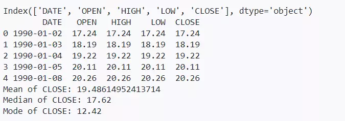
# Display the column names of the dataset print(data.columns)
# Display the first few rows of the dataset print(data.head())
# Calculate mean, median, and mode for the 'CLOSE' column mean_close = data['CLOSE'].mean() median_close = data['CLOSE'].median() mode_close = mode(data['CLOSE'])[0][0]
print(f"Mean of CLOSE: {mean_close}") print(f"Median of CLOSE: {median_close}") print(f"Mode of CLOSE: {mode_close}")
You can also try this code with Online Python Compiler
- Range: The difference between the maximum and minimum values.
- Variance: The average of the squared differences from the mean.
- Standard Deviation: The square root of the variance.
Python
Python
import pandas as pd
import matplotlib.pyplot as plt
import seaborn as sns
from scipy.stats import chi2_contingency, mode

# Load the dataset from the URL
url = "https://raw.githubusercontent.com/datasets/finance-vix/main/data/vix-daily.csv"
data = pd.read_csv(url, parse_dates=['DATE'])


# Calculate mean, median, mode, range, variance, and standard deviation for the 'CLOSE' column
mean_close = data['CLOSE'].mean()
median_close = data['CLOSE'].median()
mode_close = mode(data['CLOSE'])[0][0]
range_close = data['CLOSE'].max() - data['CLOSE'].min()
variance_close = data['CLOSE'].var()
std_dev_close = data['CLOSE'].std()
print(f"Range of CLOSE: {range_close}")
print(f"Variance of CLOSE: {variance_close}")
print(f"Standard Deviation of CLOSE: {std_dev_close}")
You can also try this code with Online Python Compiler
Range of CLOSE: 73.55
Variance of CLOSE: 62.04485108956657
Standard Deviation of CLOSE: 7.8768554061609235
3. Visualizations
- Histogram: Shows the distribution of a single numerical variable.
- Box Plot: Shows the quartiles and outliers of a numerical variable.
- Bar Plot: Shows the frequency of each category in a categorical variable.
Python
Python
import pandas as pd
import matplotlib.pyplot as plt
import seaborn as sns

# Load the dataset from the URL
url = "https://raw.githubusercontent.com/datasets/finance-vix/main/data/vix-daily.csv"
data = pd.read_csv(url, parse_dates=['DATE'])

# Plot a histogram of the 'CLOSE' values
plt.figure(figsize=(10, 6))
data['CLOSE'].hist(bins=50)
plt.title('Histogram of Close Values')
plt.xlabel('Close')
plt.ylabel('Frequency')
plt.savefig("close_histogram.png")

# Plot a bar plot of the 'CLOSE' values
plt.figure(figsize=(10, 6))
data.set_index('DATE')['CLOSE'].head(30).plot(kind='bar')  # limiting to the first 30 entries for better visualization
plt.title('Bar Plot of Close Values')
plt.xlabel('Date')
plt.ylabel('Close')
plt.savefig("close_barplot.png")

# Plot a box plot of the 'CLOSE' values
plt.figure(figsize=(10, 6))
data['CLOSE'].plot(kind='box')
plt.title('Box Plot of Close Values')
plt.ylabel('Close')
plt.savefig("close_boxplot.png")
plt.show()
You can also try this code with Online Python Compiler
These techniques help us understand the basic characteristics of our data. They can reveal patterns, help identify outliers, and give us a general sense of the distribution of our variables.
Note: Univariate analysis is often the first step in data exploration. It gives us a foundation for further analysis and helps guide our investigation into relationships between variables.
Bivariate Analysis
Bivariate analysis is used to find the relationship between two variables. It's a statistical technique that's used to find out if there's a relationship between two variables, and if so, how strong that relationship is.
There are several types of bivariate analysis:
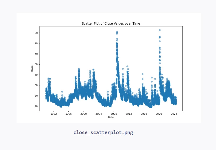
1. Scatter Plot
This is a graphical representation of the relationship between two numerical variables. Each point on the plot represents a single observation.
Python
Python
import pandas as pd
import matplotlib.pyplot as plt
import seaborn as sns

# Load the dataset from the URL
url = "https://raw.githubusercontent.com/datasets/finance-vix/main/data/vix-daily.csv"
data = pd.read_csv(url, parse_dates=['DATE'])
# Plot a scatter plot of 'DATE' vs 'CLOSE' values
plt.figure(figsize=(10, 6))
plt.scatter(data['DATE'], data['CLOSE'], alpha=0.5)
plt.title('Scatter Plot of Close Values over Time')
plt.xlabel('Date')
plt.ylabel('Close')
plt.savefig("close_scatterplot.png")
You can also try this code with Online Python Compiler
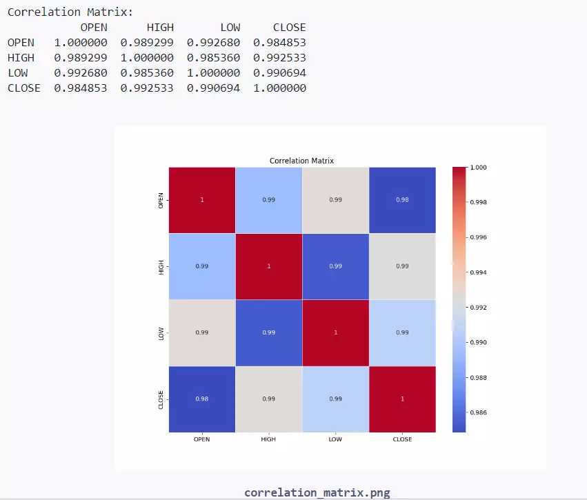
This measures the strength and direction of the linear relationship between two numerical variables. The correlation coefficient ranges from -1 to 1, with -1 indicating a perfect negative correlation, 1 indicating a perfect positive correlation, & 0 indicating no correlation.
Python
Python
import pandas as pd import matplotlib.pyplot as plt import seaborn as sns from scipy.stats import chi2_contingency
# Load the dataset from the URL url = "https://raw.githubusercontent.com/datasets/finance-vix/main/data/vix-daily.csv" data = pd.read_csv(url, parse_dates=['DATE'])
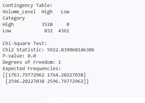
These are used to analyze the relationship between two categorical variables. A contingency table shows the frequency distribution of the variables, & a chi-square test determines if there is a significant association between the variables.
Python
Python
from scipy.stats import chi2_contingency
# Load the dataset from the URL url = "https://raw.githubusercontent.com/datasets/finance-vix/main/data/vix-daily.csv" data = pd.read_csv(url, parse_dates=['DATE'])
# Create a simple example for Contingency Table & Chi-Square Test # Fabricate some categorical data for demonstration data['Category'] = ['High' if x > data['CLOSE'].mean() else 'Low' for x in data['CLOSE']] data['Volume_Level'] = ['High' if x > data['CLOSE'].median() else 'Low' for x in data['CLOSE']]
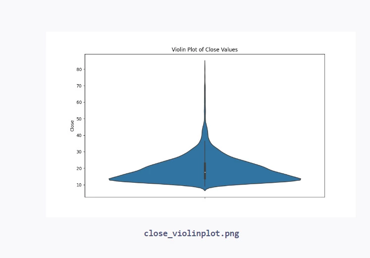
These are used to visualize the relationship between a numerical variable & a categorical variable. They show the distribution of the numerical variable for each category.
Python
Python
# Plot a box plot of the 'CLOSE' values
plt.figure(figsize=(10, 6))
data['CLOSE'].plot(kind='box')
plt.title('Box Plot of Close Values')
plt.ylabel('Close')
plt.savefig("close_boxplot.png")

# Plot a violin plot of the 'CLOSE' values
plt.figure(figsize=(10, 6))
sns.violinplot(y=data['CLOSE'])
plt.title('Violin Plot of Close Values')
plt.ylabel('Close')
plt.savefig("close_violinplot.png")
You can also try this code with Online Python Compiler
Bivariate analysis helps us understand how two variables are related to each other. It can uncover patterns that univariate analysis might miss. For example, univariate analysis might show that both sales & advertising have been increasing over time, but bivariate analysis could reveal that there's a strong correlation between the two - as advertising increases, so do sales.
Note: It's important to remember that correlation doesn't imply causation. Just because two variables are related doesn't necessarily mean that one causes the other. There could be a third variable that's causing both, or it could be a spurious relationship. That's why it's important to consider the context & use domain knowledge when interpreting the results of bivariate analysis.
Frequently Asked Questions
What are the key steps in EDA?
The key steps in EDA are: understanding the data, cleaning the data, analyzing the data using univariate, bivariate & multivariate techniques, & visualizing the data.
What's the difference between univariate, bivariate, & multivariate analysis?
Univariate analysis looks at individual variables, bivariate analysis looks at the relationship between two variables, & multivariate analysis looks at the relationship between three or more variables.
Why is data cleaning important in EDA?
Data cleaning is important because real-world data often contains errors, missing values, & inconsistencies that can distort the results of the analysis. Cleaning the data helps ensure that the insights derived from EDA are accurate & reliable.
Conclusion
In this article, we've learned about the key concepts & techniques of Exploratory Data Analysis (EDA) in Python. We've discussed data preprocessing, univariate analysis, bivariate analysis, & multivariate analysis. We've seen how to use statistical measures & visualization techniques to understand the distribution of variables, the relationships between variables, & the overall structure of the data. EDA is a crucial step in the data science process that helps us gain insights, detect anomalies, & inform our decisions about further analysis & modeling.


 9+ registered

