Feature of Flutter Buttons
The following given are the main features of flutter buttons-
- It is easy to apply themes on flutter buttons.
- Icon and text inside the button can also be themed easily.
- With different child widgets, we can compose buttons for different characteristics.
Types of Flutter Buttons
We have many types of flutter buttons, but we have old as well ass new flutter buttons also. We will look at each one of them one by one.
Old flutter buttons
The following are the types of old flutter buttons -
- Flat Button
- Raised Button
- Icon Button
- Inkwell Button
- Floating Button
- Drop Down Button
- PopupMenu Button
- Outline Button
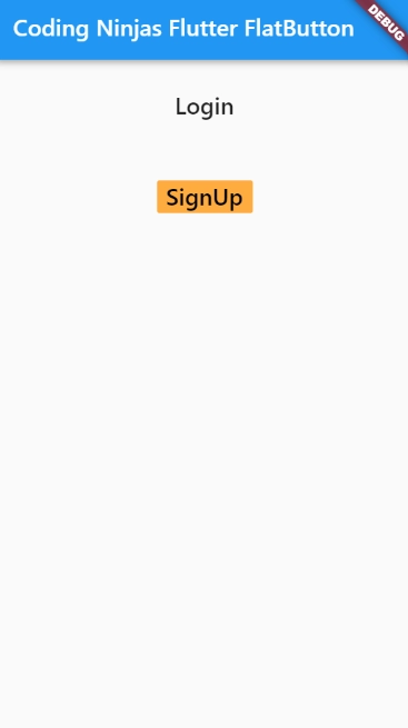
Flat Button
This flutter button doesn't have much decoration and has no levation. The flat button has two properties child and onPressed().
We mainly use it in toolbars, inline or dialog boxes with other content.
This flutter button doesn't have a color, and its text is black by default.
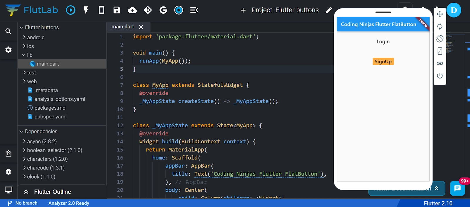
Code-
import 'package:flutter/material.dart';

void main() {
  runApp(MyApp());
}

class MyApp extends StatefulWidget {
  @override
  _MyAppState createState() => _MyAppState();
}

class _MyAppState extends State<MyApp> {
  @override
  Widget build(BuildContext context) {
    return MaterialApp(
      home: Scaffold(
          appBar: AppBar(
            title: Text('Coding Ninjas Flutter FlatButton'),
          ),
          body: Center(
              child: Column(children: <Widget>[
            Container(
              margin: EdgeInsets.all(25),
              child: FlatButton(
                child: Text(
                  'Login',
                  style: TextStyle(fontSize: 20.0),
                ),
                onPressed: () {},
              ),
            ),
            Container(
              margin: EdgeInsets.all(25),
              child: FlatButton(
                child: Text(
                  'SignUp',
                  style: TextStyle(fontSize: 20.0),
                ),
                color: Colors.orangeAccent,
                textColor: Colors.black,
                onPressed: () {},
              ),
            ),
          ]))),
    );
  }
}
Output-
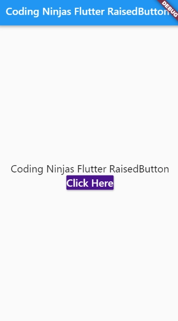
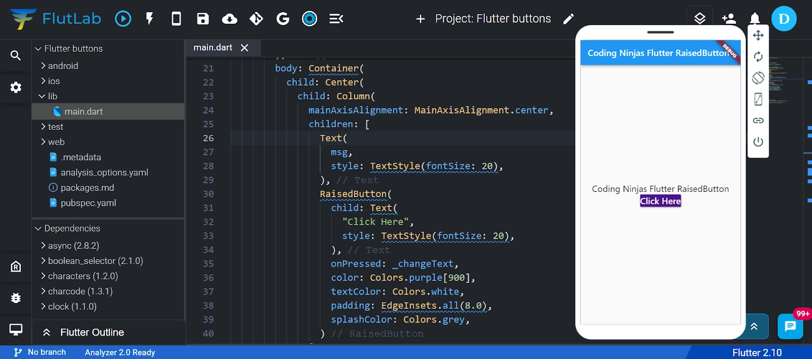
Raised Button
This flutter button is based on a material widget. It has a rectangular body. It is a flat button with elevation, and it increases when you press it, and along Z-axis, it adds dimension to UI. It has several properties like text color, padding, button color, shape, elevation, the color of a button when disabled, animation time, etc.
Two callback functions are there in raised flutter button-
- onPressed(): When the button is pressed, it is triggered.
- onLongPress(): When you long-press the button, it is triggered.
Note that if onPressed(), this button is disabled, and onLongPressed(), callbacks are not specified.
Code-
import 'package:flutter/material.dart';

void main() {
  runApp(MyApp());
}

class MyApp extends StatefulWidget {
  @override
  _MyAppState createState() => _MyAppState();
}

class _MyAppState extends State<MyApp> {
  String msg = 'Coding Ninjas Flutter RaisedButton';
  @override
  Widget build(BuildContext context) {
    return MaterialApp(
      home: Scaffold(
        appBar: AppBar(
          title: Text('Coding Ninjas Flutter RaisedButton'),
        ),
        body: Container(
          child: Center(
            child: Column(
              mainAxisAlignment: MainAxisAlignment.center,
              children: [
                Text(
                  msg,
                  style: TextStyle(fontSize: 20),
                ),
                RaisedButton(
                  child: Text(
                    "Click Here",
                    style: TextStyle(fontSize: 20),
                  ),
                  onPressed: _changeText,
                  color: Colors.purple[900],
                  textColor: Colors.white,
                  padding: EdgeInsets.all(8.0),
                  splashColor: Colors.grey,
                )
              ],
            ),
          ),
        ),
      ),
    );
  }

  _changeText() {
    setState(() {
      if (msg.startsWith('F')) {
        msg = 'We have learned what FlutterRaised button is.';
      } else {
        msg = 'Coding Ninjas Flutter RaisedButton';
      }
    });
  }
}
Output-
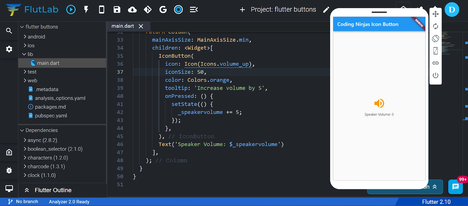
Icon Button
A picture printed on a material widget is called an IconButton. The Icon button is handy to give flutter UI a material design feel. The look and feel of this button can also be customized. When the user touches it, this flutter button icon reacts.
Code-
import 'package:flutter/material.dart';

void main() => runApp(MyApp());

class MyApp extends StatelessWidget {
  @override
  Widget build(BuildContext context) {
    return MaterialApp(
      home: Scaffold(
        appBar: AppBar(
          title: Text("Coding Ninjas Icon Button"),
        ),
        body: Center(
          child: MyStatefulWidget(),
        ),
      ),
    );
  }
}

double _speakervolume = 0.0;

class MyStatefulWidget extends StatefulWidget {
  MyStatefulWidget({Key? key}) : super(key: key);

  @override
  _MyStatefulWidgetState createState() => _MyStatefulWidgetState();
}

class _MyStatefulWidgetState extends State<MyStatefulWidget> {
  Widget build(BuildContext context) {
    return Column(
      mainAxisSize: MainAxisSize.min,
      children: <Widget>[
        IconButton(
          icon: Icon(Icons.volume_up),
          iconSize: 50,
          color: Colors.orange,
          tooltip: 'Increase volume by 5',
          onPressed: () {
            setState(() {
              _speakervolume += 5;
            });
          },
        ),
        Text('Speaker Volume: $_speakervolume')
      ],
    );
  }
}
Output-

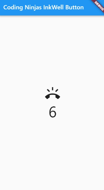
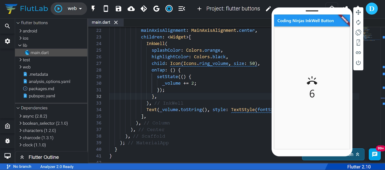
Inkwell Button
Inkwell flutter buttons are used for touch response. Here ink reaction is painted. Adding gesture feedback creates the app UI interactive. It is used primarily for adding a splash ripple effect.
Code-
import 'package:flutter/material.dart';

void main() => runApp(MyApp());

class MyApp extends StatefulWidget {
  @override
  _MyAppState createState() => _MyAppState();
}

class _MyAppState extends State<MyApp> {
  int _volume = 0;

  @override
  Widget build(BuildContext context) {
    return MaterialApp(
      home: Scaffold(
        appBar: AppBar(
          title: Text('Coding Ninjas InkWell Button'),
        ),
        body: Center(
          child: new Column(
            mainAxisAlignment: MainAxisAlignment.center,
            children: <Widget>[
              InkWell(
                splashColor: Colors.orange,
                highlightColor: Colors.black,
                child: Icon(Icons.ring_volume, size: 50),
                onTap: () {
                  setState(() {
                    _volume += 2;
                  });
                },
              ),
              Text(_volume.toString(), style: TextStyle(fontSize: 50)),
            ],
          ),
        ),
      ),
    );
  }
}
Output-
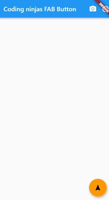
Floating Button
This flutter button is a circular icon button used to trigger primary action in your applications. In today's application, we primarily use this button.
FloatingActionButton: With a child widget, it creates a simple circular floating button. To display a widget, it must have a child parameter.
FloatingActionButton.extended: An icon and a label inside it create a wide floating button. It uses tags and icon parameters instead of a child.
Code-
import 'package:flutter/material.dart';

void main() {
  runApp(MyApp());
}

class MyApp extends StatefulWidget {
  @override
  _MyAppState createState() => _MyAppState();
}

class _MyAppState extends State<MyApp> {
  @override
  Widget build(BuildContext context) {
    return MaterialApp(
      home: Scaffold(
        appBar: AppBar(
          title: Text("Coding ninjas FAB Button"),
          backgroundColor: Colors.blue,
          actions: <Widget>[
            IconButton(icon: Icon(Icons.camera_alt), onPressed: () => {}),
            IconButton(icon: Icon(Icons.account_circle), onPressed: () => {})
          ],
        ),
        floatingActionButton: FloatingActionButton(
          child: Icon(Icons.navigation),
          backgroundColor: Colors.orange,
          foregroundColor: Colors.black,
          onPressed: () => {},
        ),
        /*floatingActionButton:FloatingActionButton.extended(
        onPressed: () {},
        icon: Icon(Icons.save),
        label: Text("Save"),
      ), */
      ),
    );
  }
}
Output-
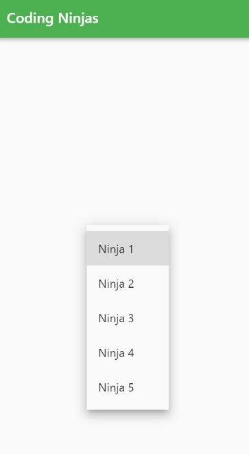
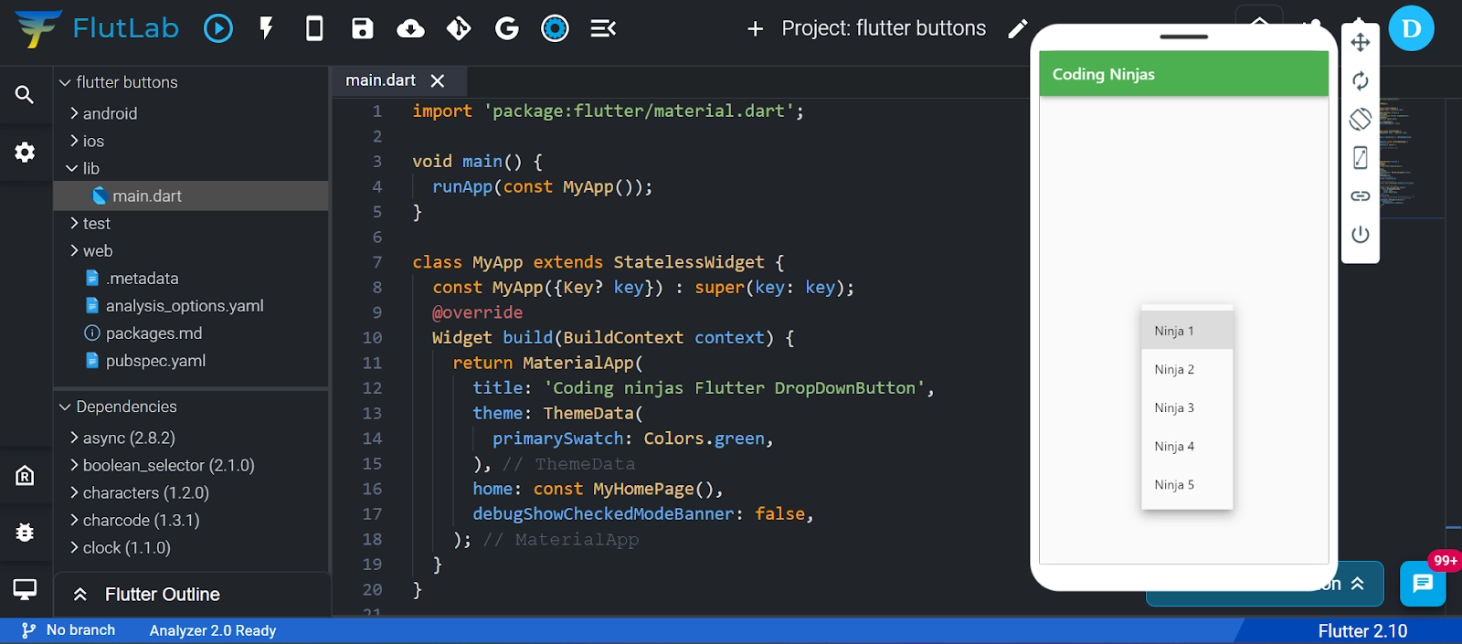
Drop Down Button
For creating a nice overlay on the screen, allowing the user to select any item from multiple options, we use the drop-down flutter button. For implementing a drop-down box or drop-down button, Flutter provides a simple way. This button shows the desired item and an arrow that opens a menu to select an item from multiple options.
To implement a drop-down list, Flutter provides a DropdownButton widget. You can place it anywhere in our app.
Code-
import 'package:flutter/material.dart';

void main() {
runApp(const MyApp());
}

class MyApp extends StatelessWidget {
const MyApp({Key? key}) : super(key: key);
@override
Widget build(BuildContext context) {
  return MaterialApp(
  title: 'Coding ninjas Flutter DropDownButton',
  theme: ThemeData(
    primarySwatch: Colors.green,
  ),
  home: const MyHomePage(),
  debugShowCheckedModeBanner: false,
  );
}
}

class MyHomePage extends StatefulWidget {
const MyHomePage({Key? key}) : super(key: key);

@override
_MyHomePageState createState() => _MyHomePageState();
}

class _MyHomePageState extends State<MyHomePage> {

// Initial Selected Value
String dropdownvalue = 'Ninja 1';

// List of items in our dropdown menu
var items = [
  'Ninja 1',
  'Ninja 2',
  'Ninja 3',
  'Ninja 4',
  'Ninja 5',
];
@override
Widget build(BuildContext context) {
  return Scaffold(
  appBar: AppBar(
    title: const Text("Coding Ninjas"),
  ),
  body: Center(
    child: Column(
    mainAxisAlignment: MainAxisAlignment.center,
    children: [
      DropdownButton(

      // Initial Value
      value: dropdownvalue,

      // Down Arrow Icon
      icon: const Icon(Icons.keyboard_arrow_down),

      // Array list of items
      items: items.map((String items) {
        return DropdownMenuItem(
        value: items,
        child: Text(items),
        );
      }).toList(),
      // After selecting the desired option,it will
      // change button value to selected value
      onChanged: (String? newValue) {
        setState(() {
        dropdownvalue = newValue!;
        });
      },
      ),
    ],
    ),
  ),
  );
}
}
Output-
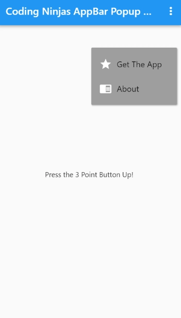
PopupMenu Button
When this flutter button is pressed, it displays the menu, and then it calls the onSelected() method, which dismisses the menu. It is because one item from the multiple options is selected. A text and an image are contained in this fltter button. To list all the options, I will mainly use with Settings menu. It helps in making a great user experience.
Code-
import 'package:flutter/material.dart';

// main method
void main() {
// runapp method run the our main app
  runApp(SimpleAppBarPopupMenuButton());
}

class SimpleAppBarPopupMenuButton extends StatelessWidget {
  const SimpleAppBarPopupMenuButton({Key? key}) : super(key: key);
// definition of the dialog
// box when value is selected
  void _showDialog(BuildContext context) {
    showDialog(
      context: context,
      builder: (BuildContext context) {
        return AlertDialog(
          title: Text("Alert!!"),
          content: Text("You are amazing!"),
          actions: [
            MaterialButton(
              child: Text("Okay"),
              onPressed: () {
                Navigator.of(context).pop();
              },
            ),
          ],
        );
      },
    );
  }

  @override
  Widget build(BuildContext context) {
    // MaterialApp with debugShowCheckedModeBanner
    // false and title.
    return MaterialApp(
      debugShowCheckedModeBanner: false,
      title: 'Coding Ninjas AppBar Popup Menu Button',
      // scaffold with appbar
      home: Scaffold(
        // appbar with title text
        appBar: AppBar(
          title: Text('Coding Ninjas AppBar Popup Menu Button'),
          // in action widget we have PopupMenuButton
          actions: [
            PopupMenuButton<int>(
              itemBuilder: (context) => [
                // PopupMenuItem 1
                PopupMenuItem(
                  value: 1,
                  // row with 2 children
                  child: Row(
                    children: [
                      Icon(Icons.star),
                      SizedBox(
                        width: 10,
                      ),
                      Text("Get The App")
                    ],
                  ),
                ),
                // PopupMenuItem 2
                PopupMenuItem(
                  value: 2,
                  // row with two children
                  child: Row(
                    children: [
                      Icon(Icons.chrome_reader_mode),
                      SizedBox(
                        width: 10,
                      ),
                      Text("About")
                    ],
                  ),
                ),
              ],
              offset: Offset(0, 100),
              color: Colors.grey,
              elevation: 2,
              // on selected we show the dialog box
              onSelected: (value) {
                // if value 1 show dialog
                if (value == 1) {
                  _showDialog(context);
                  // if value 2 show dialog
                } else if (value == 2) {
                  _showDialog(context);
                }
              },
            ),
          ],
        ),
        // body with centered text
        body: Center(
          child: Text("Press the 3 Point Button Up!"),
        ),
      ),
    );
  }
}
Output-

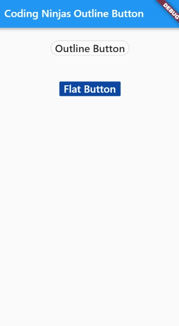
Outline Button
It is a flat button with a thin grey rounded rectangular border.
Code-
import 'package:flutter/material.dart';

void main() {
  runApp(MyApp());
}

class MyApp extends StatefulWidget {
  @override
  _MyAppState createState() => _MyAppState();
}

class _MyAppState extends State<MyApp> {
  @override
  Widget build(BuildContext context) {
    return MaterialApp(
      home: Scaffold(
          appBar: AppBar(
            title: Text('Coding Ninjas Outline Button'),
          ),
          body: Center(
              child: Column(children: <Widget>[
            Container(
              margin: EdgeInsets.all(25),
              child: OutlineButton(
                child: Text(
                  "Outline Button",
                  style: TextStyle(fontSize: 20.0),
                ),
                highlightedBorderColor: Colors.black,
                shape: RoundedRectangleBorder(borderRadius: BorderRadius.circular(15)),
                onPressed: () {},
              ),
            ),
            Container(
              margin: EdgeInsets.all(25),
              child: FlatButton(
                child: Text(
                  'Flat Button',
                  style: TextStyle(fontSize: 20.0),
                ),
                color: Colors.blue.shade900,
                textColor: Colors.white,
                onPressed: () {},
              ),
            ),
          ]))),
    );
  }
}
Output-

New flutter buttons
These new flutter buttons are up-to-date buttons with new guidelines and new styles. These flutter buttons are easier to understand and use. Here we can change the text color of TextButtons without affecting the text color of Elevatedbutton or OutlinedButton.
TextButton
To close the screen, TextButton can be used at a place such as AppBar inside the dialog box for closing it, etc.; inside any scrollable list, you'll avoid placing this button for obvious UI/UX reasons.
ElevatedButton
Where the app needs direct action from the user, such as confirming an order or booking a ticket, the best option is to use ElevatedButton. Avoid putting it over any other elevated widgets like cards as it's already elevated.
OutlinedButton
OutlinedButton is a mixture of ElevatedButton and TextButton. If you remove the border, then OutlinedButton is a TextButton. If you hover or press over it, it gives the impression of ElevatedButton, where the action is necessary but not crucial. Then we OutlinedButton as it is a medium-emphasis button.
Frequently Asked Questions
What is Flutter?
Flutter is a cross-platform development framework used to write code and can deploy on various platforms like android, iOS, and desktop.
What are the advantages of using Flutter?
A flutter is a potent tool. Following are a few advantages of using Flutter-
- Faster Development
- Live and Hot Reloading
- Good Community
- Minimal Code
- Documentation
- Cross-Platform Development
- UI Focused
How are the new Flutter buttons different?
In new flutter buttons, each button has its theme rather than a common theme applied to all other buttons, and this provides you more flexibility.
What can we do with the new Flutter buttons?
The following you can do with new flutter buttons-
- Overriding properties
- Customizing buttons in Flutter
- Setting defaults at the app level
Why should you use the new Material buttons rather than the old buttons in Flutter?
The new flutter buttons can save your time so that you invest your time in developing your app rather than finding fixes for simple solutions.
Conclusion
In this blog, we saw the topic of flutter buttons. We saw its features and types: old flutter buttons and new flutter buttons and if you would like to learn more, check out our articles on Flutter Checkbox and Flutter Stateful and Stateless Widgets.
Refer to our guided paths on Coding Ninjas Studio to learn more about DSA, Competitive Programming, JavaScript, System Design, etc. Enroll in our courses and refer to the mock test and problems available. Take a look at the interview experiences and interview bundle for placement preparations.
Do upvote our blog to help other ninjas grow.
Happy Learning Ninja!


 9+ registered

