Do you think IIT Guwahati certified course can help you in your career?
Introduction
Flutter Carousel Slider is one of the most widely used image sliders in today's apps. Carousel Sliders can be found on various eCommerce sites, including Amazon, Flipkart, Myntra, etc. The use of a slider to display the photographs creates a pleasing user experience. Since these sliders are automated, you can see various images and materials.
In this article, we will discuss the Features, Properties, Characteristics, and Implementation of the Flutter Carousel Slider.
What is a Carousel Slider in Flutter?
A carousel slider in Flutter is a UI widget used to display a series of items horizontally in a scrolling manner, typically with one item visible at a time. It allows users to swipe or scroll through the items, providing a visually appealing and interactive way to navigate content.
The carousel slider widget is commonly used in mobile app development to showcase images, product listings, news articles, or any other type of content that benefits from sequential presentation. It offers a compact and space-efficient way to display a large amount of information while maintaining a clean and intuitive user interface.
In Flutter, carousel sliders can be implemented using various packages available in the Flutter ecosystem, such as carousel_slider, flutter_swiper, or carousel_pro. These packages provide pre-built carousel slider components with customizable features like item spacing, pagination indicators, autoplay, and more.
Features of Carousel Slider
Responsive design, adapting to different screen sizes.
Smooth transition effects between slides.
Support for both images and content as slide elements.
Navigation controls for manual slide control.
Auto-play functionality with customizable timing.
Customizable slide captions and titles.
Option to include carousel indicators for slide tracking.
Support for touch gestures on mobile devices.
Multiple carousel instances on the same page
Supported Platforms
Web browsers (Chrome, Firefox, Safari, Edge, etc.).
Mobile browsers (iOS Safari, Android Chrome, etc.).
Responsive web design frameworks (Bootstrap, Foundation, etc.).
Content management systems (WordPress, Joomla, Drupal, etc.)
Installationof Flutter Carousel Slider
Download the Carousel Slider library from the official website.
Include the necessary CSS and JavaScript files in your HTML document.
Add the required HTML structure for the carousel container and slides.
Customize the CSS classes and styles to match your design requirements.
Initialize the Carousel Slider using the provided JavaScript initialization code.
Test and verify the functionality of the carousel on your website.
Properties of Carousel Slider
Width: Sets the width of the carousel container.
Height: Defines the height of the carousel container.
Autoplay: Enables or disables the auto-play feature.
Speed: Specifies the transition speed between slides.
Navigation: Determines whether navigation controls are displayed.
Pagination: Controls the visibility of carousel indicators.
Caption: Allows customization of slide captions and titles.
Responsive: Makes the carousel adapt to different screen sizes.
Touch-enabled: Enables or disables touch gestures on mobile devices.
Looping: Determines whether the carousel slides in a loop or stops at the last slide.
Implementation of Flutter Carousel Slider
This article will look at using Carousel Slider in a Flutter application. You must follow the steps below to implement the Flutter Carousel Slider.
Step 1: Adding dependencies
In the lib folder's pubspec.yaml file, add the Carousel Slider dependency.
We've added the Carousel Slider dependent to our pubspec.yaml file in the lib folder's dependencies, as shown below:
dependencies:
      carousel_slider: ^2.3.1
Now select pub.get for configuring.
Step 2: Setting Up the App
Return MaterialApp() from the main.dart() file.
First, we declared MyApp() in the main function's runApp. After that, we constructed a StatelessWidget for MyApp and returned MaterialApp (). We've given our App a title and declared the Dark Theme as the theme in this MaterialApp(). Then, we've given our first screen or slider app in the home: HomePage().
Import the flutter Carousel Slider dependencies in the HomePage.dart() file.
We must first import our package carousel-slider.dart in HomePage.dart(). Then we built an appbar within Scaffold (). The title of the app is displayed in this appbar. Then it's up to you. We've declared ListView() inside the body, and we've declared CarouselSlider() inside that, with 5 items. Each item is contained within a Container(), with attributes such as a margin specified on all sides. Following that, we provided boxdecoration, which was used to beautify our Container(). BoderRadius has been set to circular. This causes our Container() to be rounded on all sides by specifying a radius. We've now provided an image in which we've declared DecorationImage(), which is utilized to display images in our Container() via URL. And I've saved it as BoxFit.cover, which scales the image to fit the container. We've now repeated the process for the remaining four containers. Following that, we declared CarouselOptions() in the options section.
In Flutter, integrating a carousel slider involves a few simple steps:
Install a Carousel Slider Package: Begin by adding a carousel slider package to your Flutter project. You can choose from popular packages like carousel_slider, flutter_swiper, or carousel_pro. Add the package dependency to your pubspec.yaml file and run flutter pub get to install it.
Implement the Carousel Widget: Next, import the carousel slider package in your Dart file and use the provided carousel widget to create the slider. Customize the widget by specifying properties such as the list of items to display, item size, autoplay behavior, pagination style, and more.
Add Content to the Carousel: Populate the carousel slider with content, such as images, text, or custom widgets. You can provide a list of items to display in the carousel, and the widget will automatically render them in a scrolling manner.
Customize Appearance and Behavior: Fine-tune the appearance and behavior of the carousel slider to match your app's design and functionality requirements. Adjust properties like item spacing, animation duration, autoplay interval, pagination indicators, and gesture detection to create the desired user experience.
Handle User Interaction: Implement any necessary logic to handle user interactions with the carousel slider, such as tapping on items, swiping to navigate, or interacting with pagination controls. You can use callback functions provided by the carousel widget to respond to user actions accordingly.
By following these steps, you can easily integrate a carousel slider into your Flutter application and enhance the user interface with interactive and visually appealing content navigation.
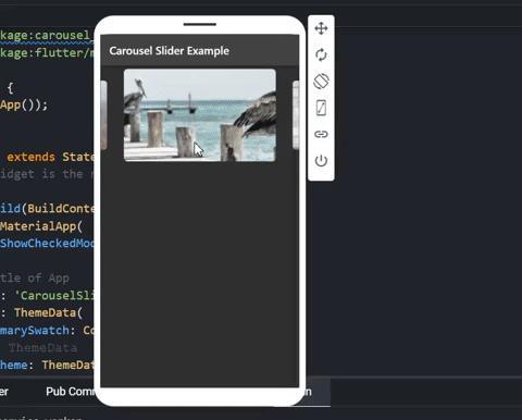
Example Application
Let's consider an example application where we use a carousel slider to showcase a collection of product images in an e-commerce app:
This example demonstrates a simple Flutter application that uses the carousel_slider package to display a carousel slider of product images. Replace the image URLs in the productImages list with your own image URLs to test the carousel slider in your application.
Frequently Asked Questions
What is carousel slider Flutter?
A carousel slider in Flutter is a UI widget used to display a series of items horizontally in a scrolling manner, typically with one item visible at a time. It allows users to swipe or scroll through the items, providing an interactive navigation experience.
Is Carousel and slider same?
No, carousel and slider are not the same in Flutter. A carousel slider typically displays multiple items in a horizontal sequence, allowing users to swipe through them, while a slider typically presents a single value on a linear scale that users can adjust by dragging a thumb or handle.
How do you give a slider in Flutter?
To create a slider in Flutter, you can use the Slider widget provided by the Flutter framework. Simply instantiate the Slider widget with appropriate parameters such as value, min, max, and onChanged callback, and add it to your Flutter UI tree.
How do you add a picture to carousel slider Flutter?
To add a picture to a carousel slider in Flutter, you can use the carousel_slider package or similar carousel slider libraries available in Flutter. Simply provide a list of image URLs or image widgets to the items property of the carousel slider widget, and the library will handle the display and navigation of the images for you.
Conclusion
In this article, we have discussed the Flutter carousel slider. We have discussed its properties and how we can use it correctly with the help of an example. So basically, the carousel slider is a widget in the Flutter and supports infinite scroll and custom child widgets.


 9+ registered

