Table of contents
1.
Introduction
2.
What is Flutter Checkbox?
3.
Checkbox Example
4.
Constructor of Checkbox Widget
5.
Checkbox Widget Properties 
6.
Example
7.
CheckboxListTile
8.
CheckboxListTile Example
9.
Frequently Asked Questions
9.1.
What is Flutter used for?
9.2.
How to make a single select checkbox in Flutter?” 
9.3.
How to add text next to a checkbox in Flutter?
9.4.
How do you add a checkbox in Flutter?
9.5.
How do I make a checkbox list in Flutter?
10.
Conclusion
Last Updated: Jul 3, 2024
Easy

Flutter Checkbox

Author Lekhika
1 upvote
Career growth poll
Do you think IIT Guwahati certified course can help you in your career?

Introduction

In this article, we will learn how to use checkboxes in Flutter. In Flutter, we can have two checkboxes: a compact version of the checkbox called "checkbox" and the "CheckboxListTile" checkbox that comes with a header & subtitle. We will discuss these Flutter checkboxes in detail.

What is Flutter Checkbox?

A Flutter checkbox is a type of input component that holds the boolean value. A GUI(Graphical User Interface) element allows users to choose multiple options from many selections. Here, users can reply only with a ‘yes’ or ‘no’ value. A checked/marked checkbox means ‘yes,’ and an unmarked/unchecked checkbox means ‘no’ value. Generally, we can see the checkboxes on the screen as a square box with white space or a tick mark. A label or a caption corresponding to each checkbox explains the meaning of the checkboxes.

Attributes Descriptions

value

We use it to check whether the checkbox is checked or not.

onChanged

We call it when the value is changed.

Tristate

False by default, its value can be true, false, or null.

activeColor

Specifies the color of the selected checkbox.

checkColor

Specifies the color of the check icon when they are selected.

materialTapTargetSize

We use it to configure the size of the tap target.


Demo example:

Checkbox(  
  value: this.showvalue,   
  onChanged: (bool value) {  
    setState(() {  
      this.showvalue = value;   
    });  
  },
),


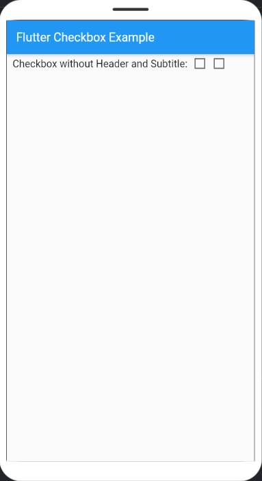
Here, we have a boolean called this.showvalue. Once a user presses the checkbox UI component in the app, it sets the state of the boolean to the changed value. If the app needs the checkbox to be flexible and toggle between “true” and “false” you can set it up so that the value changes to the opposite value every time the checkbox is pressed.

Checkbox Example

import 'package:flutter/material.dart';

void main() {
  runApp(MaterialApp(
    home: MyHomePage(),
  ));
}

class MyHomePage extends StatefulWidget {
  @override
  _HomePageState createState() => _HomePageState();
}

class _HomePageState extends State<MyHomePage> {
  bool valuefirst = false;
  bool valuesecond = false;

  @override
  Widget build(BuildContext context) {
    return MaterialApp(
      home: Scaffold(
        appBar: AppBar(
          title: Text('Flutter Checkbox Example'),
        ),
        body: Container(
            child: Column(
          children: <Widget>[
            Row(
              children: <Widget>[
                SizedBox(
                  width: 10,
                ),
                Text(
                  'Checkbox without Header and Subtitle: ',
                  style: TextStyle(fontSize: 17.0),
                ),
                Checkbox(
                  checkColor: Colors.greenAccent,
                  activeColor: Colors.red,
                  value: this.valuefirst,
                  onChanged: (bool? value) {
                    setState(() {
                      this.valuefirst = value!;
                    });
                  },
                ),
                Checkbox(
                  value: this.valuesecond,
                  onChanged: (bool? value) {
                    setState(() {
                      this.valuesecond = value!;
                    });
                  },
                ),
              ],
            ),
          ],
        )),
      ),
    );
  }
}


Output (Unchecked):

Output (Checked): 

Constructor of Checkbox Widget

In Flutter, the Checkbox widget's constructor has the following main parameters:

Checkbox({
 Key? key,
 required bool value,
 ValueChanged<bool?>? onChanged,
 Color? activeColor,
 Color? checkColor,
 MaterialStateProperty<Color?>? fillColor,
 MouseCursor? mouseCursor,
 MaterialTapTargetSize? materialTapTargetSize,
 VisualDensity? visualDensity,
 bool tristate = false,
})


  • value: A required boolean value representing the current state of the checkbox.
     
  • onChanged: A callback function that is called when the checkbox's state changes.
     
  • activeColor: The color of the checkbox when it's checked.
     
  • checkColor: The color of the checkmark icon.
     
  • fillColor: A property for customizing the background color of the checkbox when checked.
     
  • mouseCursor: The mouse cursor to use when the mouse pointer is over the checkbox.
     
  • materialTapTargetSize: Specifies the size of the tap target.
     
  • visualDensity: Allows you to adjust the visual density of the checkbox.
     
  • tristate: A boolean that, when set to true, allows the checkbox to have three states: checked, unchecked, and indeterminate.

You can use these parameters to customize the appearance and behavior of the Checkbox widget in your Flutter app.

Checkbox Widget Properties 

The Checkbox widget properties in Flutter include:

  1. value: Represents the current state of the checkbox (required).
     
  2. onChanged: Callback function on state change.
     
  3. activeColor: Color when checked.
     
  4. checkColor: Checkmark color.
     
  5. fillColor: Background color when checked.
     
  6. mouseCursor: Mouse pointer behavior.
     
  7. materialTapTargetSize: Tap target size.
     
  8. visualDensity: Adjusts visual appearance.
     
  9. tristate: Enables three-state behavior.

Example

Here's a simple example of a Checkbox widget in Flutter:

import 'package:flutter/material.dart';
void main() {
 runApp(MyApp());
}
class MyApp extends StatelessWidget {
 bool isChecked = false;
 void toggleCheckbox(bool value) {
   // Handle checkbox state changes
   isChecked = value;
 }
 @override
 Widget build(BuildContext context) {
   return MaterialApp(
     home: Scaffold(
       appBar: AppBar(
         title: Text('Checkbox Example'),
       ),
       body: Center(
         child: Column(
           mainAxisAlignment: MainAxisAlignment.center,
           children: <Widget>[
             Checkbox(
               value: isChecked,
               onChanged: toggleCheckbox,
             ),
             Text('Checkbox is checked: $isChecked'),
           ],
         ),
       ),
     ),
   );
 }
}

In this example, we create a simple Flutter app with a checkbox that toggles its state when pressed. 
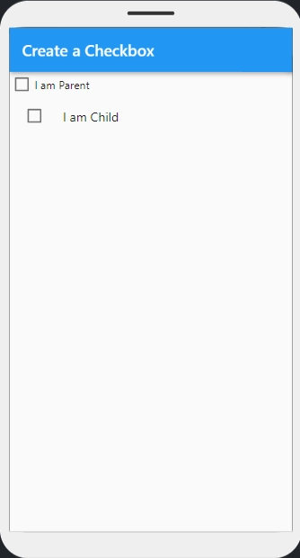
CheckboxListTile

The distinction between the two widgets is that the CheckboxListTile has the property “title”. You don’t need additional widgets to give your Flutter checkbox some identification. In the example below, you will see how to implement the exact Flutter checkbox from before, but this time in a CheckboxListTile widget:

Demo example:

CheckboxListTile(
  controlAffinity: ListTileControlAffinity.leading,
  secondary: const Icon(Icons.abc),  
  title: const Text('demo-mode'),  
     subtitle: Text('sub-demo-mode'),  
  value: this.subvalue,   
  onChanged: (bool value) {  
    setState(() {  
      this.subvalue = value;   
    });
  },
),


The code demo is similar to the above one. We have CheckboxListTile having a property “controlAffinity,” which is set to “ListTileControlAffinity.trailing”, meaning the checkbox will be on the right side of the title. Secondary contains icons that we may add to the Flutter checkbox list.

Attributes Descriptions

value

We use it whether the checkbox is checked or not.

onChanged

Called when the value is changed.

titile

Specifies the main title of the list.

subtitle

Specifies the subtitle of the list. Usually, we used it to add the description.

activeColor

Specifies the color of the selected checkbox.

activeColor

Specifies the color of the selected checkbox.

selected

False by default, highlights the text after selection.

secondary

Widget that is displayed in front of the checkbox.


CheckboxListTile Example

import 'package:flutter/material.dart';

void main() {
  runApp(MyApp());
}

class MyApp extends StatelessWidget {
  // This widget is the root of our application.
  @override
  Widget build(BuildContext context) {
    return MaterialApp(
      title: 'Create a Checkbox',
      theme: ThemeData(
        primarySwatch: Colors.blue,
      ),
      home: MyHomePage(title: 'Create a Checkbox'),
    );
  }
}

class MyHomePage extends StatefulWidget {
  MyHomePage({Key? key, required this.title}) : super(key: key);
  final String title;

  @override
  _MyHomePageState createState() => _MyHomePageState();
}

class _MyHomePageState extends State<MyHomePage> {
  bool _checkbox = false;
  bool _checkboxListTile = false;

  @override
  Widget build(BuildContext context) {
    return Scaffold(
      appBar: AppBar(
        title: Text('Create a Checkbox'),
      ),
      body: Center(
        child: Column(
          children: [
            Row(
              children: [
                Checkbox(
                  value: _checkbox,
                  onChanged: (value) {
                    setState(() {
                      _checkbox = !_checkbox;
                    });
                  },
                ),
                Text('I am Parent'),
              ],
            ),
            CheckboxListTile(
              controlAffinity: ListTileControlAffinity.leading,
              title: Text('I am Child'),
              value: _checkboxListTile,
              onChanged: (value) {
                setState(() {
                  _checkboxListTile = !_checkboxListTile;
                });
              },
            )
          ],
        ),
      ),
    );
  }
}


Output:

Frequently Asked Questions

What is Flutter used for?

Flutter is Google's portable UI toolkit for crafting attractive, natively compiled mobile, web, & desktop applications from a single codebase. The Flutter works with existing code, is used by developers and organizations worldwide, and is free and open source.

How to make a single select checkbox in Flutter?” 

To create a single select checkbox in Flutter, you would use the Checkbox widget. This widget requires a bool value to represent its checked or unchecked state. You typically manage this state using a bool variable in your widget's stateful or stateless class. By updating this variable in response to user interaction (onChanged callback), you control whether the checkbox appears checked or unchecked.

How to add text next to a checkbox in Flutter?

To add text next to a checkbox in Flutter, you can use a Row widget. Inside the Row, place the Checkbox widget followed by a Text widget. This arrangement allows you to visually associate the text with the checkbox. The Row widget aligns its children in a horizontal arrangement, making it ideal for placing widgets side by side. Adjust the text style and alignment properties as needed to achieve your desired layout and appearance.

How do you add a checkbox in Flutter?

To add a checkbox in Flutter, use the Checkbox widget and manage its state with a boolean variable.

How do I make a checkbox list in Flutter?

Create a ListView with CheckboxListTile widgets, each managing a boolean value. Use a List<bool> for checkbox states.

Conclusion

This article gives information about Flutter Checkbox and its uses. Being a Flutter developer, you must be well versed with the concepts like Flutter Checkbox, which you have learned just now.

Also read Flutter TableFlutter Expansion TileCardFlutter CalendarFlutter Tabbar.

Refer to our guided paths on Coding Ninjas Studio to learn more about DSA, Competitive Programming, JavaScript, System Design, etc. Enroll in our courses and refer to the mock test and problems available. Take a look at the interview experiences and interview bundle for placement preparations.

Live masterclass